
Last Updated on November 2, 2022 by
As the end of the year is approaching, you may be involved in preparing an annual company review presentation. Here’re some simple tips on how to make it visually attractive. How to make financial results more interesting, inspirations for showing sales, production, accounting data, and other KPIs in eye-catching visual form.
I was involved in a bunch of such presentations. They were usually prepared for the board report meetings or company year-end party. A CEO presented what happened over the year if the yearly goals have been met. Sometimes every department contributed – showing sales statistics, marketing campaigns summary, and production numbers. Accounting guys presented a financial outlook if the revenue will reach the 2015 target? Will the business be profitable or in red numbers?
Such presentations are usually full of numbers. And that’s dangerous. If there are many of them, this can lead to famous death by PowerPoint :).
To avoid it, you can easily make these review slides more attractive. Just add a few simple shapes – and change plain numbers to colorful, simple infographics:
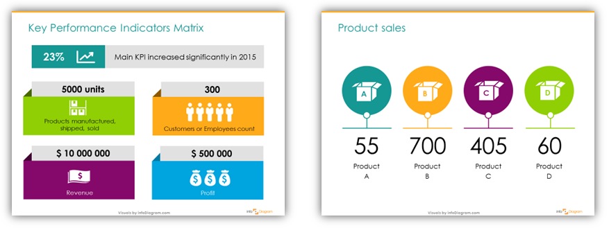
Illustrate financial tables by adding icons:

Present major events and projects over a neat timeline:

Make such simple graphics yourself, it’s not so hard. Or reuse our pre-designed Annual company review presentation template with KPI diagrams and symbols for financial items – revenue, profit, costs, EBITDA.
See more examples below in my recent Slideshare presentation deck:
Graphics sources used in this presentation: Yearly Business Review Template and Flat Ribbon Banners.
A quick survey – which of the slides above you find the most useful for you? Financial report? Key data slide? Timeline?
Key data slide and timelines.