Why is WordPress great tool for presenters?

Last Updated on January 12, 2022 by Anastasia

For a presenter, PowerPoint or other presentation software is indeed the main tool for creating a presentation but there’s certainly much more of what you want to say to your audience. It won’t fit all into a few slides of your presentation. As a presenter, you’re passing on knowledge. No matter if it’s just a general overview of the topic or deep insights packed up with details.
Continue reading Why is WordPress great tool for presenters?

How to Present Business Analysis by One Icon [concept visualization]

Last Updated on January 12, 2022 by Anastasia

If you’re working on market research or just planning the future of your product or company, you often deal with a business analysis of some kind.

It can be within a qualitative analysis like 360-degree feedback surveys, SWOT or PEST analysis or opinion checking. Or if it involved more data measuring then we talk about quantitative analysis. I’m not going to write about data visualization here (but you can check some examples in this post “How to present KPI data in a presentation“). For now, I’d like to focus on illustrating analysis concept in general.

Continue reading How to Present Business Analysis by One Icon [concept visualization]

Presenting a Deadline in a PPT, XLS, DOC Documents [concept visualization]

Last Updated on June 23, 2022 by Anastasia

‘The very last deadline is February the 29th!’

How often do we hear the word ‘deadline’? All the time, right? Whether we are working on different projects, designing roadmaps, talking about marketing activities, creating our quarterly reviews, or simply designing calendars to plan our work ahead. We have to set specific deadlines because if there’s no time limit, there’s no real work.

For some of us ‘deadline’ may sound scary, especially if we leave all the work for the last hour 🙂

Continue reading Presenting a Deadline in a PPT, XLS, DOC Documents [concept visualization]

Too much info on a slide? Simplify complex presentation in three steps

Last Updated on March 6, 2024 by Rosemary

Is your presentation overloaded with information and do you want to minimize the amount of text keeping the main message? During slide design or redesign we often face the problem of how to simplify a complex presentation and leave only important information. In this blog, we share here three tips on how we cope with it.

The common problem is how to avoid too ‘wordy’ slides, which are good for reading on-screen if someone has lots of time. But who has it today? Even more, if the slides are to be presented at a meeting, texts on slides are effectiveness killers. However, there is a way to visualize key facts and make them simple and easy to understand for our audience.

Continue reading Too much info on a slide? Simplify complex presentation in three steps

How to Present Flexibility on a Slide [concept visualization]

Last Updated on January 17, 2022 by Anastasia

A few tips on how to express visually the idea of flexibility in a presentation – for example showing that your company is dynamic or your solution is adaptable.

This concept appears pretty often over various corporate slideshows, market analysis reports but also in soft-skills contexts such as giving feedback training presentations.

Continue reading How to Present Flexibility on a Slide [concept visualization]

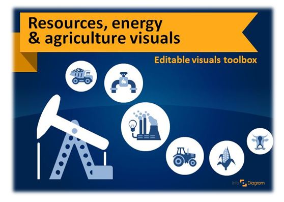
Illustrating Resources, Energy and Agriculture Presentation

Last Updated on January 17, 2022 by Anastasia

Talking about energy resources or agriculture topics? Illustrating natural and alternative energy operations, or food production flowcharts can be challenging. Especially when you rely on images from the standard sets of clip art. There’s a lack of consistent symbols set that would cover in detail all types of resources, energy and agriculture. 
Continue reading Illustrating Resources, Energy and Agriculture Presentation