
Last Updated on July 30, 2018 by Anastasia
How even a non-designer can create neat infographics in PowerPoint
Today we are sharing with you a few tips on creating simple infographics. Following these steps, you can design eye-catching presentation graphics, that will look much better in your slides.
This blog post is sharing an experience of our fresh team member, Anastasia. She is taking care of our community engagement, besides being a fan of nice visual presentations:
I will describe my particular experience 🙂 As I’m not a designer I face the same problems as you, guys. Before I learned these particular tips, my presentations consisted mainly of heavy texts, they looked unprofessional, the style was old and I have to admit it, they were boring.
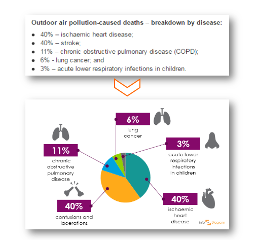
Ok, so follow me. The diagram topic was not familiar to me at all and actually, that was good. Below you can see the information I had to present and the infographics I could make out of it.
The question you want to ask is ‘How a non-designer could possibly create such infographics?’. I was delighted with the result too 🙂 So follow me, let’s take it part by part.
1. Analyze numbers or information
Think about how you can organize data: whether to make a line graph, bar chart, histogram or pie chart (of course, there are more of them, but I listed the most common and suitable ones). As you can see, I chose a pie chart, because in such way the information looks organic and you can add as many icons and images as you want.
2. Use the PowerPoint magic
Believe me, this program can perform much more than you think. For creating charts, find ‘Insert’ -> ‘Chart’ and choose the best for you. Then the Excel window will open, where you can add all your information. My first step looked like this:
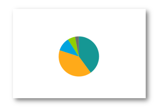
Lonely, isn’t it? A year ago I would only add numbers and maybe make them bold. However, now I know much more and I will share the secrets with you 🙂
Next I added my numbers – 40%, 40%, 11%, 6% and 3%. As I’m a girl, I made the boxes purple and I put white numbers on them. Then I added lines to link the percentage and responding part of the chart and here’s what I got:
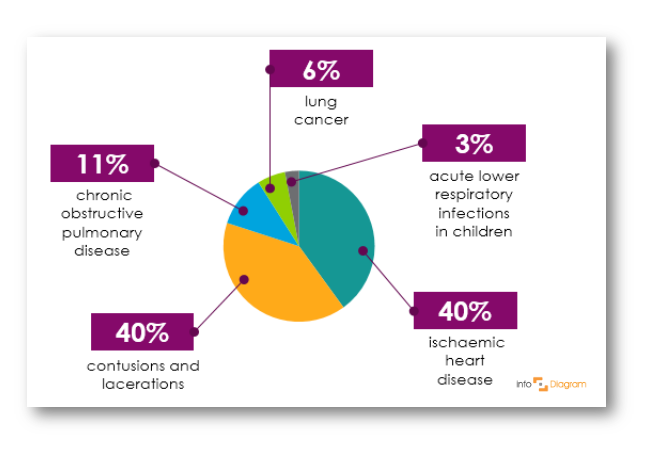
Rectangle boxes and lines can be found in ‘Format’ -> ‘Shapes’.
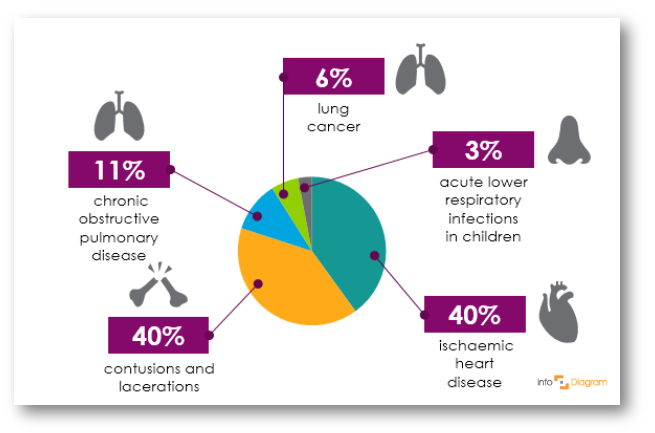
However, I still wasn’t satisfied with the result. Something was missing. Then one of our infoDiagram designers saw this chart and told me: ‘Why is it so sad? Add organs.’ I was slightly shocked and didn’t get which of my organs exactly should I give to make it look better. The following line was: ‘We have exact icons of everything you need.’
The next (and the last) version of my graph you can see here (you have already seen it in the very beginning, but it is so pretty that I can’t but mention it one more time):
Then I knew that was it.
The icons of heart, lungs, and bones from the picture can be found in this Human Body Parts presentation icon set.
Now my chart is proudly standing in the line with others, which are actually made by designers 🙂 It was a proof for me that even I, a non-designer, can make some professional infographics.
Examples of healthcare do-it-yourself infographics
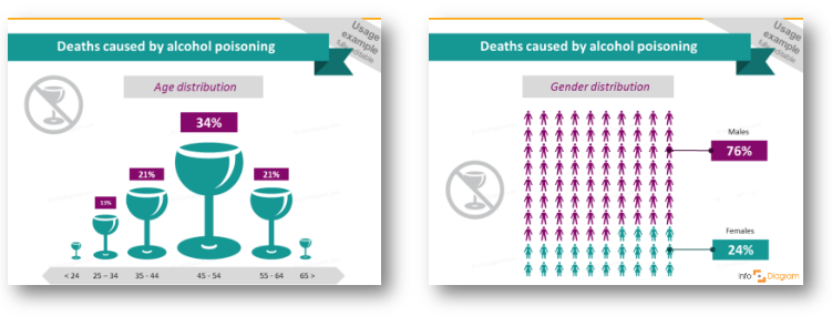
On the images below are samples of infographics you can easily create, and it is not a time-consuming task. Here are data on stop-smoking effects and organs damaged ith alcohol, presented in a creative way:

On the image below you can see statistical data, which actually don’t look like statistics anymore:
If you’re doing presentations on healthcare and medical related topics, then find some inspiration in our Slideshare presentation:
I hope those several ways to create infographics can inspire you, too. So you’ll also stop using these ugly text boxes and overload your slides with tables 🙂
Don’t hesitate and write your comments, I’d like to hear your opinion, as this is my first experience with sharing such a story. Maybe my chart is not so good as I think of it 🙂
More articles on presentation graphics
Check out these articles if you search for more inspiration on how to visualize your presentation:
- How To Be Creative When Preparing Presentation
- 3 diagram mistakes to avoid in slides design
- 4 steps to make attractive medical data chart in PowerPoint
Here’s a sneak view from our recent infoDiagram workshop where we worked on designing a new content, including me working on those medical infographics 🙂

See you in the next posts 😉
Anastasia, Community Engagement representative