Last Updated on August 31, 2023 by Anastasia
Tables are used everywhere in business – price lists, KPI comparisons, project meetings, quarter review meet-ups, accounting audits… Sounds familiar? Table infographics are one of the most common ways to present data. Making a table in PowerPoint or Excel is simple and quick. However, usually, those tables look pretty basic and boring. It’s time to change that!
Read on to find out four easy steps you can follow to quickly change default data tables into more attractive and professional-looking table graphics.
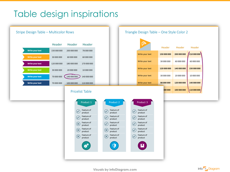
All graphics can be found in the Creative Tables Graphics slides collection. Click on the pictures to see the details.
All the presented table makeovers you’re about to see are done using only standard MS Office PowerPoint tools. You don’t need any special software, only your computer and a bit of imagination. Let’s have a quick view of how tables can be redesigned.
Before and After PowerPoint Table Redesign
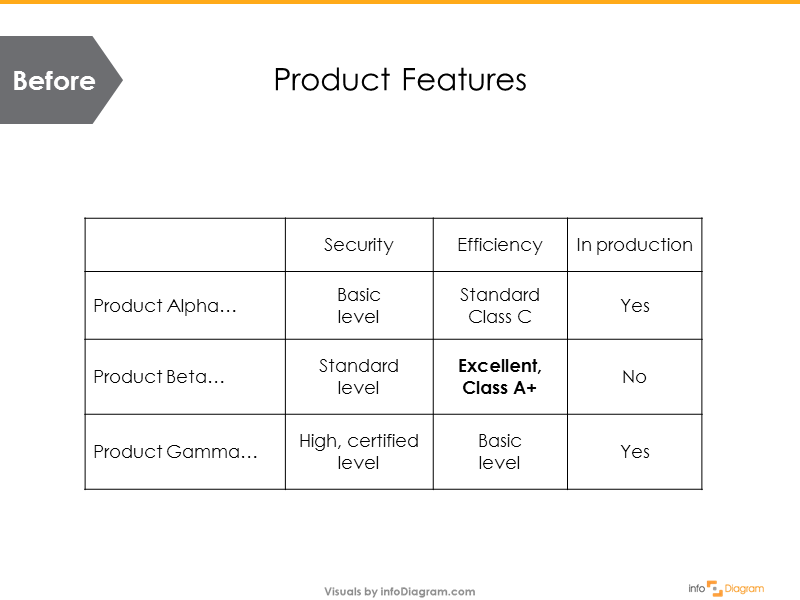
Below you can see a standard table comparing three product features created in PowerPoint. If you use the standard table style it will look like this – a grid with black lines and plain white cells filling:
Here’s an example of how such a table can be facelifted in a few steps to look consistent, and easier to read and remember.
Which table would resonate longer with your audience? Is the one above or below?
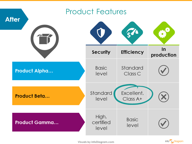
And the best part is that it took me 5-10 minutes, using just colors, basic shapes, and a few simple symbols. So don’t worry, you don’t need to have profound design skills to achieve similar results.
For more table examples, check out this table graphics collection here.
Below you can see four steps that are easy to follow. Even if you don’t feel like a graphic designer, you can do it :).
1. Replace the grid of your standard presentation table
The table cell borders separate the content of your table cells. They are far less important than the content itself. Therefore it is a mistake to make them strong black as in the example. Make them look less important by replacing the high-contrast black grid with light gray (or any other color, which will suit your style, gray is one of the most neutral colors). You can also remove the borders completely if you have wide table margins. Here are two examples of such change:
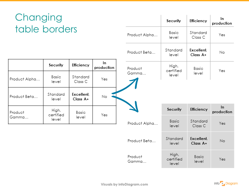
Believe me, your tables will look more elegant and professional without the default black borders.
Eventually, you can get rid only of the outside grid and it will also look better.
To edit the table border click on the table itself and then select in the PowerPoint top menu: Design Table Tab: Borders.
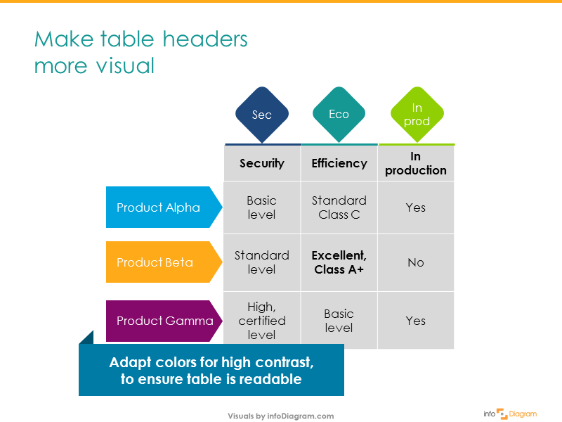
2. Add shapes to table columns and rows headers
The next step is to enhance the headers. Adding a simple arrow shape behind the table will do the trick.
Then adjust the colors of added shapes. Depending on what the goal of the presentation slide is, select the colors:
- Use vivid colors like I did if you want people to focus on that part – in this case, the three products in my example.
- Use calmer colors for less important parts (e.g. shades of gray or blue)
Don’t forget to check if the text on the header is still readable after you add colors. Ensure the contrast – change the header font color to white from black if needed.
3. Illustrate your PowerPoint table with icons
If you have a few more minutes and want to move your tables to the next level, enrich them further with illustrative symbols. Using icons related to the concepts and ideas creates a strong visual association. That will help your audience focus on the information you want to present to them.
In the product table example below, the three features are replaced with simple flat icons – a shield for security, a gauge for efficiency, and cogs representing production.
For increasing visual power I also replaced the third column with discrete Yes / No values but Check / Uncheck icons.
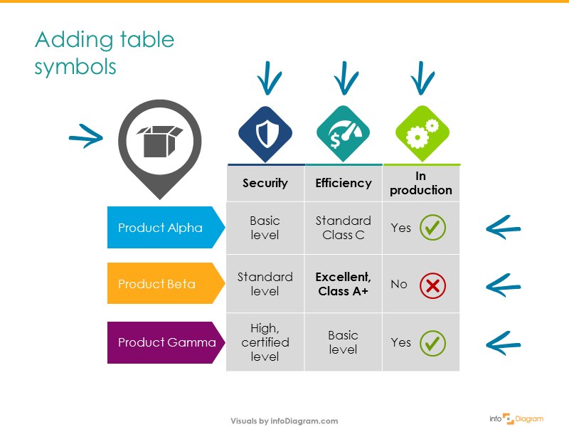
If you need to represent a specific concept with a symbol, check the list of common business concept visualization ideas. We put together various concept visuals on how to illustrate ideas like strategy, competence, deadlines, taxes… Let us know if we missed anything.
By adding small pictures you can focus people’s attention on the points you want: whether you want to emphasize the functionality of a product, the status of a project, or numeric values.
4. Highlight the key table cell content
Most probably there’s one key piece of information in the table you want to show in the context of other table data. Make this key value stand out. The easiest thing is to make the text or number bold or use a different color. However, to make it visually more attractive, I’d suggest other ways of highlighting it:
- make the table cell dark and the text white. This way the whole cell will stand out.
- add an extra shape e.g. a circle with an outline and transparent filling over the table. Or even better, add a hand-drawn swoosh shape. Using such a style will add a personal touch to the table – like you marked it with a pen on paper.
That’s all. Four tricks you can use to make your presentation tables fancier:
- Replace the default black table grid
- Add shapes under the table headers
- Illustrate items with icons to create a mnemonic association
- Highlight the key information in the table.
Most importantly, these simple do-it-yourself instructions will help you save time and create engaging infographic table designs using only PowerPoint shapes, markers, and icons. You can choose your favorite trick from above and try using it in every presentation (e.g. contrast colors, or icons), and see how it changes your slides.
If you like the slides above, you can download them directly here:
Creative Tables PPT Graphics Collection
See the full instructions in this YouTube movie:
I hope this blog inspired you, and I’ll be happy to know if you could apply those steps in your presentation. If you have any other challenges which stop you from slide design, let me know in the comments, and I’ll be glad to share my advice.
Happy designing!
Peter Zvirinsky
CEO, Chief Slide Designer, Co-founder at infoDiagram.com
Very helpful… thanks
thanks, Himanshu. we’re glad you find it useful 🙂
Thanks a lot for this!
we’re glad you found inspiration in this blog, Gaston.
If using shapes and table from PowerPoint how do I reference them
Hi, what do you mean by referencing them? Their objects (e.g. inside a VBA macro) or you mean something else?
You can try to open the Selection pane window to see all objects on the slide, including shapes and tables if they are present there. Let me know if that helps.
This is a simple but great trick that brings a usual table to a special table. I get inspired by this instruction.
Many thanks
we’re glad the tricks were useful for you 🙂