
Last Updated on March 13, 2024 by Rosemary
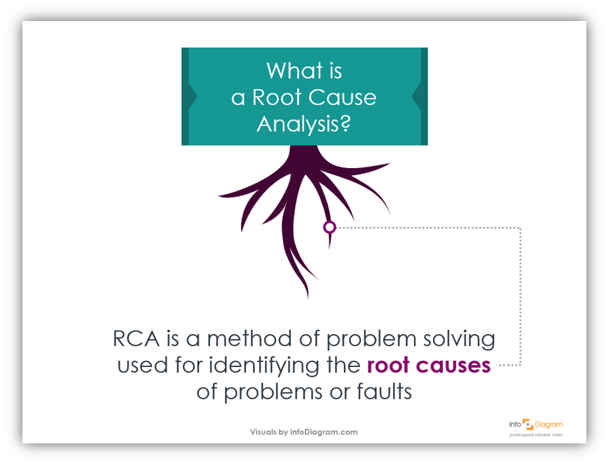
What is Root Cause Analysis, and how might it be helpful in your business? Root Cause Analysis is a method of problem-solving. If you could isolate a problem within your business and identify the root cause – you could then resolve the issue.
Elevate your business performance presentations with our curated resources – visit our financial performance PPT reports webpage.
A great way to make presentations relatable and memorable is to involve real-life circumstances and situations. What better way is there to make a presentation “real” than to try and resolve an actual problem you’re experiencing? Not to mention, if the presentation is to the team trying to solve the problem, your presentation will be more effective if you can first explain how the problem came to be in the first place.
If you need to make creative presentations on the Tree Branch Diagram Root Cause Template and need more ideas, check out these unique icons.
Why it is important to present Root Cause Analysis in a creative way
Creative presentations are more engaging. Your audience will pay closer attention and be more responsive if your presentation is creative. Your audience paying more attention will, in turn, make the presentation more effective. How? Audiences who pay attention and follow along with the material will retain it better than audiences who are not focused. (Or worse, an audience that is drifting off to sleep!)
In this blog, we’ll share how you can share a Root Cause Analysis in a creative way. Some techniques for that include:
- using visual allegories
- using colors with meanings attached
Want to highlight the source of a problem or fault in your next presentation? Let’s get started.
Use Visual Allegories
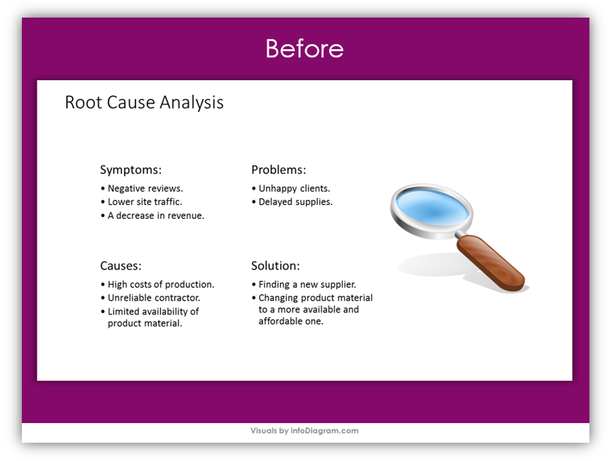
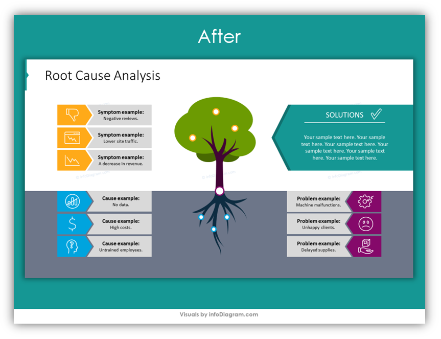
Think outside the box. Specifically, think about how you can present Root Cause Analysis with less focus on the literal boxes. Instead of using a regular diagram with squares, circles and arrows – use trees with complex root systems. See how the basic, before RCA was very dry and lacked visual appeal. After incorporating the tree and root system icons, the slide is far more interesting. Even before all the data and information is provided.
Provide as much or as little detail as you like
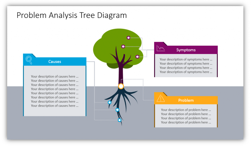
The tree and the leaves represent symptoms of the problem. They are ways the root cause manifests itself. You can provide details about these symptoms and how they influence day-to-day operations, your customers, or whatever part of your business is influenced. The problem itself is where the symptoms and the root cause meet – the ground level in the diagram. The actual problem is what you’re trying to describe the root cause of, so try not to get too bogged down in the details when describing the problem. The causes are the roots. As you can see in this example slide, the root box is larger than the other two because there can be many causes for one problem.
Use color to guide your audience through the presentations
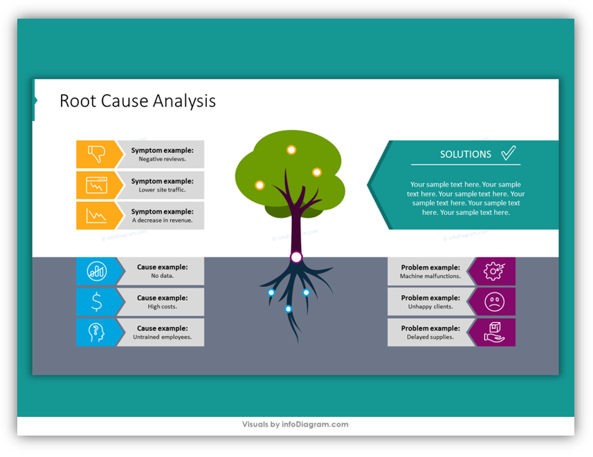
Associate one color with one topic. Use that color to label the description box as well as the different emblems which mark the relevant part of the tree. For example, you could use purple to represent problems on one slide. Then use that same shade of purple throughout the presentation when describing problems. This helps your audience follow along and helps you to maintain consistency.
Use icons to drive your points home
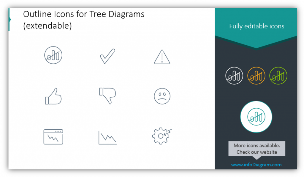
You can customize the icons used with any of your slides. By changing the icons which accompany your points such as the symptoms, problems, or causes of the problems you can again help the audience follow along. It also looks more visually interesting than blank text, which is always an asset when trying to maintain audience focus and attention.
By using visual allegories rather than plain tables on their own, you can engage your audience and make them think. This ensures they’re paying attention. You’re free to provide as much or as little detail as you like, as well as customize the icons used to illustrate each of your points. Another way to draw your audience in is to purposefully use color. Not only to symbolize the different components but to create a sense of uniformity and balance.
Please re-use the templates provided in the Tree Branch Diagram Root Cause Template, or feel free to make your own based on the tips provided here. You’re always welcome to add additional slides from [relevant icon pack]. Keep these tips for making a creative RCA presentation in mind the next time you need to build a compelling presentation.
Check our video guide on how to redesign Root Cause Analysis step by step:
Graphical Resources: Tree Branch Diagram Root Cause Template
To help you build your own creative, interesting Root Cause Analysis presentations we created the Tree Branch Diagram Root Cause Template, which you can download from here:
Tree Branch Diagram Root Cause PPT Template
Icons like these, and others, keep audience members from zoning out or dozing off during what might otherwise be very dry presentations. Don’t be accused of being dull, again. Incorporate interesting graphics into your next presentation. Customize the color scheme and icon sets to match your brand colors or most recent project. Wow your audience with your next presentation.
Why settle for boring when your presentation could be extraordinary?