Last Updated on June 6, 2023 by Anastasia
Do you need to explain or spell out a process advancement, hierarchy, complexity change, or development cycle? Illustrations can help you keep your audience focused and ensure they understand what you’re trying to break down. Processes or technological components with multiple layers graphics are easier to understand when laid out visually.
If you’ve been considering using bullet points to explain some process or part of your presentation, think again. Layers and tiers are a much more stimulating way. Here are a few ways you can have an interesting presentation with customized graphics, without hiring a designer.
Disclaimer: The layers graphics we present here comes from the commercial Layers & Tiers Diagram PPT Graphics collection that we’ve designed.
Use a 3D Diagram to Explain Layers
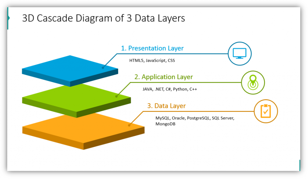
In this example, we highlight the presentation layer, application layer, and data layer. Notice how each layer is color-coded and customized with a related icon. See how there is room for both headlines for each layer as well as a description. In this example the layer descriptions are brief. This is so that your audience is focused on you, the speaker, rather than trying to read the text on your slides.
Don’t Be Afraid to Provide More Detail – Use Description Areas
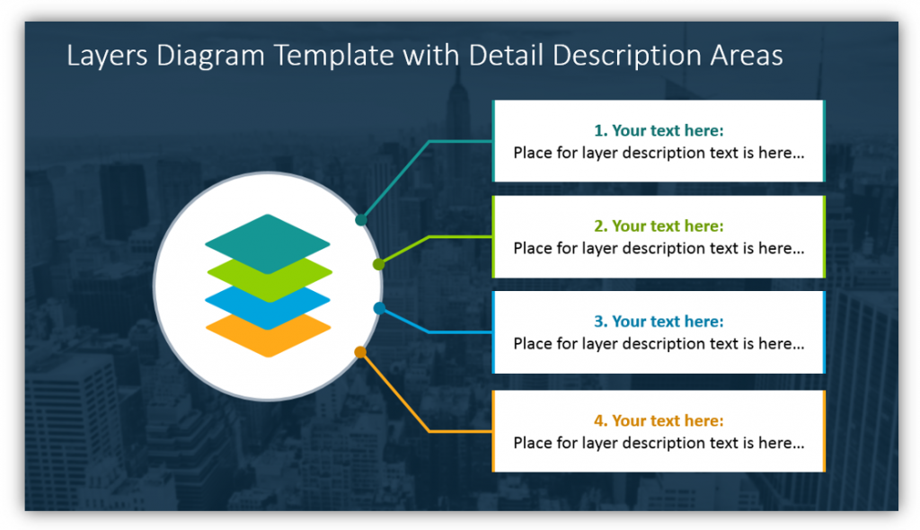
If you need to provide more supplemental information you may use description areas. This is also helpful if you would like your audience to take better notes during your presentation. Ideally, you won’t put exactly what you plan to say in the description areas. (Doing that may cause your audience to tune you out and read, instead.) By adding supplementary information you can help your audience follow technically complex presentations more easily.
Get Creative – This Colorful Smart Phone Infographic Will Help
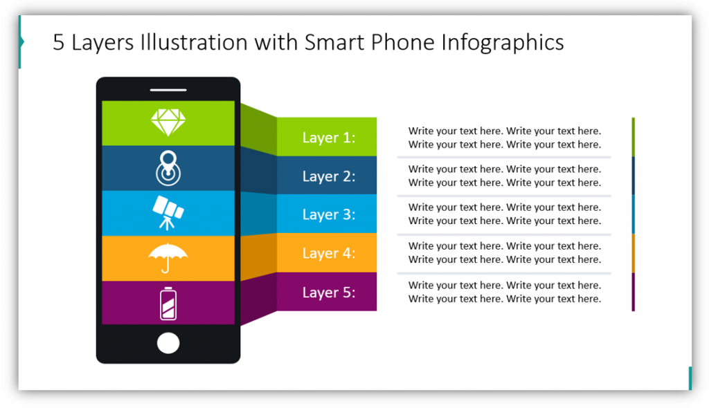
This graphic is visually interesting. You could easily customize the colors used on this slide to match your brand or project. By changing the colors to suit you and your audience, you keep things relatable. This infographic, like others in this set, can be modified with icons, labels for the layers, and descriptive text. With these three components, you can easily make a cohesive presentation.
Explain Different Tiers with or Without Overlap
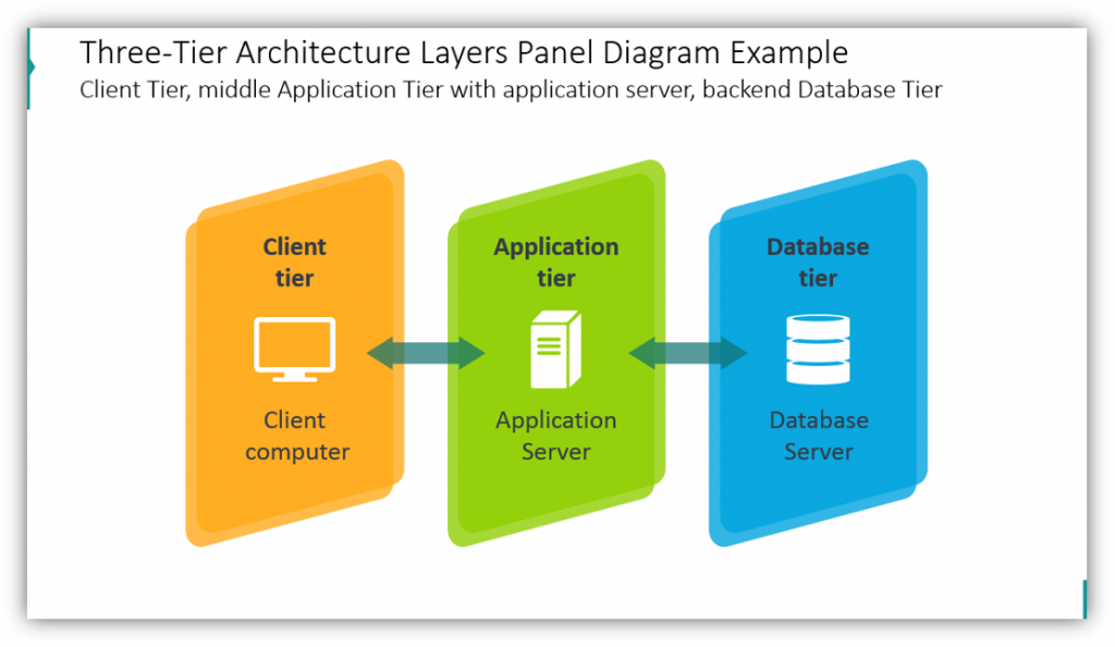
In the IT presentation example, you can easily see how the client tier, the client computer; the application tier, the application server; and the database tier, the database server all work together. This harmonious relationship is best explained visually. From this point, you can further explain the levels and how they interact. You can provide as much or as little background information as is necessary, based on how familiar your audience is with the subject matter. If the tiers overlap, you can literally show that as well. Let the icons overlap as much or as little as you need. These layers can be customized as well.
Think Outside the Box by Using Different Shapes
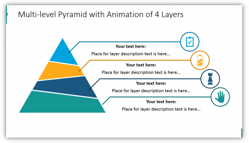
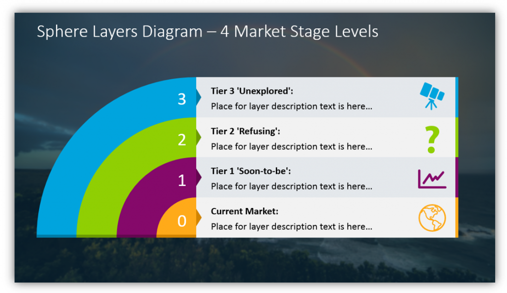
Layers aren’t always square. Don’t be afraid to branch out. This icon set contains level diagrams which utilize pyramids, dartboard shapes, and sphere-based layers. These different shapes can all accomplish the same task. Break down the different layers. Provide supplemental details. Customize your colors, icons, and other attributes to make the experience truly unique for your audience whether they’re your team, new recruits, or people you intend to sell to.
You can use interesting 3D diagrams to explain layers, provide as much or as little detail as you’d like with description areas, get creative with engaging infographic styles and unique shapes, and elaborate on different tiers with and without overlap – all with one graphic set.
Resource: Layers & Tiers Diagram Graphics
The layers and tiers diagram graphics set can help you explain linear processes, explain different parts of an organization, highlight the different stages of development, or anything else you can dream up. Although most of the examples contained 4 or fewer layers, the set allows you to display lists with up to 7 layers. Even with as many as 8 layers, there’s still room for details, descriptions, and plenty of customization. Modify the shapes to suit your purposes by changing the color, size and more.
If you find the above examples useful or helpful you can down the full graphics set here:
Layers & Tiers Diagram PPT Graphics
You can also download 200+ creative PowerPoint diagrams, including timelines, lists and comparisons for more presentation graphic variety.