
Last Updated on June 19, 2023 by Anastasia
Are you preparing infographic tables for your presentation? Do you need to show and compare business numbers or important KPIs in a matrix format? Using the standard table provided by PowerPoint or Excel usually does not look attractive and it’s easy to lose the attention of your audience.
I’d like to show you a few slide examples and advice explaining how you can make a creative-looking table and KPIs slides with a modern flat graphic style. Get inspired and apply that knowledge in your next work with PowerPoint.
Why and where use Infographic Tables and KPIs diagrams?
During preparing a presentation full of numbers and overall business measures such as KPI (Key Performance Indicators) we must remember that presented data should be clear and understandable for our audience.
Using tables is very common because they provide an organized way to present a comparison or data series. One of the biggest challenges while working with PowerPoint tables is keeping them readable and visually attractive. It’s worth keeping in mind during the design process that people can remember data easier when illustrated with graphic elements.
Below I’m listing various business topics where infographic tables are heavily used:
- Presenting financial data, such as budget tables, profit and loss statements, or balance sheets
- Illustrating company performance – sales amounts, revenue streams, or production numbers
- Visualize projects status or tasks implementation over time
- Show product features comparison between various product variants
- Present pricing of a product or service options
Let’s see how those table use cases can look when we you apply a few creative design tricks.
Get all the graphics presented here – click on the slide pictures to see and download the source illustration. Check the full Business PowerPoint Table Flat Design Templates
Presenting Financial Table with Costs Distribution
The cost distribution table appears in sales or budget presentations. As presented on the slide below, you can add vivid colors to make it look attractive without overshadowing the most important data.
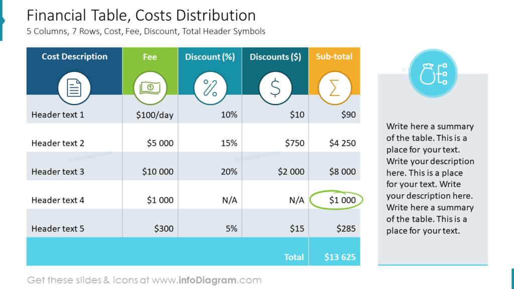
Let’s analyze this table’s appearance. It is a very simply built table where the row containing headers is marked with colors. Every header has assigned a different color and corresponding icon. Icons match the header topic and immediately create an association with the column category they present. Thanks to such illustrations a reader receives a clear message about where and what is presented in the table.
Have you spotted that the last row is highlighted while all others are kept in grey and white color? It’s intentionally done to pay attention to that position on the table – a Total value in this case. For the author of that slide is more important to show the audience the total sum than its components. You can use such a highlighting method for any row in the table which in your opinion is important.
Project Status Overview Table with Harvey Ball Status Indicators
The tabular form is used also in project management, where you present a matrix of projects over various time stages. Gantt chart is a typical example of such visualization of project task distribution over time. If your project table is not only the duration of the project but its fulfillment status, try to show it by a graphical symbol, not only the text number.
You can see the table presented on the slide below that status information is very clear and easy to understand immediately. How to achieve such an effect using PowerPoint tables?
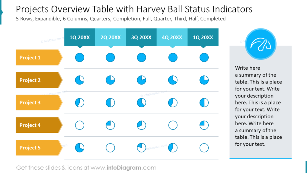
In that table, we used a pie-chart-like graphic symbol instead of the percentage text value. Project accomplishment levels (e.g. 100% done, half-done, 33% in progress, not done, etc.) were replaced with Harvey Balls symbol. Such pictograms are fast to read and send a clear message about the progress of the project at a glance.
Note that the table has no need for a grid thanks that there is enough margin around cell content. Using arrow shapes for column and row headers is easily noticeable. Arrows direct the way where rows and columns go. You can create them from simple shapes in PowerPoint.
Table with Product Features Comparison
Have you ever been wondering how to make a comparison table attractive?
Take a look at the slide below. Reading the table you can spot quickly what features are present or not at each of the 5 products. You can call the attention of the audience with colors. Here each product column (including the header) is painted with a different color. What’s important, we use the tick icon as a status indicator of the product’s features. Icons reflect the meaning faster than words “present/missing”.
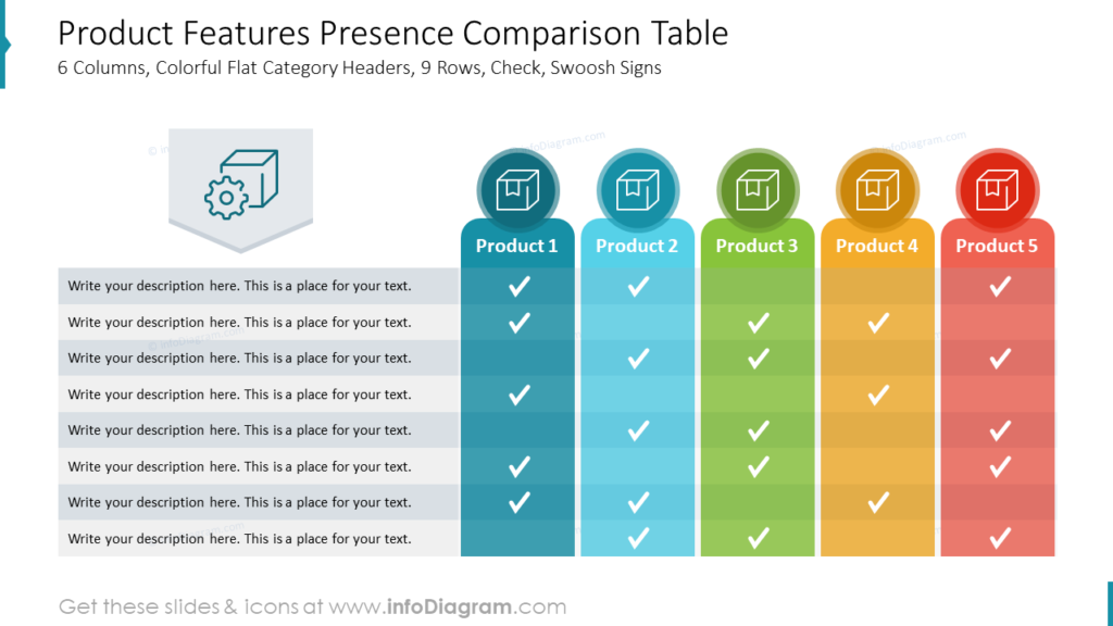
During working with such expanded infographic tables it’s worth keeping rows’ backgrounds colored alternately (eg. with hues of grey). It is a better way to separate rows than a usual black grid.
Graphical Presentation of KPIs Values
This is not about a table, but the outcome of what usually people want to show on a table. Sometimes you don’t need to show all details in your presentation. Sometimes you need to present only the main outcomes. In a business context, often it is a set of Key Performance Indicators.
So how to make such KPI stand out from the crowd? I would advise using two powerful elements: numbers and icons.
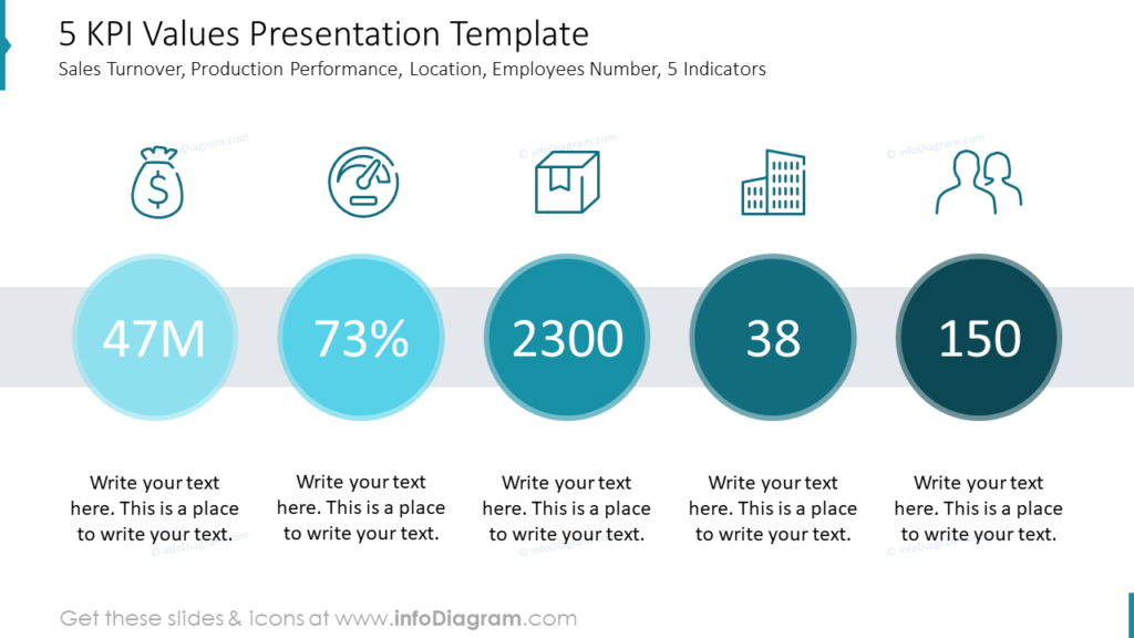
With a properly chosen icon, you can symbolize every part of your KPIs presentation:
- icon of the bag with money -> budget
- dashboard gauge icon -> performance
- box icon -> products
- building icon -> offices
- people icons -> employees
To emphasize the importance of numbers we created circle-shaped backgrounds for each KPI. It’s the most vivid and eye-catching part of the slide. It’s very easy to overdose with the effects so consequently, I recommend keeping the slide in one shadow eg. turquoise or blue.
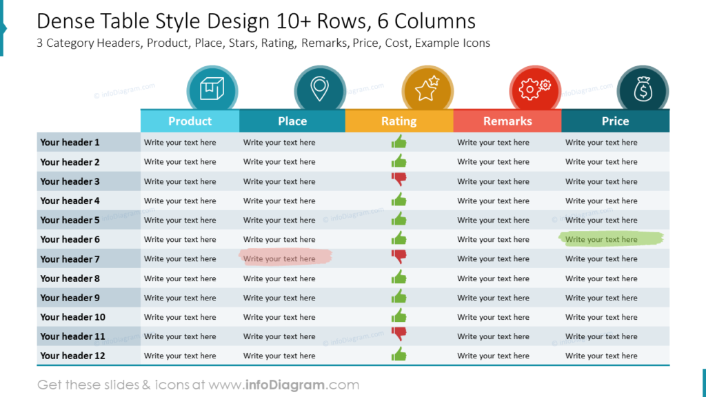
Presenting Data in Dense Table
The table shown below consists of thirteen rows and six columns. It is a pretty big amount of data to put there for one slide, especially if presented in a bigger room. Let’s follow a few design rules to prevent the content from being blended together.
- Keep rows looking different with the use of colors instead of a grid but use a maximum of three shades of one color.
- Make columns distinctive by highlighting the header row. Use a different color for each column. For a more powerful effect, assign a corresponding icon to each header.
- Try to replace (where it’s possible) content with a symbol like using a thumb-up and a thumb-down picture instead of words in the rating column.
- Set the small font size to keep the content readable and fit to rows but not smaller than 8 pt. Use a font that is readable but not too wide e.g. Calibri, Calibri Light, Arial Narrow Segoe UI. Avoid wide typography fonts such as Century Gothic, Verdana, or Tahoma.
- Make the table as big as possible, stretch to the whole slide but remember about keeping some margins on the edges.
Main design tips on working with Infographic Tables and KPIs in PowerPoint
Working with tables or key data slides in PowerPoint doesn’t have to be boring. I hope that I proven it with the examples presented above. When you’re facing a table full of data you can quickly redesign it by adding icons to headers, highlighting columns with colors, replacing content (when it’s possible) with symbols, or using simple shapes to spotlight rows. Such prepared infographic tables will call the attention of your audience and data will be easier to understand and remember.
Resources: PowerPoint Table Design
The examples presented in the post use graphics from a PowerPoint template we designed for tables and KPI lists. Check the whole presentation in the infoDiagram collection under the following link.
Business PowerPoint Table Design Deck
In addition, you can extend the deck with a universal set of elegant outline style diagrams right here with different graphics, styles, and a lot more.
For more inspiration, see tips on beautifying a table in PowerPoint and how to redesign a table representing features in four easy steps.