
Do you need to present multiple data charts and KPIs? Don’t know how to combine it in an attractive and readable way? It’s a common problem during working with executive data report presentations or charts. The number of figures and text can be pretty dense and it can be difficult to present it clearly. I recommend using several basic design rules to create concise data dashboard PowerPoint presentation templates.
Continue reading Illustrating Executive Data Report Presentation with PowerPoint DashboardsCategory: Data Charts for PowerPoint
Ideas for illustrating data in PowerPoint. See how data charts can be enriched graphically so they look more attractive and professional, while data is still editable.
Some blogs contain templates with real data (like macroeconomic values e.g. country GDP, population, or unemployment rates – based on recognized data sources). Or we added exemplary data.
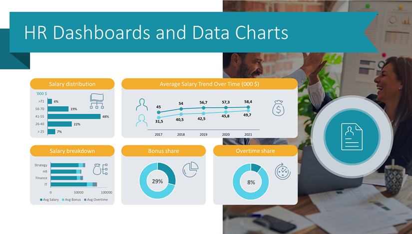
How to Illustrate HR Data Using Dashboards in PowerPoint
Need to present human resources-related metrics? Use an organized way to display important aspects of the human resources performance indicators inside a concise data dashboard. This will help your audience quickly gain insights into the presented data. Read on to get inspiration and graphics ideas on illustrating HR concepts.
Continue reading How to Illustrate HR Data Using Dashboards in PowerPoint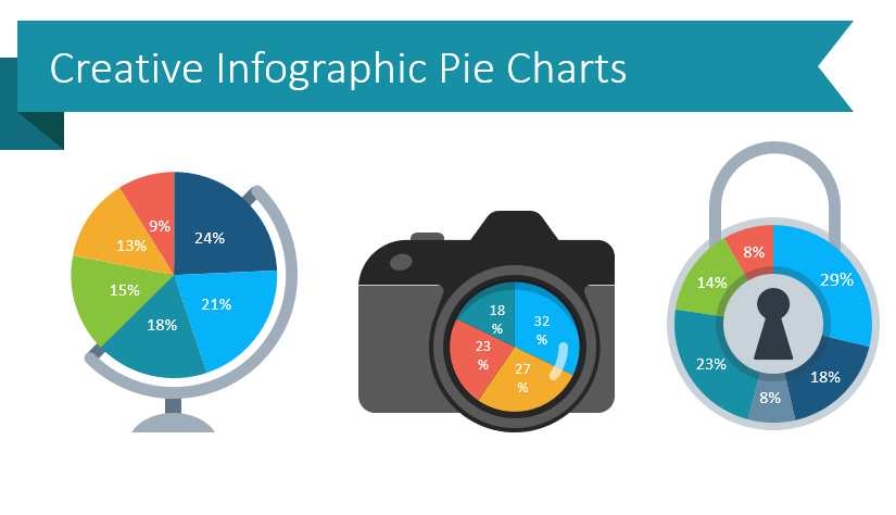
6 Creative Alternatives for Pie Charts in PowerPoint
A pie chart is a very popular data visualization used in business presentations. It’s visually simple to interpret. If you need to emphasize part-to-whole, illustrate proportions or visualize shares, a pie chart is a tool to consider. We put together six unusual alternatives to boring data visualization, read on to get some inspiration and examples.
Continue reading 6 Creative Alternatives for Pie Charts in PowerPoint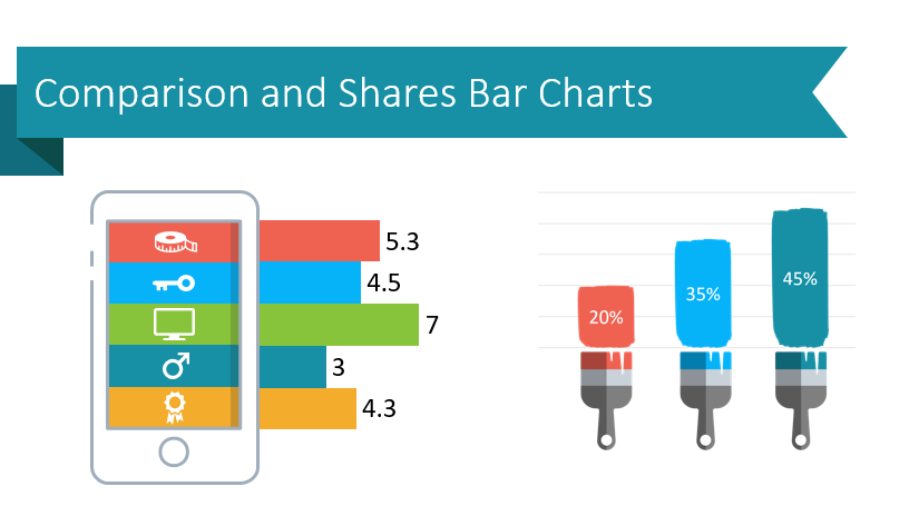
Make Creative Data-Driven Presentations with Bar Chart Templates in PowerPoint
Do you need to make a data-driven PowerPoint presentation more engaging? Eye-catching visuals can help your audience understand figures, progress, and make data comparisons. MS Office and PowerPoint have basic bar chart templates you can use, but they lack uniqueness and creativity. Professional, modern PPT graphics offer an attractive alternative that will make your presentations more memorable.
Continue reading Make Creative Data-Driven Presentations with Bar Chart Templates in PowerPoint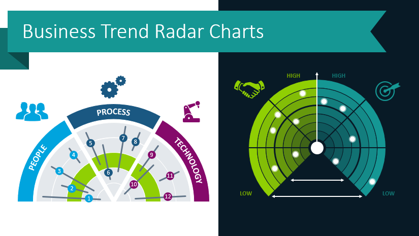
Use Modern Radar Charts to Present Business Trends and Market Analysis
Do you struggle to present your market analyses? It is often challenging to share and explain business trends. Charts, tables, and graphs you can build in PowerPoint are often unattractive and confusing. This is because, for many of us, design and being artistic are not easy. If you would like to see how you can create an engaging and unique business trend presentation using radar charts, keep reading and get inspired!
Continue reading Use Modern Radar Charts to Present Business Trends and Market Analysis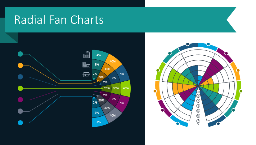
Present Industry Trends, Survey Results and more with Radial Charts
Do you struggle to make your informative presentations interesting and engaging? If you need to share industry trends, survey results, or anything which can be divided into categories, consider using radial diagrams. Even an organizational structure can be explained using radial diagrams. These graphics, also known as radial charts, are perfect for situations where you’re tempted to use repetitive, default pie chart graphics. Using beautiful, consistent diagrams and icons throughout your presentation will help your audience understand your findings or message in a creative way.
Continue reading Present Industry Trends, Survey Results and more with Radial Charts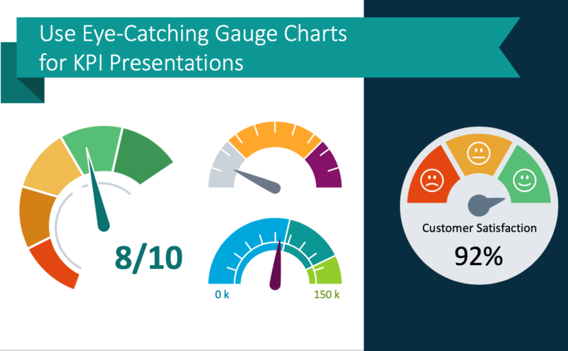
Use Eye-Catching Gauge Charts for KPI Presentations
Has your company or team achieved a goal or reached a key progress indicator? How might you present such an abstract concept? Speedometer gauge charts make a perfect visual aid.
Continue reading Use Eye-Catching Gauge Charts for KPI Presentations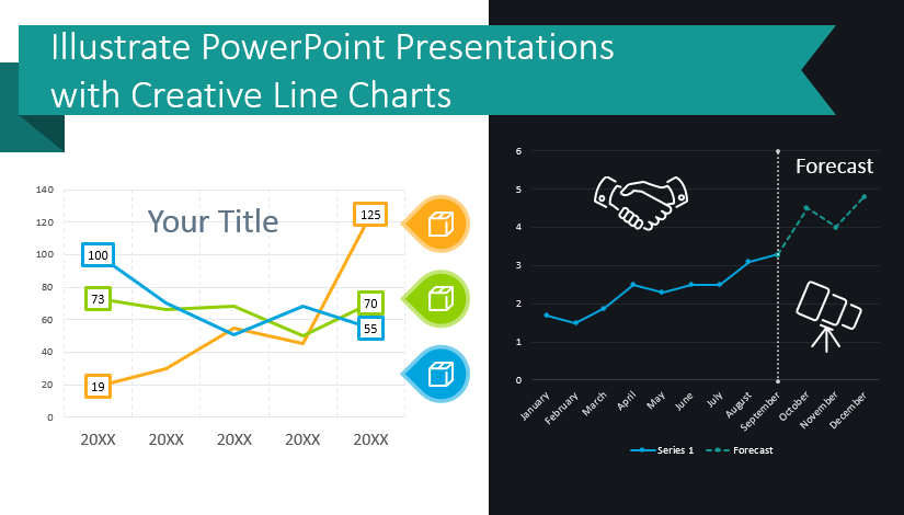
Illustrate Data-Heavy PPT Presentations with Creative Line Charts
Are you presenting a data-heavy topic? If you are presenting sales trends or product demand forecasts or manufacturing performance, you can give more impactful presentations with cohesive, creative graphs. You can avoid falling into the same old pattern of repetitiveness by using sharp, modern graphics. Elegant line charts can elevate your presentations and help your audience follow complicated presentations on difficult topics.
Continue reading Illustrate Data-Heavy PPT Presentations with Creative Line Charts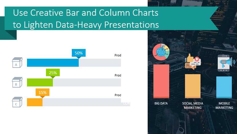
Use Creative Bar and Column Chart Templates to Lighten Data-Heavy Presentations
Is your next presentation containing a bunch of small graphs, default column chart diagrams and tables? All stuck together on one slide? Then you’re suffering a data-heavy slide symptom.
Continue reading Use Creative Bar and Column Chart Templates to Lighten Data-Heavy Presentations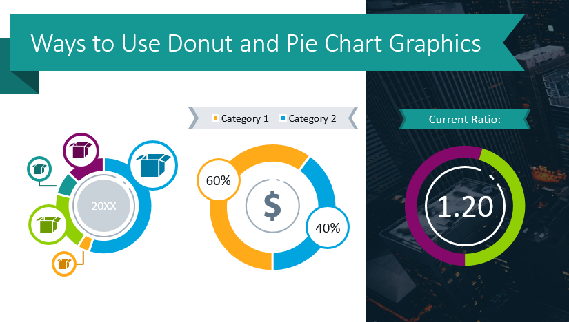
Ways to Use Donut and Pie Chart Graphics
You are probably familiar with pie charts. Pie chart graphics are great for representing numerical values that comprise a whole. Pie charts are wonderful for when you need to show rough proportions of a few categories which total 100%.
Continue reading Ways to Use Donut and Pie Chart Graphics