This is a continuation of part I. In the previous post I have described how to find data and prepare slide format. Also how to setup background for your infographics.
Continue reading How to create infographics in PowerPoint – part II
Blog – Creative Presentations Ideas
infoDiagram visual slide examples, PowerPoint diagrams & icons , PPT tricks & guides
Are you struggling with creating modern uncluttered slides? Use our hints to create stunning presentations.
This is a continuation of part I. In the previous post I have described how to find data and prepare slide format. Also how to setup background for your infographics.
Continue reading How to create infographics in PowerPoint – part II
Surely you have seen many great infographics. Want to create your own? Never did it before?
Continue reading How to create infographics in PowerPoint – part I
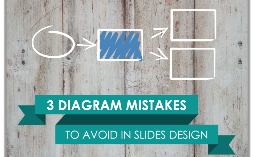
Chances are you have used some diagrams or workflow schema in your presentation, right? If you do, respect :). Diagrams are indeed an excellent way to visualize your message. Here are three design hints to make sure your diagrams are professional looking and remain readable. Three ideas on how to avoid the most common diagram mistakes.
Continue reading 3 Diagram Mistakes to Avoid in Presentation Slides DesignWe have been putting together visual slides for our colleague Marcin, some time ago.
Marcin was impressed by the book he was reading and wanted to note down the main ideas for himself and share them with others.
Continue reading Designing doodle presentation on time management [Slideshare]
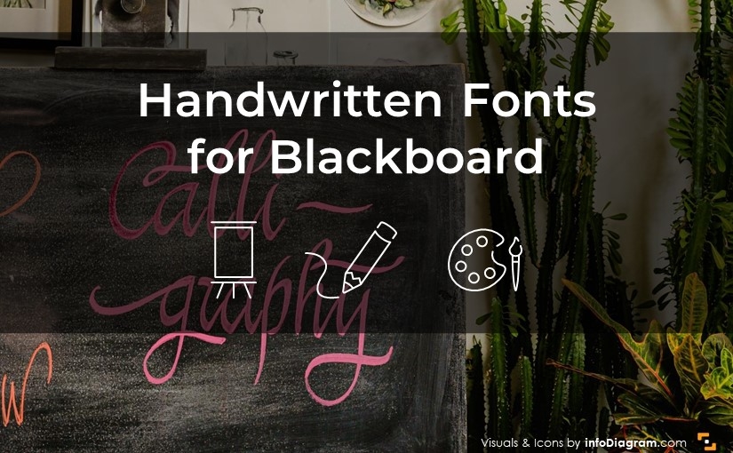
We know choosing handwritten fonts can be time-consuming. There are some very nice and readable, which you can use to add a personal touch to your presentation. Check our blog for examples and inspiration!
Continue reading Handwritten fonts for blackboard PPT slide designLooking at our previous posts, you could see we were not blogging too often. Once every 2-3 months. Our intention was mainly to share some specific diagram visualization examples. Now we are going to extend this focus – sharing some more general design and PPTX hints on using slides illustrations, giving hints on using PowerPoint or other presentation software. And showing you more about what we are cooking for you in our visuals kitchen.
Continue reading News: Extending blog: Design and PPTX hints
One reason so few of us achieve what we truly want is that we never direct our focus; we never concentrate our power. Most people dabble their way through life, never deciding to master anything in particular. Tony Robbins
Today I want to help you to stay focused on your objectives and how you can help your team to stay focused on what is important for you.
Continue reading Communicate your agenda or follow other’s dreams
Have you ever been to a conference, where you felt lost in the presentation?
I experienced many such situations. The worst was IT conferences – speakers there usually present some new cool application. Most of the speech a speaker talks about all the magic features their software offers. However often I missed one thing – what the hell was their application good for?
Continue reading Every business presentation should start with a diagram
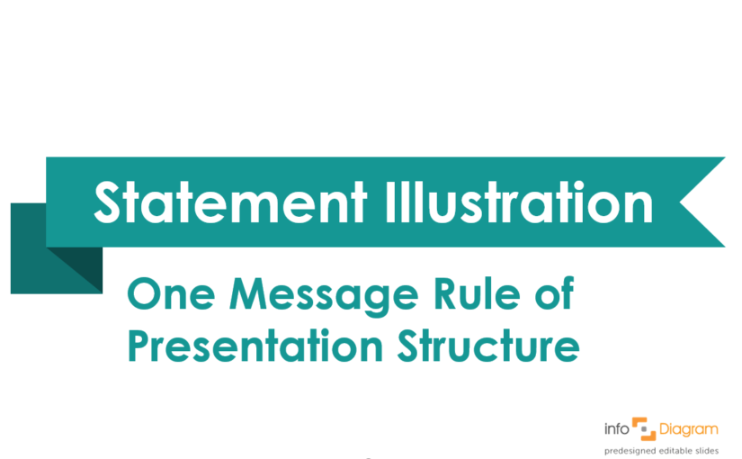
A few weeks ago I was designing slides for an interesting motivational speech, where I had to illustrate the business model.
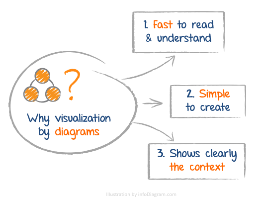
Imagine a situation – you are working on a presentation, you know your content, you have a structure, and there is one key message you want to make sure every body will remember from your talk. You know that just saying or writing that message is not good enough. What else can you do? What about supporting it by graphical illustration that tells your key message in visual way.
I was in such situation when working on my training. In this article I am going to present you a simple visualization example of a such key message.
Continue reading 1 message rule (Prezentio’s Rules of good presentation)
![Designing doodle presentation on time management [Slideshare]](https://blog.infodiagram.com/wp-content/uploads/2016/02/doodle_time_mng_hints_slide_ppt1.png)