Elevate Healthcare Presentations with Outline Healthcare Graphics

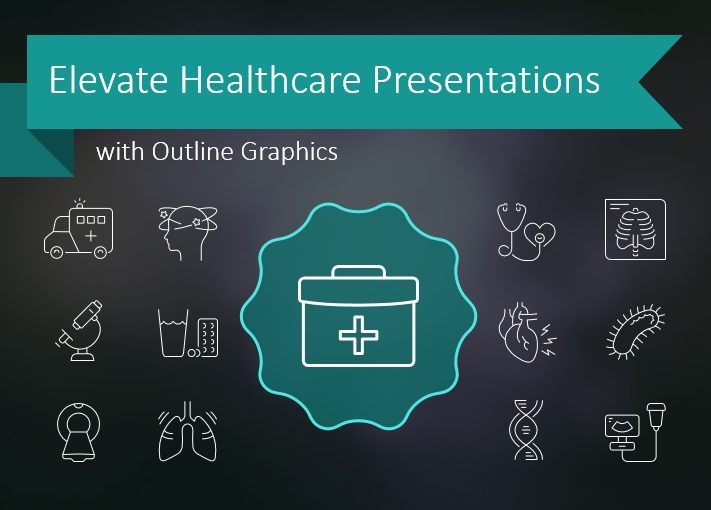
Visual appeal is essential for attention-grabbing not only in medical presentations

If you need to illustrate healthcare documents, you will need well-done graphics. You’ll want elegant imagery which can help you get your concepts across. You want high-end images but may not have the time or budget to hire a designer to create custom graphics for every project. In those circumstances you want engaging graphics to help solidify your points. You can efficiently relate messages with graphics. By choosing the correct icon or small graphic, you can replace words and make difficult ideas easier to understand.

Continue reading Elevate Healthcare Presentations with Outline Healthcare Graphics

Presenting Comparisons with Creative PowerPoint Tables

Comparing complex product features or purchasing decision alternatives can be challenging, especially when each product has several technical features you need to consider. Whether you need to compare solution categories or compare specific product versions – comparison table diagrams are there to help.

Continue reading Presenting Comparisons with Creative PowerPoint Tables

Illustrate Strategies with Milestones by Curved Roadmap PPT

Looking for a way to illustrate a plan, journey, or steps and milestones? With the approaching new year, this topic is especially relevant now 🙂

Continue reading Illustrate Strategies with Milestones by Curved Roadmap PPT

Present Decision-making Process Creatively With a Decision Tree Diagram

Need to present a business decision process, illustrate a legal procedure, or show the decision logic in an expert system answering human questions?

Continue reading Present Decision-making Process Creatively With a Decision Tree Diagram

Infographics as a content marketing tool – does it still work?

For years, they have been helping us to understand data and often made us go “wow”. We click “Like”, share them. But is releasing them actually profitable for their authors?
And if so, how to achieve the best results when using infographics for online marketing?

Continue reading Infographics as a content marketing tool – does it still work?

How to Create Growth Diagram in PowerPoint

At the end of the year, we’re all reporting. It may be not such a pleasant process, but let’s be strong 🙂 We usually talk about growth or decline in certain spheres. Today I’ll show you how to quickly design a growth diagram in PowerPoint.

Continue reading How to Create Growth Diagram in PowerPoint

Why It Is Important for Marketers to Use Visual Slides

No matter the sales pitch or your experience as a marketer, visual presentations will always find a place in your repertoire. According to statistics, 91% of people feel to present their ideas to others if their arguments are backed by visual slides.

Continue reading Why It Is Important for Marketers to Use Visual Slides

Role of Visuals in Project Management [interview with Mike Clayton]

Here comes our next blog-interview with presentation users. This time with project management trainer and speaker – Mike Clayton. Mike will share his experience about using visuals in his videos and live presentations and also he’ll tell us about his challenges and ways to overcome them.

Continue reading Role of Visuals in Project Management [interview with Mike Clayton]

Using 3D Supply Chain Vector Icons for Realistic PPT Illustrations

Why use 3D icons in a presentation?

3D logistics icons are useful for creating realistic presentation flowcharts. These so-called isometric icons allow you to present various logistical processes close to a real three-dimensional view of objects from above. If you’ve seen our posts about flat icons (Simple Flat Icons for Infographics Presentation), you’re familiar with the way imagery can help you explain logistics. You may also be wondering what makes a 3D icon better than a 2D icon, or whether there is a difference at all.

Continue reading Using 3D Supply Chain Vector Icons for Realistic PPT Illustrations