How to Present Business Analysis by One Icon [concept visualization]

If you’re working on market research or just planning the future of your product or company, you often deal with a business analysis of some kind.

It can be within a qualitative analysis like 360-degree feedback surveys, SWOT or PEST analysis or opinion checking. Or if it involved more data measuring then we talk about quantitative analysis. I’m not going to write about data visualization here (but you can check some examples in this post “How to present KPI data in a presentation“). For now, I’d like to focus on illustrating analysis concept in general.

Continue reading How to Present Business Analysis by One Icon [concept visualization]

Presenting a Deadline in a PPT, XLS, DOC Documents [concept visualization]

‘The very last deadline is February the 29th!’

How often do we hear the word ‘deadline’? All the time, right? Whether we are working on different projects, designing roadmaps, talking about marketing activities, creating our quarterly reviews, or simply designing calendars to plan our work ahead. We have to set specific deadlines because if there’s no time limit, there’s no real work.

For some of us ‘deadline’ may sound scary, especially if we leave all the work for the last hour 🙂

Continue reading Presenting a Deadline in a PPT, XLS, DOC Documents [concept visualization]

Too much info on a slide? Simplify complex presentation in three steps

Is your presentation overloaded with information and do you want to minimize the amount of text keeping the main message? During slide design or redesign we often face the problem of how to simplify a complex presentation and leave only important information. In this blog, we share here three tips on how we cope with it.

The common problem is how to avoid too ‘wordy’ slides, which are good for reading on-screen if someone has lots of time. But who has it today? Even more, if the slides are to be presented at a meeting, texts on slides are effectiveness killers. However, there is a way to visualize key facts and make them simple and easy to understand for our audience.

Continue reading Too much info on a slide? Simplify complex presentation in three steps

How to Present Flexibility on a Slide [concept visualization]

A few tips on how to express visually the idea of flexibility in a presentation – for example showing that your company is dynamic or your solution is adaptable.

This concept appears pretty often over various corporate slideshows, market analysis reports but also in soft-skills contexts such as giving feedback training presentations.

Continue reading How to Present Flexibility on a Slide [concept visualization]

Illustrating Resources, Energy and Agriculture Presentation

Talking about energy resources or agriculture topics? Illustrating natural and alternative energy operations, or food production flowcharts can be challenging. Especially when you rely on images from the standard sets of clip art. There’s a lack of consistent symbols set that would cover in detail all types of resources, energy and agriculture. 
Continue reading Illustrating Resources, Energy and Agriculture Presentation

How to Present Content on a Slide [concept visualization]

In the era of content marketing, everybody is speaking about an importance of a content. Well, every presentation is based on some kind of content – whether you are talking about industry-specific topics or discussing business and marketing related questions.

The question is how to illustrate a content idea in a proper way in your document? Doesn’t matter if it’s a PowerPoint presentation, blog article or any kind of report.

Continue reading How to Present Content on a Slide [concept visualization]

How To Be Creative When Preparing Presentation

Looking for an answer on how to be more creative and original while creating presentations? Check the following four tips.

No doubt you want to make an outstanding presentation, which will catch all the attention of the audience. The trick is how to be different than the masses. Especially if you’re one of the several presenters. The question is how to step out of the common default look of slides everybody is using? Find a moment before making a presentation, jump into your creative mood. How? Continue reading How To Be Creative When Preparing Presentation

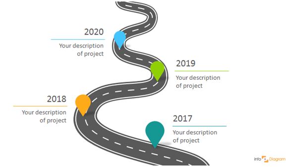
Three Creative Ways to Do a Roadmap Slide

When you want to present long-term plans, visualizing them is the best way to communicate your company or product vision. In this blog, you’ll find three ways to make your strategic roadmap presentation attractive and well-remembered.

Continue reading Three Creative Ways to Do a Roadmap Slide

New Presentation Resources We Designed in 2016

But firstly huge THANKS.
2016 was a great year for us. Because of you!

Thanks for using our slides graphics. For writing us what you need. For helping us improving the world of visual communication 🙂

New Learning Resources for Presentation Design

Here are blog articles with hints and examples of making an engaging visual presentation:

Continue reading New Presentation Resources We Designed in 2016

BCG Matrix Definition and Examples [presentation infographics]

The Boston Consulting Group’s product portfolio matrix (BCG) is designed to help with long-term strategic planning, to help a business consider growth opportunities by reviewing its portfolio of products to decide where to invest, discontinue, or develop products. Since 1968, the BCG matrix, also known as the Boston or growth-share matrix, has been a tool to answer those questions by providing them with a way to analyze product lines in search of growth opportunities.

Continue reading BCG Matrix Definition and Examples [presentation infographics]