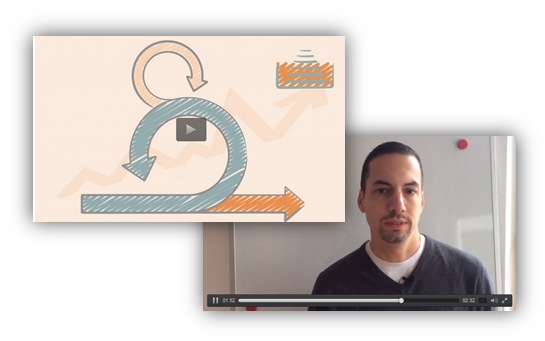
This is a story of Sebastian, who uses our scribble slides graphics not only for classical presenting at a meeting. Sebastian is the person behind the idea of our Scrum visuals – icons toolbox and recent know-how slides.
Continue reading How Sebastian uses slide design for e-learning Scrum course

Making Personal Happy Holiday Card in 5 minutes using PowerPoint
Want to prepare a Happy Holiday card for Christmas or New Year for Your friends, clients, and partners?
You can make it all using only PowerPoint (works fine also in Keynote or Google Slides). It takes you a few minutes only.
Continue reading Making Personal Happy Holiday Card in 5 minutes using PowerPoint
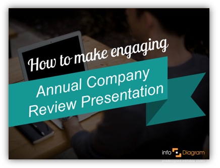
How to make attractive Annual Company Review presentation
As the end of the year is approaching, you may be involved in preparing an annual company review presentation. Here’re some simple tips on how to make it visually attractive. How to make financial results more interesting, inspirations for showing sales, production, accounting data, and other KPIs in eye-catching visual form.
Continue reading How to make attractive Annual Company Review presentation
![How to show Benefits or Features Creatively [PPT guide]](https://blog.infodiagram.com/wp-content/uploads/2016/02/benefits_list_creative_slide_1.jpg)
How to show Benefits or Features Creatively [PPT guide]
Have a presentation where you need to show the benefits of features? Or product characteristics?
Let’s show it in an atypical creative way.
We have prepared some inspirations for such slide designs.
Continue reading How to show Benefits or Features Creatively [PPT guide]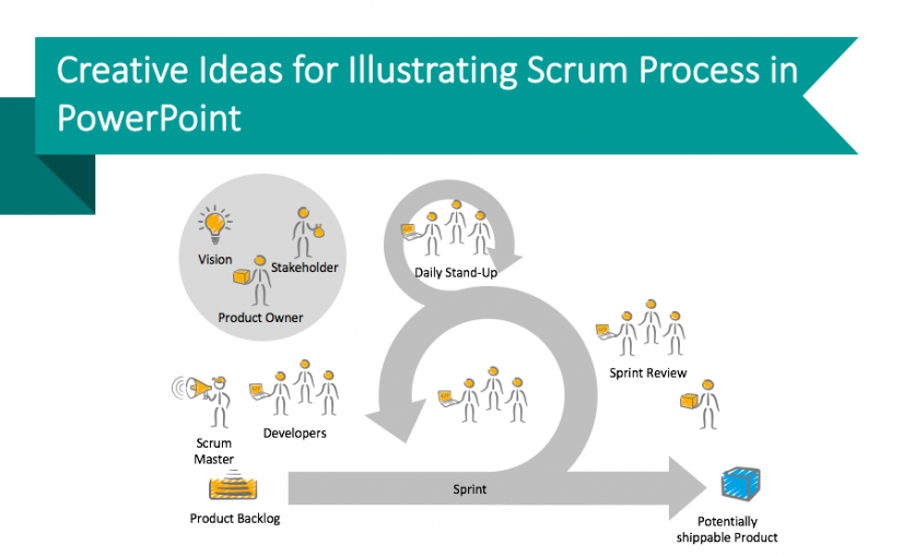
Creative Ideas for Illustrating Scrum Process in PowerPoint
Are you managing a project in IT, automotive, or other similar domains? If you do, you know that presenting such complex topics can be a challenge. In this blog, we would like to share a few tips that can help you. 🙂
Continue reading Creative Ideas for Illustrating Scrum Process in PowerPoint
How to make a presentation in a rush
In today’s busy world the speed of preparing slides is a critical issue. Here are a few suggestions on how to speed up designing your presentation.
Continue reading How to make a presentation in a rush![7 tips for stress-free conference or seminar talk [checklist]](https://blog.infodiagram.com/wp-content/uploads/2015/10/tips-stress-free-conference-seminar-talk-presentation-powerpoint-picture-825x510.jpg)
7 tips for stress-free conference or seminar talk [checklist]
Want to deliver your presentation smoothly?
Make sure you follow this checklist and be stress-free at your conference or seminars.
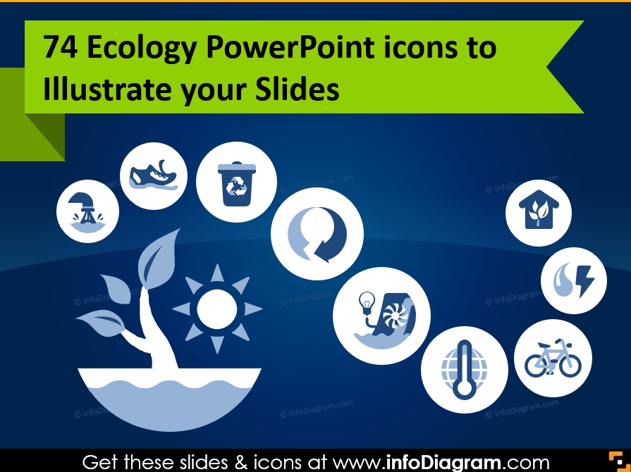
74 Ecology PowerPoint icons to Illustrate your Slides
Need to speak about ecology and the environment? We are extending our collection of business sector icons by freshly designed presentation symbols for ecology-related topics such as green technology, environment, and not less important waste management.
Continue reading 74 Ecology PowerPoint icons to Illustrate your Slides
![Making Creative Slides [Slideshare featured]](https://blog.infodiagram.com/wp-content/uploads/2016/02/creative_slides_intro.png)
Making Creative Slides [Slideshare featured]
Answering your question about how to make creative slides – we put together several ideas.
Read further to check our presentation with examples at Slideshare. You can find hints on how to change a formal slide into a creative one.
Continue reading Making Creative Slides [Slideshare featured]
![New way of getting single slide – Subscription Plans [news]](https://blog.infodiagram.com/wp-content/uploads/2015/08/subscriptoion_table_thumb1-2.png)
New way of getting single slide – Subscription Plans [news]
Today we are happy to have the first subscribers using the system. Here we present what it is about, how it works.
Continue reading New way of getting single slide – Subscription Plans [news]