7 Flat Banner Design Ideas for Making Attractive Slides
If your presentation is in a flat style, but you want to add creative elements and make slides look nicer, a flat banner design is a good graphical element to use. And believe me, there are more cases where you can use such shapes, then the title of a slide.
So let’s explore … cases where the banner will ‘save a day’ 🙂
Note: All images below can be found in Flat Banners Ribbon Collection (see details by clicking the pictures).
7 ways of using flat banners:
- present main ideas
- create banner bullet-point lists
- make the outstanding header of a text slide
- design map titles
- present customer opinions
- illustrate quote
- create timeline
So let’s try using them on slides and see the result.
#1: Define the Main Ideas
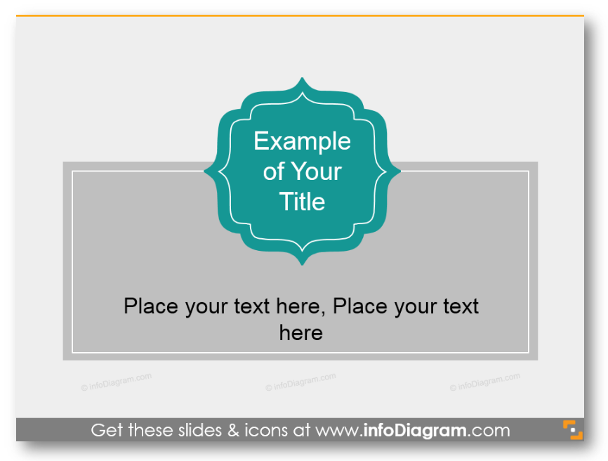
Such a curved label will catch the attention on the most important idea. Under you can write short description or explanation, but don’t overcrowd slides with text.
#2: Create Banner Lists
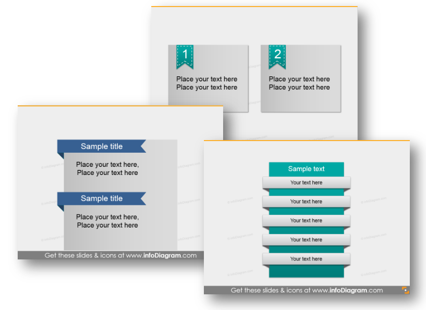
Here you can see three possible variants of designing lists: with two points (placed differently) and 5 stages. This last diagram can be also used as an agenda.
#3: Title of a Text Slide
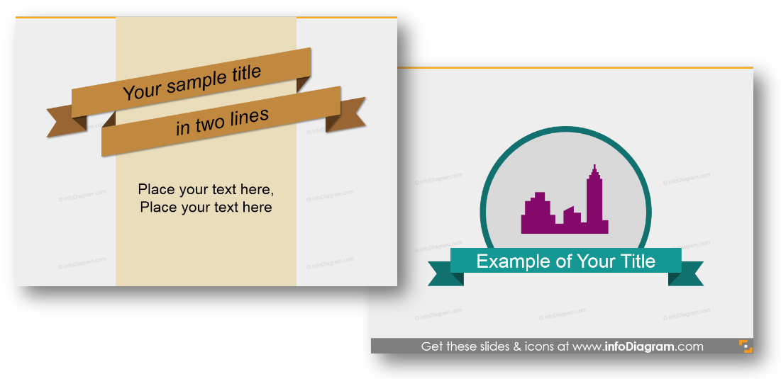
Even the simplest flat banner design can look attractive on a slide if you add a little design touch. Like here: on the first picture we rotated them a little, on the second – added an icon (you can replace it with any image or symbol as well). You can also use such slides as a transition to the other presentation section.
#4: Banner as a Map Headline
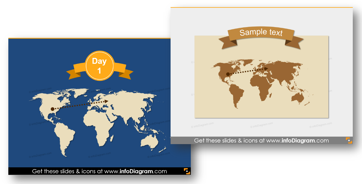
Here ribbons used as titles of maps. If you’re speaking on travel meeting or have one map slide, on a banner you can state the main idea, dates or country you want your audience o look at.
#5: Present Customer Opinions
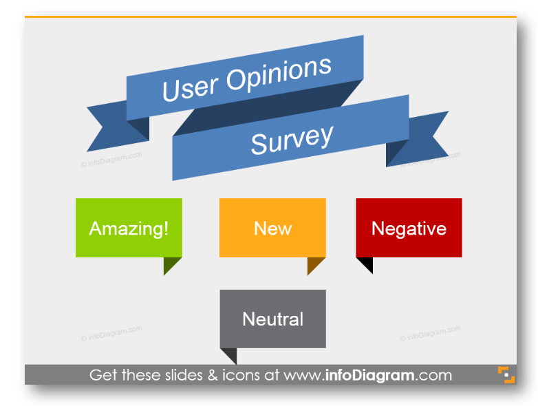
Another not so obvious use of banner shapes: show the results of clients or users survey. Various colors will help you and your team to distinguish the types of opinions.
#6: Illustrate Quotations
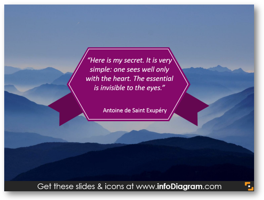
Simple background and quote in a hexagonal-shaped label made this slide attractive for the eye. Such illustration is better than the bare text, isn’t it?
#7: Design Timelines
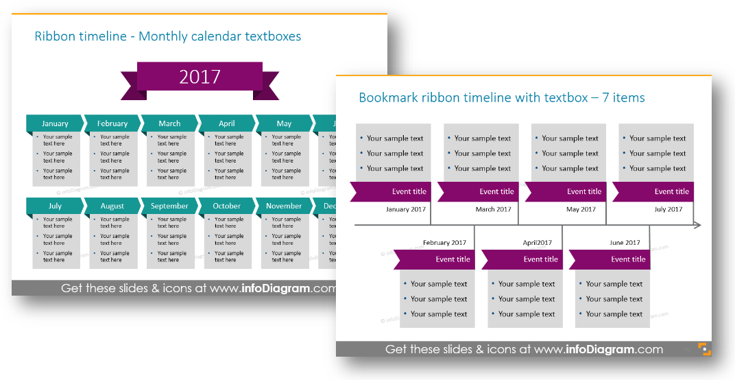
Need to show a history of events? Why not apply ribbons then? Even if you have many events, banners will nicely outline each one.
Flat Banners on Your Slide
Those are seven ideas of using flat banners and ribbons on slides: outlining main thoughts, creating lists and agendas, map and text slide headlines, presenting customer opinions, illustrating quotes and timelines.
Share your ways of using such visual elements in comments 🙂
If you decide to add such shapes to your presentation, all these graphics are available in the editable form here. Our pre-designed PPTX template contains slide title banners, ribbons and labels in flat, metro UI style.
What’s Inside Flat Banners Collection?
Predesigned infographics shapes and slide deck contains:
- 66 flat shapes: banners, ribbons, bookmark labels. Available in different colors: turquoise, light blue, violet, yellow, light green.
- Usage examples: world map trip, numbering, unique slide titles, list diagrams
Click on the button to see Flat Metro Graphical Style banner shapes for slide titles, infographics, and other visualization use:
See our Infographic Templates Design Bundle if you need more inspiration and ideas to create your presentations.

