ESG Scorecard and Metrics: Visual PowerPoint Presentation Templates
Present ESG metrics and sustainability scorecards with impact. Visual PowerPoint templates for ESG reporting, SDG goals, and sustainability KPI dashboards.
Are you about to present topics of ESG?
In the following article, we show a several examples of how you can present various sustainability concepts, KPIs and ESG metrics with visual PowerPoint slides.
Source of graphics presented here is available for download as editable illustration. You can see the full ESG Metrics, Sustainability KPIs and SDG PowerPoint Deck here.
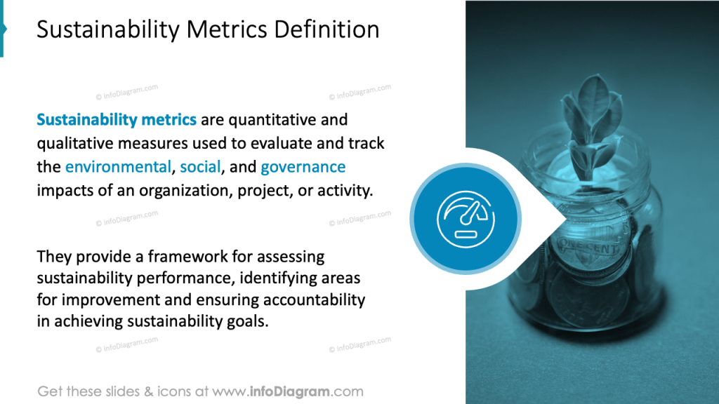
What are Sustainability ESG KPI Metrics?
ESG Sustainability metrics are set of Environmental, Social and Governance key performance indicators. These measures help to evaluate an institution in context of its sustainability and ethical impact. They also can address and mitigate non-financial risks within the organization.
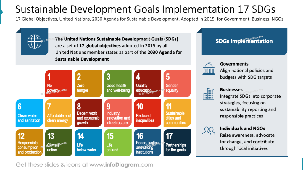
Present 17 Sustainable Development Goals – SDGs
There are 17 recognized SDGs – each has it’s associated color and graphical symbol. Here are brief explanations of what those goals mean and how they are visually represented:
- No Poverty SDG nr 1
- The goal is to reduce poverty by creating fair jobs, paying living wages, and supporting local communities.
- represented by the red and people icon
- Zero hunger SDG nr 2
- Supporting food security by reducing food waste, improving supply chains, and investing in sustainable agriculture.
- represented by the orange and bowl of food icon
- Good Health and Well-being SDG nr 3
- Promoting healthy workplaces by setting safety standards, employee wellness, and access to healthcare benefits.
- represented by green and heart rate line icon
- SDG 4 – Quality Education
- Investing in skills and training for employees. Supporting education programs in the community.
- represented by the claret color and open book icon
- SDG 5 – Gender Equality
- Ensuring equal opportunities for all genders. Special focus is on leadership roles and pay equity.
- represented by the salmon color and gender symbol icon
- SDG 6 – Clean Water and Sanitation
- Reducing water use in company operations. Making sure there is a clean water access for workers and surrounding communities.
- represented by the blue and glass with water icon
- SDG 7 – Affordable and Clean Energy
- Using energy efficiently and switching to renewable sources like solar or wind to reduce emissions.
- represented by the yellow and sun power button icon
- SDG 8 – Decent Work and Economic Growth
- Creating quality jobs in good condition. Promoting innovation and helping to grow the economy responsibly.
- represented by the claret color and rising chart icon
- SDG 9 – Industry, Innovation and Infrastructure
- Investing in sustainable technology and building eco-friendly facilities.
- represented by the salmon color and cubes icon
- SDG 10 – Reduced Inequalities
- Promoting diversity and inclusion in hiring, salaries, and career advancement.
- represented by the red and equal icon
- SDG 11 – Sustainable Cities and Communities
- Supporting local development by using preferably local resources, improving employee commutes, and reducing urban impact.
- represented by the yellow and building icon
- SDG 12 – Responsible Consumption and Production
- Minimizing waste and managing resources efficiently across the supply chain.
- represented by the orange and infinity loop icon
- SDG 13 – Climate Action
- Cutting carbon emissions and setting climate goals to reduce the company’s impact on global warming.
- represented by the dark green and eye with earth inside icon
- SDG 14 – Life Below Water
- Avoiding polluting oceans by managing wastewater and reducing plastic use.
- represented by the blue and fish in waves icon
- SDG 15 – Life on Land
- Protecting forests and biodiversity by means of sustainable sourcing and land management.
- represented by the green and landscape icon
- SDG 16 – Peace, Justice and Strong Institutions
- Acting with integrity by promoting ethical business practices and respecting human rights.
- represented by the dark blue and dove icon
- SDG 17 – Partnerships for the Goals
- Cooperating with others – from NGOs to governments – to share knowledge and create a positive impact together.
- represented by the navy blue and interconnected rings icon
You can present them on a slide altogether and add definition, explanation, comment, e.g., how those goals are implemented by various institutions – Governments, Businesses, and NGOs.
Or you can use such a visual list as engaging colorful shapes – each color refers to global objectives.
The visual style is consistent throughout, using simple, modern typography and clear spacing, which contributes to an organized and professional appearance. We suggest reserving some space on the side or top of the slide for a concise title or explanation to provide context for the audience.
This approach results in a visually engaging, informative slide that effectively communicates complex sustainability goals in a clear and accessible way.
Present 17 SDGs Performance Table
If you want to show how different business units implement specific Sustainable Development Goals, you can present it in a table format like the one below.
There are 17 columns, each with assigned color of specific SDG. The status os SDG achievement is represented by RAG dots – Green for “SDG achieved”, Amber for “challenges remain” and Red dot of “major challenges remain”. This form is quick to grasp and easy to edit, as those are standard circle shapes you can move around.
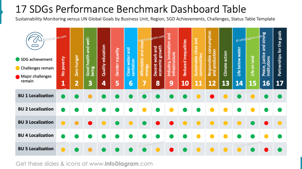
To recreate a similar slide in PowerPoint, start by constructing a matrix using a table. Then create rows beneath for each business unit or region being analyzed. Use PowerPoint’s shape and fill tools to insert uniformly sized circles as status markers. To maintain clarity, ensure consistent row height, column width, and ample spacing.
This type of dashboard is an effective way to present sustainability data in an actionable format, ideal for executive summaries or internal reporting.
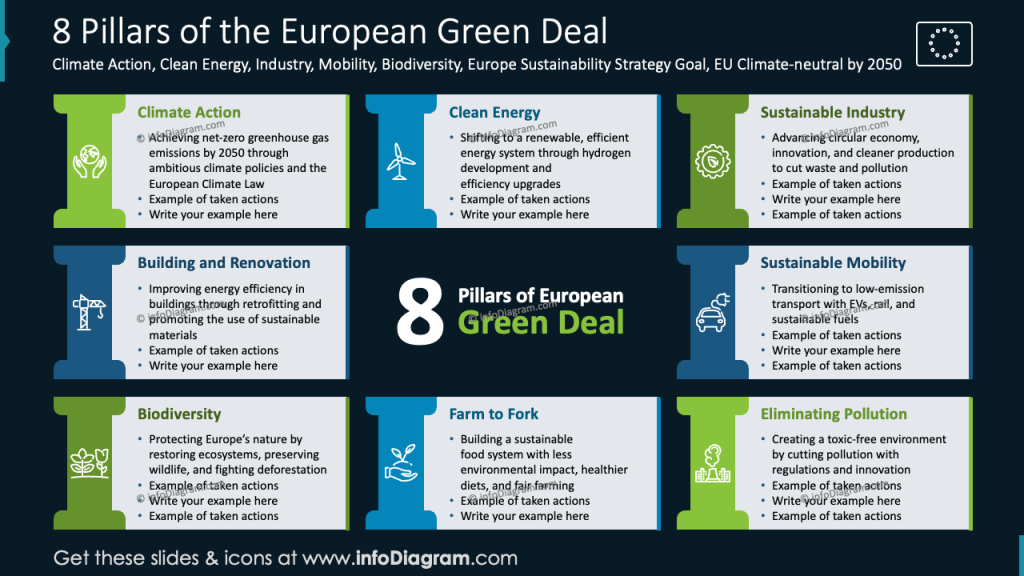
Present EU Green Deal Pillars
If you need to present European Union Green Deal framework, this an example how you can create a visually attractive slide. Show those pillars in a visually structured slide by using stylized blocks, where each pillar represents one key area of the Green Deal. Arrange the pillars side by side on a horizontal baseline to emphasize their equal importance and interconnection, creating a metaphorical meaning of the EU’s sustainability strategy.
Remember to use consistent colors aligned with environmental themes (greens, blues, earth tones).
Or if you want to underline the joint structure, you can use such a circle diagram:
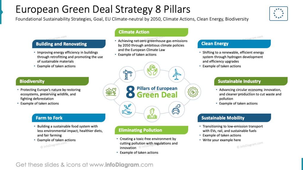
This type of layout visually emphasizes the holistic nature of the Green Deal. Each component contributes to the overall sustainability framework and depends on the others to function effectively.
In the center of the circle, you can place icons, illustrating 8 pillars of the European Green Deal.
This circular format works especially well in presentations where you want to show balance, synergy, and integration between policy areas rather than hierarchy or sequence.
Show MSCI ESG Rating
To compare how your institution does within the ESG rating within your industry, you can use a classical bar chart but assign it colors following the ESG rating scale.
See how we presented it using a horizontal bar chart where each institution or company is represented by a separate bar, with the length indicating its ESG score or ranking.
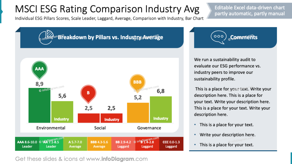
The bars are color-coded according to the ESG rating scale (e.g., dark green for top score, yellow for average, and red for underscore), which allows for quick visual comparison.
To enhance readability, we suggest including clear axis labels and data values.
To present one overall ESG Risk score KPI, you can show it the way we did below. This presents a composition of the overall score that is based on particular Environmental, Social, and Governance risk scores.
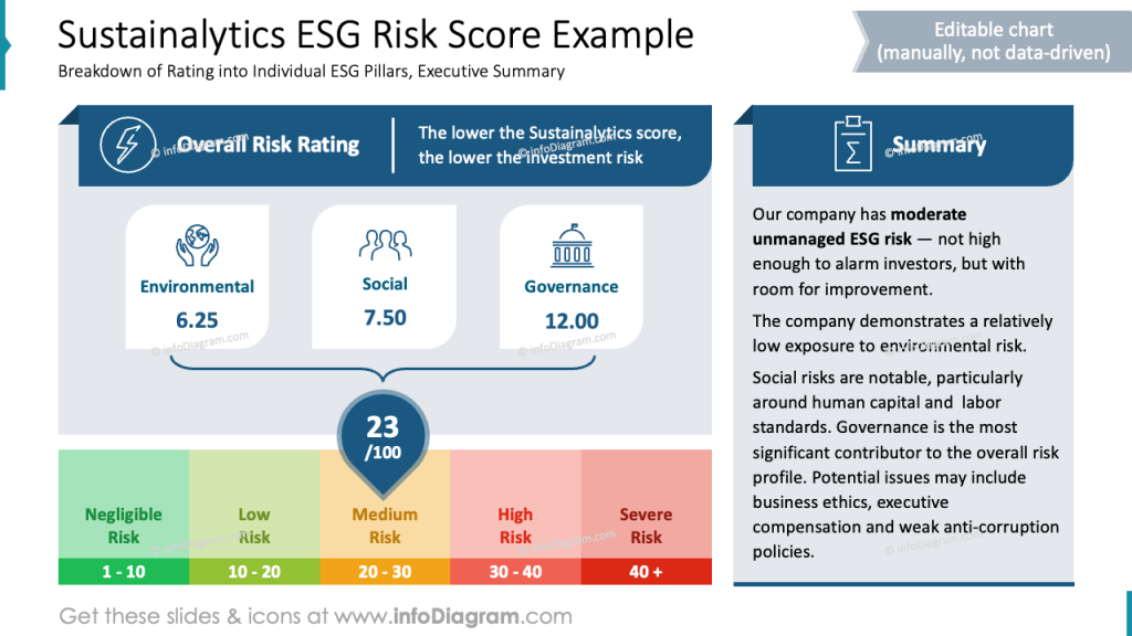
To recreate a similar slide in PowerPoint, start by dividing the layout into three main sections: the title and score summary at the top, the pillar-specific breakdown in the middle, and a summary on the right. We also recommend using distinct icons for each ESG pillar (Environmental, Social, Governance) to create visual anchors. Below that, include a clear color-coded scale representing risk levels. Finally, keep fonts consistent, use visual hierarchy through font size and weight, and leave ample white space to maintain clarity and focus.
To highlight the total ESG Risk score we used a teardrop shape and curly brackets that shows what the total score is made of. The total shape can be placed on a scale to express if the total ESG risk is negligible, medium or severe.
Visualizing ESG scorecard values
If you want to represent several ESG scores together a table is typical way to do it. However, you can improve your ESG data visualization.
For example, enrich a tabular form by adding a sunburst pie chart next to it. A table is good for having a structured list of ESG scores that you can easily read fro top to bottom, even if you have longer name of ESG measures. If you want to represent the values of the ESG score in more visually engaging way, a data chart is a better choice.
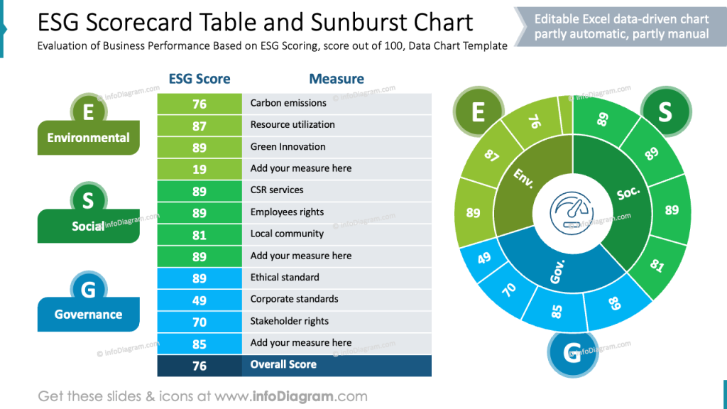
Using a circular chart flow like in this slide above is an better choice for several reasons.
- Data values are represented by arc size, that is faster to grasp by a reader
- Sunburst chart is an intuitive and visually engaging way to represent also hierarchical levels or grouped data.
- The circular format naturally emphasizes the joined importance of Environmental, Social, and Governance areas, avoiding a linear hierarchy that might suggest separation or prioritization.
- It also allows you to display multiple layers of information compactly.
- The radial symmetry is visually balanced and more aesthetically appealing, that improves audience engagement during presentations.
Explaining what are 3 Scopes of Carbon Emissions
Within Environmental sustainability metrics, there are recognized three scopes of carbon emissions.
- Scope 1 represents direct emissions from owned or controlled boilers, furnaces, and vehicles.
- Scope 2 means indirect emissions released into the atmosphere associated with the consumption of purchased electricity, heat, steam, or cooling.
- Scope 3 covers other indirect emissions that come from the activities of the assets that the organization doesn’t own or control but indirectly impact its value chain.
To present those definitions of what’s Scope 1, Scope 2, and Scope 3 visually, add an illustration, e.g. an icon of a car, of a factory, or of a truck
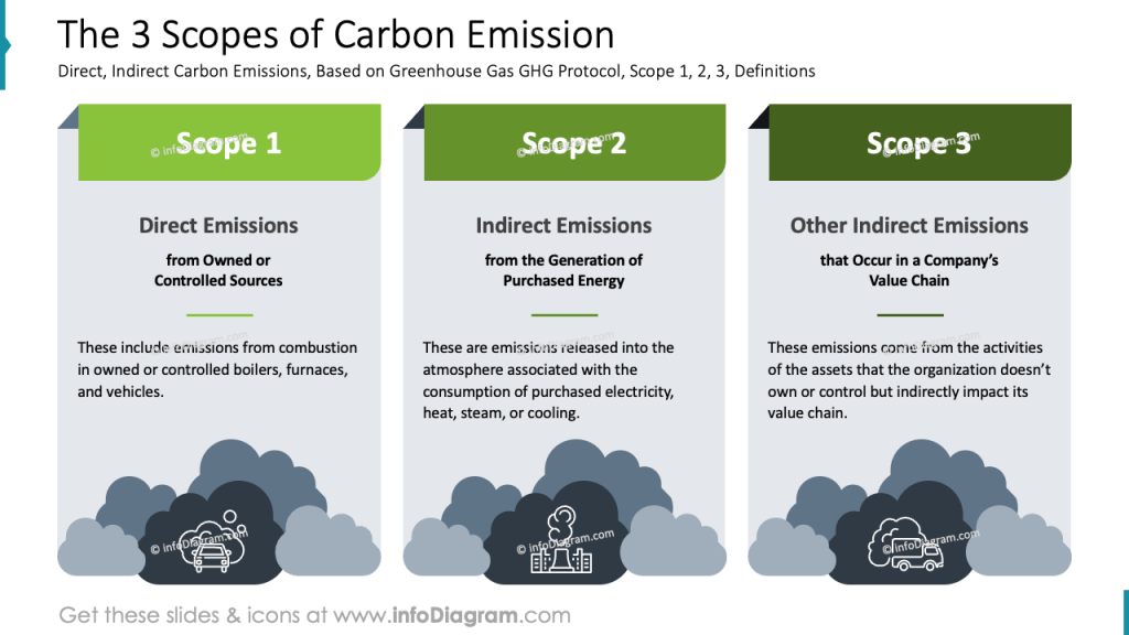
Using a three-column layout for presenting the 3 Scopes of Carbon Emissions offers several practical advantages. It clearly distinguishes each scope: Direct Emissions (Scope 1), Indirect Emissions from purchased energy (Scope 2), and Other Indirect Emissions across the value chain (Scope 3), making complex information easier to understand.
Designer Tips for a Professional ESG Metrics Presentation
Good design supports effective communication and creates an overall impression of a company’s brand. As slide designers, we recommend you to:
- Assign a unique, vivid color to each step or concept to guide the viewer’s eye and support understanding of the structure.
- Balance visuals with text for clarity to support comprehension without overwhelming the viewer with information.
- Use simple icons that match the concept to help viewers quickly associate visuals with key terms.
- Highlight keywords or key data by using bold text or distinctive color to draw attention to the most important terms on a slide.
Label all axes and segments clearly and avoid excessive data in the chart – focus on the few metrics that support your main message.
Resources: Sustainability Presentation Templates
The slide examples above are part of our PowerPoint slide library. The full presentation is available in the infoDiagram collection of PPT graphics:
Read other related posts featuring examples of presenting sustainability topics:
- Corporate ESG Sustainability Report Presentation
- Social Sustainability Report ESG Presentation
- Circular Economy and Sustainability Diagrams
Or watch our video with slide redesign instruction: