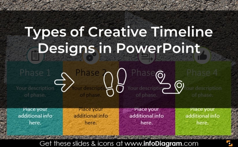
How to Illustrate Relationship Clearly With a Structure Diagram

A structure diagram is a powerful tool for visually representing relationships and connections between different elements. Whether you’re designing a software system, presenting organizational hierarchy, or planning a project, structure diagrams can help communicate complex ideas clearly and concisely.

In this blog, we’ll discuss the types of structure diagrams, and their use cases, and explore how to enhance them with visual elements.

Continue reading How to Illustrate Relationship Clearly With a Structure Diagram

Illustrating Company’s Performance: Tips and Tricks for Successful Presentation

Presenting your company’s performance is crucial for showcasing your achievements to a supervisory board or investors. In this article, we will explore various methods and strategies to effectively communicate your company’s performance, including data visualization, key performance indicators, and storytelling techniques. By implementing these tips, you can add compelling graphics to your presentation that accurately represent your company’s success and drive growth.

Continue reading Illustrating Company’s Performance: Tips and Tricks for Successful Presentation

How to Present Company History Creatively in PowerPoint

Whether you’re looking to highlight key milestones or tell the story of your company’s evolution, a well-designed presentation can captivate your audience and leave a lasting impression. In this article, we’ll explore the secrets of creating concise company history graphics and provide tips for creating compelling timelines that effectively communicate your brand’s story.

Continue reading How to Present Company History Creatively in PowerPoint

How to Illustrate Levels Clearly Using a Hierarchy Diagram

A hierarchy diagram is a visual representation of a system or organization, showing the relationships between different levels or components. It can be used in a variety of fields, from business management to education to computer programming. In this blog, we’ll explore the benefits of using such diagrams, different types of diagrams to show the concept of hierarchy and a guide for creating your own.

Continue reading How to Illustrate Levels Clearly Using a Hierarchy Diagram

Visualizing the Process and Structure with Train Graphics in PowerPoint

Are you looking for ideas on how to visualize a process or a roadmap? Today I’d like to show you a wide usage of the train graphics in the presentation. With locomotive and carriage shapes, you can symbolize the following chapters, steps, or periods. With those graphics, you can build on the creative and meaningful touch of your presentation. 

Continue reading Visualizing the Process and Structure with Train Graphics in PowerPoint

Illustrating Strategy & Leadership Topics with Lighthouse Graphics in PowerPoint

Would you like to visualize your concept of leadership or present the direction of a strategy? You can use the creative visual metaphor here – lighthouse graphics. A lighthouse is a strong symbol of navigation, and avoiding danger, and it gives an artistic and original touch to business presentations.

Continue reading Illustrating Strategy & Leadership Topics with Lighthouse Graphics in PowerPoint

PowerPoint Timeline Graphics: 3 Creative Ideas You Need To Try

The beauty of graphical timelines used in presentations lies in their fast comprehension. Everybody knows how to read them and see where’s beginning and where’s next step. Unlike in the case of some special data charts. PowerPoint timeline is also easy to create and flexible to modify. You can present exact dates or just show events and actions in a particular sequence.

Continue reading PowerPoint Timeline Graphics: 3 Creative Ideas You Need To Try

Creative Use of Quadrant Diagrams in PowerPoint

Are you preparing slides about market segmentation? Or you’re working on a presentation about brand positioning, consumer markets, or geographic segmentation? Consider using a visual form of quadrant diagrams for presenting such information. This is a common way used by leading consulting companies. For example, a well-known Gartner’s Magic Quadrant divides market players into four segments: leaders, challengers, visionaries, and niche entities.

Let me show you a few slide examples with quadrant graphics and get inspired on how you could prepare similar slides yourself.

Continue reading Creative Use of Quadrant Diagrams in PowerPoint

Use Euler Diagram to Illustrate Overlapping Items in PowerPoint

Looking for a way to explain relationships between sets or groups? An Euler diagram is a great visual way to present connections among objects by a set of shapes. Check out 5 cases where such a diagram will help you show complex concepts and relations in an easy-to-understand way.

Continue reading Use Euler Diagram to Illustrate Overlapping Items in PowerPoint

Use To-Do Checklist Graphics For Original Presentations

How do you present projects to your team? Do you share your personal to-do list? Do you create a to-do checklist presentation for the entire project? No matter what your approach, if you want your team to efficiently manage their many tasks and assignments, it is essential to give a compelling to-do list presentation. This easy-to-use time management tool is crucial to many organizations.

Continue reading Use To-Do Checklist Graphics For Original Presentations