Category Infographics types
Various graphical styles to add creative elements to your presentation slides. These ideas will help you deliver a powerful message, design less generic and more appealing slides, and engage your audience.


How to Effectively Present Country Market Insights in PowerPoint
When you want to present a market analysis of a specific country, using…

How to Present Inventory and Stock Metrics in PowerPoint
Need to present the status of your inventory or your stock management performance…

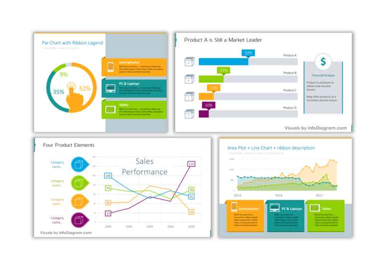
Chart PPT Redesign: 6 Before-and-After Data Visualization Examples

Eye-catching ways to present Debtors AR report in PowerPoint
Do you need to present your debtors accounts receivable status and analysis of…

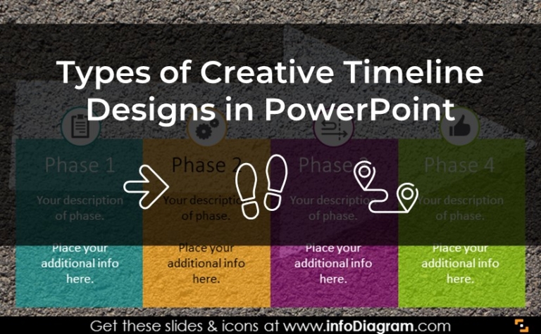
7 Creative Timeline Design Ideas for Presentations [With Examples]

How to Present OpEx Analysis with Visual Impact in PowerPoint
Need to present an operating expenses analysis outcomes? Check out our examples of…

Beautify the Look of Bar Charts in PowerPoint in 5 Simple Steps
A professional presentation aims to deliver a clear message in every presentation slide. …

Creating Impactful Slides: PowerPoint Chart Improvement Tips
As a slide designer, I frequently work on enhancing charts to make them…

Perfecting Your Chart in PowerPoint: Top Mistakes in Data Visualization
When it comes to creating a chart in PowerPoint, knowing what to avoid…
