Presenting Business Sectors the Modern Way – Outline Industry Icons Overview
Presenting a list of various industry sectors happens quite often. You may need to present the portfolio of your projects for various industries. Or you need to show that your clients are from various areas – production, public services, and finance. If you are doing market research there is probably a chart representing different sectors.
In all those cases, adding a visual symbol for the specific business sector will make your presentation look more professional and attractive.
Elevate your business performance presentations with our curated resources – visit our financial performance PPT reports webpage.
To help you out we designed a set of all industry icons in modern outline style. This post will give you a few design ideas on how you can use those PowerPoint industry symbols to enhance your charts or portfolio lists in your presentation.
You can find all the icons and slides here: Industries Outline Icons Bundle (see details by clicking the slide pictures with examples).
A typical challenge in preparing a presentation is how to present information (especially bare numbers and statistics) compellingly so that the audience will follow and stay attracted to your presentation content.
Here are nine examples that demonstrate adding outline icons in various slide contexts. All illustrations are done from scratch in PowerPoint:
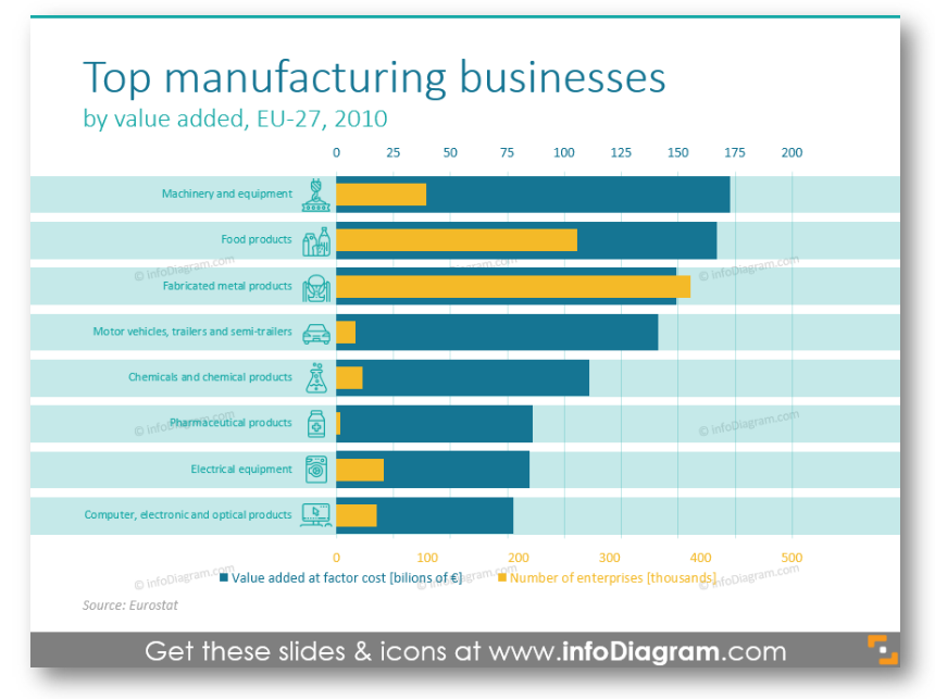
#1: Illustrating Bar Chart with Top Businesses Production Statistics
You can see a bar chart, which shows data on eight manufacturing spheres. Actually, two types of data can be visible in this diagram: one in blue color and another in yellow. It is easy to analyze all the information, even though there are eight indexes.
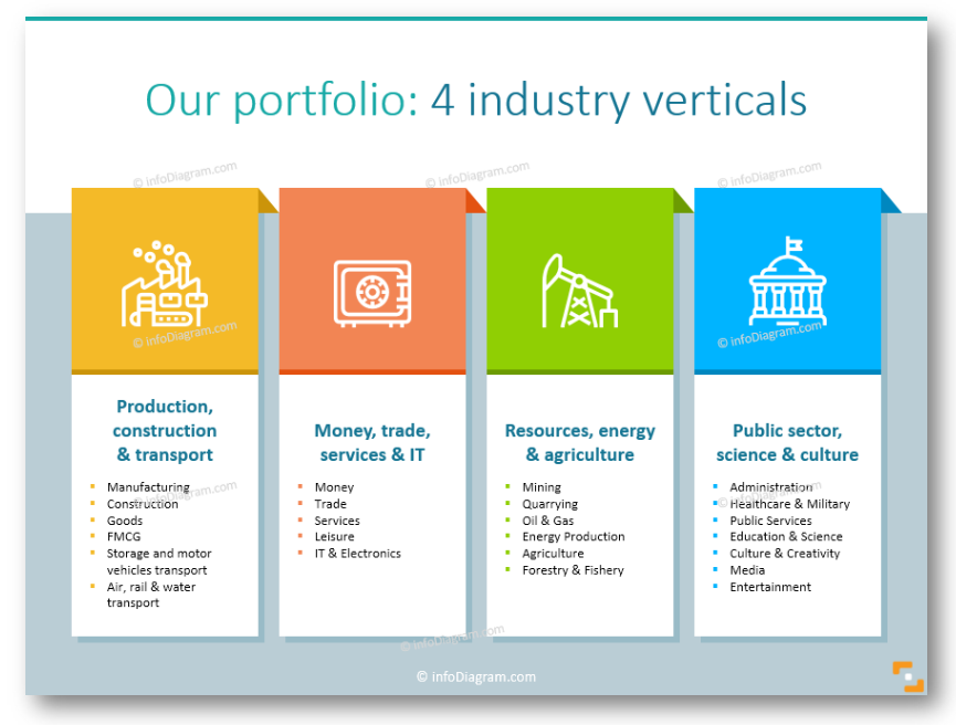
#2: Making Visual Industry Portfolio
The next example where you can need symbols for various business verticals is a presentation of a project or company’s client portfolio slide.
#3: Presenting Flowchart of a Supply Chain
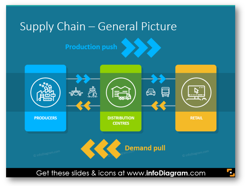
Here’s another idea how you can show the logistics process on a simple readable diagram. The trick for keeping it simple is not to put too many arrows and texts, just a few symbols and descriptive text will work.
#4: Comparing Import-Export Trade Charts
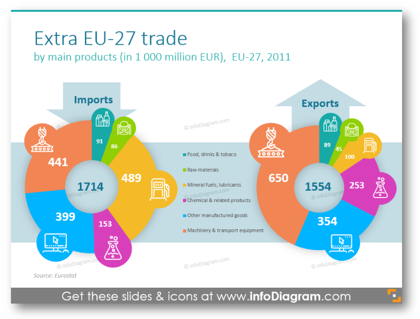
The first classic variant is to use pie charts: show all main products with illustrative symbols (to save space and make a clean slide). Notice a simple way to distinguish import and export charts. As with all examples, the shapes and icons are editable vector objects so their color palette can be changed to your preferences 🙂
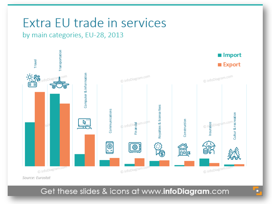
Another way to create an attractive comparison chart if you have more data categories is to present it in a column chart. For each industry sector, there is one outline pictogram depicting it.
#5: Zooming into a Pie Chart
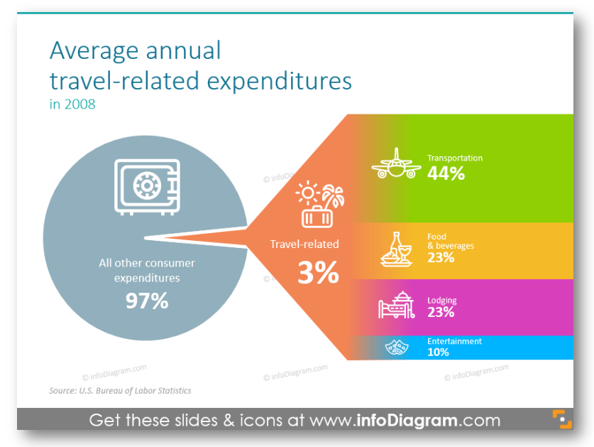
If your slide is about a small part of the full market share, then you can use this way if presenting it: put this sector aside, write a description and percentage number and create kind of arrow, which leads to ‘the big pie’.
#6: Showing Customer Relationship Management Process Cycle
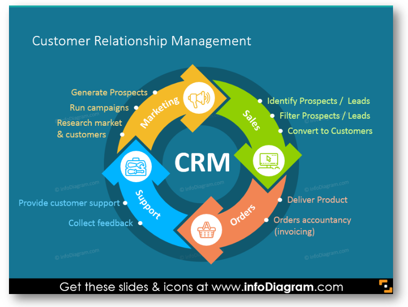
In the picture above you can see a typical CRM process: from marketing to support. Every stage is illustrated with a different color, an icon, and descriptions.
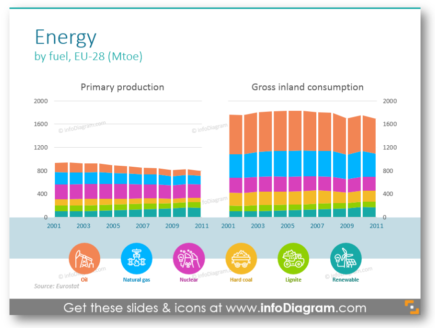
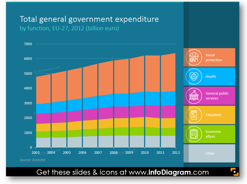
#7: Making Iconographic Categories Legend for a Chart
On this slide example, we use data of production and gross inland consumption of energy. We added here an illustrated legend for the energy sources.
You can easily replicate this kind of data legend for any chart with several categories. With the help of flat icons and vivid colors, the boring default charts transform into nice readable infographics.
#8: Adding Data Labels on a Line Chart
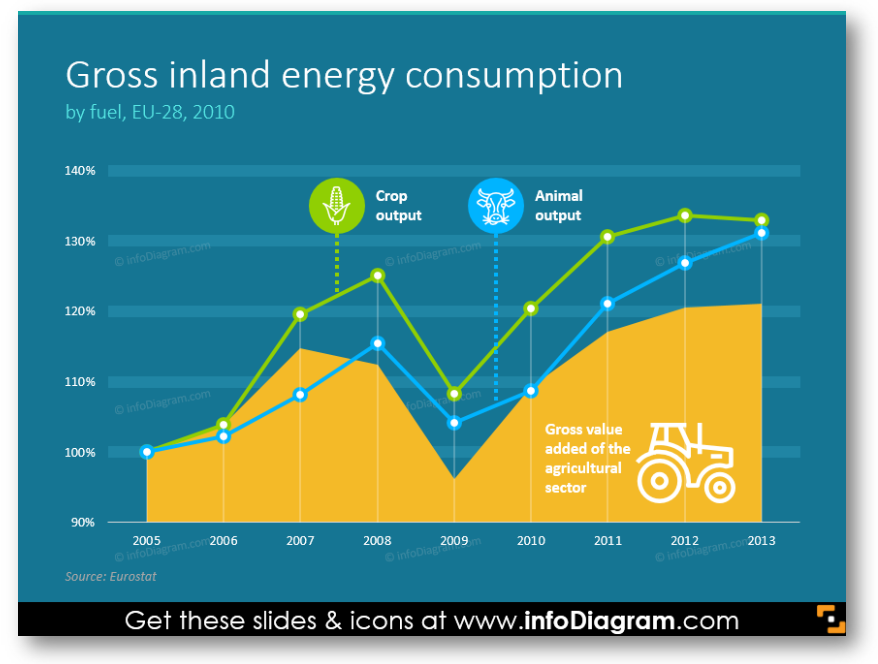
Another idea you can try for an atypical chart is to use a dark background. The line chart category is illustrated by an icon linked to the specific line. Or when you use a filled area line chart you can place the outline symbol inside the area under the data line – like we did with the tractor icon representing the agriculture sector.
Take care the icon color is in contrast to its background, so it will be visible also in too-bright room conditions.
An alternative place to put the icons is not inside the chart but on the separate legend area on the side.
To sum up, adding an icon to represent an industry is a quick way to make your presentation look professional. Whether you present a portfolio of the projects for various industry sectors or you want to enrich your chart.
To ensure your new slide design looks professional remember about basic design rules – see more in Consistency in Presentation.
Resources for mixed industry presentations
It’s not easy to find a modern and consistent set of industry icons that cover all major business sectors. And it’s even harder if you want editable vector symbols not only bitmap pictures that are not as sharp and editable as the vector ones.
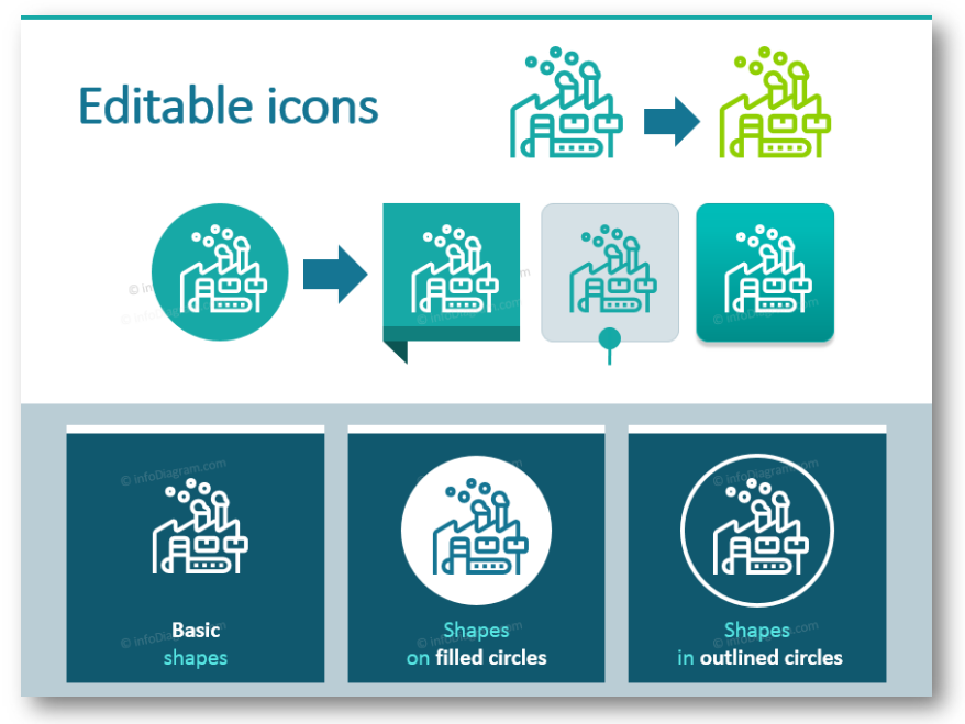
Therefore we decided to design a comprehensive set of editable PowerPoint outline icons representing all mainstream industries. We put all these graphics in a PowerPoint format so you can change their color using standard shape editing tools. However, the symbols can be imported into other presentation software such as Keynote or Google Slides. You can also export the final pictures as a PNG bitmap file that you can put on your webpage, for instance.
Explore our YouTube channel for more creative inspiration:
The industry icons collection covers:
- Production sectors symbols such as Construction, Manufacturing, Goods, FMCG, Transport, Storage
- Financial services pictograms: Money, Trade, IT, Electronics
- Natural Resources, Energy, Mining, Oil, Gas and Agriculture icons
- Public sectors symbols for Science, Culture, Administration, Healthcare and Education
If you like the slide examples above, you can download them directly here:
We designed this bundle in a modern outline style, however, you can check the same collections in flat style (if it fits your presentation more): Industries icons bundle.


