Performing a Market Analysis of Europe? Compare Your Options in the EU
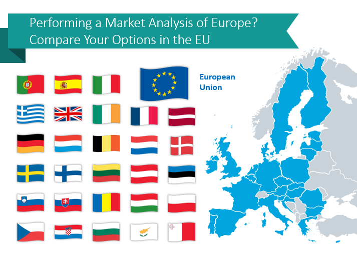
If your organization is debating or considering international expansion in the European continent, you need to perform a thorough market analysis. You should compare macroeconomic EU statistics to get a clearer understanding of the options.
Explaining your decision in a geographical context, while showing the countries you considered on a map, will benefit your audience. Especially if there are geographic factors at play as part of your decision-making process.
You’ll want to know the government debt figures of specific European countries, the area’s unemployment rate, the GDP per capita, the changes in the GDP, as well as the overall population of the areas you’re considering. When you have those figures in hand you can form a more informed argument for one expansion location over another. With the appropriate icons, you can create a compelling presentation for your board or deciding entity. You can also explain to different departments why you’ve elected to pursue one location over others.
The macroeconomic statistic graphics we present here come from the EU PPT Statistics: European Union countries economics collection that we’ve designed.
Differentiate Between EU Regions
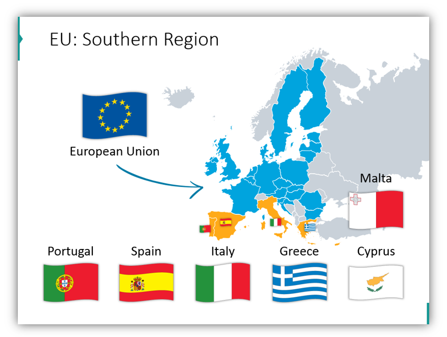
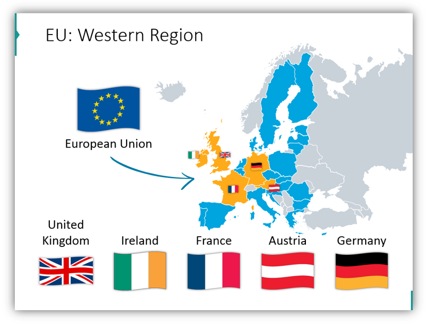
First, think about which region or regions of the EU you’d like to consider. Do you prefer the Nordic Region? Western Region? Benelux Region? Southern Region? Benelux Region? Baltic Region? Western Region? Central Eastern Region? Or perhaps the Southeastern Region? Each region has its own distinctive pros and cons, so weigh them carefully. When you’ve made your decision, present some of the facts about two or more of the regions you considered. This will give you credibility. Your audience will understand that the region you selected is the best choice based on the facts you share.
Compare the GDP of the Countries You’re Considering
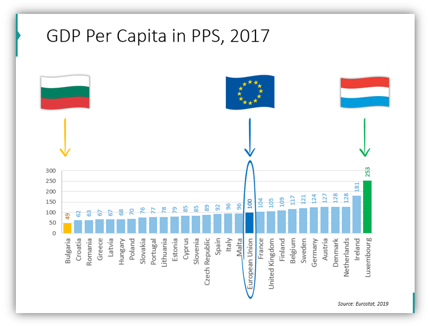
The formula for calculating GDP is:
- GDP = private consumption + gross investment + government investment + government spending + (exports – imports)
You can calculate those figures yourself or gather them from a reliable source, for example, the EU statistics office Eurostat is a good source for such data. Wherever you collect your data from you can present it in a visually striking way. See how in this table we present the GDP per capita of several countries. The two being compared are highlighted by making them a different color and by drawing a line in that same color to single them out. The EU as a whole is also presented on the slide so that the audience has a better way to compare. The EU has an additional circle around its bar to draw even more focus to it.
Use maps and Larger Graphs to Express GDP Per Capita and Growth
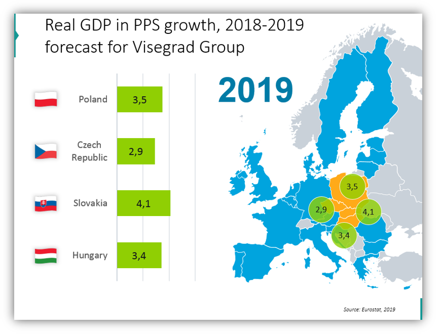
When you’re drawing a comparison of several countries, use maps along with charts. Adding maps will make your slides more visually compelling and will help make your points and topics more real for your audience because they’ll see, visually, the countries you’re discussing. Notice how the chart comparing Real GDP in PPS growth for the Visegrad Group is improved with the inclusion of the map. If you’d like, you can customize the colors to make the bars in the table correspond with the labels on or country markers on the map so it’s even more clearly explained.
Compare Government Debt
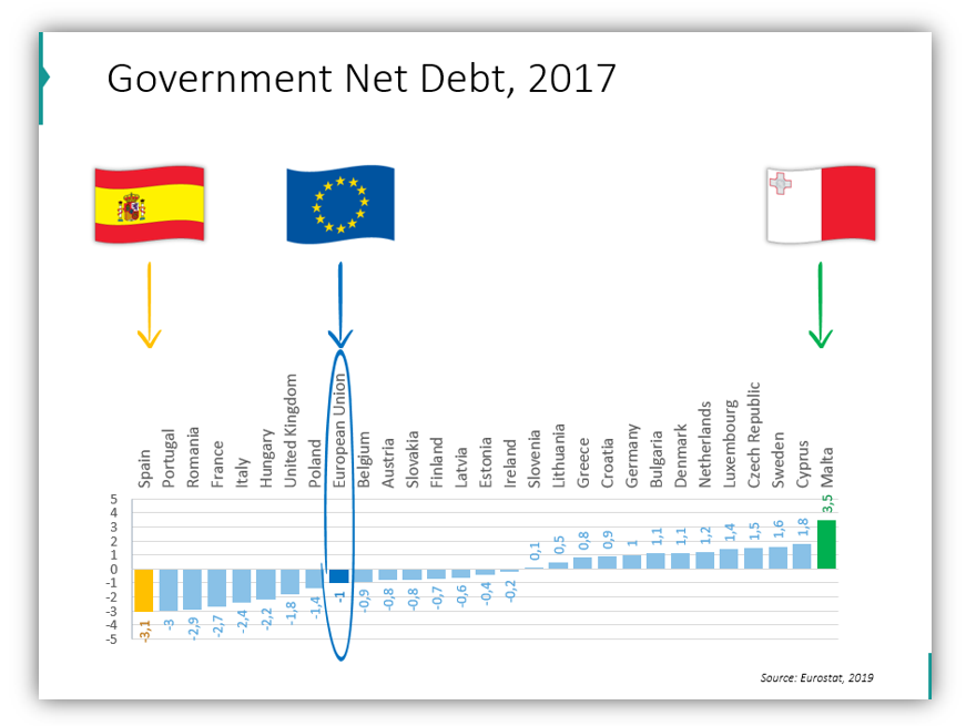
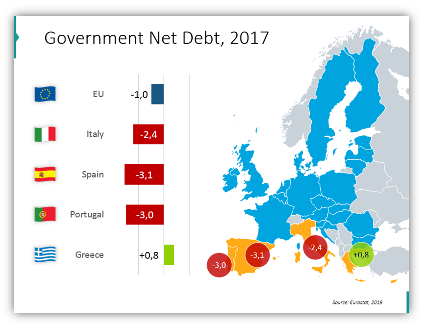
Although debt is never pleasant to think about, considering government debt is essential before expanding into a new country or region. You can present all of the government debt you’d like to consider in one easy-to-follow slide. See how in one of these examples Spain is highlighted by making the bar a different color and with its flag and an arrow. Malta is highlighted in a similar fashion. Notice how the European Union at large is marked on the chart so that you have a basis for comparison for the two countries. Notice how in the second example you can compare a smaller number of countries while still including the EU overall. In this example, the countries with negative values are marked in red, while Greece, the only positive value, is marked with green. The EU is marked with blue as it is being included for comparison.
Explore the Unemployment Rate and Overall Population of Countries and Regions with Maps and Charts
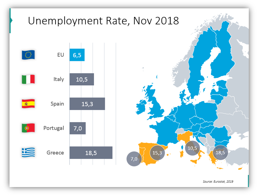
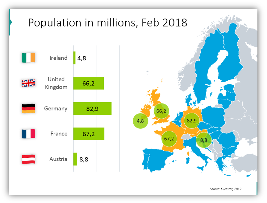
Two macroeconomics figures which are important to consider are the unemployment rate and the overall populations of given regions and countries. You have the option to only utilize maps at any point. Population figures could easily be highlighted on the countries in round labels as they are in the example. However, the chart provides a visual expression of the differences between the values. Looking at the numbers it’s obvious that Ireland has a lower population than Germany just looking at the round bubble labels. However, the chart provides a more detailed expression of that fact. With the chart, you can see roughly how much larger the populations are of different countries.
You can distinguish the different EU regions from one another, compare GDPs, express GDP per capita and growth, compare government debt, share the unemployment rate, and present the total population of any region or regions you’re considering expanding your business to.
Resource: EU Statistics – European Union countries economics
It is well documented that visually boring presentations are less effective. Presentations that utilize imagery are typically easier to follow and more enjoyable for the audience. Charts, graphs, and maps are all ways to make dry, macroeconomics presentations less dull. As an added bonus, your audience is more likely to recall information from the presentation when they’re focused and attentive, so there are only positives to making your fact-laden talk more engaging.
Do you think you could benefit from EU statistics slides? You can download the full diagrams and statistics set here to make presentations of your own:
If you’d like to further customize your presentation you can also take a look at our maps collection for more.