Make Effective Fiscal Presentations with Finance Data Charts in PowerPoint
Are you making a financial review for your company or organization? Presenting financial information can be intimidating. You want your presentation to be interesting and engaging, but it needs to be clear and attractive. Your audience needs to come away with a clear understanding of the facts and figures you’ll be presenting, and finance data charts can help you with that.
If you can incorporate modern, data-driven Excel charts you’ll be one step ahead. When you add in revenue data, costs distribution structures, profits, and customer acquisition performance you’ll paint the full picture.
Share Company Profitability, Revenue versus Costs, Expenses in an Easy to Understand Way
Are you already a presentation pro?
If you know exactly how you’d like to use graphs and graphics to present your company’s financial data click here to see Company Finance Data Charts set.
If you’re prepared, but want some fresh ideas to make more effective, professional presentations, read on. Find some new inspiration.
Explain Company Profitability
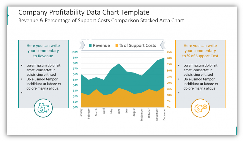
This data chart template will allow you to share your company’s revenue and the percentage of support costs. The stacked area chart shows a year of financial data in an easy to follow way. The space on the left allows you to provide commentary about the revenue. Why was there a spike in revenue for a given month? Why was there a stark drop? You can add details or a few notes which you can use as starting points to give a verbal explanation. The right box gives you a place to explain the percentage of support costs. You don’t want to have large walls of text, that’s part of why you’ve chosen to incorporate graphs. However, by making short notes for yourself and for your audience, you can be sure to address points of interest before your audience has the chance to ask about them.
Share the Cost Distribution Breakdown
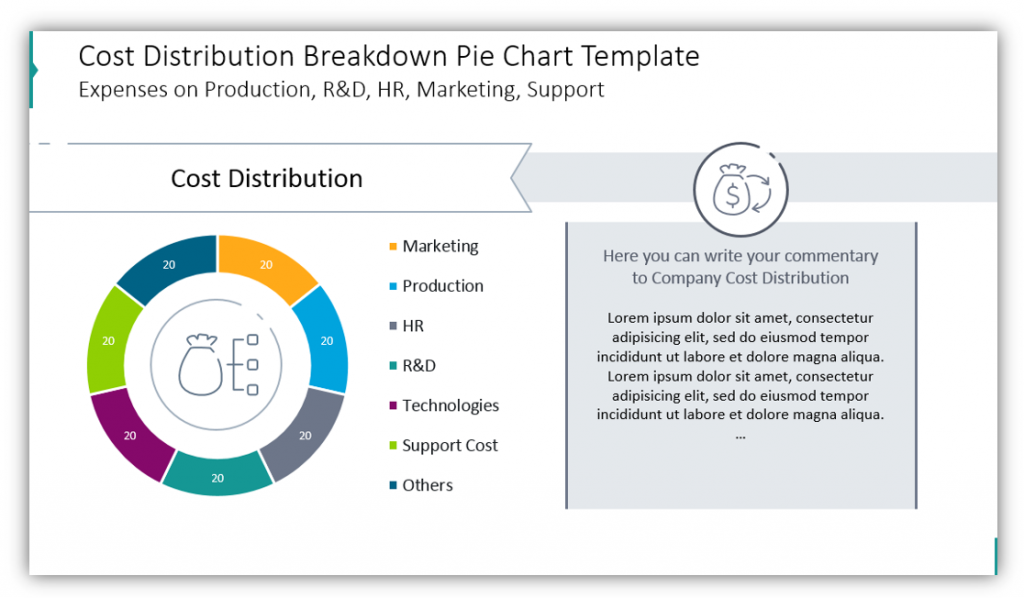
This pie chart is great for helping you explain the cost distribution. You can break down expenses on production, R&D, Marketing, HR, Support, and even more. You are welcome to modify the color scheme as well as the icons utilized in this slide. You may change the icons or remove them entirely, depending on what you feel is the best looking and professional. Notice how, in addition to the detailed pie chart, you have the option to add comments and explanations for the figures presented. If you’re making suggestions on how to cut expenses in certain areas, you’d be able to do so in the description box as well.
Break Down Your Expenses
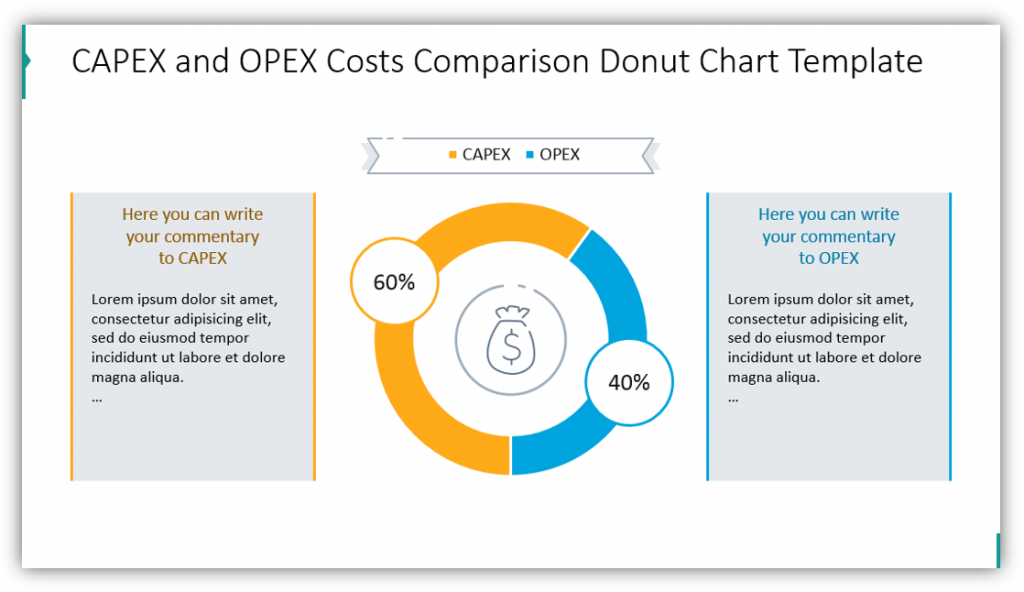
After describing what your expenses are, you can share how they’re necessary and will help your organization. CAPEX and OPEX expenses are treated differently for both accounting and tax purposes, and as such may require additional explanation. Operating expenses (OPEX) are necessary for day-to-day business functions whereas capital expenses (CAPEX) are expenses meant to create future benefits. By separating them visually you can help your audience conceptualize the separation and see how the different expenses compare.
Combine Finance Data Charts on One Slide
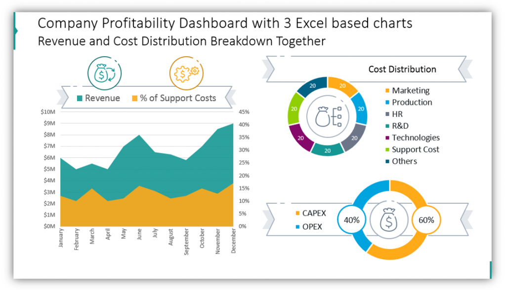
If you have a lot of ground to cover, you may not wish to share each chart separately. In many cases, it makes sense to share your revenue and cost break downs together. This way, if there are questions, you can refer to the appropriate chart. This is easy to accomplish when you opt to provide details and explanations verbally rather than in text boxes to the side.
Express Key Performance Indicators and Customer Performance Indicators
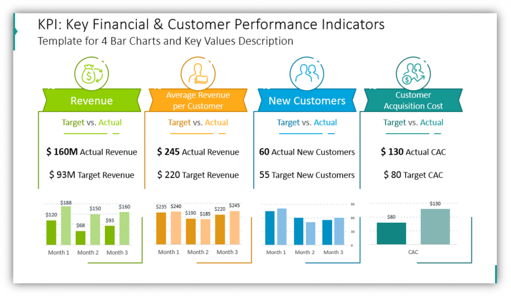
Show your audience what your targets were versus the actually achieved results. You can explain your revenue targets overall and average revenue per customer targets. You can also explain your new customer goals and results, as well as share the costs of acquiring those customers.
There are many, many more slide templates in this set. You can share monthly or quarterly reviews rather than looking at annual figures. You can compare the current ratio of assets to liabilities using pie charts and description tables. You can break down the return of company assets over a year or explain the company’s operating profit margin. If you’re a financial professional, this makes sense. Of course, explaining your company’s financial standing includes far more than your profitability and expenses. Using this icon set you can share everything in an easy to follow the presentation.
Resource: Company Finance Data Charts
When you use professional, modern graphics you’ll make a better impression. When you choose graphics which are sleek and easy to customize you can invest time in collecting data rather than designing slides. The hardest part of a financial presentation should be keeping track of finances, not building the slideshow.
Need more financial graphic ideas? Let the full graphic set inspire you to create something great for your fiscal presentations:
If you need some embellishments for your financial presentation, you should also check out Business decks collection for more graphic ideas.
In case you need to talk about the company’s stock performance, check our article on how to present stock performance.