Use Modern Diagrams to Illustrate Customer Experience Metrics
How much do you value your customer experience? A remarkable customer experience is critical to the sustained growth of any business, it helps you to retain customers and get more loyal clients. Unfortunately, as is true of many data-heavy topics, sharing customer satisfaction survey results or other customer experience metrics in a PowerPoint can be challenging. If you need to explain this important data in an easy-to-follow, fluent way, visualizations may be the solution.
Are you sick of using boring, PowerPoint default graphs and diagrams? Use compelling customer experience metrics diagrams to make bold statements about your customer journey. Check out the full Customer Experience Metrics PPT Diagrams set here.
Explain the definitions of customer experience metrics and difference between them
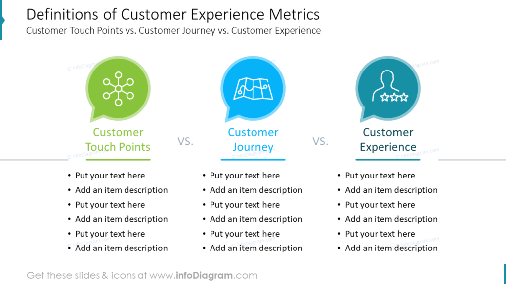
Do you need to present different types of customer experience information or provide a comparison of definitions? In the example slide, you can see how striking visuals can help audiences understand the key differences between customer touchpoints, the customer journey, and customer experience. Notice how the carefully selected icons make the slide more appealing than 3 lists would be on their own.
Separate fact from fantasy in your next presentation by sharing customer experience facts

If you need to dispel rumors about customer experience at large or shed light on how your customers really feel, the fantasy vs. reality slide is a great approach. You can share prominent customer service business beliefs or what you’ve uncovered in your own customer experience surveys. Our designers made the most use of the space by making one “fact us reality” comparison for the slide. This keeps the slide from becoming too cluttered or overwhelming.
Remember, one comparison like this actually contains multiple statistics in addition to the comparison itself. By incorporating color-coding, simple circle shapes to represent the different figures, and using a photo with icons to fill the white space in an attractive way the designers made this slide pop!
Present your customer journey vs. customer experience and show consumer touchpoints at once
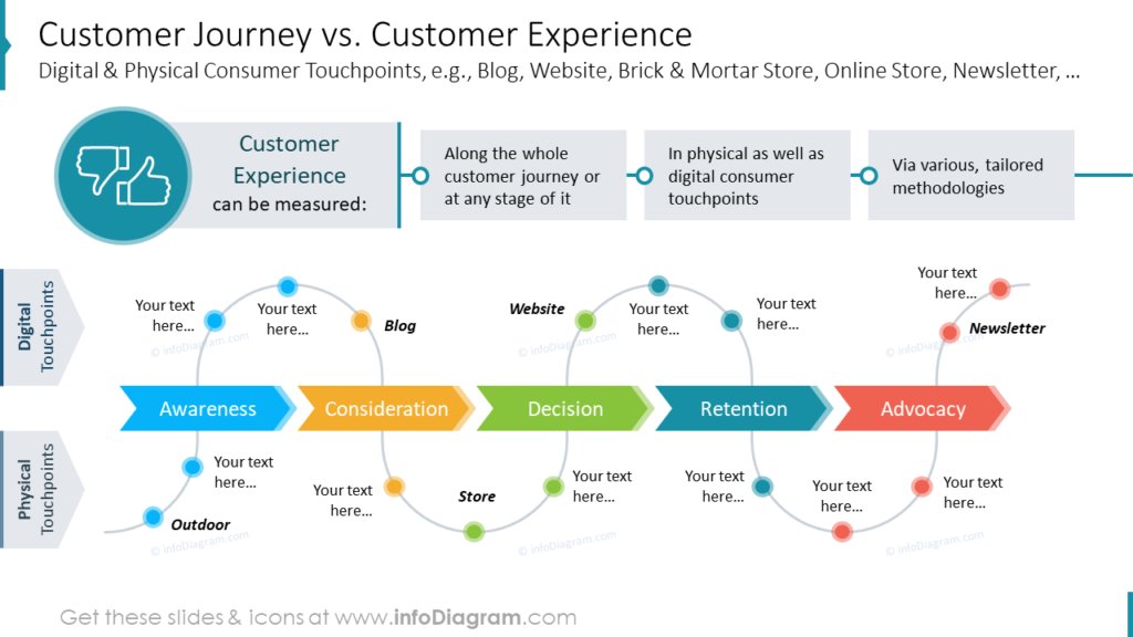
Are you struggling to help your audience understand your customers? One approach is to present your touch points, customer journey, and customer experience as a process. In the example, our designers built three paths. These flow chart diagrams combine to create a powerful infographic in PowerPoint. It explains how customer experience is measured, which touchpoints are used, and at what point in the customer journey different digital and physical consumer touchpoints are incorporated. Examples of the touchpoints used are your business blog, website, brick, and mortar store, online store, and newsletter but you may have other consumer touchpoints to add to your own slide. Think about how you could use diagrams separately or together to paint a more complete customer experience picture.
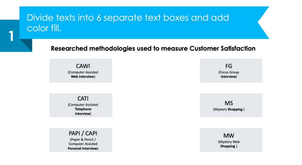
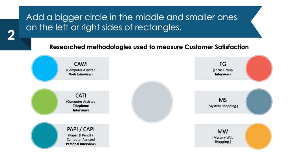
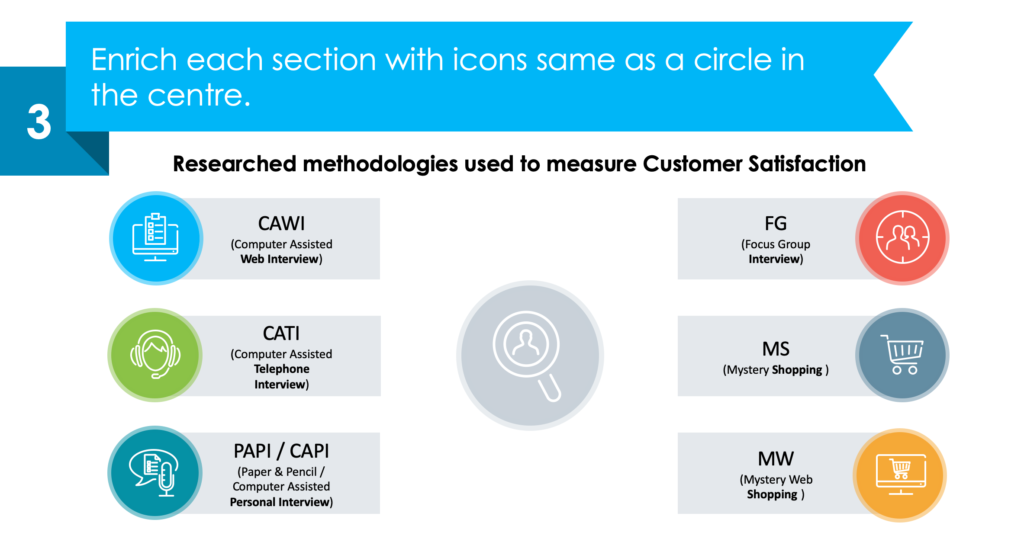
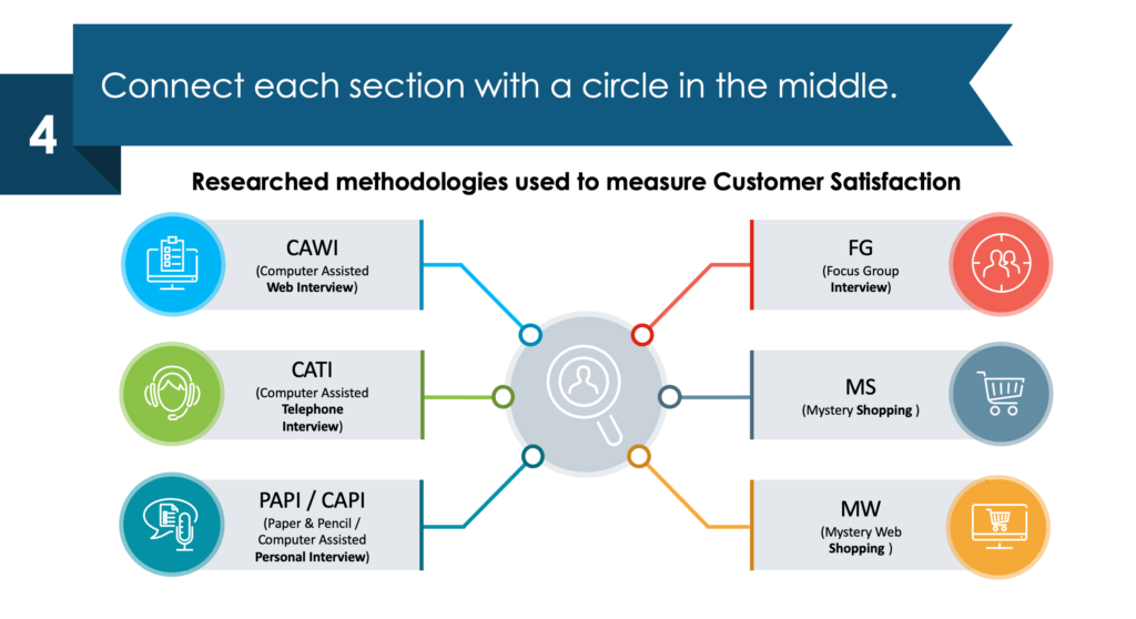
Get creative with customer experience metrics and methodologies in PowerPoint
1. Divide text sections into 6 separate text boxes and add a color fill.
2. Add a big circle in the middle and smaller ones on the left or right side of each of your rectangles.
3. Enrich the slide by adding icons in each of the circles both in the middle and in each section.
4. Connect each section with a circle in the middle.
Resource: Customer Experience Metrics Diagrams
Our designers created these customer experience metric diagrams to make your life easier. You can customize each of the shapes, diagrams and icons in this set with PowerPoint. Save time and make sure your next CX presentation looks sleek, memorable, and professional. Tie your complex findings together simply.
Customer Experience Metrics Diagrams are a convenient solution for people who want polished visuals for their presentations without design skills. Check out the full set by clicking here: