How to Create a Memorable Supply Chain Process Presentation Using PPT Visuals
There are situations in reporting supply chain topics when you may want to illustrate complex processes in a digestible and memorable way. Conveying massive amounts of data in the form of lists and tables is not enough in such cases. Converting from a word-based to a more visual presentation tends to help in fast scanning, understanding, and memorizing information. This method seems especially effective when showing flows and dependencies, which are the core of the logistics and supply chain process.
To help you understand how the visualization of SCM processes works, we’ve prepared a few slides covering production, storage, delivery, and selling processes. These example topics can inspire you to improve your next PowerPoint presentation:
- Production push and demand pull diagram in the supply chain model
- Production flow scheme in a supply chain model
- Distribution optimization flow map in supply chain
- Map-based overview of the European supply chain
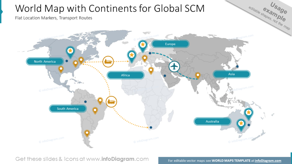
- Map-based overview of the global supply chain
Get all the graphics presented here – click on the slide pictures to see and download the source illustration. Check the complete Logistics and Supply Chain Process Diagrams PPT Template and Icons here.
Why Illustrate Supply Chain With PowerPoint Visuals?
When presenting topics related to time and space, it’s worth checking if there is a way to convert that information into graphics which can this way become a background for other data. This tactic reduces the time needed to absorb all information and produces a vivid image in the audience’s memory. Each layer of such an infographic can stand for a different type of message, for example:
- arrows for flows
- icons for means of transport
- flags for places
- maps for an area of operation
On top of that, you can place information about process characteristics, steps, participants, etc. This way of creating a presentation increases readability and helps differentiate one slide from another.
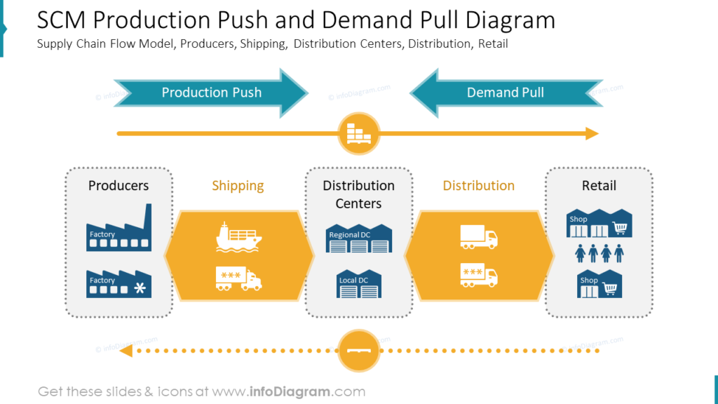
Outlining SCM Production Push and Demand Pull Process
The main components of any supply chain are its participants and the way they exchange goods and information expressed by production push and demand-pull. Whenever it is necessary to show how system elements affect each other flowchart comes in handy. The simple diagram below illustrates how blocks, icons, and arrows convey the message with a minimum amount of words. Thanks to color coding and the shape of blocks, we can easily distinguish participants such as Producers, Distribution Centers, and Retail from means of transport such as Shipping and Distribution. Also, without words, we get a picture of how products will be transported.
Notice that elements containing logistic icons are sharply finished to remain arrows. Their role in this diagram is to represent the flow: of product loads and empty transportation units. It’s easy to understand that everything about this process is circular and consists of steps.
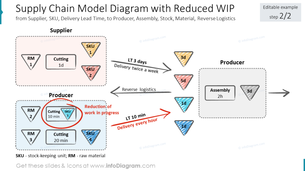
Mark Changes on Supply Chain WIP Model Slide
In some cases, you may need to emphasize the production process development. It’s a constant cycle of growth and optimization, so straightforwardly highlighting such changes in the presentation is helpful. On the next slide, you can examine this theory yourself. Note how elements representing resources and actions of supplier and producer, such as raw material, cutting, stock-keeping unit, delivery, and assembly, are regularly shaped and toned. In contrast, a hand-drawn red oval stands out and allows spotting important information quickly.
At this point, you might notice the casual graphic style of this diagram. It’s an option worth considering if you want to add more human touch to your schemes. Using sketch arrows or outlines looks less generic and efficiently grabs attention. What needs to be kept in mind is the balance between scribbled and regular elements and using a consistently narrow color palette for a professional look.
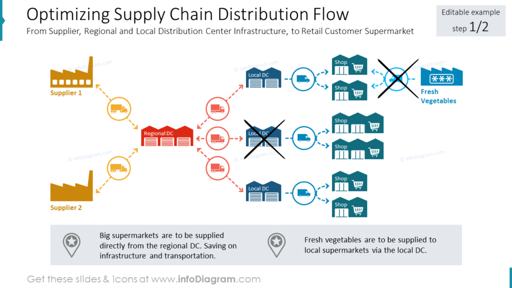
Map and Optimise Supply Chain Process Distribution Flow Using Icons
The distribution of physical goods is the fundamental supply chain issue containing information on flows and dependencies between process participants. As with every other process, it changes over time as an answer to market fluctuations. All these complex data tend to be hard to fit into the tables because each element can be connected with many others. That’s when flow maps become useful.
Check out the next slide on how pictograms and arrows make understanding this process easy. Color coding facilities group them according to their role, underlined by different shapes of icons representing them. Thanks to that scheme, it’s easy to tell suppliers from distribution centers and retail shops. This color relation is passed to delivery methods such as trucks and vans paired with one or two-direction arrows. Once the map of the whole process is ready, marking any changes on top is easy.
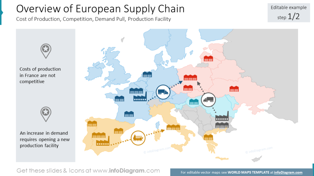
Visualize European Supply Chain With Maps and Pictograms
You may find yourself in need of presenting all facilities being a part of our Supply chain process. A simple table would do the job, but when the distance between objects and their relations are the key factors implementing a map seems to suit this task better. This paragraph’s picture shows an example of a European network of factories and distribution centers in various countries. Such a presentation allows you to analyze the current operation state and spot and note down chances for improvement. What catches attention, in this case, is grouping countries and coloring them to emphasize their relations. Thanks to this procedure, we can easily recognize which facilities belong to them and compare their representation on the map.
Another benefit of using maps is the possibility of marking flows. Observe how transport routes are clearly visible in the discussed picture. Thanks to logistic arrows and icons, we can state the direction, dependency, volume, and mean of transport. Also, moving these elements around the map is easy, adding much flexibility to further modifications.
Illustrate Global Connections Using World Map and Logistics Icons
Perhaps the process you wish to illustrate is worldwide, and you would like to fit everything on one slide. That’s another benefit of using maps we didn’t mention before. The last slide we prepared shows how efficient this choice may be.
To avoid color overrepresentation, all continents were colored in shades of grey. All visual elements placed against this background pop up – names of continents, place pins, and transportation routes. The map’s color palette was limited, giving great freedom in choosing colors for the markers. It’s hard to imagine conveying so many layers of information using words, not to mention saving them successfully in the audience’s memory.
Summary of Design Tips for Presenting Logistics and Supply Chain Process
Presenting complex production, storage, or distribution processes may be very demanding for presenters used to text slides. An extensive network of connections between its elements and multiple layers of information often asks for visuals to help close the message in one memorable diagram. We hope that the examples you saw made you realize how many different ways of delivering the same info you have. Remember those few tips when designing your next supply chain slides, and the result may surprise you:
- replace words with icon representations
- illustrate flows with arrows consciously using arrowheads
- introduce color backgrounds to group similar information
- incorporate maps whenever talking about places
- add scribbled elements to catch attention and humanize your data
- keep your color palette narrowest possible when creating complex schemes
- mark changes in the processes with hand-drawn vivid markings
- balance sketched graphics with regular shapes for a professional look
Resource: PowerPoint Template for Supply Chain and Logistics Process
The supply chain and logistics diagrams illustrating this blog are available for download in our infoDiagram collection of ready-to-use templates. You will find many slides appropriate for institutional, business, and civil audiences in this presentation, including facilities and transportation icons, modeling schema symbols, hand-drawn arrows and symbols, maps, flowcharts, quote, and more.
Don’t hesitate to check the details and click the link to see the full slides deck:
If you’re looking for more visuals to illustrate supply chain and transportation management try our collection of logistics icons.
For more inspiration on creating supply chain and logistics presentations, have a look at these 4 templates we recommend for supply chain managers and similar professionals.