Illustrating Executive Data Report with PowerPoint Dashboards
Do you need to present multiple data charts and KPIs? Don’t know how to combine it in an attractive and readable way? It’s a common problem during working with executive data report presentations or charts. The number of figures and text can be pretty dense and it can be difficult to present it clearly. I recommend using several basic design rules to create concise data dashboard PowerPoint presentation templates.
I am sharing several business examples of such dashboards to help you make your data presentation easy to understand for the audience and attractive to look at.
Get inspired on how you can present your data and charts on dashboards in a visual way with a few examples below:
- explain what the data dashboard is
- summarize the financial situation of a company or a project budget
- visualize the customer satisfaction status, feedback measures, trends
- compare sales trends and your salesforce performance
- present the profile data of a market or a customer
Get all the graphics presented here – click on the slide pictures to see and download the source illustration. Check the full Dashboard Layouts for the Executive Data Report Presentation PowerPoint templates collection here.
PowerPoint as a flexible alternative for dashboards presenting
There are specific BI data visualization tools such as PowerBI or Tableau for interactive dashboards. However, there are also cases when I would recommend PowerPoint instead:
- When you need flexibility of layout and illustrating data with additional elements (product pictures, custom statuses, showing processes or outcomes in visual way)
- When story-telling matters – and you want to connect data to narrative presented on more slides. To explain context, dig deeper why that data-driven decision matters, what are consequences…
- When having a curated data snapshot is enough, as compared to real-time interactive dashboard where data can change anytime.
What is a data dashboard – defining the term.
A data dashboard is an information management tool that visually tracks, analyzes, and displays key performance indicators (KPI), the most important metrics, and data aggregates in order to monitor the health of a company, department, or business-specific process.
The purpose of the data dashboard is to give an executive overview of a company’s performance.
If you need to present such a dashboard definition on a slide, you can illustrate it by adding a theme-related picture, to make such text slide more visual. Highlighting a keyword is also a good idea in case of longer text blocks.

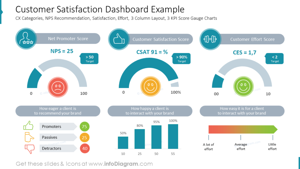
Example of Customer Satisfaction Visualization on Dashboard Slide
Customer satisfaction is one of the marketing indicators of purchase intentions and customer loyalty. It’s good to present all the factors on one slide to have a quick look at the all significant data.
As you can see in the example slide below, the customer satisfaction dashboard can contain elements such as customer experience (CX) categories, net promoter score (NPS) recommendation, satisfaction, effort, and key performance indicators (KPI). Each factor is presented in a graphical way with bar charts, gauge charts, symbols of thumbs representing different levels of customer engagement, or the icons of faces for three different statuses.
The whole slide is divided into three columns which gives quite a lot of space for data. With more extensive amounts of data, it’s better to limit the colors on the slide. There’s one leading color + red, orange, and green colors reserved for statuses only. To enrich the content the columns’ headers are represented with adequate icons.
Financial Example: Presenting Company Budget Graphically in Executive Report
If you want to present a budget summary on one slide, it’s possible to create it in a graphical way, as in the example below.
This budget dashboard example slide includes a presentation of the following financial categories:
- revenue and operational cost development over a year
- CAPEX and OPEX expenses ratio comparison
- cost distribution over various company departments
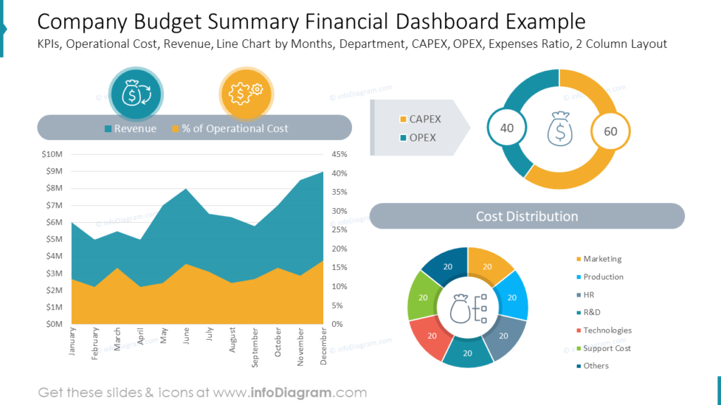
To represent all the above data we used a slide with a two-column layout. One column is dedicated to the aerial chart which shows the data over time. The second column contains two donut charts. They are more creative for data comparisons than pie charts. They present general data rations at one glance, and additionally, they look more unusual than typical pie charts. It’s easy to combine representative icons into them, too. With such presented data you can easily grab the audience’s attention to the numbers you want to present.
Example of Sales Trends Comparison Dashboard Made in PowerPoint
The next thing you may need to present is a comparison of the yearly sales trends. Such an overview requires much data presented over a few years. See the following example of a dashboard template for three years’ comparison of such data as monthly sales performance, growth drivers, and regions split.
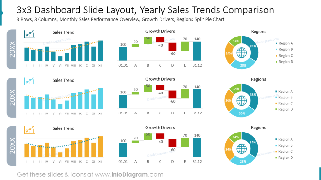
Notice how the use of a grid and margins helps to create organized slide content. The above slide has dedicated 3 rows for each year. In every row, there’s a place for a chart representing each of the factors of the summary. We used three different types of charts to present sales data:
- clustered column-line chart for the sales trend
- waterfall chart for the growth drivers
- donut chart for representing regions
Creating such a multi-data summary may become a complex task. The important thing is to recognize:
- what is the main data or message you want to convey,
- what reading flow do you want to present – what should be the order of reading data,
- what type of data you present and what kind of charts fit them best. PowerPoint has built-in more than 15 different kinds of charts, so it’s worth getting familiar with them while working on a presentation. However, I recommend using the basic simple charts, especially on such busy slides.
Let’s remember about the readability. The charts’ look must be consistent. Using too many colors and too small space between elements will make the slide overwhelming and hard to read.
Presenting the Customer Profile Data on the Dashboard Slide
To present the customer profile on one slide it’s good to create a one-sheet document that contains key information about your ideal customers and their interactions with your business in one place. You can visualize it on a single concise slide, like this:
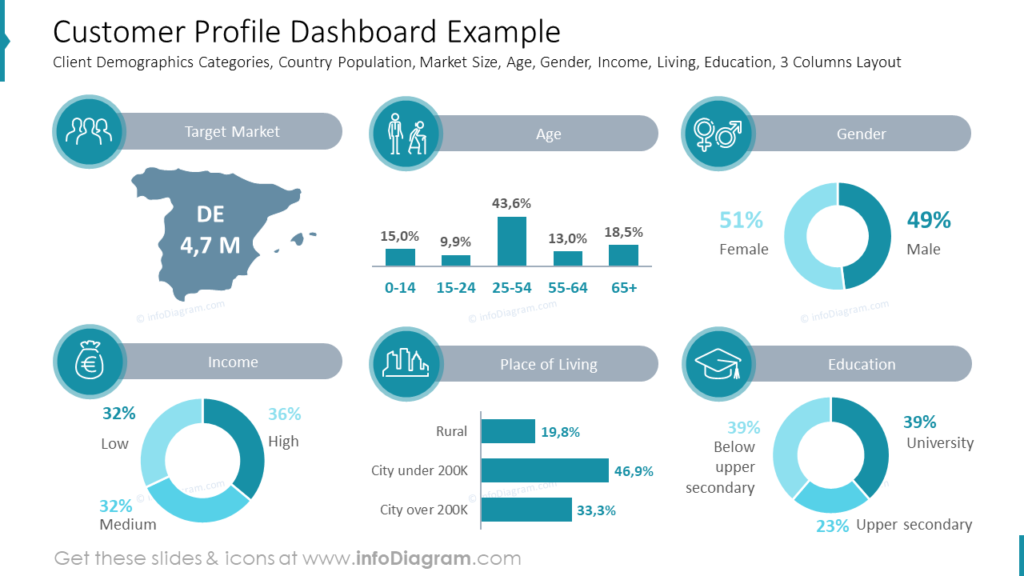
Information presented on the slide above covers such data as:
- client’s demographic categories
- country population
- market size
- client’s age
- client’s gender
- education level
- place of living
- income
It’s quite a lot, that’s why the slide is divided into six sections grid and covered with the gray and turquoise colors only. It lets us focus on presented data and does not distract with a variety of colors. To make each section easier to understand we symbolized it with a proper icon.
Working with Data Heavy Slides in PowerPoint – Designer Advice to Remember
Data reporting can be much more efficient when it’s presented in an attractive and easy-to-digest way. Using dashboard layouts will help you to transform your data visually. But it’s still needed to remember about few simple rules connected with data and charts presentation:
- analyze the data you want to present and match them with a proper chart type – for example: to show data change over time (like sales trends, website traffic) use a line chart. To present single category percentage data like education level use the donut or pie chart. To compare data from multiple categories use column and bar charts. Prefer simple charts over complex ones. Remember, what counts is the speed your audience understands the slide.
- use color coding – some colors have a natural association with some state. Red is typical for alarm or negative financial status. Green represents usually satisfactory results and positive status. Orange can be a state in the middle or a warning level. Grey is usually associated with neutral values.
- illustrate your data for quicker comprehension. Try to add icons – properly chosen simple symbol can perfectly reflect the meaning or the data category or chart title. The human brain can remember data better when they are illustrated with symbols.
I’m sure that with these basic design rules, you can make a stunning presentation and overall impression.
Resources: Universal Dashboard Layouts for Executive Data Presentation for PowerPoint
The examples above used the graphics from a PowerPoint template on the topic of Dashboard Layouts. All slides are available in the infoDiagram collection of presentation graphics.
Moreover, see how you can extend your data presentation and illustrate HR data using dashboards.
Explore more creative ideas for presenting management-related topics on our blog.
FAQ Using PowerPoint Dashboards
Those are common questions I get from clients or trainees when I’m designing such dashboards slides
How do I link Excel data so I don’t have to manually update every month?
The most common way is using Paste Special > Paste Link. This creates inside the PowerPoint an OLE connection to your source Excel file. When you update that Excel file, the PPT chart updates automatically. However, be warned: if you rename or move the Excel file to different location (e.g. different user catalog), the link will break. But the data will still be displayed from the last Excel source version.
What is the recommended rule for data density on a slide?
If your audience has to lean forward to see data, you’ve failed. Aim for one major insight per slide. I know this can be a challenge having dense slides. If you need to present in a bigger room, consider creating another version of presentation, where you split data to more slides to get space for values enlargement.
Should I use a Table or a Chart for a Board presentation?
I recommend try to use a Chart on a first place, as they visualize information better than a table. Data charts are the best form to show trends, comparisons, or outliers (untypical data out of expected scope, that trigger audience question “What is happening?”).
Use a Table only if the Board needs to see the exact currency values for specific line items (when you expect question “Exactly how much?”). If you must use a table, highlight the most important row or cell with a light fill color, or add some visual highlighter. See examples of such table data highlights in this blog 7 Ways to Make PowerPoint Tables More Attractive and Clear.
Can I make a PowerPoint dashboard interactive like Power BI?
Sort of. You can use Hyperlinks on shapes to “jump” to different slides. For example, clicking a “Regional Sales” icon can take you to a hidden slide with a deeper breakdown of that specific region. It mimics a “drill-down” feel without the complex software.
Why do my Excel charts look blurry or pixelated in PPT?
This usually happens if you paste as a “Picture (JPG or PNG).” The Fix: Paste as an “Excel Chart Object” or an “Enhanced Metafile (EMF).” EMFs are vector-based, meaning they stay crisp no matter how much you resize them.
How do I stop the “So what?” question from the Board?
Avoid presenting charts without a Lead sentence. Instead of titling a slide “Q3 Sales Trends,” title it “Q3 Sales Rose 12% due to XYZ market expansion.” Use the PPT slide as the “conclusion” and the Excel data as the “evidence.”
Follow our YouTube channel, and subscribe to our newsletter for more design tips and slide inspiration.