Build an Engaging Presentation with Proper Structure Slides
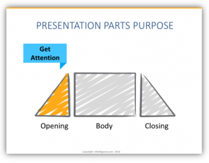
Opening, body, and closing are obvious structure parts of the presentation. However, are you using these structure slides effectively? Each of these parts has its objective that you should clearly highlight also on your slides. How?
The parts of a good presentation & corresponding structure slides
Regardless of the topic, when you build an engaging presentation you must follow a simple format. Every interesting presentation created can be broken into three easily defined parts. It is essential that you have content which fits into the standard structure. Depending on your content, supplementary information that doesn’t “technically” fit may be helpful, but without these three main sections you will struggle to maintain coherence and you’ll lose your audience’s attention.
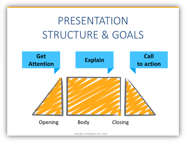
The three essential parts of any presentation are the opening, body, and closing. Let’s take a closer look!
The Opening Slide
Obviously, the opening portion of your presentation will include the title slide, as well as any agenda or structure outlining slides. Why is the opening essential? It sets the stage for your presentation. You can use your title slide and a catchy headline to draw your audience in.
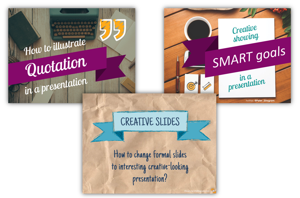
A tip we’ve picked up to make presentations more powerful is to add a strong visual slide in addition to the title and tagline. A strong visual slide could be a full slide picture of a photograph – something to draw viewers in. You want to fully engage your audience!
The Body Slides
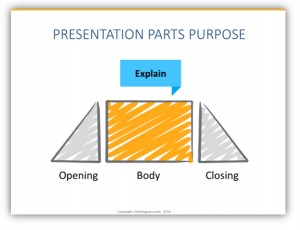
The second portion of all good presentations is the body. In the body section, you’ll clearly explain your topic. If you are giving a lengthy presentation or webinar and you have multiple, related topics to cover then you should add divider slides to help the content flow more smoothly. Keep in mind that your divider slides should not contain any graphics that might be distracting. You may opt to insert totally blank slides to serve as dividers, or include slides with the name of each subsequent section. Whichever option you choose, the important part is to explain what it is that you are presenting or teaching as you move through this section.
The Closing Slides
The final portion is often the most difficult. The third essential part of any presentation is the closing. In the closing you want to accomplish two things – provide a call to action which inspires your audience, and to share your details if you anticipate there being a need for follow up. Your call to action should effectively prompt the audience to do something with their new found information. Strong calls to action are powerful and can set the room to act on their knowledge. Weak calls to action will leave viewers wondering “what was the point of that?” – a kiss of death for any presentation.
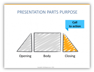
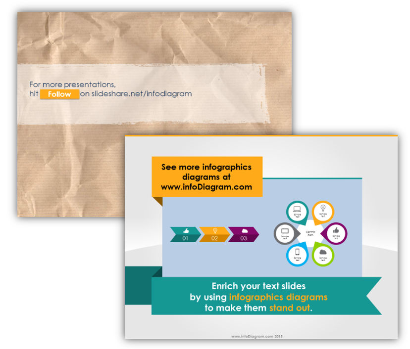
To make strong calls to action even more striking, you should highlight it visually. Things like using large fonts or graphics which accent the text are especially useful. (Our favorite method of highlighting calls to action is to place the information into a sticky note graphic or other atypical shapes.) Incorporating visual elements helps to draw the eyes toward the call to action and make it more significant to viewers. Some examples:
The Takeaway
- Great presentations have one thing in common: a basic structure that sets both presenter and audience up for success. It’s a win-win!
- The essential presentation parts that you’ll need are: the opening, body, and closing
- You should tie your presentation together with a call to action. Let your audience know where to go from here!
If you find you’re still struggling, reach out via the contact form. We’d love to offer advice for how to improve your projects!
Graphics resources used in the examples above:
- Presentation skills training toolbox (PPT diagrams)
- Flat style Ribbons and Banners for PowerPoint
- Editable Scribble icon symbols
If this article was helpful, you might enjoy:


