Graphics for Explaining Data Science on your PowerPoint Slide
Today data and digitalization of business operations is everywhere. No matter where you turn, you’ll have to look at numbers and chase statistics to get anywhere. You’ve heard all the marketing buzzwords and seen all the fuss. You know it’s important, but how can you effectively talk about data science during presentations?
Artificial Intelligence, Data science, Machine Learning, Predictive analytics. Odds are that you’ve heard some of these terms. You may understand them, work with them or want to learn about them, to catch up. The best way to communicate those new terms is by creating visual associations, that helps us to understands those IT concepts. Data visualization of AI processes and elements is a skill worth to master. Let us show you a few graphical inspirations of presenting data science topics.
Remark: You can get all diagrams and icons from Data Science Analytics Icons.
What is the Easiest Way to Explain Data Science
As we have mentioned before, the easiest way to explain complex strategies is to simplify them by utilizing simple, memorable pictures.
We’ve created a icons set of data science presentation symbols to aid you in explaining these complex concepts and ideas. These infographics elements are great for explaining data and data-ridden concepts, whether you want to simply show a data science definition or create do-it-yourself infographics in PowerPoint or data processing flow charts.
What’s Inside the Data Science & Big Data Library?
The data science and big data icon library contain over 30 modern, flat symbols which are all presented as editable vector artwork.
A Detailed Icon Set Breakdown
- Symbols of data types (text, media, location, structured or unstructured data)
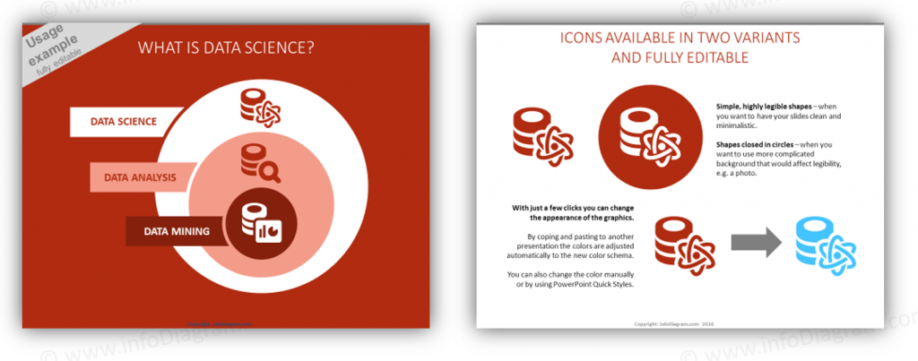
- Editable diagrams for use explaining the definition of data science and data processing.
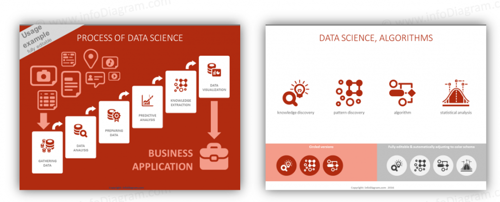
- Icons for different areas of data science such as data science, predictive analysis, segmentation, forecasting, knowledge discovery, and pattern recognition.
- Symbols for exploratory data analysis and statistical analysis, as well as algorithms.
- Pictograms from various data processing concepts: transformation, data quality, data security and privacy.
- An extendable set of flat data-related icon symbols for infographics
 Determine What’s Best – One, Ten, or ALL of the Data Science Presentation Icons
If you’d like to try out our icons we have several ways you can do that. Choose any single slide or purchase it on a ‘pay as you go’ or ‘a la carte’ manner:
- To get a few of selected slides only, join our membership program and subscribe to receive slide graphics on a one time or recurring basis. (With this option you can even select graphics from other sets!)
- Snag all the Data Science presentation symbols and diagrams in a one time, pay as you go package.
How to Use Data Science Presentation Icons
The typical purpose for our Data Science themed icons is for Powerpoint or Keynote presentations. Some folks have even reported that they copy our diagrams directly into Word or Excel to create and distribute promotional material or additional content to follow or precede a presentation. Others still have mentioned they’ve utilized our diagrams in Slideshare presentations and Youtube videos.
Check out this YouTube movie which explains more about Data Science:
By adding animations and a bit of music or sound effects you can quickly create a much more dynamic and interesting presentation.
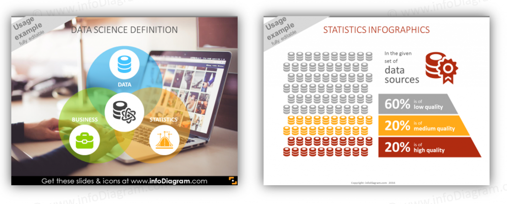
Check out Data Science graphics library for creating a presentation on data, analytics and Big Data topics. Using only PowerPoint or Keynote, you can easily make illustrations about Predictive Analytics, Data Mining, show statistics infographics quickly on a slide:
Looking for more creative presentation graphics? Get on our newsletter and never miss an announcement. You’ll stay informed about all of our new updates. Plus, if you sign in for our newsletter you’ll get a Creative slide design guide with free hand drawn shapes, absolutely free!