PowerPoint Chart Ideas: 6 Graph Designs That Work
Transform boring default charts into professional visuals. See 6 PowerPoint chart redesign examples - pie, bar, line, and column - with templates you can download.
Many business presentations are made a day before meetings, if not an hour :). No wonder they look pretty default. Don’t lose the power of your final data presentation due to a lack of preparation time. Wanna know how you can quickly do standard chart PPT beautification using PowerPoint? Keep reading.
We’ve put together a bunch of ideas on how to present data using vivid infographic charts. See six examples of redesigned charts and graphs: pie, line, bar, and column, comparing several charts and enhanced bar charts.
Quick TL;DR summary of creative ways to present data in PowerPoint: Skip the default Excel look and match the chart to your message. To show KPI data, use gauge charts or customized pie charts for parts-of-a-whole (max 6–8 slices). Bar charts fit exact comparison of categories, line or area charts for trends over time (max 4 lines), and column charts for values across time periods. Add a category icon to each data series, use one accent color to highlight the key number, and remove redundant axes, gridlines, and legends. Below are 6 before-and-after examples made in PowerPoint (pie, bar, line, column charts, you can copy and adapt).
Presenting facts, statistics, and other numerical figures are the essence of pretty much every business presentation. Whether you do a quarterly review, investor pitch, or project status meeting.

Their main role of presenting numbers is to give credibility to your message. Showing data facts engages your audience more than talking in abstract terms.
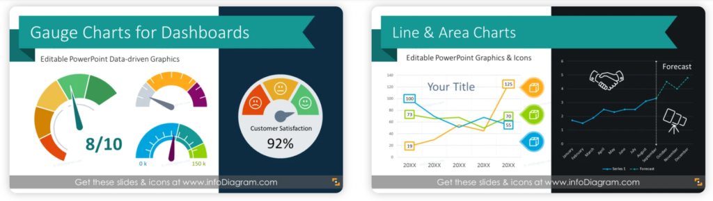
To make your presentation stand out from the others, avoid the default Excel look of data charts. Move your data visualizations to the next level. For example, show a success level by a customized gauge chart or use a line plot with illustrated categories.
The data visualization designs below are a part of our Data Chart PPT Infographics collection (see details by clicking the pictures). You can get a commercial version of that specific Pie chart designs here).
Using the predesigned template is a handy timesaver. However, with some little work, you can recreate similar charts also by yourself. Let our chart ppt transformation examples be an inspiration for you. Sometimes adding a simple shape or icon will do wonders :).
Whichever type of chart you need — pie, bar, line, or column — the goal is the same: make the data instantly readable. Your audience should understand the whole slide idea in under 5 seconds.
Six common data presentation cases
1. KPI charts: comparing several values on a slide
Presenting set of key performance indicators is quite common topic for business presentations. Such a slide should be clear and get full attention of your audience. Therefore it’s worth spending a bit more time crafting an interesting KPI data visualization.
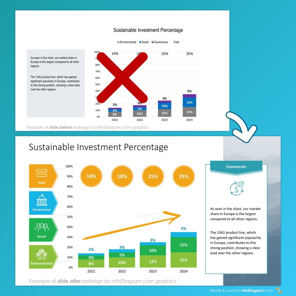
You can visualize only the data values as a text. Having a slide like the one below presents the key values clearly and gives you space to add more details under each KPI.
You can also visualize those KPI numbers with in a more creative way, e.g. using gauge chart:
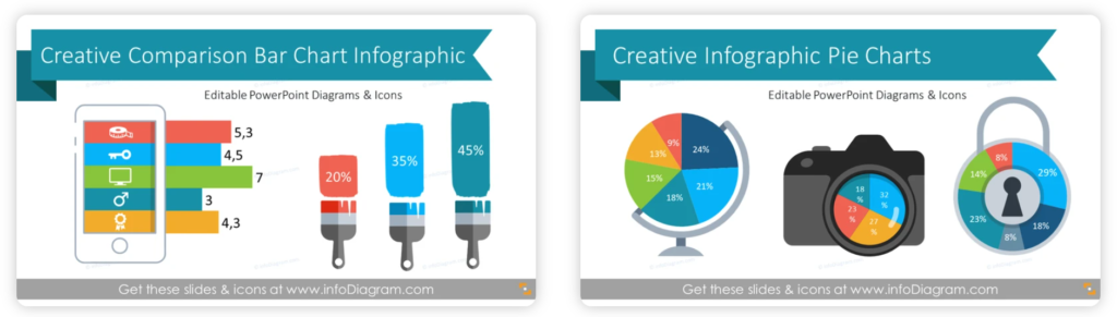
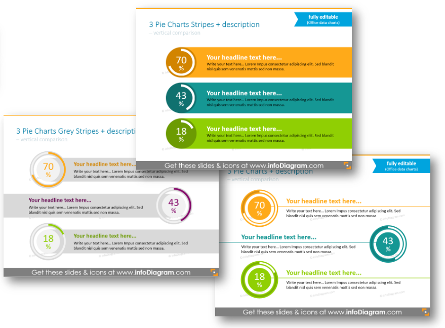
If you need to show percentages or compare several products or projects, then pie charts can be a good tool for that. You can place text on the white or colored background, or make charts bigger and eliminate the amount of description.
However, avoid using pie charts for presenting more categories in such a chart. If you have eight or ten data categories there, it will become less readable. In case of presenting KPI data – pie chart is OK, as there you usually present one category – usually a percentage level of reaching a goal.
See how you can transform a text values to a pie chart comparison presentation slide:
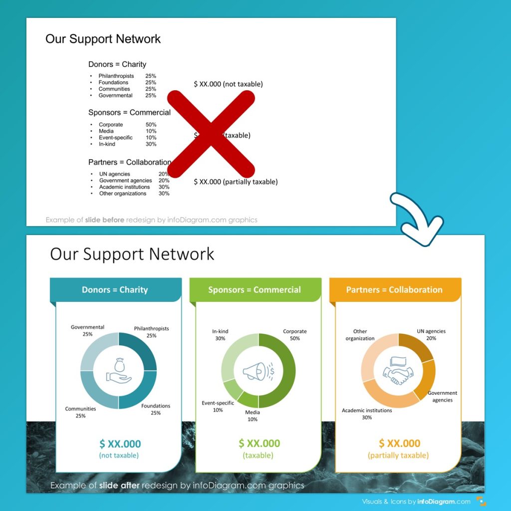
If you want to present similar pie chart comparison in more creative way, see our design examples below. Notice how adding a simple background shape improves the look of the data presented. Now it’s more the infographics than a standard MS Office chart, isn’t it?
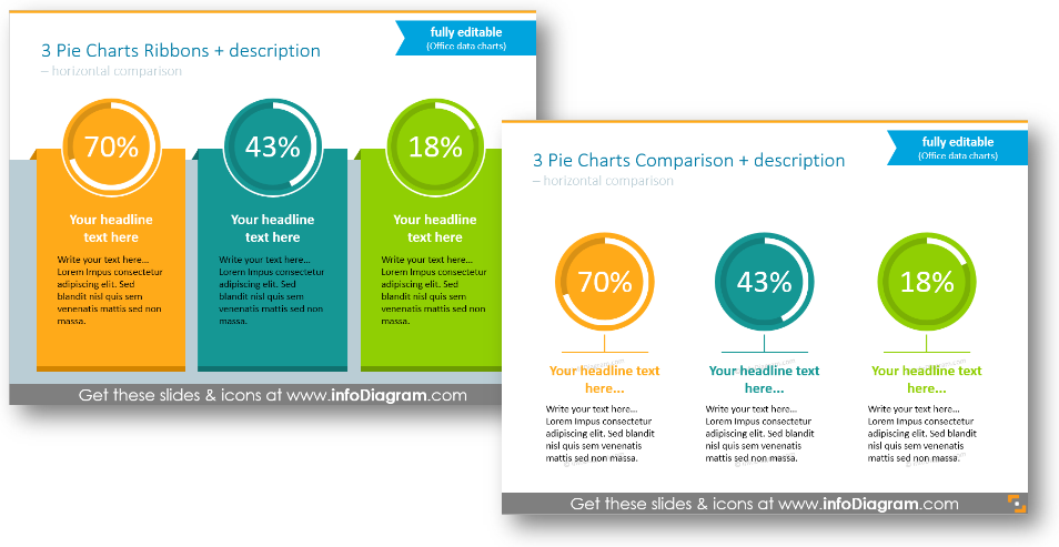
You can order charts horizontally by their values:
For more business performance data presentations, check our financial performance presentations webpage.
2. Enhancing data chart PPT with the illustrated data legend
For cases when you have to present numerical data in one chart, you can apply such legend illustration by adding category icons and adjusting the chart colors:
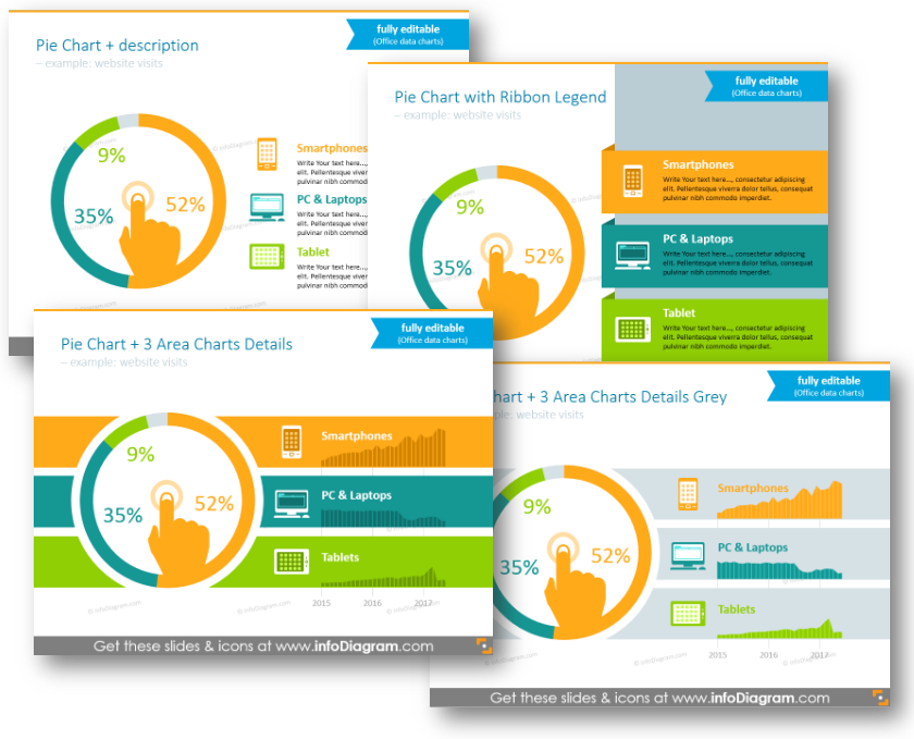
To dig into data details, you can place other line charts in the legend itself, which will look good in tandem with the main data.
Data Design Tip: don’t illustrate too many categories on one pie chart. Recommended number is up to 6, max 8 categories. If you have more, consider using bar char instead.
Another example of nicely illustrated data legent:
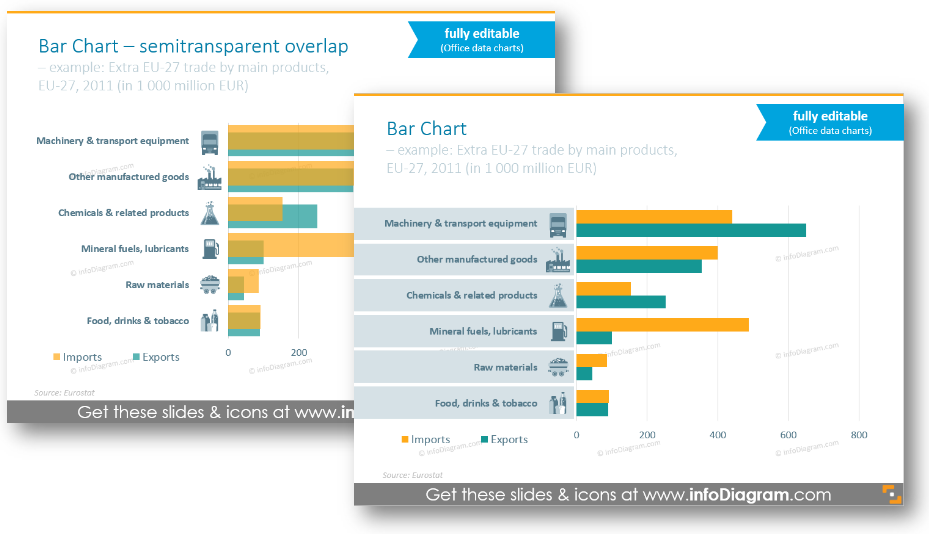
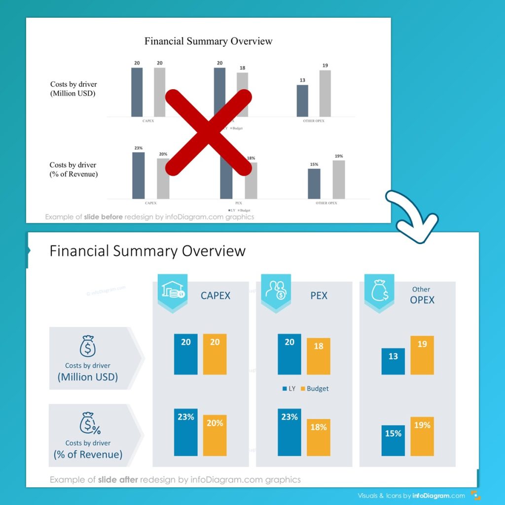
3. Bar charts graphical upgrade for presenting product categories
If you add to the standard bar chart a bit of design touch and flat icons, you can quickly improve its attractiveness, while still using data editable MS Office charts.
See below how we redesigned a bar chart for representing trade statistics – you can adjust chart colors and add illustrative icons for each data category.
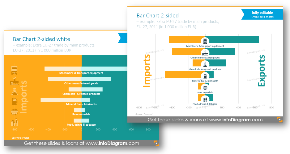
You can experiment a bit and use two-sided charts within slides (with a colorful background if you wish). This is a case when you need to compare two values for each category e.g. import and export of commodities, or male-female age distribution:
4. Line & area charts: showing trends over time
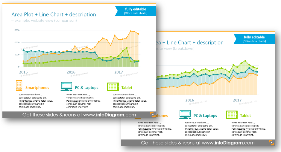
Is your slide about upcoming trends, progress, or performance over the last period? Then you’ll use a classical line or area graph. This can be also enhanced using a few design tricks:
- Make the line thicker, to be well readable also from a distance
- Avoid similar colors of a line chart
- For Area chart fill, choose a semitransparent color of a lighter shade than the data line.
Data visualization advice: For good readability, don’t put more than four categories in one line chart, it will be too crowded. Better create another line chart below with the same time axes but next data categories.
5. Column charts: comparing values across time
The alternative to a line plot is a column chart with the time variable on horizontal axes. We recommend using this vertical version of a bar chart when your data have more discrete values, for example, product sales, or number of employees.
See example of slide redesign that contained several column charts. Notice how a simplicity of design and layout can create an organized slide look:
The column charts are very universal, you can present clearly several categories in one chart. However, I would recommend not to overdo it. If you want to show more than 6 categories, better split this data visualization into several column charts. They can be placed on the same slide one under another – this way the reader will see data refer to the same timeline.
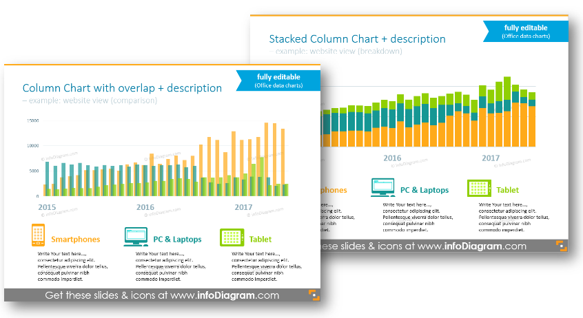
Readability advice: If you use a stacked chart, then use contrasting colors of data categories, so the border can be clearly visible.
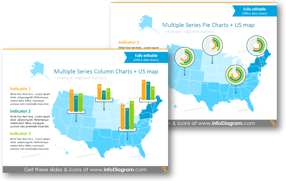
6. Presenting multiple microdata charts on geographical maps
The last example shows how you can present a location-based data chart. If you want to present some economic or demographical statistics related to a specific state or country, you can try this:
- create a simplified chart (remove the axis, and keep only essential data). Place them over a map
- create a copy of your simplified chart and edit its data. Then move this chart to the location it refers to.
This way you can rather quickly create a simple infographic while having all charts editable. See the example below showing charts placed on specific US states:
Whatever chart PPT type you choose, ensure it is readable and your audience can easily catch the main idea while looking at it.
Presenting information in such a visual way is much more engaging, than just writing numbers aside.
Check our video guide on how to redesign a pie chart step by step:
Further reading on data presentations
Still not sure what chart type to choose? Ask us for advice or get some inspiration by checking these resources:
- TED talk – The best stats you’ve ever seen by my data presentation guru Hans Rosling
- Article How to choose the right chart or graph for your data
- Evergreen book Say It With Charts: The Executive’s Guide to Visual Communication by
Downloadable resources: Data Chart PPT Slides Collection
All examples are from our PowerPoint Diagrams collection. It contains several types of data-driven charts, which can be easily edited and added to other presentations. Check its content here:
More data chart templates are available in our Creative Charts library, including financial reports, untypical bar, or pie charts.