How to Present Inventory and Stock Metrics in PowerPoint
Need to present the status of your inventory or your stock management performance data?
Get ideas on how you can create an eye-catching report highlighting stock levels, order fulfillment efficiency, or inventory control processes.
Typical inventory report will likely cover those areas:
- Stock levels and inventory aging analysis
- ABC inventory analysis
- Key inventory metrics such as Turnover Ratio, Days on Hand, Fill Rate etc.
- Inventory management strategies e.g. with stock reduction initiatives
Let us show you examples of how such presentation slides can look like.
Get all the graphics presented here – click on the slide pictures to see and download the source illustration. Check the full Inventory Metrics Analysis and Stock Management Presentation (PowerPoint Template)
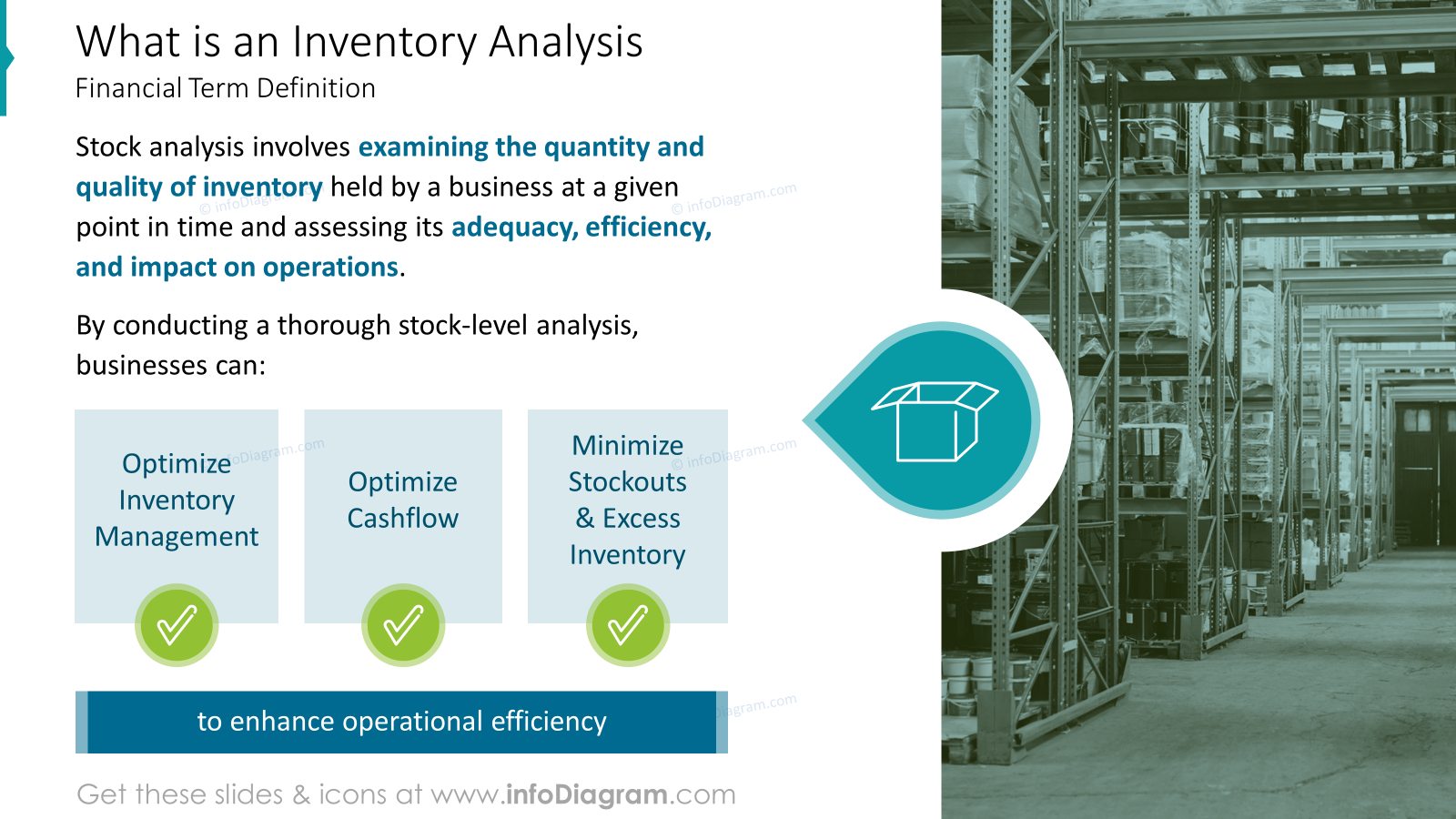
Reminding what is an inventory analysis
Depending on your audience, if at your meeting you have people new to stock-related terms, you may want to explain quickly what inventory analysis is about on one slide. It can be done more attractively than just writing plain text:
Inventory analysis involves examining the quantity and quality of inventory held by a business at a given point in time and assessing its adequacy, efficiency, and impact on operations.
By conducting a thorough stock-level analysis, businesses can: optimize inventory management, optimize cashflow, minimize stockouts & excess inventory
You can illustrate it through a simple diagram, showing what stock-level analysis can help with. This way you are changing blocks of text into something easy to digest and understand.
See on slide below how you can replace a list of items by simple list diagram made of shapes.
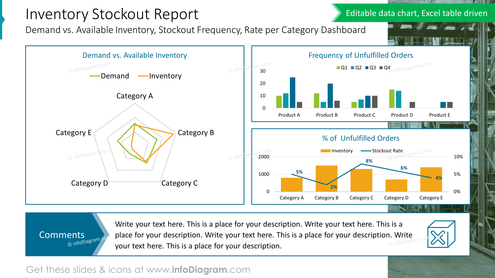
Presenting Inventory Stockout Report
When you need to compare in your report Demand vs. Available Inventory or analyze a Stockout frequency you can use a dashboard layout based on grid. This kind of layout can help you to present in a readable and clean way, which is easy to understand for your audience.
Have a look at our slide example presenting inventory stockout data. We used here frames that separate topics and give a structure. Adding a commentary field at the bottom gives a place for explaining charts and writing your insights, especially when you are going to export file to PDF and send it by email.
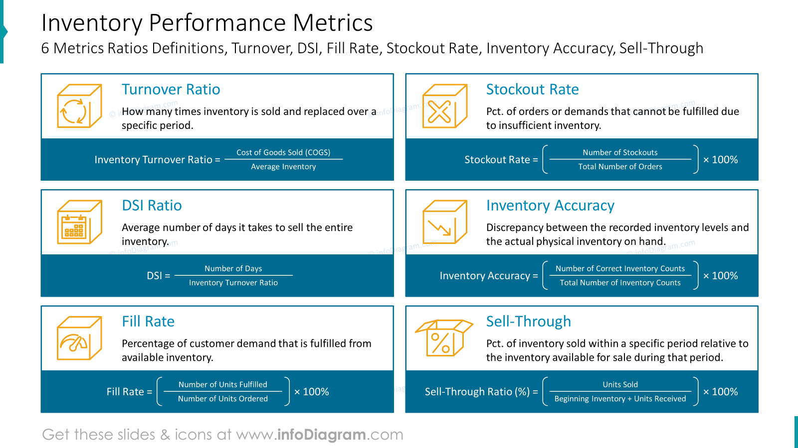
Defining Performance metrics of Inventory management
If you need to explain inventory performance metrics to people who are not familiar with all those terms, use a slide to remind them of metrics formulas used often in context of stock management:
- Turnover ratio – number of times inventory is sold and replaced
- DSI ratio – average number of days it takes to sell the entire inventory
- Fill rate – ratio of customer demands that is fulfilled from available inventory
- Stockout rate – orders that can not be fulfilled because of insufficient inventory
- Inventory accuracy – discrepancy between recorded inventory and actual physical inventory on hand
- Sell-through ratio – inventory units sold relative to inventory available for sale at certain periods of time
When presenting inventory analysis formulas you can show each metric in a form of a brief explanation and formula placed on a distinctive background (as most important here). Adding a visual metaphor in the form of an icon will help in faster understanding the topic.
Presenting inventory analysis formulas can look like this:
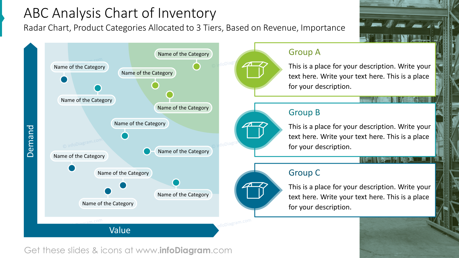
Show ABC Analysis chart of inventory
You can use such a custom radar chart to show product categories allocated in several tiers, e.g. based on revenue and importance category. This way you can visually show the placement of categories depending on Demand and Value. Having such radar charts as PowerPoint vector graphics gives you flexibility to adapt – adding colors from lighter to darker puts an accent to the most important categories.
Notice the customized legend on the right side with a description of groups. You can add here more text description than in a regular legend. There is a separate color for each group to easier distinguish specific groups. Using icons also adds more visual impact to such presentation slide.
Finish the presentation with stock reduction initiatives and an inventory management strategy
At the end of your presentation show the next steps to take. You presented stock status and now it is a good time to define actions to be done and further strategy.
To present such a plan in a structured way, put your actions inside a table, where you explain objectives, action plan, and desired results. Don’t forget to define a responsible person.
Here’s an example of a PowerPoint slide presenting stock reduction actions:
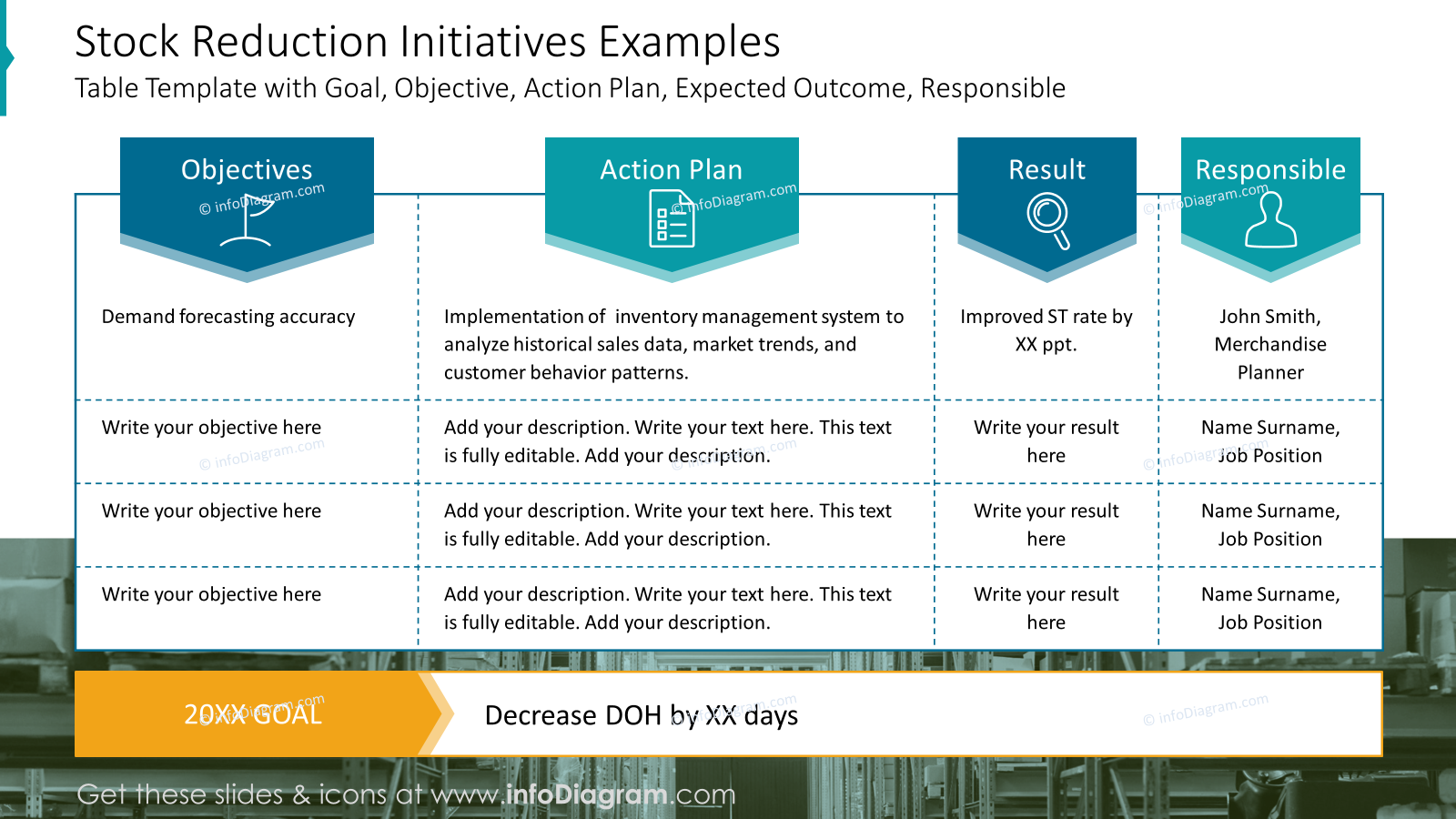
Notice how having a custom designed table headers makes table look much more interesting. We placed headers on color arrows pointing to specific columns. It adds focus and sets a starting point for readers. We also added icons to add a visual connection to header texts.
If you want to show also strategy for future inventory management, you can visualize it with a table like this example:
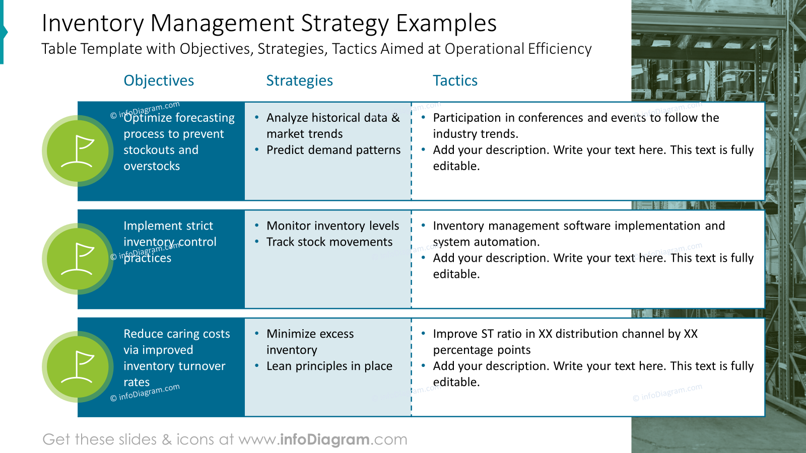
Here we created a table to show Objectives, Strategies, and Tactics for operational efficiency.
The first column is highlighted as it is the most important part, the next columns are in lighter shades to express the order of reading and show the flow. Each objective is supported by an icon, so it grabs attention even more.
What to Remember to present inventory in visually attractive way
If you want to present inventory and stock metrics in a way that will resonate with your audience, apply a few design advices that will help you to create a professionally looking presentation:
- Keep the layout simple and clean.
- Use a highlight color to emphasize key points and headlines.
- Work with grids to add structure to your slides, especially when creating a dashboard slide with multiple data charts.
- Adjust and customize tables and data charts for clear structure and readability.
- Enrich your data with icons – properly chosen icons can nicely reflect the meaning of your content.
- Consider using a custom design legends in data charts when you want to explain what data categories are about. This will support a visual storytelling of your data.
I hope with those ideas you will be able to make an impactful presentation.
Resources for Inventory Presentations
The slide examples above are from one of our financial PowerPoint templates. The full presentation is available in the infoDiagram collection of PPT graphics:
If you present more of financial reporting topics, you can extend your data presentation with other financial PPT templates. Or try a free sample of financial charts.