7 Sections for Effective Presentation Training Slides
Are you delivering a public speaking or presentation skills training? Find some inspiration for your slides here.
Explore our Business Performance PPT Reports category on the website for more resources to boost your presentation impact.
In this article I suggest how you can prepare engaging PowerPoint visuals covering presentation training topics, specifically:
- How to illustrate presentation structure and content types on a slide
- Visualizing speaker and listener types
- Presenting various meeting room setups
- How to show hints for preparing speech and presentation itself
- Closing the presentation training with a recap and summary slide
Whether you are a professional communication trainer or a beginner, I believe you can find some handy examples.
Note: All slide examples are from the Presentation Skills Training PPT Toolbox. Click the pictures to see details.
We’re talking a lot here about presentation content, right visualizations, showing concepts… Let’s get back tot he roots and recall the very basics of high-quality presentation and how it should look like.
Words are the most powerful drug used by mankind.
Rudyard Kipling
Rudyard Kipling was right that words are a very powerful tool, however, if used and delivered effectively. Let’s break down some theories into short sections.
#1: Illustrating Presentation Structure by Drawing
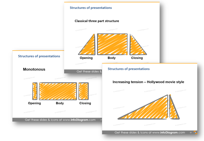
In my presentation experience, I see usually those 3 most popular kinds of structures: classical 3-part, monotonous and ‘Hollywood-movie’ style. When you explain such structures, I suggest you draw a simple diagram like the one above. Either on a flipchart or if you want to have materials prepared before, then make a slide with those speech flow diagrams.
You can either show them all together on one slide for comparison or put each on a separate slide. This way you will get attention and focus on one presentation type at a time.
For discovering more tips for structuring presentations I recommend checking Nancy Duarte’s blog series: Structure Your Presentation Like a Story and her book Resonate.
4MAT – My Favorite Presentation Structure
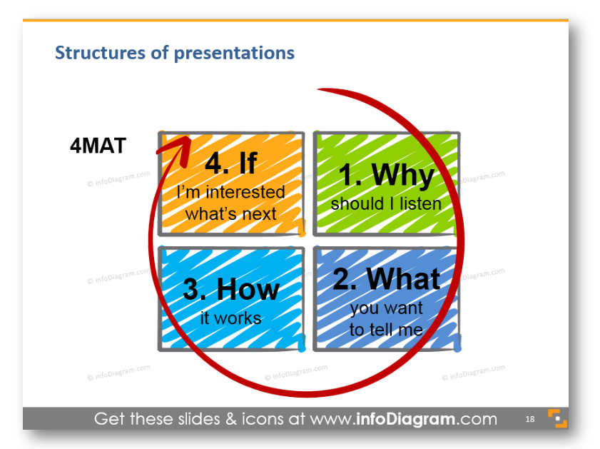
Out of various speech structures, I like the most the 4MAT concept. It is pretty simple and works for me.
I suggest that when you create a presentation, ask yourself those four questions. Those are questions listeners have in their heads when they listen to you.
Using the 4MAT framework helps me to see things from the viewpoint of my audience and be sure listeners will get their ideas right.
#2: Explore Presentations by Content
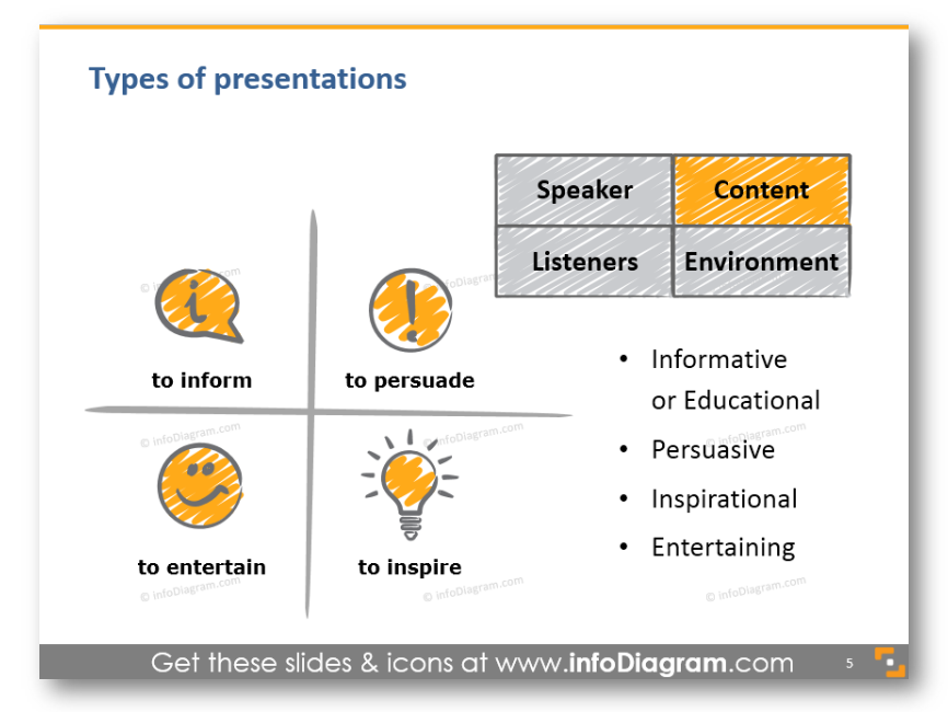
It’s obvious the presentation content defines the presentation type. However, it’s good to remind yourself what’s the goal of the presentation – to inspire or to entertain only? Do you want to persuade your audience of your idea or only to inform, to give a report?
Some examples:
- For inspiring presentations: Talks on TED.com are the best examples. Or check one of Elon Musk’s speeches on the Mars Mission. Politicians use this presentation to type a lot
- Informative presentations are usually used when you do a project summary report or yearly business review. Unfortunately, lots of school lectures fall into this category, even though the teachers should work on moving towards an inspiring segment with a bit of entertainment to keep kids attention.
- For persuasive presentations just think of the last sales or marketing presentation you experienced.
- For entertainment – check out any stand-up comedy talks, for example, this (being a father I really appreciate that later talk).
- A mixture of entertainment and information is e.g. famous John Oliver show
You have to make sure that your speech is relevant to the audience you’re speaking to.
#3: Analyze the Speaker Types
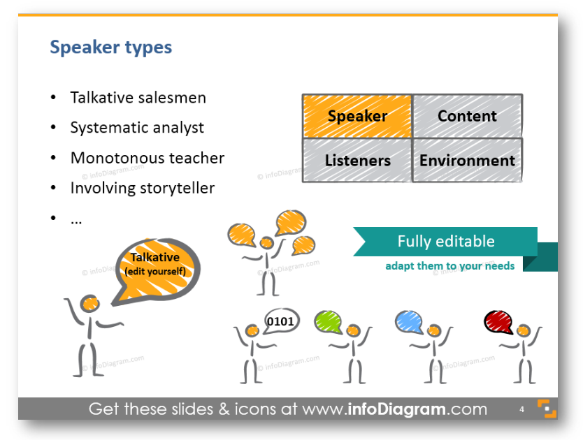
When teaching about properly preparing a talk, you need to consider also different speaker types classification. I put here four kinds of presenters: a typical talkative salesman style, an analyst type who likes to go into details (sometimes too much), a monotonous teacher style (that would need a point of wake up) and an involving storyteller. However, you can think of other examples based on your experience.
Depending on the particular speaker type, you can use its strong sides to build the presentation differently and also support it with proper visuals. For instance, for a talkative salesman, the agenda slides can provide a structure to follow. On the other hand, a too much detailed analyst on lengthy teacher talk can benefit from having a strong visual section slides that will wake up your audience.
#4: Analyze the Listener Groups
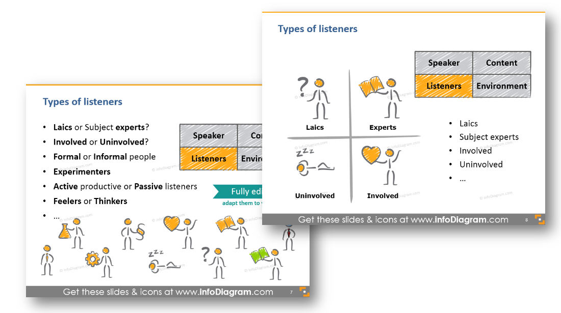
Knowing the speaker type is one thing. However, even more, important is to examine the audience carefully to reach them best.
Every presenter should ask first “Who are my listeners”? Do they prefer a formal or informal way of communication? Are they feelers or thinkers (see MBTI types of personality)? Will the audience be active or rather passive during the talk?
When doing a presentation training, you should address this key question. And what is the better way than to illustrate it e.g. by a set of icons?
In my slides, I added there also a hand drawn chart where you can position the major listeners’ types. Then you can place and move around the central circle to show various audience cases on a knowledge and involvement scale.
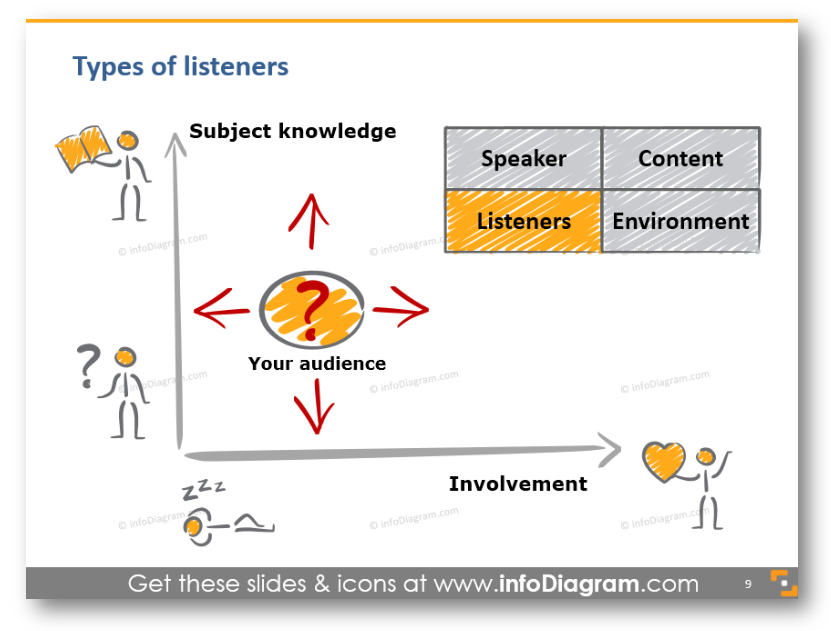
In a training, you can include a similar chart (or apply those presentation training diagram slides) for determining the audience type.
#5: Room set up – the importance of the presentation environment
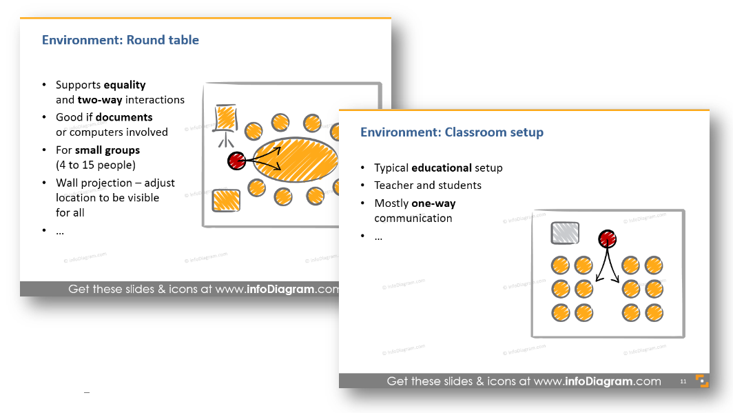
After talking about the presentation audience and speaker types, a good presenter should think also about the place where the talk will take place. Choosing a suitable environment is an important factor for the effective delivery of the speech.
I distinguish here five common kinds of room setups: classroom, multiple groups environment, interactive roundtable, big theater and sitting in a circle. Each one suits a different purpose. Some of these you need to arrange before, of course, you will know if you speak at a big conference that there will likely be a theater-like room. However, sometimes even a small change of sitting arrangements can provide a totally different atmosphere for a speech.
Some examples:
- Classroom setup assumes rather one-directional communication from teacher to students.
- Roundtable or sitting in a circle encourages discussion and underlines equality of all participants.
- Having clusters of multiple groups is great if you want to have several teams working on some group work.
#6: Presenting Hints for Speech Preparation
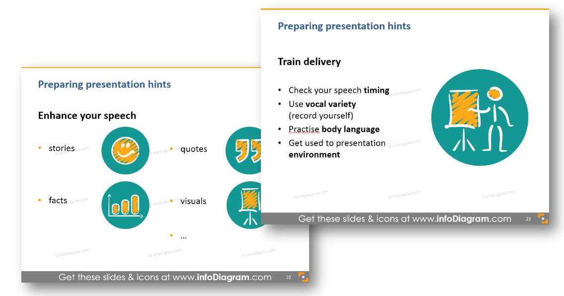
If you want to add a list of things to remember before making a presentation, I suggest you try to illustrate each point with some image, as I did above. This creates a better mnemonic association for each point and people will remember the hints longer. Even better, replace the bullet points with a vivid diagram along with keeping the icons.
#7: Presenting Summary of the Training
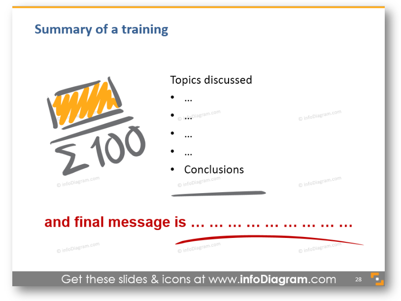
At the end of the training, remember to repeat the main message once again. Present the main conclusion, and give your audience something to think about. You can write it down on a slide clearly, without too many distractions. Or write it by hand on a board or flipchart.
Resources for Presentation Training
Besides the links I shared above I recommend those further reading and resources
- Toastmasters International public speaking clubs all over the world
- Books: Slide:ology Nancy Duarte and Presentation Zen by Garr Reynolds
- Our PowerPoint Training templates for various soft-skills training, see details below.
- Blog articles about other types of training materials:
So if you’re having training on how to create and deliver a presentation, you can reuse slides from our collection in your projects. Or just get inspiration from my slides and create them yourself.
If you decide to go for our hand-drawn style diagrams, you will be able to easily edit all content, adapt the colors to your brand, and add the whole slides or particular charts to your training presentation.
For more inspiration, subscribe to our YouTube channel:
Graphics resource: Presentation skills training toolbox
You can also check the presentation template we’ve designed with illustrations of types of speakers or presentation structures:
If you like such scribble style, see the complete All Scribble Symbols Bundle, with over 250 handwritten hand-drawn symbols and shapes.
About the author:
Peter Zvirinsky is a slide design trainer and the founder of infoDiagram. He is helping presenters, trainers and various business managers to communicate their ideas in clear visual way usually in form of PowerPoint slides. Peter loves changing text information into simple diagrams and he wants to inspire also others to use this visualization process in everyday life. Reach out to Peter on LinkedIn or via his slide design & training website.


