7 Creative Alternatives to Bullet Points in Presentations [2026]
Stop boring your audience with bullet points. Here are 7 proven alternatives - icons, diagrams, timelines, and more - to make your PowerPoint lists stand out.
Do you use bullet point lists often in your presentations? I bet the answer is yes. We use bullet-points in presenting company history, project plans, ToDo lists, priority checklists, agendas, principles, and lots of others. They are fast to create but let’s make them look more creative. Go a little bit further than creating default SmartArt diagrams, and explore innovative list presentation ideas.
Here are a few fresh alternatives you can use to replace default bullet point enumerations in your presentations and make your notes more structured.
Editable PowerPoint graphic for bullet-points replacement is available in this Universal Diagrams Collection PPT Slide-Deck.
I believe you are tired of bullet points and simple lists as same as I do, so why don’t put a touch of originality to our slides? That way it is possible to create more attractive designs and, of course, impress your audience.
Here are several approaches you can use instead of bullet point enumerations:
- represent list by graphical metaphor, for example, a lighthouse graphics: when you need to illustrate strategy direction, leadership, or vision concepts. Or use a puzzle shape if your list should express points that create a strongly connected idea.
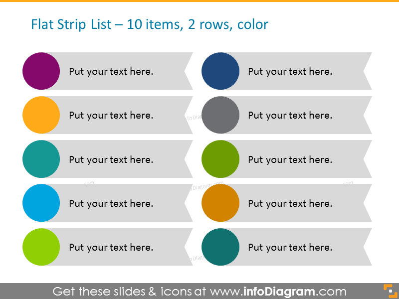
- replace bullets with a set of shapes with text inside e.g. arrows, circles, hexagons or rectangles. Using standard PowerPoint shapes is enough.
- use iconography to illustrate points, assigning a theme-related icon for a specific item.
Let’s explore several slide examples below.
7 Creative Ways of Illustrating a List
The general idea is to replace each item in bullet points with a visually more attractive design element. Below you’ll find several options of shapes you can consider. I suggest using shape types and colors that fit the most your brand or the graphical style you use in your business materials (every shape and symbol from our collection is editable).
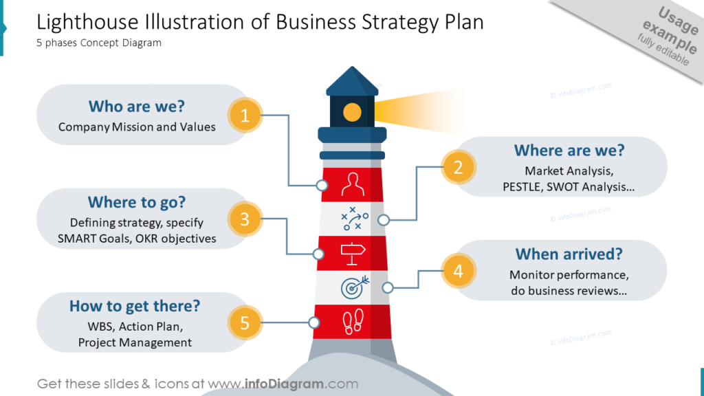
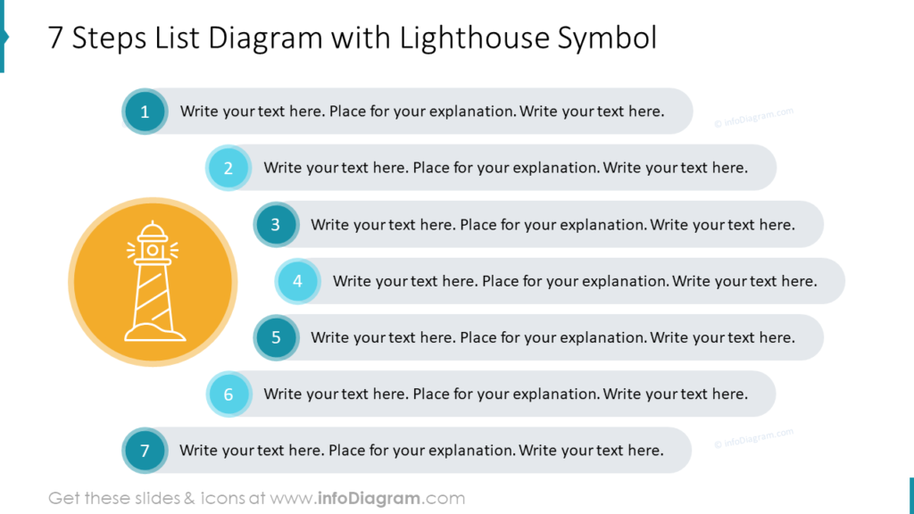
1. Use illustration metaphor
You can build a list around some illustration that is composed of certain elements, for example a jigsaw puzzle, set of bricks or stairs. Ideally if an illustration is related to your presentation topic.
A graphic can be used as a central element with list items around it (in our case it is a lighthouse slide below), or as a side element, or you can write item names inside the illustration, if the text is short.
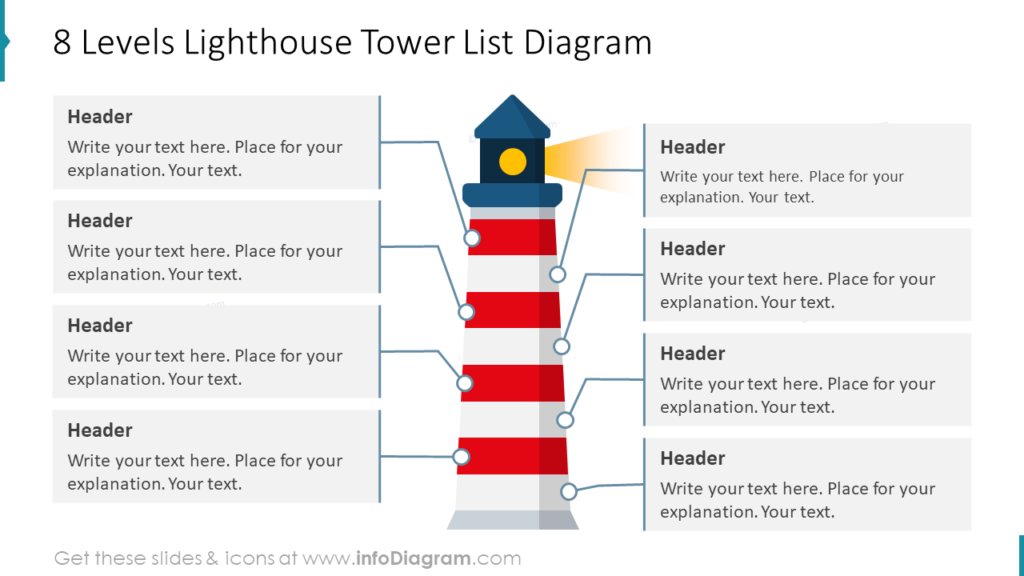
The lighthouse metaphor is also useful when you want to illustrate strategy direction, leadership, or vision concepts in an attractive way. Here are more examples of using these graphics:
You can explore the full collection of lighthouse infographics here:
2. List inside a shape – Dynamic Arrows Style
One idea is to replace bullet points with a series of arrows. You can use one color or several ones for each item. These arrow-shaped lists are good for expressing dynamic style. They quickly grab attention to a certain point:
You can apply your brand colors to the lists, as the arrows are PowerPoint editable shapes. Additionally, you can enrich the main points by adding a symbol for each item. Download the collection here:
If you are looking for concept visualization ideas, check this article: One Picture to Rule Them All – Concept Visualization List.
Here’s an example of a project plan checklist, illustrated with icons:
It’s quite a dense list so with help of the icons you can visualize your content better. Symbols make it easier to read and remember.
3. Key Components List Inside Hexagon Shapes
Lists with an odd number of points are a bit more problematic to create because they are harder to spread out symmetrically on the slide. Think about some shapes in which you can type the text and distribute it so that it forms an attractive whole (such as the shape of a honeycomb). If the points do not have a lot of content, you can additionally enrich them with icons. Here’s an example of such a list:
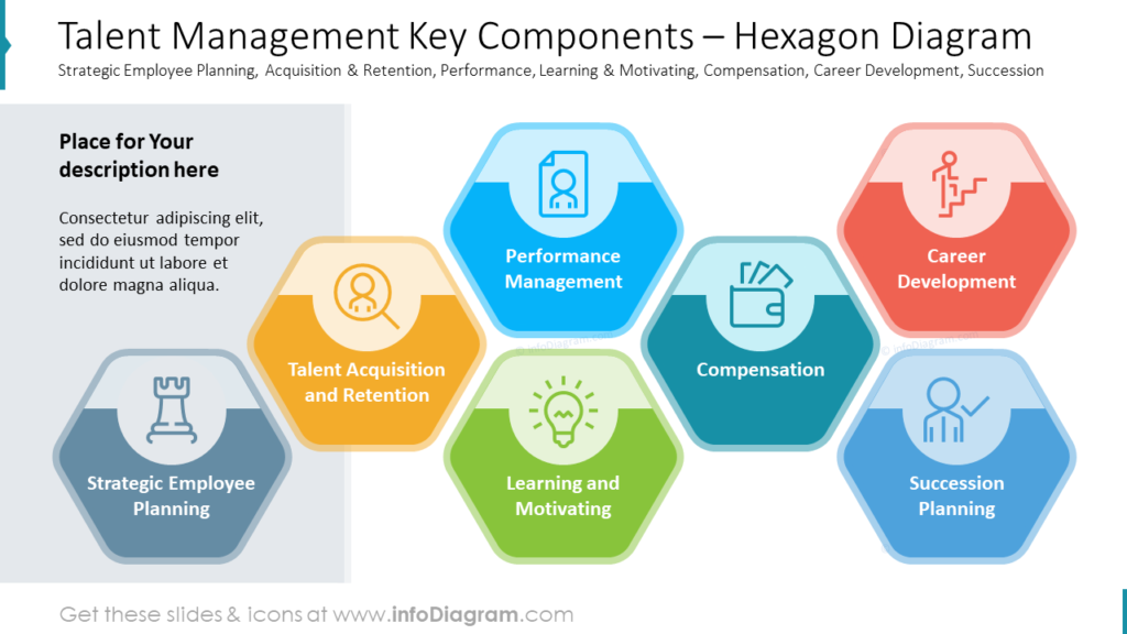
This slide example is part of the HR Talent Management presentation deck.
4. List with Numerous Strongly Related Points
When you need to present more points on the list, you can try the wheel layout. The individual elements of the list are distributed evenly around some circular element, in the following case it is a diagram consisting of three puzzles.
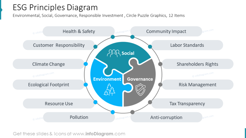
You can see more templates to illustrate actions against climate change here.
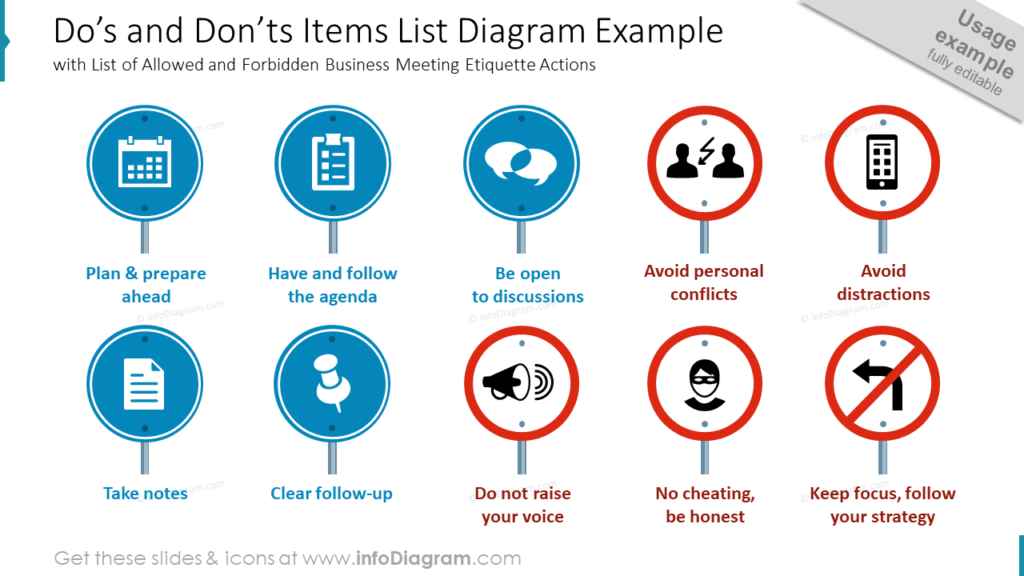
5. Road Signs as Bullets
Road signs are assigned to each point and affixed with the corresponding icon on the slides below. We chose the graphics of the road sign because we are talking about the rules of the workplace in this example and this visualization seems to be an interesting metaphor here. It’s good practice to find a metaphor for the content and visualize it graphically.
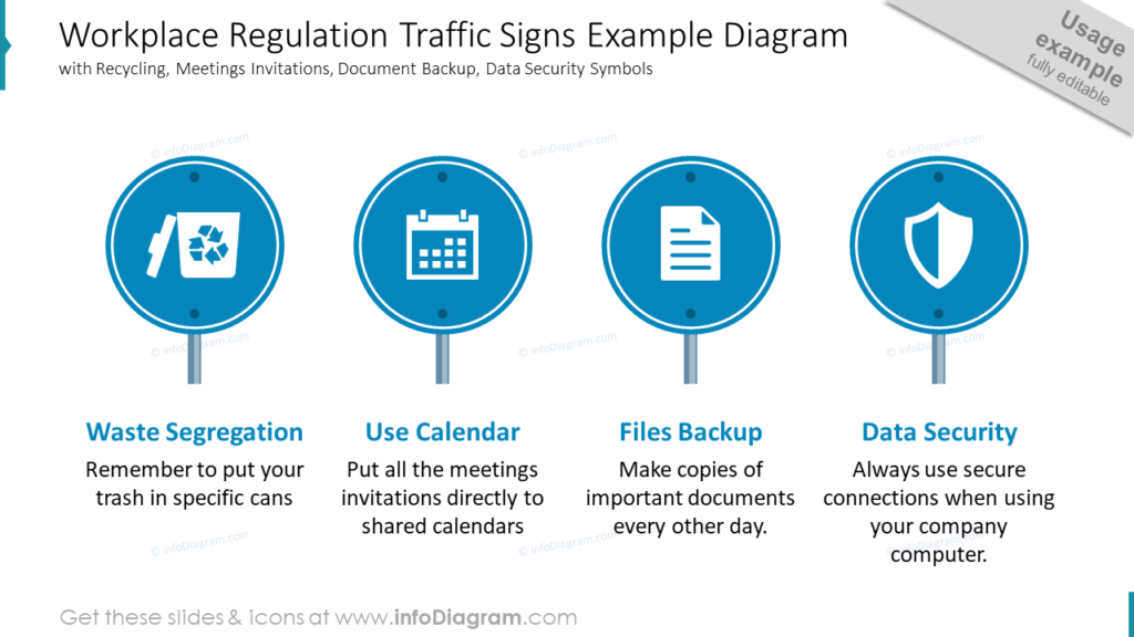
How to create such a sign? If you take a good look, you will see that it consists of the simple shapes that are in PowerPoint (circle and rectangle, seriously, there are no simpler shapes 😉 ) just fold them properly and you’re done.
See more slides from the road signs infographics deck here:
6. Circle Strip Lists for Smooth, Perfection Style
Okay, but what if we will get through pretty standard arrows to something more original but at the same time professional-looking? Our designers were experimenting a lot and here’s the result:
Looks more attractive than a standard bullet-point list, doesn’t it? 🙂 Such circles don’t steal attention from the content and add a modern touch to the slide.
Replace default bullet points in your agenda with colorful or mono-color lists with circles aside, see the full deck here. These rounded shapes can be used to represent values of something stable, friendly, something ideally shaped, and perfect.
7. Teardrop Shapes List Presentation Ideas to Combine Dynamics and Perfection
“Okay, – you would say, – but if I want to use arrows, but also like the idea of ideal round shapes?” Then I have to advise you on teardrops – a combination of arrows and circles together. This is a really good way to design eye-catchy slides without special knowledge and effort:
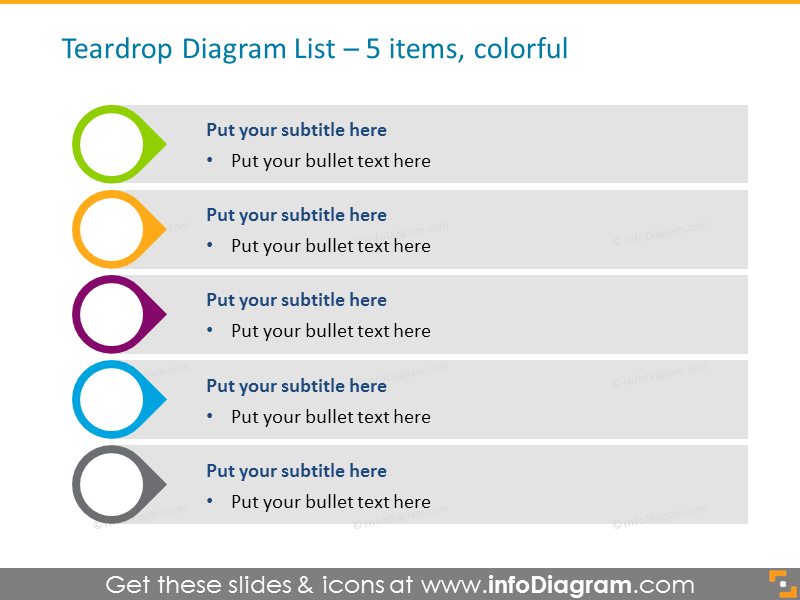
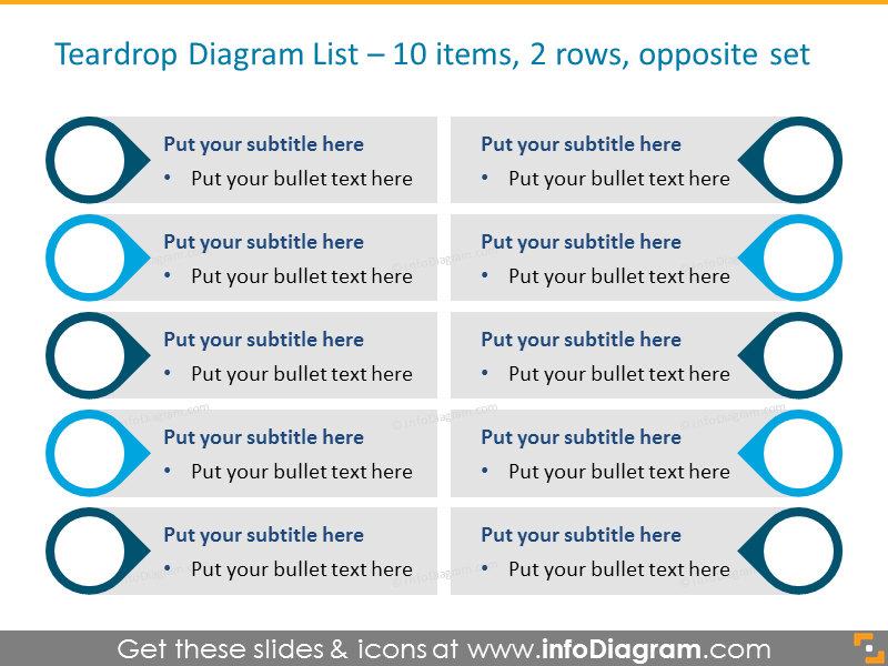
You can use teardrop lists for your investor pitches, market research reports, HR, strategy, and planning presentations.
Apply list diagrams for comparisons or longer agendas, and place as many items as you need. Check the teardrop lists set here.
Attractive lists can greatly refresh the overall slides’ look. A collection of design ideas by hand will help you create highly visual and elegant presentation content, and support your storyline – read more in my another article how to tell a business story with slides.
More Creative Design Ideas
If you search for more ideas, here are some interesting articles you can check:
- 4 Steps for Good-looking Tables in a Presentation
- 6 bullet points ideas by Connie Malamed
- Simplify Complex Presentation in Three Steps article
- 6 Creative Alternatives for Pie Charts in PowerPoint
Stay updated
Get new presentation ideas and updates sent directly to you! Plus, if you sign up for our newsletter now, you’ll receive a Creative slide design guide at no cost, as well as hand-drawn shapes you can start using right now.


