Presenting Comparisons with Creative PowerPoint Tables
Comparing complex product features or purchasing decision alternatives can be challenging, especially when each product has several technical features you need to consider. Whether you need to compare solution categories or compare specific product versions – comparison table diagrams are there to help.
Elevate your business performance presentations with our curated resources – visit our financial performance PPT reports webpage.
Tables provide you with an easy-to-interpret, visually appealing, structured, and creative way to run a comparison analysis. You can add detailed descriptions to the tables to provide more in-depth descriptions and reasons behind your decisions.
5 ways to use comparison table
Here are a few examples of how you can use comparison tables in a creative visual way.
1. Enhancing table design with colors and symbols
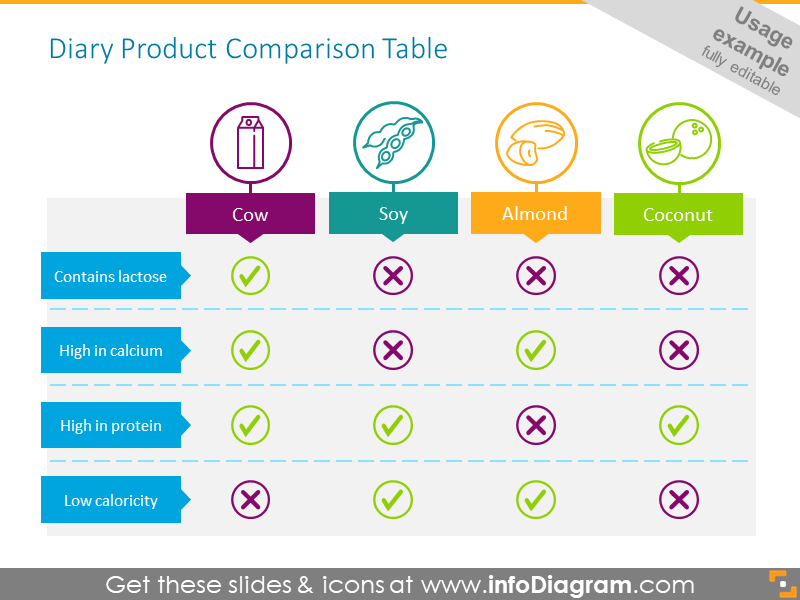
Use icons and colors to compare similarities, differences, strengths, and weaknesses.
In this example, you can see dairy being compared with other alternatives like soy, almond, and coconut milk. The green checks and purple x’s make a visually engaging, effective expression of the difference between the alternatives.
2. Comparing features and pricing
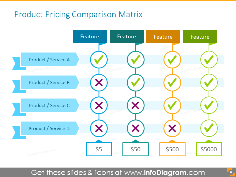
By adding pricing information, you can easily create a pricing comparison matrix. By shifting the color scheme or adding different accents you can easily highlight the preferred or most popular package.
3. Highlighting one column using a comparison table
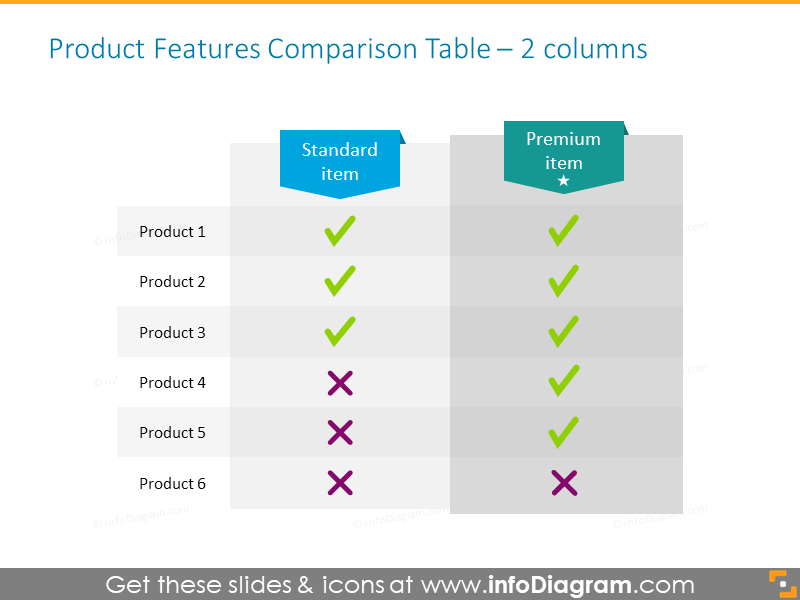
Use a modern-looking 2-column comparison table to highlight differences between packages. Show your sales staff or even potential clients the benefits of your premium offering over the standard plan. This can be modified to add additional packages or offerings by adding additional columns.
4. Showing preferred solution
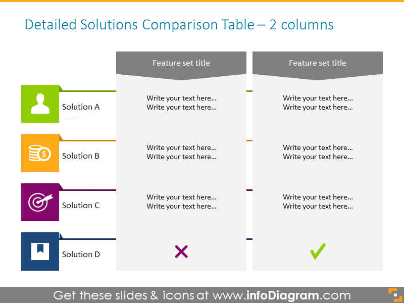
Comparison tables can also be beneficial when planning detailed solutions. Although checkmarks and x’s are highly effective ways to convey simple information, you may use text to provide more nuances and details.
5. Presenting several options with details
Use the comparative analysis template to compare several items using text. By putting the different features on the table you can paint a fuller picture for your audience.
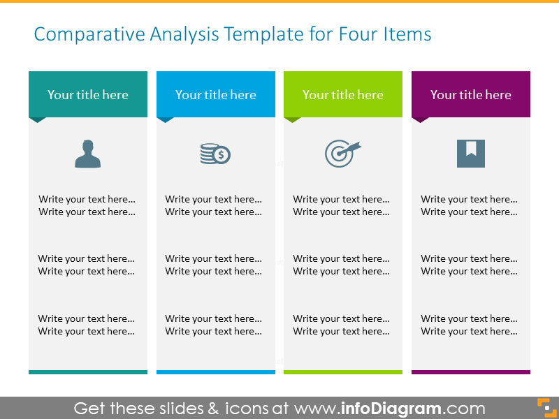
Supplemental icons that represent the product, category, or other details can help personalize the imagery. When you then customize your color scheme to match your brand the visuals are more powerful.
This icon set also allows you to change the outline thickness and color scheme. This will allow you to use them on dark backgrounds. The flexibility of this graphic set also allows you to print your slides to create handouts – all you need to do is use a light background!
Check our video guide on how to redesign comparison tables step by step:
Resource: Creative Comparison Table Slides Collection
To help you with your comparison presentations we have created a creative comparison tables template icon set. These PowerPoint graphics can also be modified to suit your data and comparison needs.
The comparison tables template set contains 19 tables with various numbers of columns and rows. The tables are illustrated by icons, and you can add or remove items if needed. If you need to print resources from your presentation data, you may do so easily with light table graphics. The set also includes 22 vector icons to represent different categories and industries.
If you find the above examples useful or had other ideas for the icons, you can download the full set here.
You can also look at the modern Flat Infographic Templates Ultimate Bundle for more presentation graphic variety.


