How to Use PowerPoint to Make Creative SWOT Analysis Diagrams
Could you benefit from attractive SWOT Analysis Diagrams? Designing creative SWOT analysis diagrams doesn’t have to be difficult.
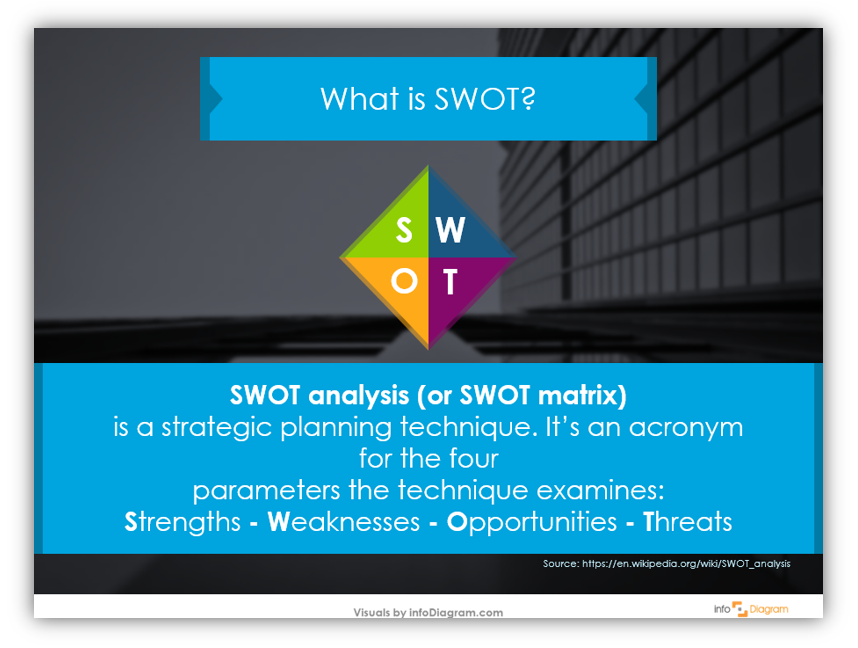
SWOT is a strategic planning technique. SWOT itself is an acronym for the four parameters examined by the analysis. They are Strengths, Weaknesses, Opportunities and Threats – SWOT. SWOT analysis is sometimes referred to as a SWOT matrix. Having creative, attractive SWOT diagrams will help keep your audience interested and engaged by your presentation. It will also make your presentation easier to follow. The goal is to explain your material in a way that is easy to follow and can be retained. Why wouldn’t you also choose a display that looks professional and can be customized?
Click here to see the SWOT analysis template diagrams set.
Why make attractive SWOT analysis diagrams
Attractive and clear visuals look more professional and are less distracting for the audience. Unfortunately, many of us don’t have the time to create our own complex images. Beyond lacking the time, we might not have the energy, resources, or skills to create attractive diagrams. Are you a Photoshop Pro? If not, you’re not alone.
What if you could create visually stunning diagrams in PowerPoint? With pre-made diagram sets, you can! Create stunning, customized graphics with PowerPoint. By changing the colors, size of the icons, and adding supplemental information you can have a completely unique presentation without extensive graphic design experience.
In this blog, we’ll share how to create a creative SWOT Analysis Diagram in PowerPoint:
- learn why creative SWOT analyses are better than plain old tables
- learn why PowerPoint is the easy design choice
Why create boring slides? Having a slide with a white background with a bullet point list is not engaging. It’s boring just writing about it. Why wouldn’t you create slides like this, instead?
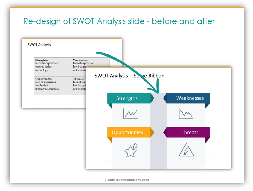
Want to make great SWOT analyses slides like the one above? Let’s get started.
Replace bullet-points with text in shapes
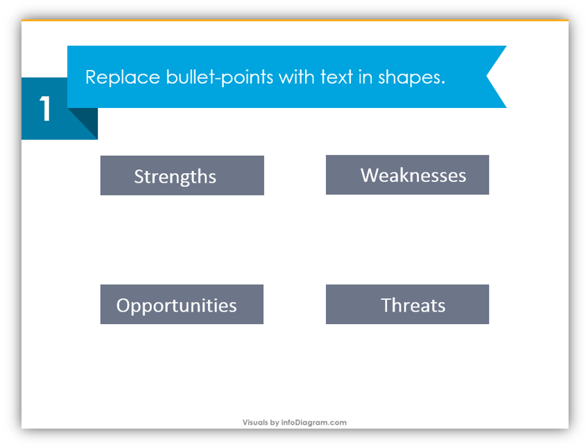
Using label icons and incorporating color will liven up a dense presentation. Which of the above presentations looks the most professional? Which one would hold your attention? It can be difficult to maintain audience focus and attention. It is especially difficult when the tables are basic and lifeless. Jazz yours up by customizing the tables.
Add a darker stripe in the middle, then add details
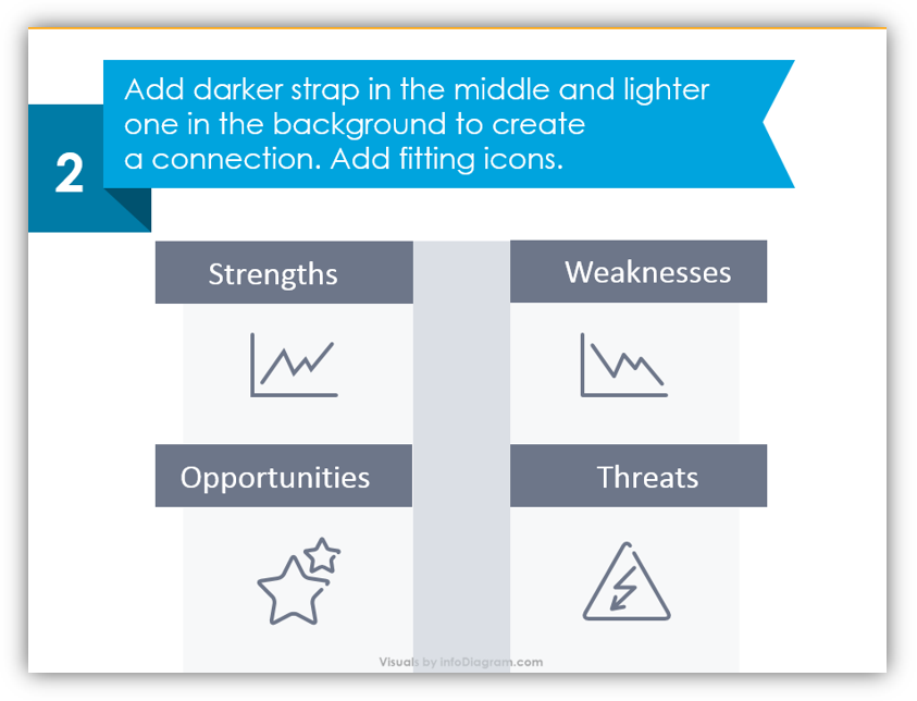
By adding lighter stripes in the background you make a connection. That way the different parts of the imagery look as though they’re connected. The next step should be adding relevant icons. In the example, Strengths are conveyed with a line chart that is increasing. Weaknesses are indicated with a line chart that’s decreasing. Opportunities, a positive, are expressed with stars. Threats, on the other hand, are symbolized with a warning sign. You can modify the icons to something appropriate for your industry, business, or situation.
Add decorative triangles and modify the colors
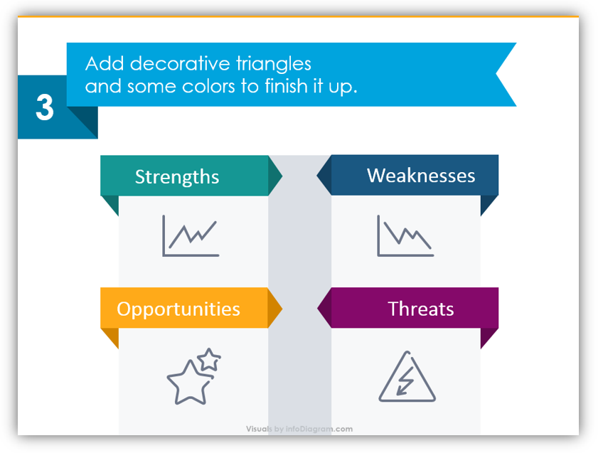
By adding some simple triangles, the simple rectangular labels turn into obvious banners and labels. The colors can be changed to match your brand. They could also be customized to match the rest of your presentation. The important thing is that they’re legible and eye-catching. You want them to attract your audience and hold their attention.
Not sure what colors to use? Try Symbolism
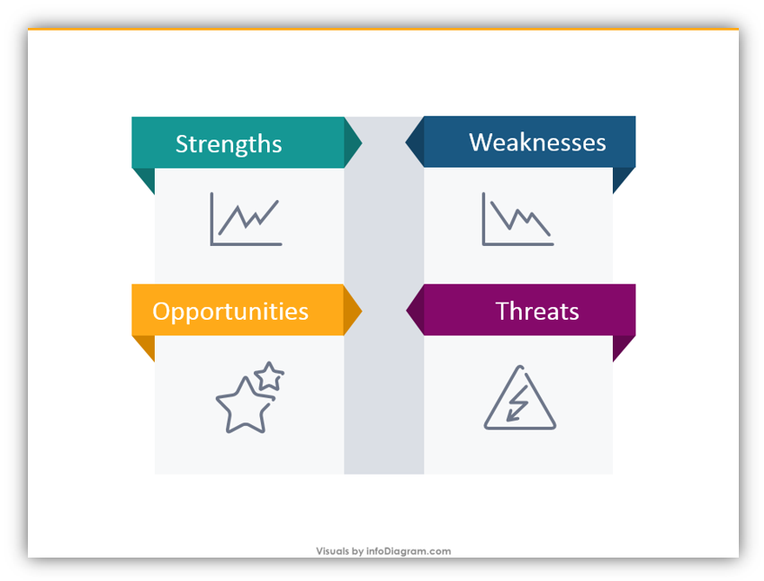
In our example, we chose a greenish color to represent Strengths. This is because green and green-ish colors are associated with ambition. Green is also related to good judgment. We chose blue to represent Weaknesses because blue is a calming color. Historically it has been associated with melancholy and sadness. Yellow was an obvious choice for Opportunities because yellow has been shown to boost enthusiasm. It is positively correlated with confidence and optimism – all things that make sense when discussing Opportunities. For Threats, we chose to use violet because it’s a strong, striking color. It can signal caution and warning but isn’t as aggressive as red.
Get inspired! You can make your own designs using these methods. Get even more creative. Compare internal and external SWOT analyses. Slip your SWOT Diagrams on a slide with a striking photo background. If the polished, professional look doesn’t suit your business or audience you can also use icons which look hand drawn to make your designs unique.
If you don’t have time to build your own SWOT Analyses using the tips outlined above, please consider using the templates provided in the SWOT analysis diagrams set. Of course, if you choose to make your own or use our SWOT template diagrams set, you can always add additional slides or icons from our icon and diagram collections. Keep this article in mind the next time you need to build a compelling presentation with a SWOT Diagram.
Graphical Resources: SWOT analysis template diagrams set
To help you make an attractive SWOT diagram we created SWOT analysis template diagrams set, which you can get here:
The icons will help you save time and allow you to put together cohesive, professional SWOT analyses slides without breaking the bank hiring a designer of your own or wasting your valuable time. There are many SWOT icons available in a variety of styles which are sure to suit any presentation need you may have. If you’d like to make your SWOT analysis presentations even more engaging, consider adding additional icons.