5 Ways to Use Pipe Shape Diagrams
Do you need to explain a process or flow? Pipe flow diagrams can help. They are great for showing a process timeline, merge several inputs, or turn one input into several outputs. With modern, simple illustrations, you can create memorable, easy to follow presentations.
You can see the Pipe Shape Diagrams set by clicking here.
When Should You Use Pipe Shape Diagrams?
Use a Pipe Flow Chart Instead of a Road
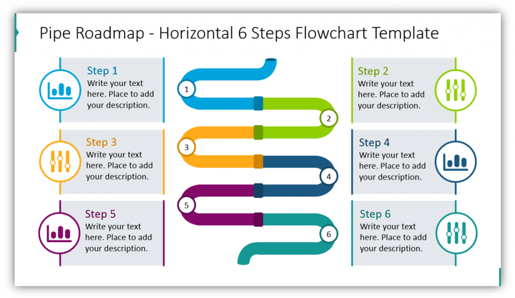
In this example, the Pipe Flow Chart has been divided into six sections. Each section represents a different step in the process. The pipe creates a different visual than a usual flow chart or road diagram. The segmented portions help your audience visualize the distinctions between steps.
Share Product Development Stages
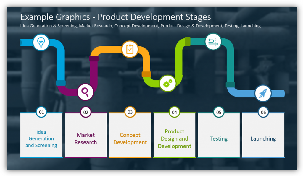
This Pipe Shape Flow Chart Diagram shares the stages of developing a product from idea generation and screening all the way to launching the product. The icons meant to represent each step can be customized, as can the colors used to represent each part of the process. You can use this slide for your own product development process or another process that’s essential to your business or organization.
Do you have ideas for how you might use Pipe Shape Diagrams? Click here to see the full set:
Describe a Timeline Using Pipe Shape
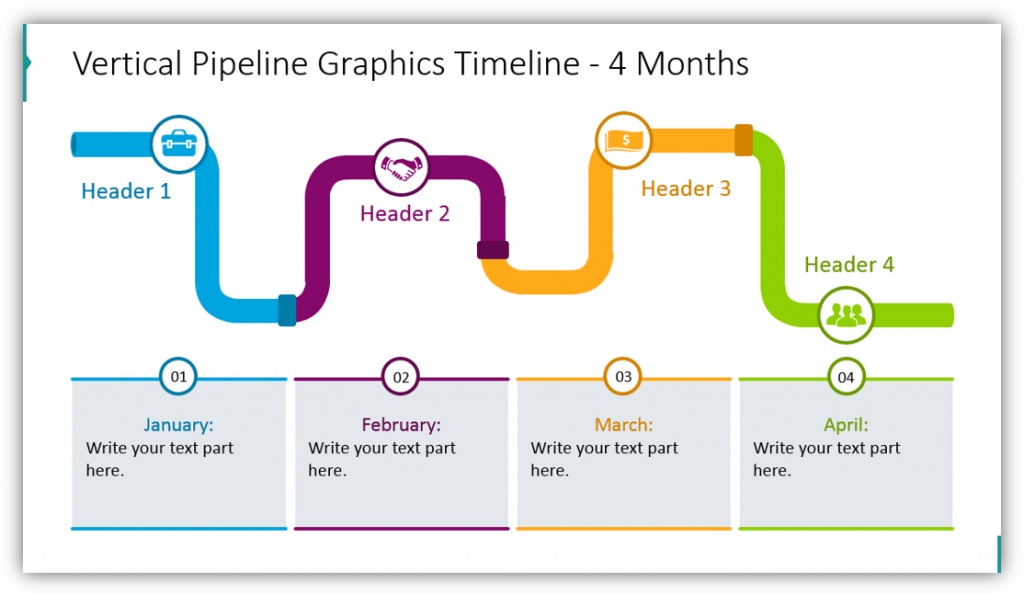
In this example, four months are represented as segments or pieces of pipe in the Pipe Flow Chart. The headers used can be modified to match the months listed or to describe the different stages which will play out across the four months listed. You can add additional details in the text boxes and change the icons used to better explain the steps you’re describing.
Explain a Merger or Joint Venture
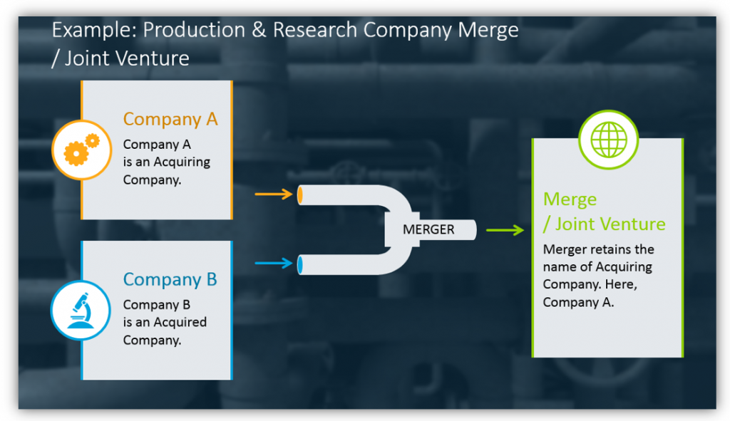
Are two of your competitors merging? Are you planning to merge with another entity? Are you working with another organization on a project? You can explain all of these situations and more with this simple, easy to understand merger/joint venture graphic. You can easily describe the companies involved as well as the merger/joint venture. With the visuals in place, conceptualizing the business changes should be easy for your audience.
Explain How One Input Must Serve Multiple Purposes

In this example, one input is being distributed across two outputs. This might look like an investor’s capital being spread across research and development and quality control or any number of situations. The important thing is to customize the graphics so your audience has the best chance of understanding what it is you’re trying to explain.
Whether you’re using Pipe Flow Chart Diagrams to replace a road or traditional flow chart, describe your product development process, explain a merger or show how far investments have to go – you’ll be in good shape. All of the examples are easy to understand, though their concepts may be complex and multi-faceted.
Resource: Pipe Shape Flow Chart Diagrams
Pipe Flow Chart Diagrams are great for when you need to share a sequence of events. If the procedure you’re outlining needs to be ordered in a timely manner, a pipeline with many segments is the ideal graphic. You can easily use Pipe Flow Charts to represent distribution or merging of an idea.
Pipe Flow Infographics are great for presenting large amounts of information in a structured way. You can use colorful icons to better explain complex concepts. Remember, complicated ideas require special care to be readable and easy to understand.