5 Details to Remember While Presenting Survey Results in PowerPoint
Do you need to report survey results? If your next presentation will feature polls, evaluating poll results, or other data analysis consider how you’ll present that information.
Explore our Business Performance PPT Reports category on the website for more resources to boost your presentation impact.
You don’t want to overload your audience with too many figures. Charts and tables loaded with numbers and data can be overwhelming. If you want your audience to follow your presentation, they need to understand your message.
How can you use Survey Results Graphics?
#1: Summarize Objectives, Conclusions, and Recommendations
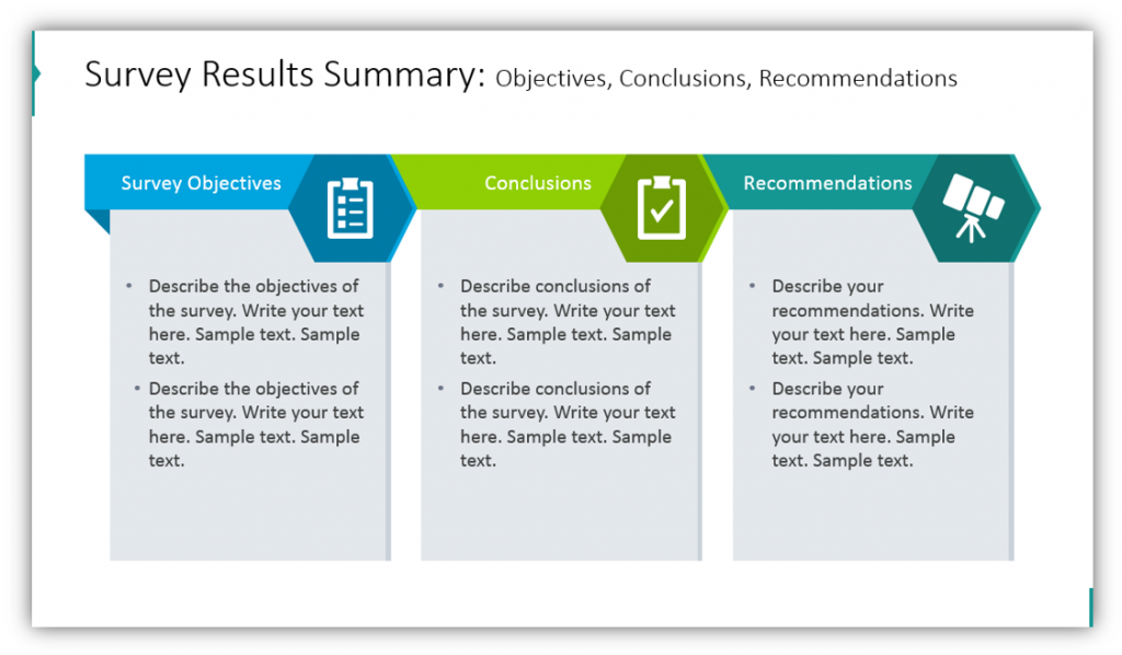
Reporting the results of a survey is only part of the task at hand. When utilizing the Survey Results graphics you can also help your audience interpret your findings. Share what the objective of the survey was. Explain what conclusions can be drawn from the survey results, and provide recommendations for where you and your audience can hope to go from that point forward.
#2: Explain the Executive Summary of the Survey
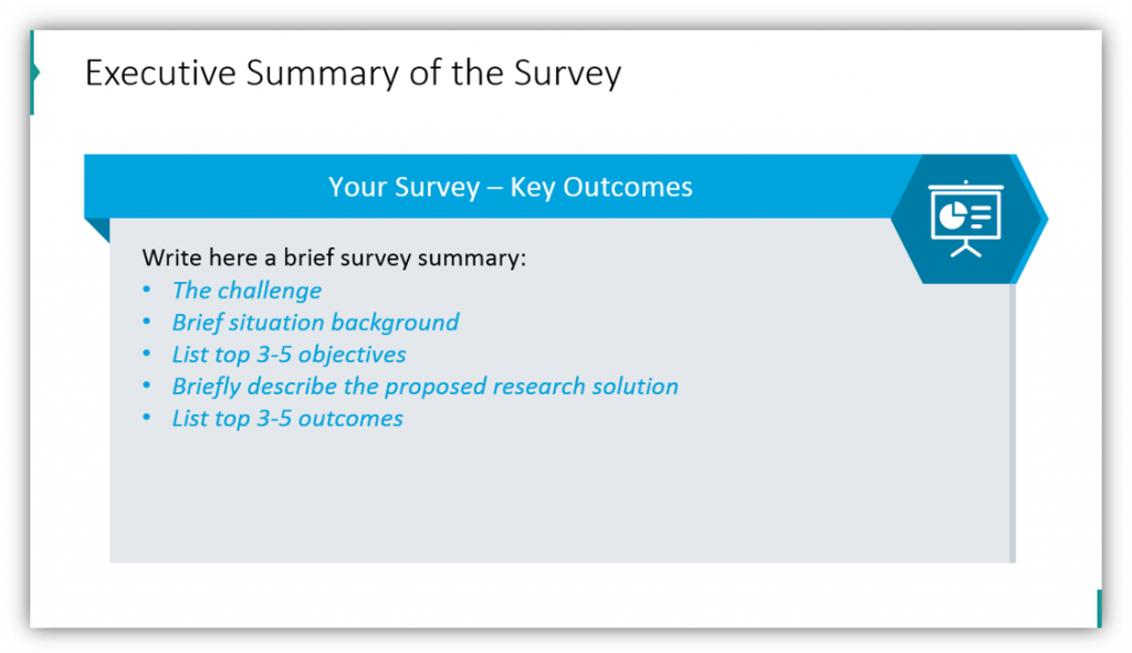
You’ll want to share the details of your survey, sure, but you will also need to explain the key outcomes. Explain the survey using a slide like this. That may look like explaining the challenge that prompted the survey or the challenges you faced when constructing the survey. Either way, you’ll want to provide background information for your audience on both the survey and the situation that prompted it. You’ll want to list the top 3-5 objectives so your audience understands the reason why the survey was necessary. It’s also a good idea to describe the solution you’re proposing and what the outcomes could be.
Have an idea for how you can implement ready-to-use, modern symbols to share survey results, explain polling methods, describe your survey participants, chart responses, or more? Click here to see the full set, now:
#3: Share How the Survey Was Conducted
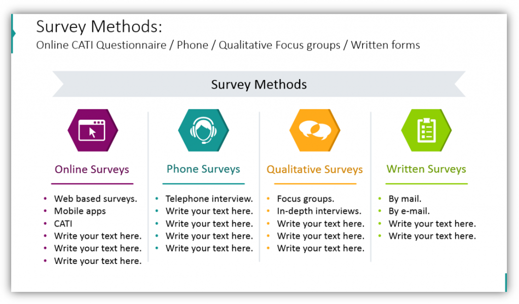
What methods did you use to conduct your research? Were you surveying your participants online, over the phone, or in person? Did you conduct in-depth interviews, or were participants making selections from multiple-choice sheets? These details can help make your survey results real to your audience and help them understand the process. You can customize the icons to match what your actual methods were and provide details in the bulleted lists below.
#4: Explain Who Took the Survey
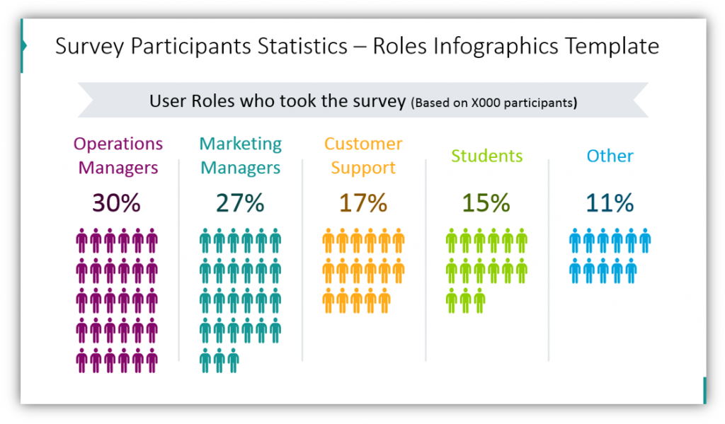
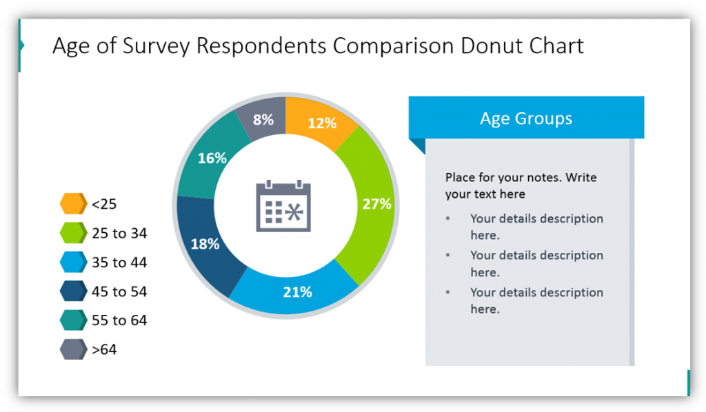
Who within your organization or the public at large took your survey? Share information about who they are outside of their answers. This will provide greater context. Share details about the participants’ roles in your organization if you polled employees. Explain what roles the participants play in their daily lives if you collect demographic details or survey the public at large or your clients. Tell your audience who you spoke to, so they can better appreciate the significance of your findings.
#5: Share Poll Questions in the Survey Results
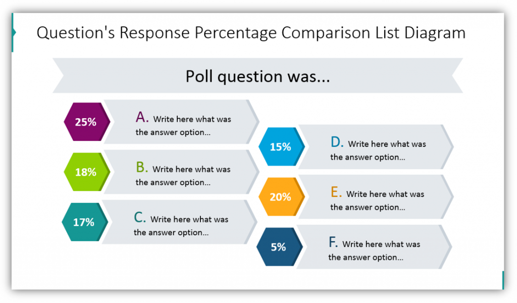
You can share the exact questions asked to let them know the exact answers they had to choose from and the percentage of answers given. This can be important if there are two answers that stand out as most selected. You can customize this slide with the number of answers your participants had to choose from and provide as much or as little detail as you’d like.
You can use Survey Report Presentation Graphics to summarize the findings of or explain the mechanics of your survey – customize the graphics to suit your needs.
Check out our YouTube channel for more inspiration:
Resource download: Survey Results Report Presentation Graphics
In addition to sharing the results of a survey, you can also use these graphics set to explain the logistics of an upcoming survey project. Use the graphics to explain the process to your prospective survey team, or explain the results after the fact to an audience of your choosing.
This modern, polished slide set can be used for various survey and poll-related presentations. Check out the full set, here:
Modify the colors and more to suit your organization and brand or your intended audience. Remember, cohesive graphics that are uniform in style and color palette add a layer of professionalism to any presentation.