Use Creative Bar and Column Chart Templates to Lighten Data-Heavy Presentations
Is your next presentation containing a bunch of small graphs, default column chart diagrams and tables? All stuck together on one slide? Then you’re suffering a data-heavy slide symptom.
Using default looking Excel charts might work for a draft presentation, but they aren’t very attractive. When giving a presentation that is important to you, the function is important, but having eye-catching, informative visuals will give you an edge.
Use customized charts to make an impact
With the wrong visuals, even the most staggering data can be unimpressive. Column and bar charts are versatile and can help you make a better case with your comparison-based analysis.
Want to use graphs your audience will understand? Shift away from standard charts instead use professional Bar and Column Chart Data-driven PPT graphics to represent your numbers unique information.
Let’s see a few examples of how you can enrich default data charts by additional graphical elements.
Chart comparing product KPIs
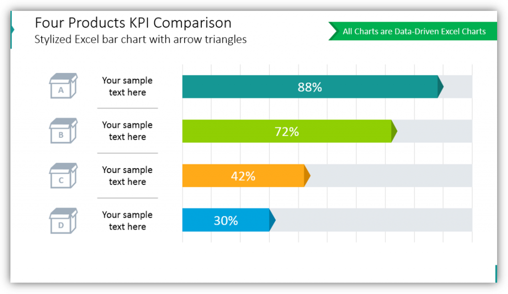
In this example, each column in the chart represents a different product. You could use each bar to represent a different person in your sales department or anything else you need to compare. To enhance the chart graphically, you can add an illustration of each product, customize the look of the horizontal bar, make data labels fit nicely inside the bar while keeping the text contrast.
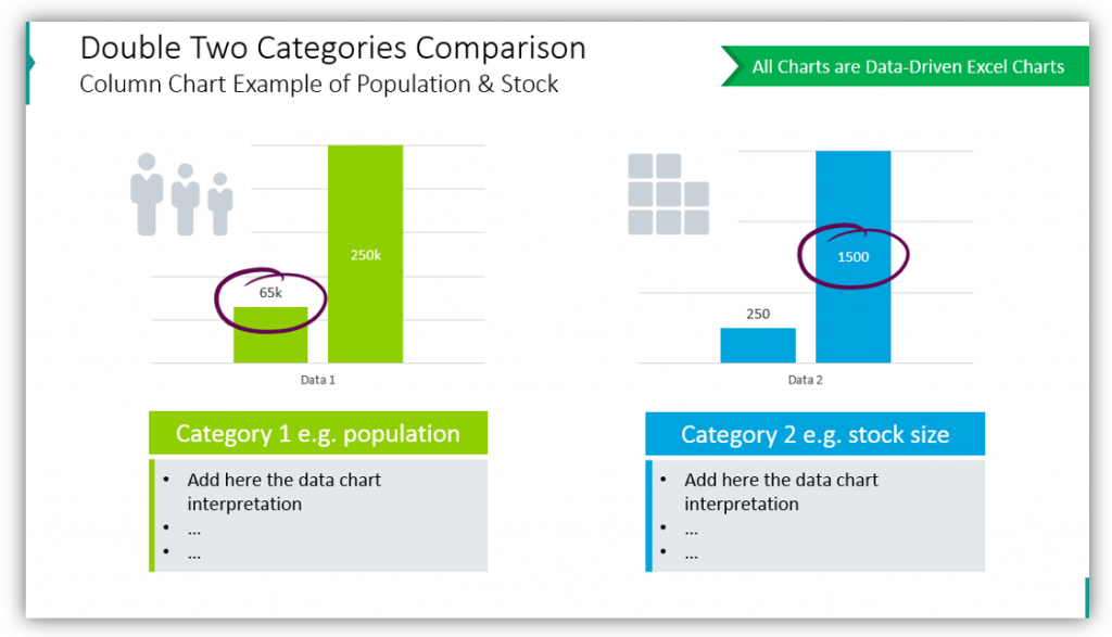
Inspiration for a market share comparison chart
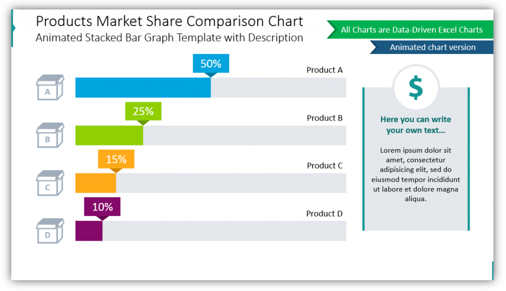
Bar charts can also be used to represent the market share. Theoretically, in this case, you could use also a pie chart (if the values sum up to 100%) but the bar chart is better to see proportions more precisely. Whether you are comparing your products in the market or your share of the market versus that of your competitors. Customize the chart by using the vivid color scheme, adding category symbols, make special data labels to make the visuals more striking.
Ways to highlight the key data using column chart
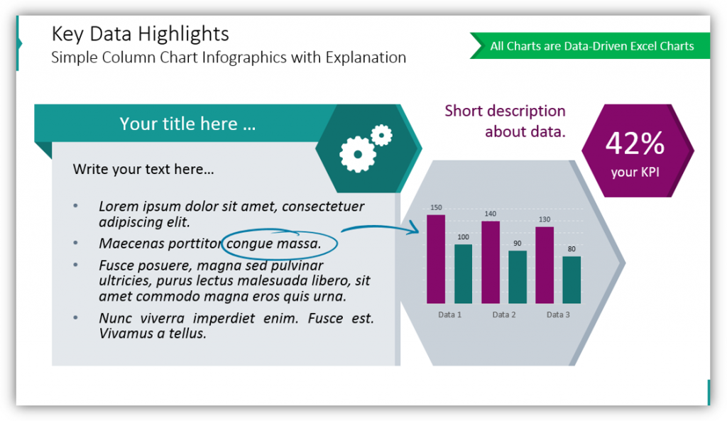
When you have significant findings to share, you can give it its own slide. This will give you space and the opportunity to give your audience all the information they need in a visually appealing, impactful way. Look at how striking the financial analysis example is.
For highlighting the key data point you can:
• Use hand-drawn marker or an arrow that stands out visually over the chart (use high contrast color)
• Write the key value in a separate box (or hexagon as on slide above) and make it the biggest text on a slide, to attract the reader’s eye.
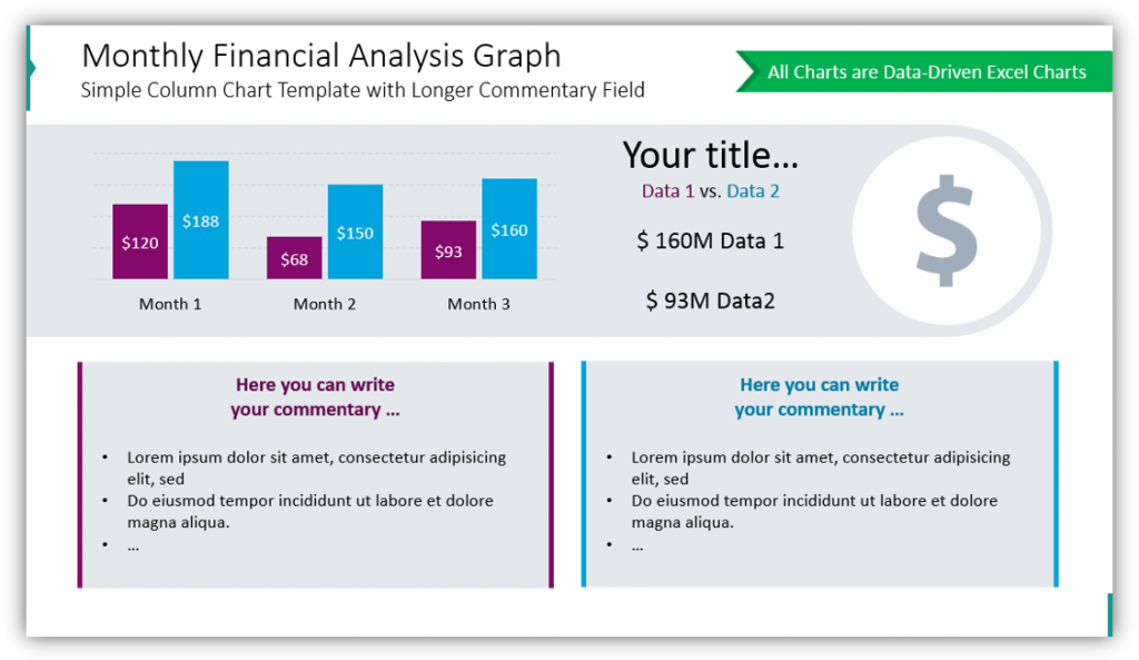
Present yearly financial performance by monthly column chart and trend line
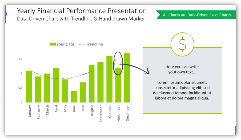
Bar graphs don’t have to be for comparing individual results. In this example you see yearly financial performance being presented with a bar graph. A trendline and hand-drawn marker were added to the bar graph to highlight overall performance trends. Hand-drawn style circle and arrow graphics can be used to highlight significant findings. Text boxes offer a great opportunity for you to add supplemental details to the slide – using a light grey background and thematic icon makes them look much more interesting.
Breakaway from boring tables and list comparisons. When you need to compare performance, the market share or two individual categories.
Clear and interesting Bar and column charts are essential for making data presentations attractive. With adding some sleek, professional graphics you will be better able to articulate your messages, even when you’re presenting data-heavy topics.
Resource: Bar and Column Chart Data-driven Graphics
We built this bar chart set so you could easily have nice, eye-catching and creative visuals for your presentations. Click here to see the slides collection:
We want you to have visually appealing charts that will help you articulate your findings without sinking a ton of time, energy, or further resources into creating your own.


