OLAP Data Cube Explained: Visual PowerPoint Diagrams for Presentations
Explain OLAP data cube concepts with visual PowerPoint graphics. See diagram examples for data warehouse presentations, multidimensional analysis, and BI reporting.
Presenting how complex data analytics operation works is hard. While explaining the OLAP data cube concept, you need to express several abstract terms at once. However, you also need to maintain your audience’s attention. They can’t learn what you need them to if they lose track and fall asleep!
There are ways to keep the attention and get your message across even when explaining sophisticated IT topics. The secret lies in using proper visuals to support your presentation. Something that is simple to create and flexible enough to adapt to your specific case.
By visuals I mean any type of drawing – it can be a sketch on a flipchart or simple concept diagram you create on a slide from basic shapes. In the case of Online Analytical Processing (OLAP), we deal with multi-dimensional datasets. The simplest way to represent them visually is to use a three-dimensional cube drawing.
To help you presenting IT data warehousing topics we have designed modern flat OLAP presentation charts to make your points. Check and use them when presenting on Business Intelligence and Big Data topics.
Here are a few examples of how you can use 3d cubes for explaining Online Analytical Processing.
Present data with multiple dimensions on a slide
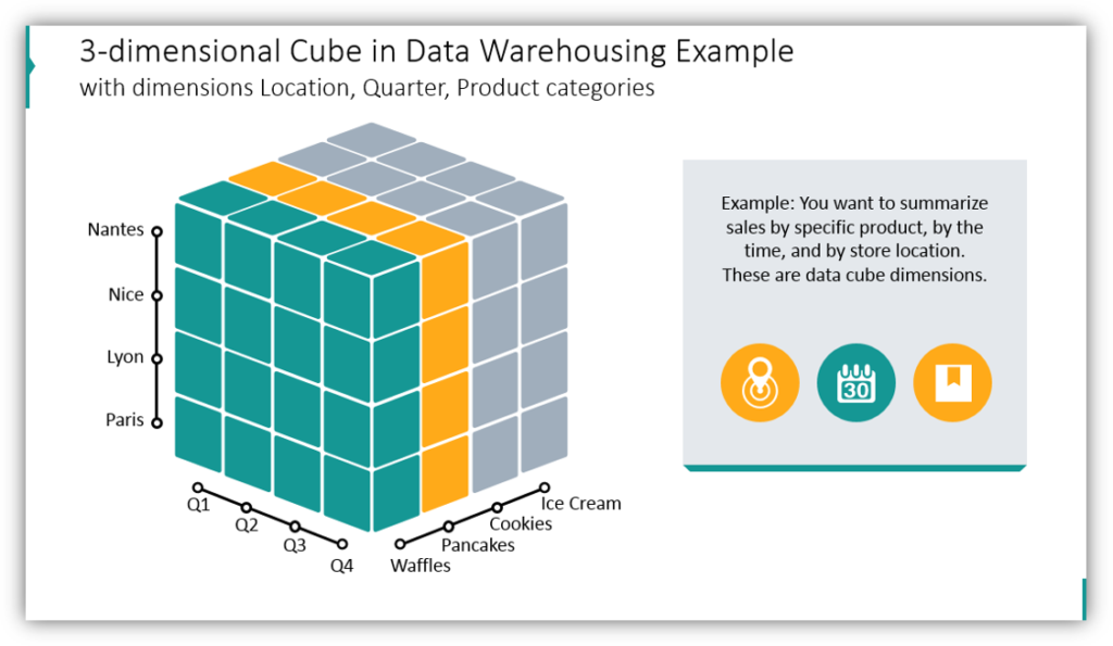
In this example, the data warehouse 3-dimensional structure is presented. The data cube includes 3 dimensions: location, time period, and products. Think about how you could incorporate this strategy to present your own message in a visually appealing way.
Explain what is a Slice in OLAP data cube
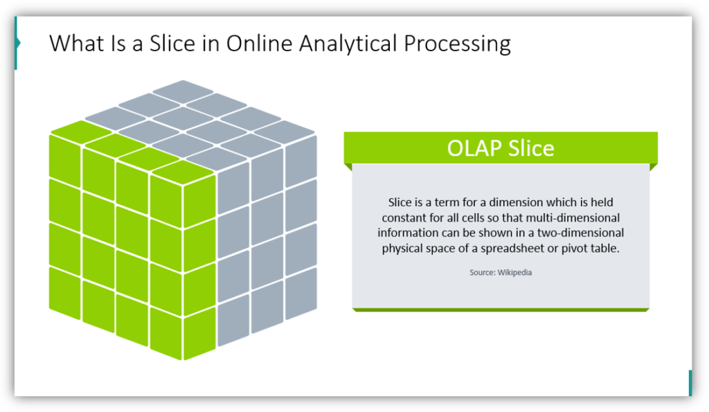
The slice is a term for a dimension that is held constant. Here the Slice definition is illustrated by 3 cubes with highlighted one layer. Using visuals like this will help your audience to imagine and understand essential data analytics terms.
Presenting what is a Dicing Operation Term
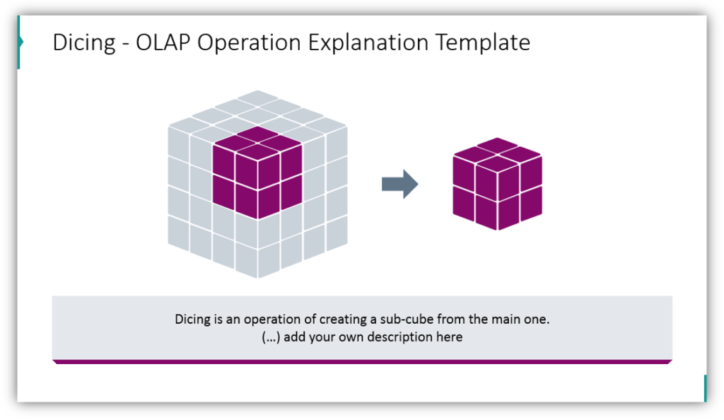
Here we show a presentation slide showing visually what is Dice and Dicing operation – the creation of a sub-cube from the main cube.
You can add your own description of the Dicing operation to better help your audience understand what is being presented. Along with showing a picture of dice within a cube. this will help you provide a clear vision for your audience.
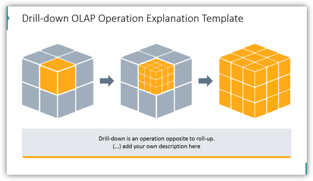
Explain Roll-up and Drill-down operations on OLAP cube
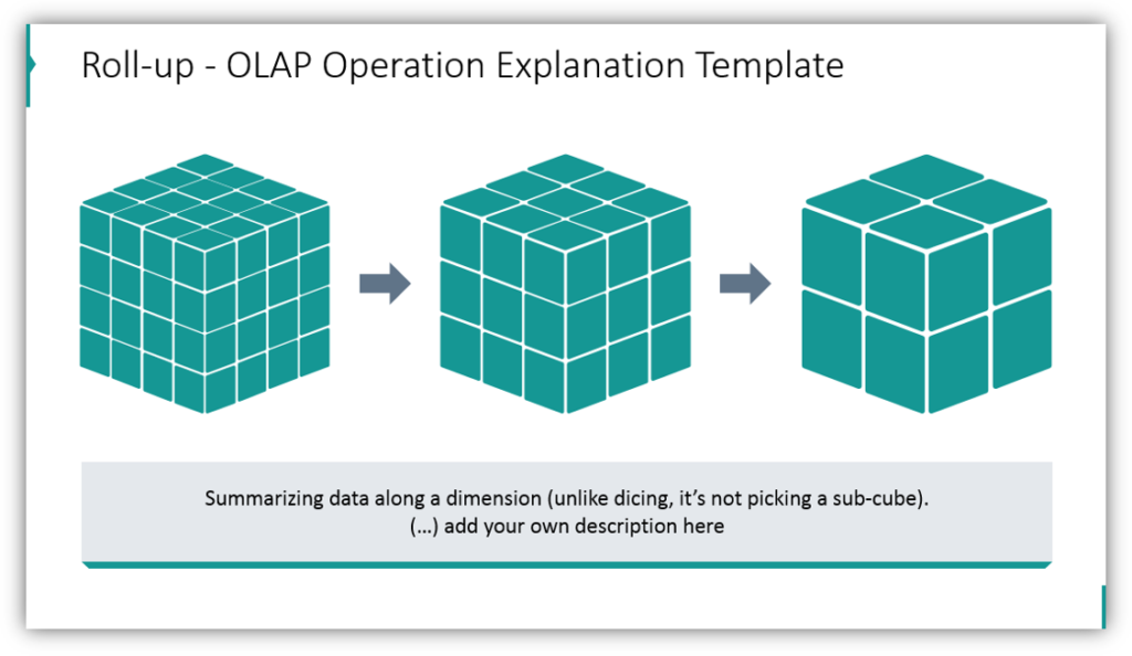
Roll-up operation is summarizing data along a single dimension. Unlike dicing, it’s not picking a sub-cube. You can illustrate the Roll-up term in the presentation by adding there cube graphics where 4 layers are merged into less (as the sum value replaces the original division).
Drilling-down is the opposite of rolling-up. And we expressed it on a slide by 3d cube that has one sub-cube split into another cube.
Presenting what is a Pivoting Rotation in data analytics
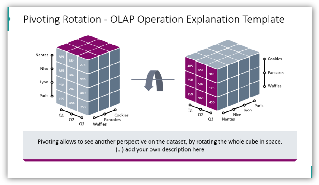
Pivoting operation within OLAP means creating a new view of specific data cube slice. You can visualize pivoting by showing the rotation of the whole cube in a space, as you can see on the slide picture. You can show the specific data values on the front slice along with an update of dimension location on a cube view – notice the geographical location moved from bottom to vertical axis.
Whether you’re teaching OLAP, explaining it to your clients or team, having a simple visualization is handy to make complex data analytics theory presentations easier to follow.
Resource: OLAP Data Cube Graphics
We created this visuals collection so you could easily have nice, eye-catching and creative graphics for your presentations. Click here to see the full OLAP slides collection:
Build beautiful charts to help you explain complicated statistics and data. Your presentations can go from being a boring, jumbled mess to cohesive and impactful. Shift away from boring tables, and articulate your findings clearly and concisely.