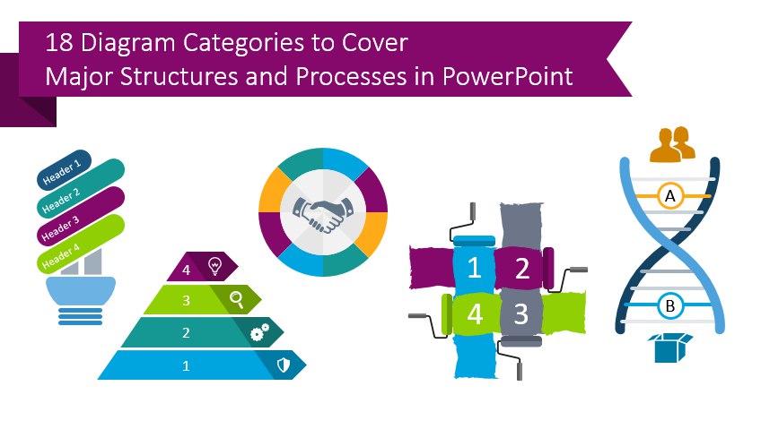
How to choose a diagram? 18 Categories to Cover Major Structures and Processes
Imagine you are working on an important PowerPoint presentation. You know that visual slide content is much better for your audience than pure text. Therefore you collect various diagrams, flowcharts, and visual metaphor ideas. However, you struggle to quickly choose a proper one expressing your topic.
I’ve been there. With every presentation project, I face this challenge – how to quickly pick the best visuals for particular slide content. How to save time and avoid designing visuals from scratch. Let me share my way of choosing a diagram.
I start with analyzing the text information I have. I try to identify the main elements and their relationships by asking questions:
- What are the key elements? Is there a list of items, benefits, features? Do they have something in common? Are they independent?
- Is there a cause relationship “because of this, that happened”?
- Is there some hierarchy or other dependency I can express by drawing?
- Is there a process, set of steps?
Then I think what kind of diagram fits this information, some examples:
- Unordered list diagrams
- Centric diagrams
- Cycle diagrams
- Venn and Euler diagrams
- Flowcharts
- Hierarchy relationship maps
- Layer diagrams
- Timelines and Stair diagrams
To help you and myself, I decided to gather all the essential diagrams we used in our design projects over the last years. To create one big set of slides that would cover all content types – from lists and agendas to timelines, data visualizations, synergies and hierarchies. I present the result below – the ultimate list of 18 categories that should cover majority of processes and structures used in business presentations.
Check the collection we designed of all common diagrams, see an overview of Flat Ultimate Infographics Bundle.
Diagram as a powerful and universal slide visual
Let me start first with definition, reminding what is actually a diagram:
What is a diagram?
A graphical representation of qualitative information through simple shapes (arrows, rectangles, circles). Diagram expresses relations such as dependency, flow, overlap or hierarchy of concepts.
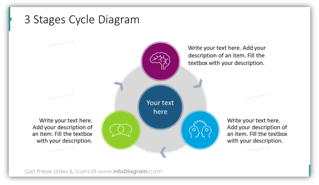
Let’s see examples of cycle diagram that shows flow between 3 stages:
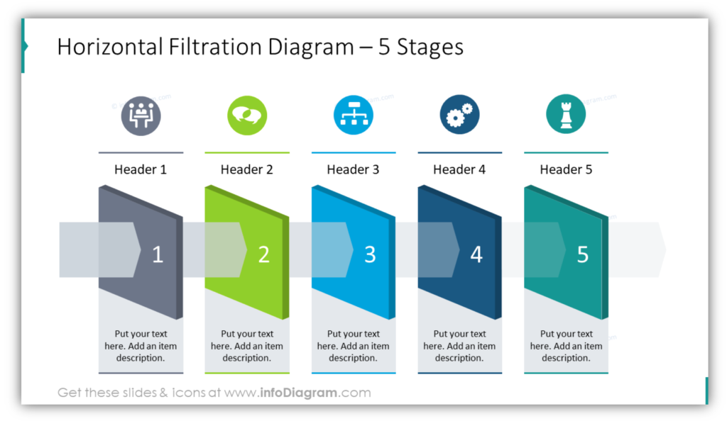
Here is a linear process flowchart presenting 5 filtration steps:
18 diagram categories and 3 areas to cover almost any content
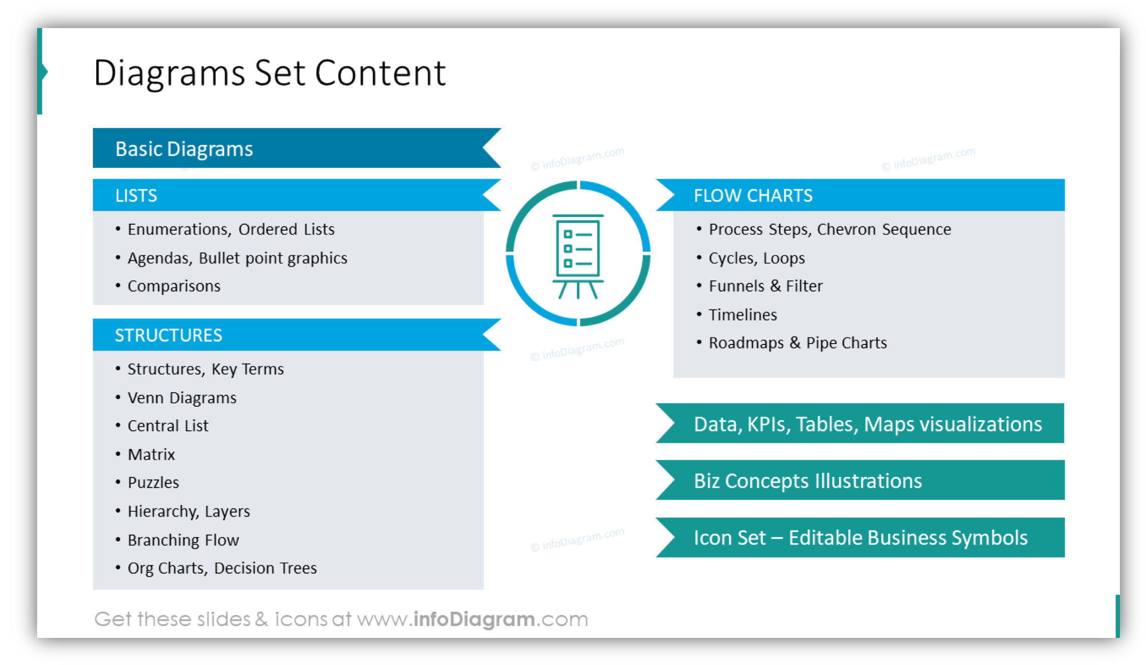
I collected all the essential diagrams we worked with, spent several hours moving pieces around and here is the result: 3 areas and 18 distinct categories of diagrams.
Three main information areas are:
• List diagrams – to present agenda or features in a visual way
• Structure diagrams – to show hierarchies and other dependencies
• Flow charts – for processes, timelines, and procedures visualization
Additionally, I added two special categories that cover data visualization and abstract business concepts:
• Data and Key Performance Indicators with creative table and chart graphics
• Business Concepts illustrations with various visual metaphors such as DNA helix or bridge.
Then we worked on diagram templates for each of those categories. Putting it all together took our team a few weeks. Designing, unifying, and quality testing of over 200 diagrams is not easy. But we did our best to create one consistent set anybody can easily use to make his or her slides look professional.
Our quality criteria were:
- Have a well-organized set of slides, by information topic, so it’s easy to understand them and use
- Consistent style of all graphics. When you pick up any graphics, it will look professional and not like randomly gathered pictures from various sources
- A universal style that fits any branding. Here we decided on a modern flat graphical style with vivid colors, that is simple yet appealing.
- Ensure all diagrams are editable so you can add or remove items and modify colors to match your company’s visual identity – replacing template color or changing any shape color.
Choosing diagram type – questions to ask
Let’s see how you can use those diagram categories and match them with your slide content. Identify what information type you have there. What is the message your slide wants to convey?
- Is it a list of independent items? Then use a list diagram.
- Does the list have an order? Consider Enumeration diagrams
- Do you compare several lists together? Then comparison diagrams may be the solution.
- Is it a sequence of steps? Then Roadmap graphics or Chevron sequence maybe the right visualization for you.
You got the idea. Let me share with you a few specific cases of those diagrams. Here are a few examples of visualization of our three information areas.
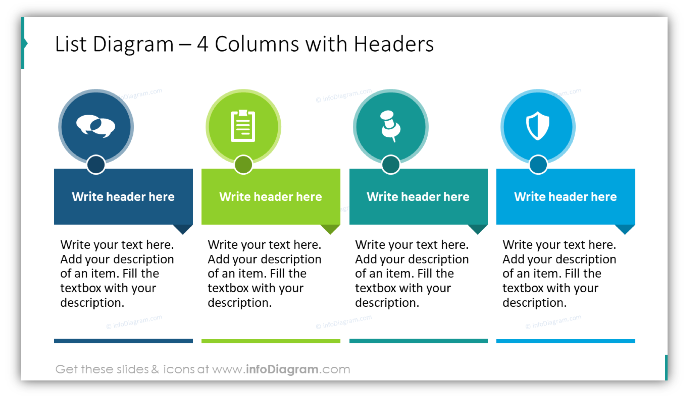
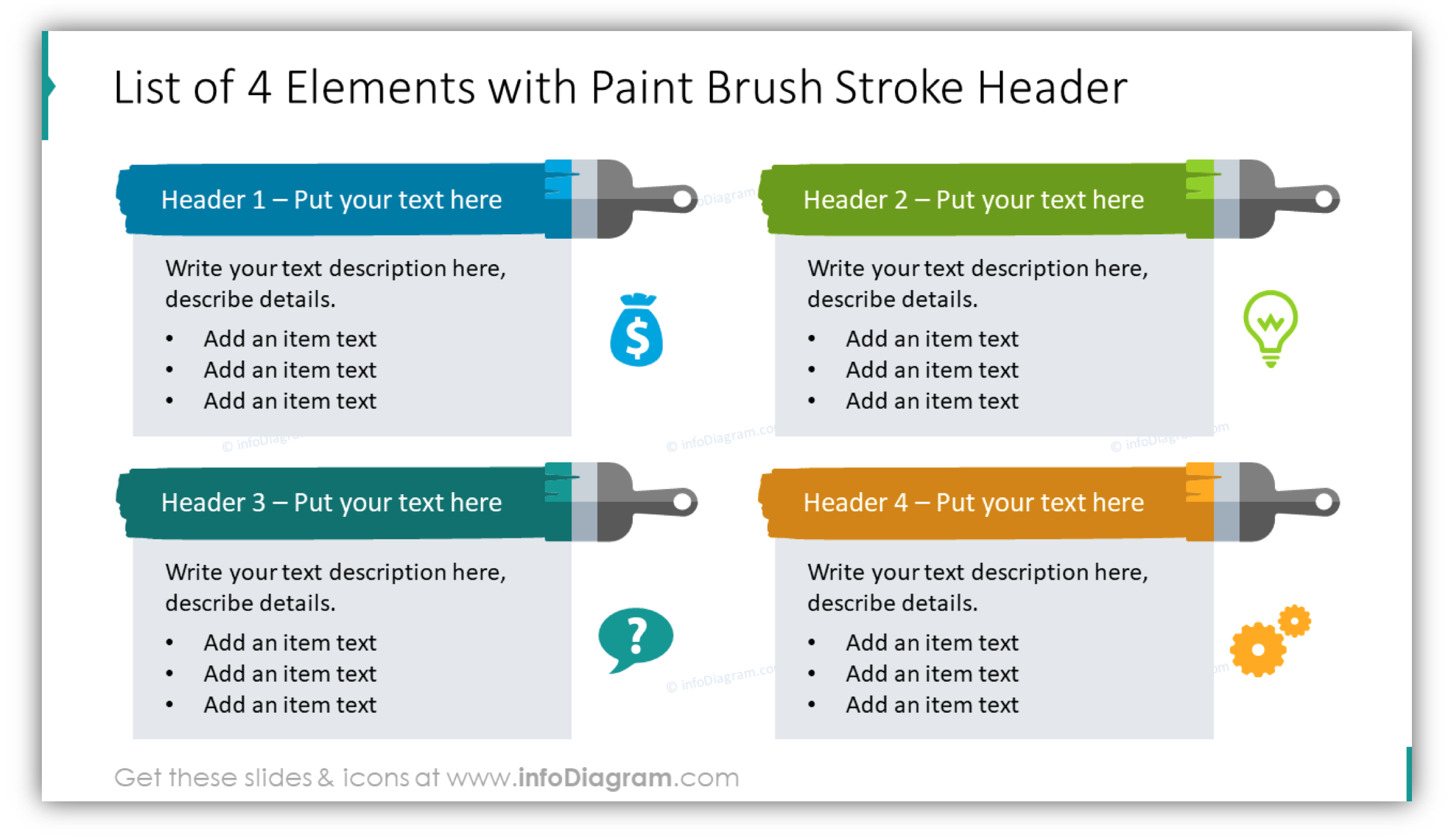
Lists to replace bullet-points or make cool PowerPoint agenda slide
When you have a list of 3-10 bullet-points, use a visual list diagram to replace plain text. For a better visual power, try to illustrate your points with a specific icon for each topic.
You can make your list look more unique and creative by using paintbrush graphics like on this example:
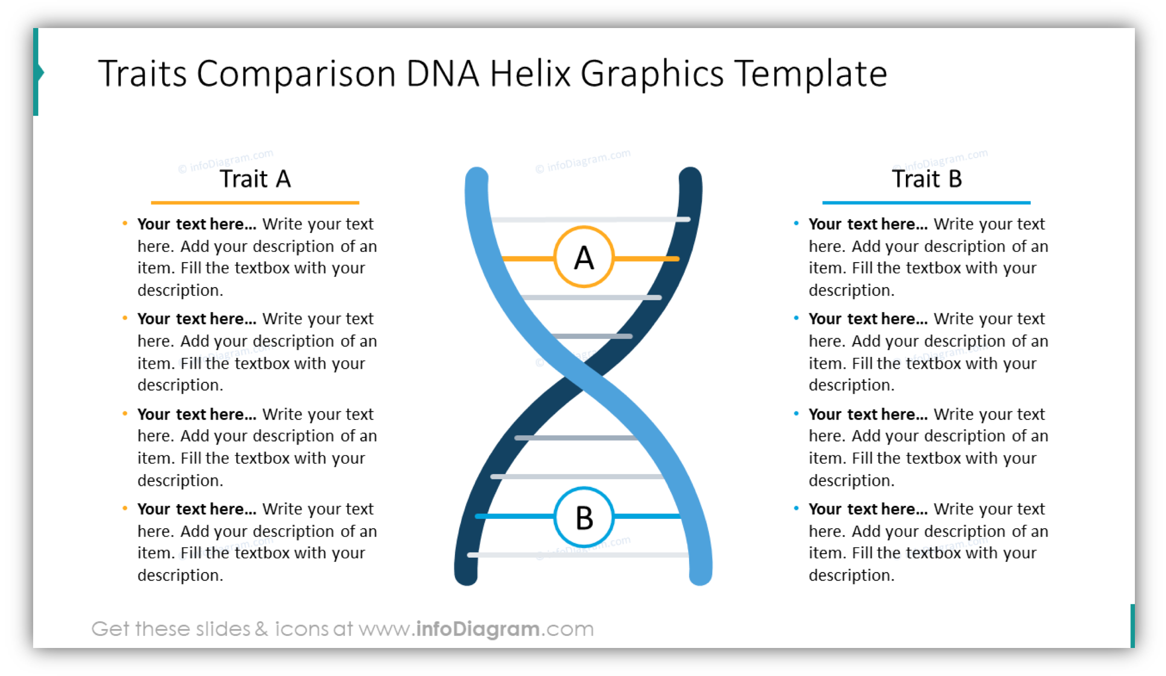
Double lists to compare categories visually
To create a nice visual comparison slide, use a two-sided graphic layout with e.g. DNA or Scale picture in the center.
On the slide above you can see scale visuals, you can use when evaluating two options and their features. A scale can show what option is heavier – that means better or winning.
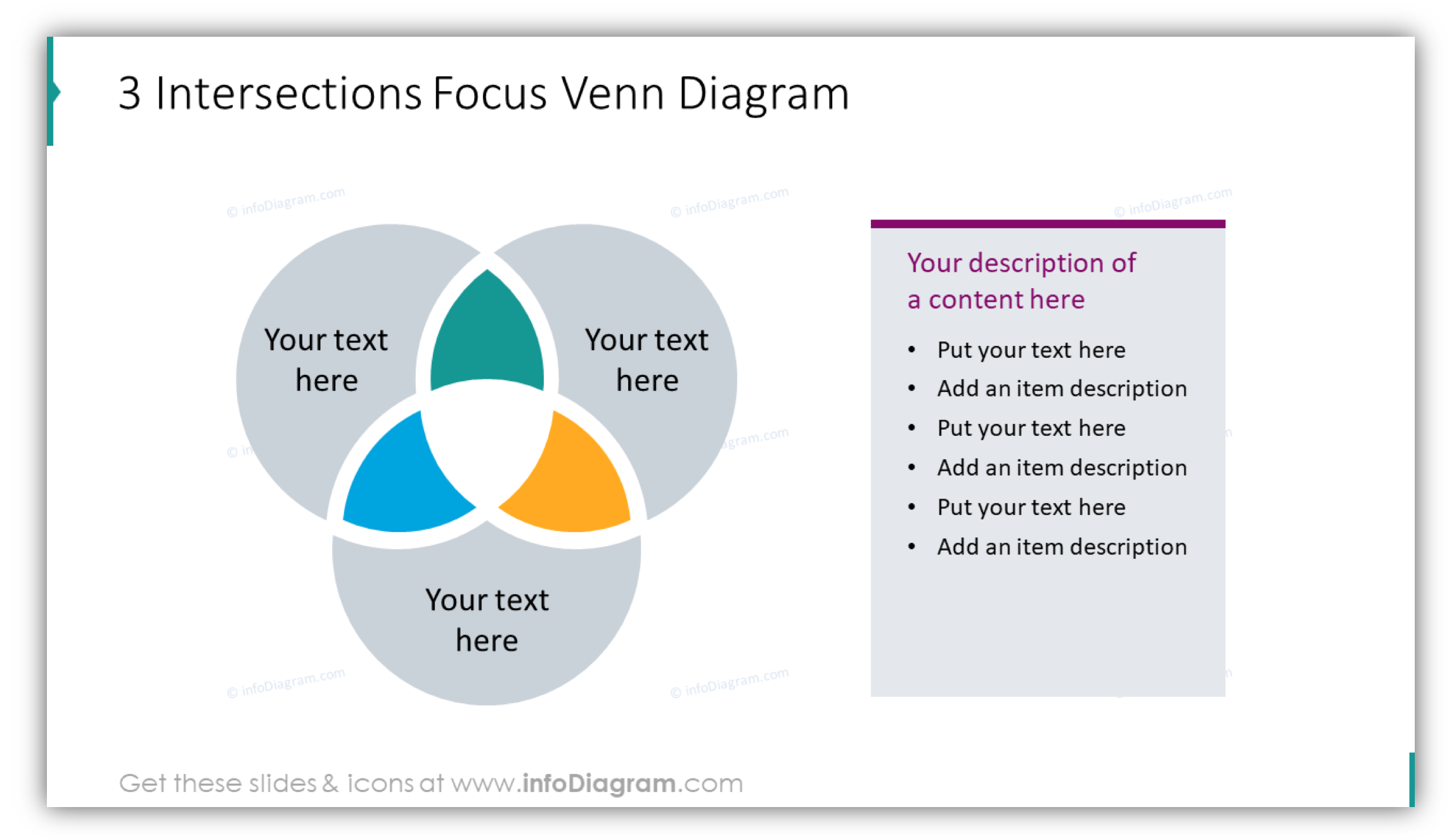
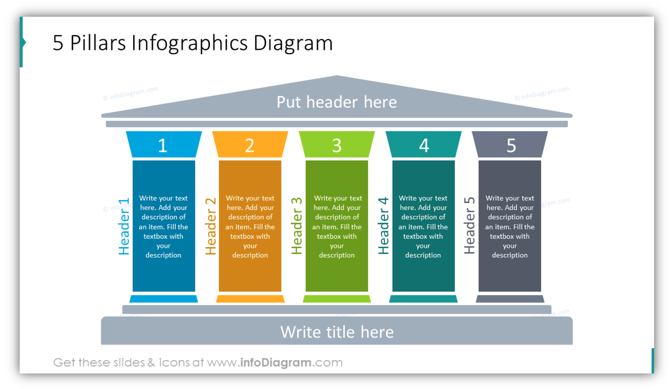
Structures you can express visually by pillars and Venn diagrams
If you present an overlap of concepts or a common area, Venn diagrams are the classical visual structure to be used. Here’s how we redesigned the Venn diagram:
On the other side, if you want to show that your idea is built on strong and several foundation concepts, consider pillar diagram:
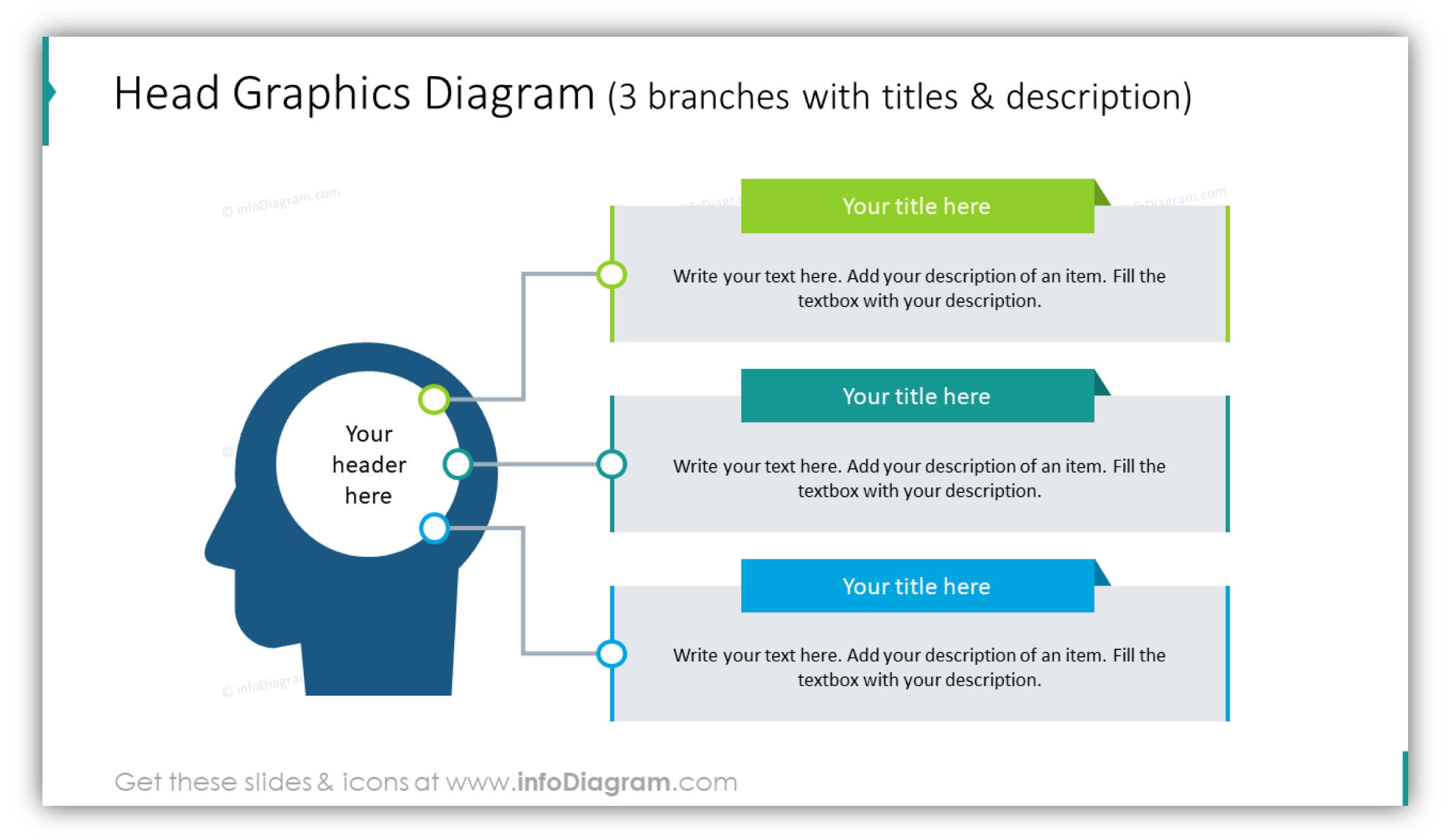
Central lists to show idea-centered concepts
Let’s say you want to show your organization is customer-centered. I’d use here a customer element as a centric element and all other items put around it.
Representing hierarchy
If you have a certain hierarchy on your slide, consider showing it with layer diagrams where you put each hierarchy level into separate a layer.
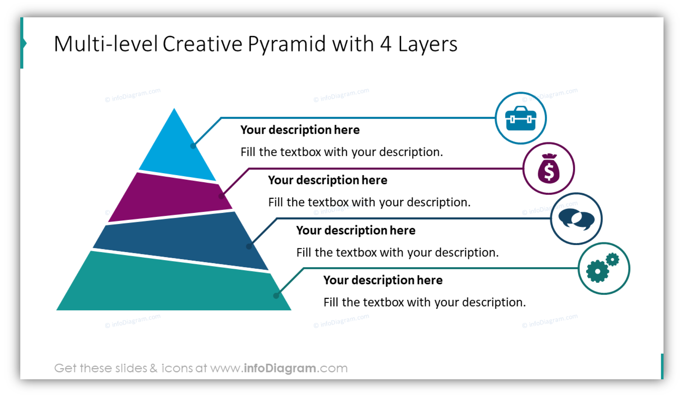
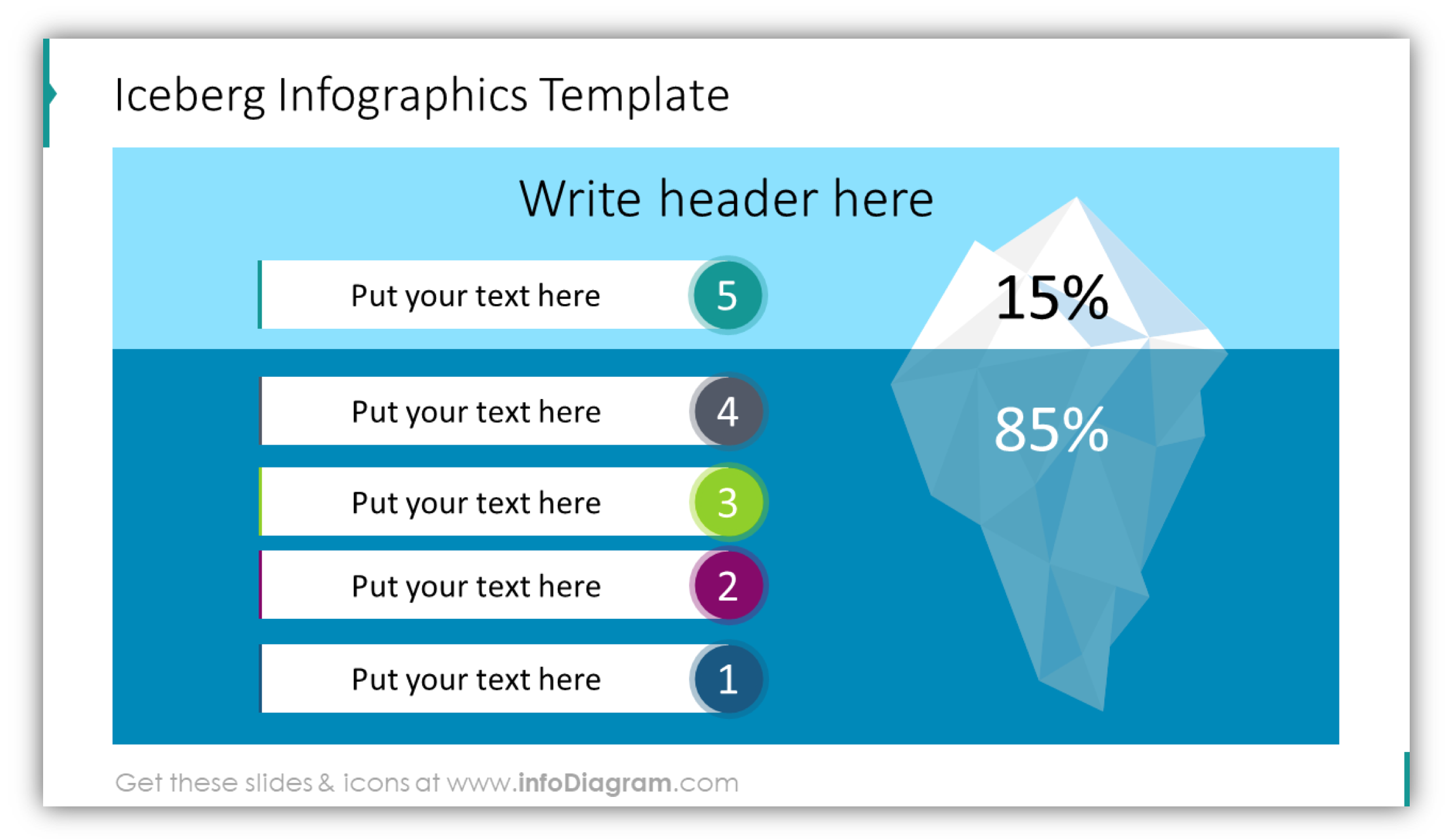
Depending on your content, try using a vertical set of layers or a pyramid. Onion diagrams can be good visuals if your slide idea is based on a central core covered all over by other layers. Or use the iceberg metaphor to express visible and hidden layers:
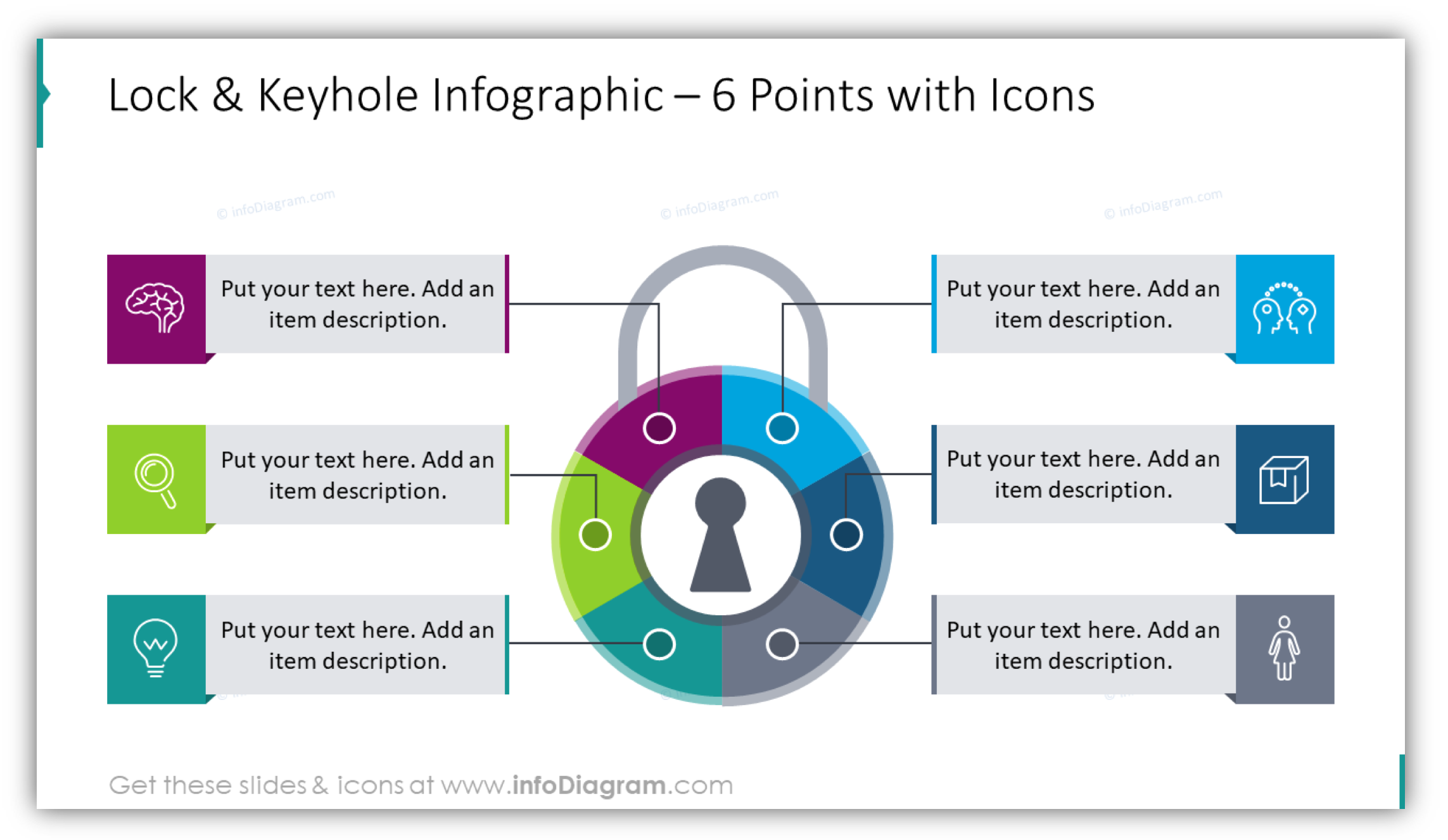
Other creative visual diagram ideas
Besides those classical diagrams I mentioned above, there are many others – matrixes, flow chart timelines, funnels, you name it.
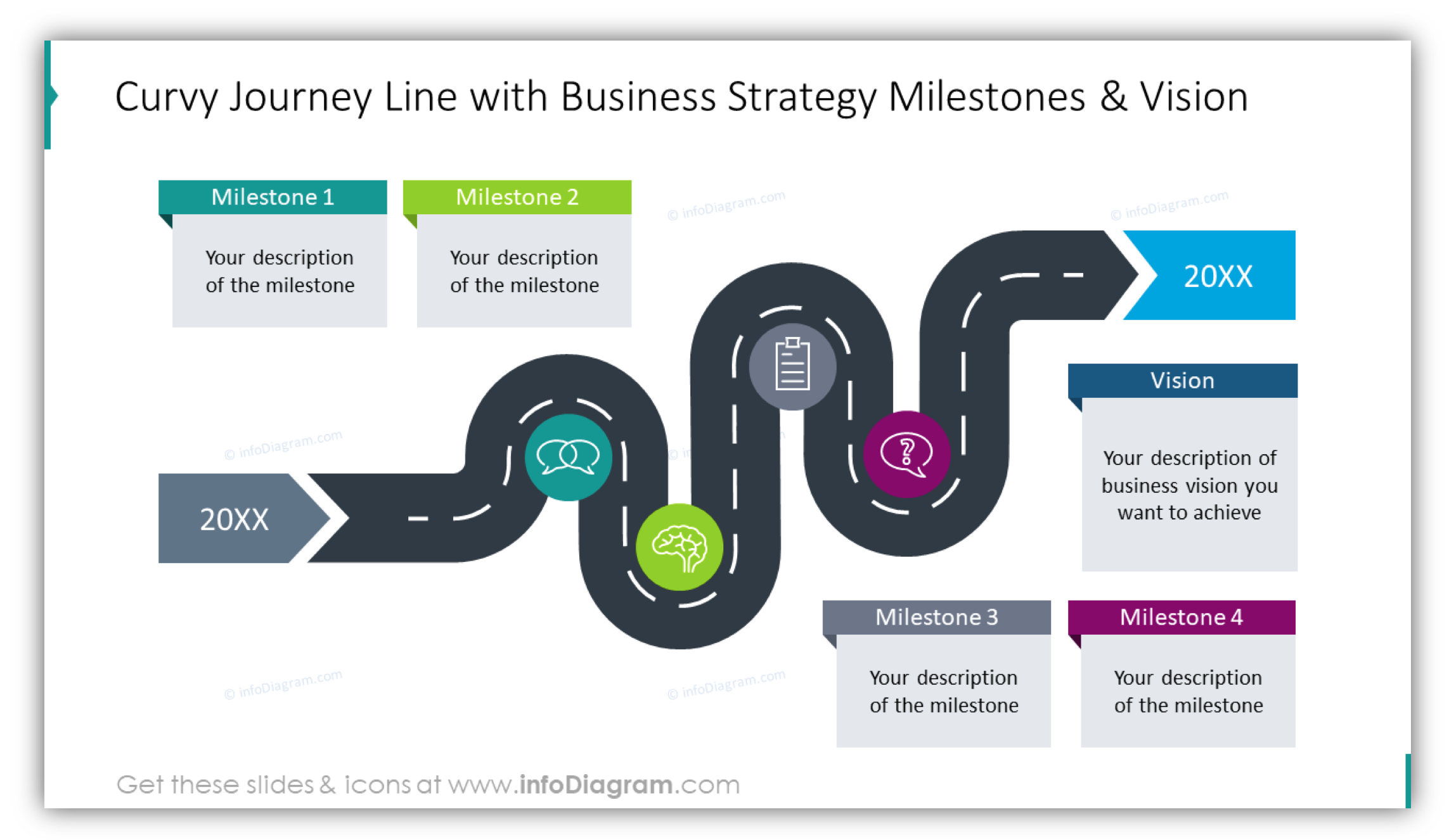
Here you can see a creative visualization of a roadmap with business strategy milestones and a definition of the company vision goal.
Designer tip: Personalize diagrams with icons – but stay consistent
Once you have found and selected a diagram that best represents your slide content, don’t forget to make it look professional. Follow those three basic design rules:
- Ensure graphics are consistent with the rest of your presentation. Use the same color palette. You can modify the diagram filling, apply your company color.
- Make sure the slide is not overcrowded. Have enough whitespace – margins around diagrams and texts.
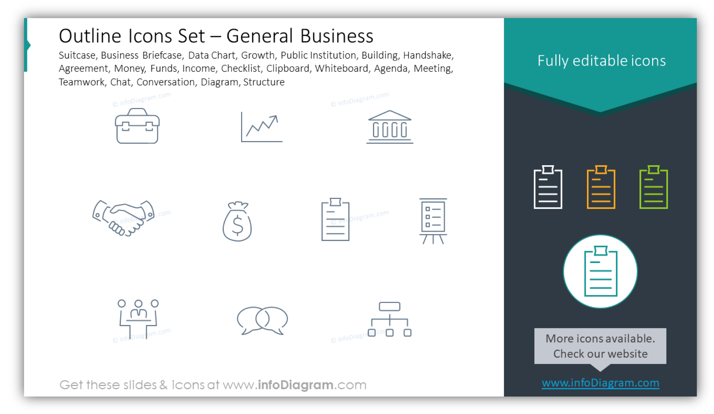
- Personalize your illustration by adding a symbol to each key element. That will make the information easier to understand. Remember about using one style of icons e.g. Simple Flat Icons or Light Outline Symbols. Don’t mix them, because that looks unprofessional.
We added the most common business symbols that you can copy into your diagram inside our slide-deck.
Those were examples of main information types – list, processes and hierarchies. Most of presentation content falls into one of those categories. If you want to dig deeper into possible information types, I recommend reading a book by Dan Roam – On the Back of the Napkin. Another book you can check is Nancy Duarte’s SLIDE:OLOGY that also contains a list of information types.
Take advantage of reusable visuals
I hope the examples above give you inspiration on how you can replace texts in a presentation with powerful visuals. You can start creating your own diagram set, using PowerPoint shapes and organizing them in a way that matches your presentation topics.
Or you can speed up the process and reuse the diagram collection we put together. We did our best to make sure all diagrams were unified, consistent, and easy to be edited.
Now I believe it will help others to make their presentations more attractive and more effective in conveying their message.
For more inspiration, subscribe to our YouTube channel:
Resource: Flat PowerPoint Visual Diagram Collection
All examples above are based on the PowerPoint diagram set we have designed. It contains over 200 diagram slide layouts and tens of vector icons that you can copy to your presentation, modify their structure and style, and write your text inside.
Do you have feedback or a special topic to cover in the diagram? Contact me and let me know, I will be glad to talk to you.


