Present Complementary or Opposing Elements With Yin Yang Diagrams
What is a good way to visually express opposition or correlation? Using easily recognizable symbols can work as shorthand to help your audience imagine interdependent relationships. Although your first conscious thought might not be “Of course! Complementary opposite forces!” the symbolism is there. This dualism concept from ancient Chinese philosophy has made its way to the global stage. Since it has, Yin Yang diagrams can help audiences around the world understand abstract concepts and relations.
Why use Yin Yang Diagrams?
Elegant diagrams and graphics are preferable to blocks of text or complicated tables when giving a presentation. Yin Yang graphics are sleek and elegant and they will immediately grab your audience’s attention. They call to mind numerous thoughts and ideas because the symbol has become so synonymous with the idea that two things may oppose one another but can still be complementary. When you use these graphics, you harness this metaphor to better engage and inform your audience.
Even your pros and cons slides can be improved with Yin Yang graphics. Did you know you can compare up to 6 factors with these templates? See the full Yin Yang Diagrams set for Powerpoint here.
Explain two opposing co-dependent elements
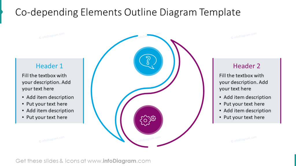
This modern interpretation of the classic Yin Yang symbol is great for presenting two complementary items. Whether you have two complementing departments, projects or something else you can easily substitute the icons in this slide to suit your needs. Add a short description to each text box to provide additional context. This will help you keep on track during your presentation as well as to help your audience understand and follow along. By not overwhelming your audience with text to read, you will be sure they focus on your spoken words and more readily engage with the material.
Describe opposing forces with bold Yin Yang diagrams
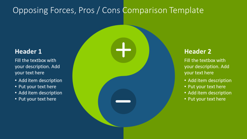
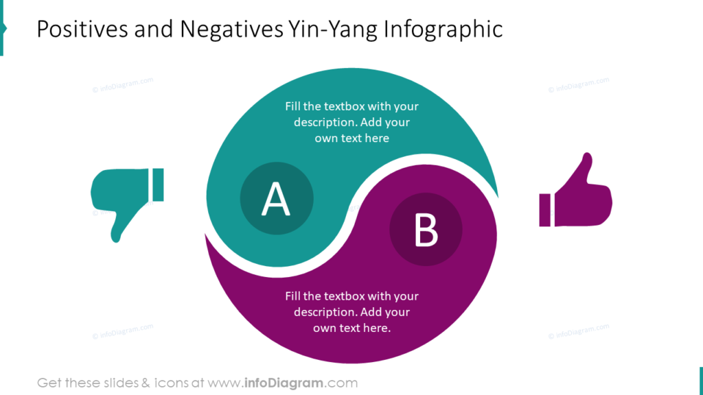
When designing slides for opposing forces like a pros and cons comparison, it is tempting to create boring, text-heavy slides. Even comparing positives and negatives like the second example often get uninteresting slides instead of attractive graphics. Many people assume lists and tables are the only way to present pros and cons. That isn’t true. As this example shows, you can incorporate the strongest elements to those traditional approaches. Use short, significant lists on the side text boxes. Supplement this information with your speech.
Make financial presentations more interesting with unique graphics
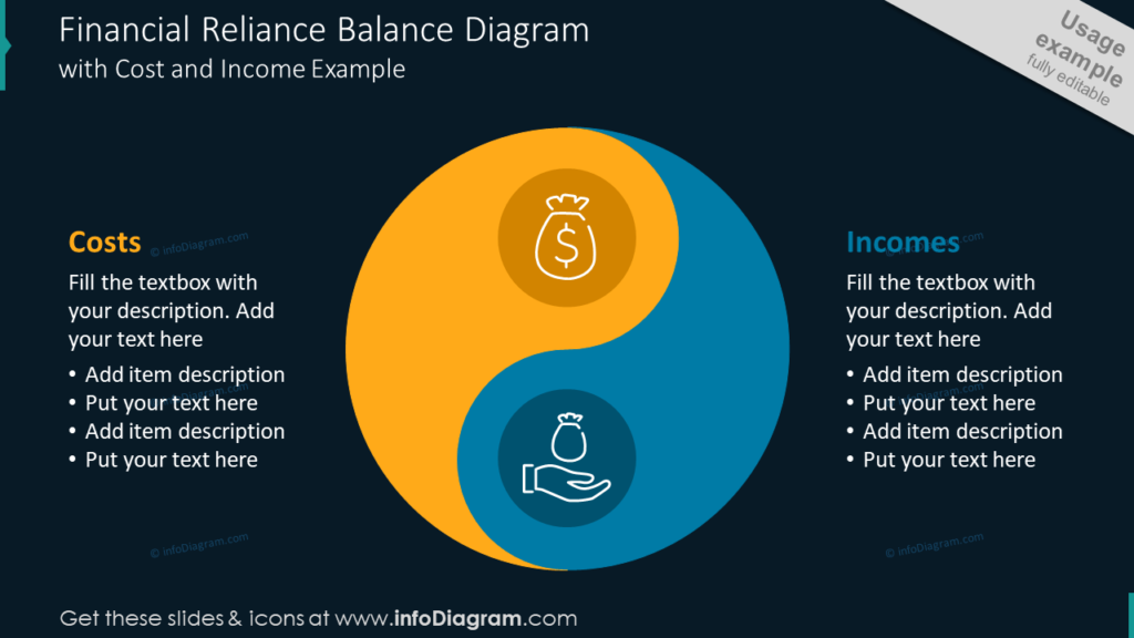
If you were considering which graphics you wanted to use for an upcoming financial presentation, you might not have thought about a Yin Yang. When you see the above example, is there a better way to present budgeting or financial interactions? Money coming in and money going out are two clearly connected elements. You want to balance your accounts – you can’t have more costs than you have an income if you want to stay in business – so use this powerful metaphor to help your audience understand your approach. Dense data or number filled slides can be overwhelming for audiences, especially if they aren’t well-versed in the material you are presenting. By using graphical shorthand like this, you can help get them on the same page with you before you launch into more complex descriptions.
Share how danger and security are connected
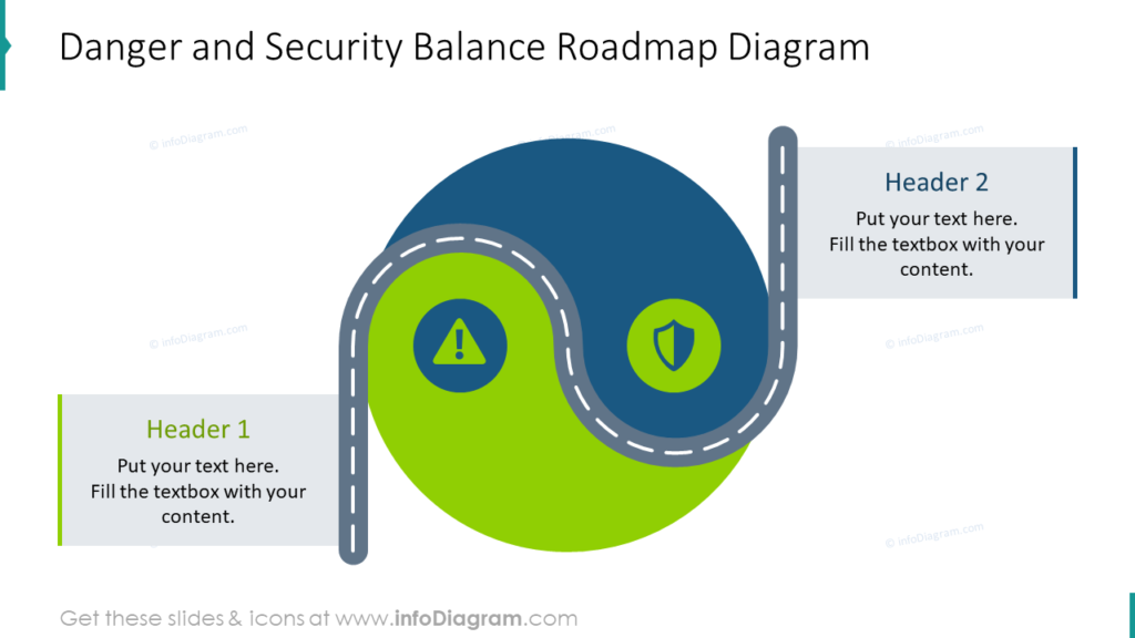
Danger and security are two opposing attributes that are closely linked. In this example, the Yin Yang features an added element, the roadmap. When discussing risk and vulnerabilities, the hope is often that they will be mitigated or addressed. The road map represents the journey from insecurity to safety. You can provide additional details or explanations in the text box, but the majority of the explanation should be provided by you. It would be a waste to incorporate graphics for abstract ideas only to default back to repetitive, cumbersome list slides that your audience will read instead of listening to you.
Branch out, compare multiple factors using one Yin Yang
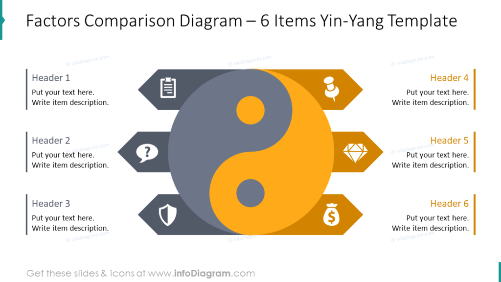
You don’t need to limit yourself to comparing two factors when using Yin Yang diagrams. In this example, three different factors work together to represent each side of the Yin Yang. The icons can be modified to best represent each factor, and the colors can be modified to suit your organization, audience, and message. Each factor gets its own heading and a space for a short description. You can also incorporate fewer factors if you do not need to compare so many.
Capture and maintain audience attention
Whether you’re comparing quality vs quantity, strengths vs weaknesses, or financial topics you can depict them all using Yin Yang diagrams. Although the common Yin Yang images feature black and white symbols, yours can be more varied. Spice them up with bold colors, your brand colors, icons, and other visually appealing accents. Simple graphics are often perfect for making messages “pop” because they don’t interfere with your audience’s understanding.
Resource: Yin Yang Balance Diagrams
Articulate your comparing presentation concepts clearly and concisely. Impactful slides are beneficial for helping audiences understand unfamiliar, abstract concepts. When using pre-made graphics you ensure consistency and cohesion across your presentation and ensure your audience won’t be distracted from your message by jarring visuals.
Creating your own imagery doesn’t have to be time-consuming. You can communicate ideas with well put together icons and diagrams. Click here to see the full Yin Yang Balance Diagrams set:
If you need more variety for customizing accents, look at our new ultimate infographics bundle with 250 slides for your choice.