Present Industry Trends, Survey Results and more with Radial Charts
Do you struggle to make your informative presentations interesting and engaging? If you need to share industry trends, survey results, or anything which can be divided into categories, consider using radial diagrams. Even an organizational structure can be explained using radial diagrams. These graphics, also known as radial charts, are perfect for situations where you’re tempted to use repetitive, default pie chart graphics. Using beautiful, consistent diagrams and icons throughout your presentation will help your audience understand your findings or message in a creative way.
Do you need to make a busy presentation more concise and less confusing? Consider using radial charts instead of a dense, wordy list or table. Click here to see the full Radial Diagram Fan Chart Infographics Set.
Explain Survey Results with Fan-Shaped Diagrams and Sleek Icons
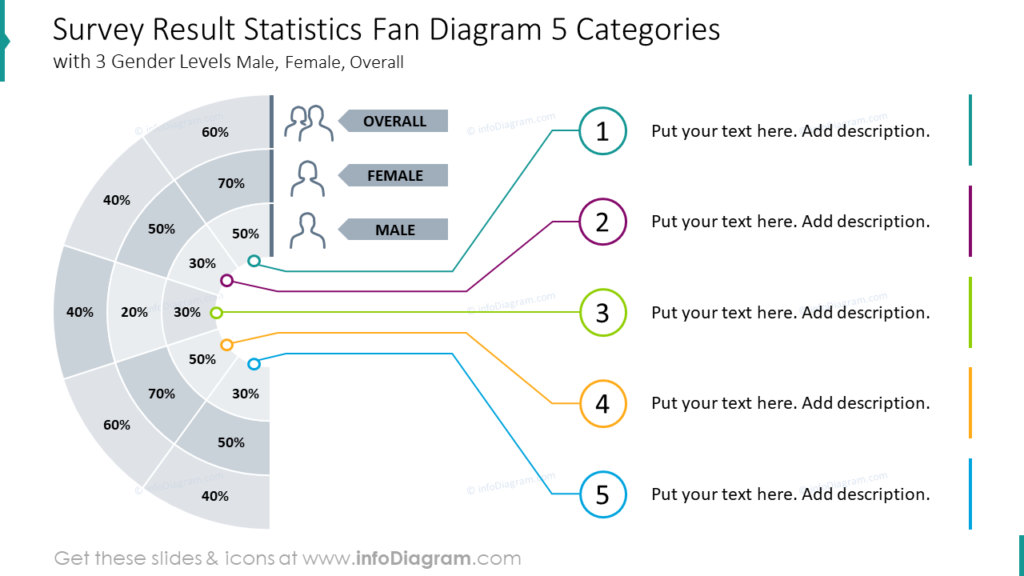
The example radial diagram looks modern and minimalist due to the light outline graphic style. The survey results are broken into demographic information and the descriptive text for each item can easily be customized. The numeric labels can also be subbed out for icons, if that suits your purpose better. Choose colors, text, and labels for each item that suit your organization and presentation purpose.
Utilize a Polar Area Chart to Present Categories as a Cycle
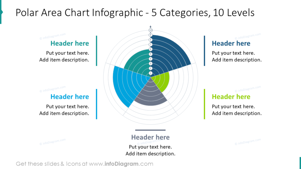
Polar Area Charts, also known as Coxcomb Infographics are types of Radial Chart which present cyclical data. An example of this might be monthly website traffic or deaths in a given month. Colors and the sizes of these graphical elements can be adjusted to suit your organization, audience, or purpose. You might also choose to add icons to represent the different categories. These charts, invented by Florence Nightingale for use in the nursing field.
Circular Organization Radial Charts Are Less Confusing Than Tables
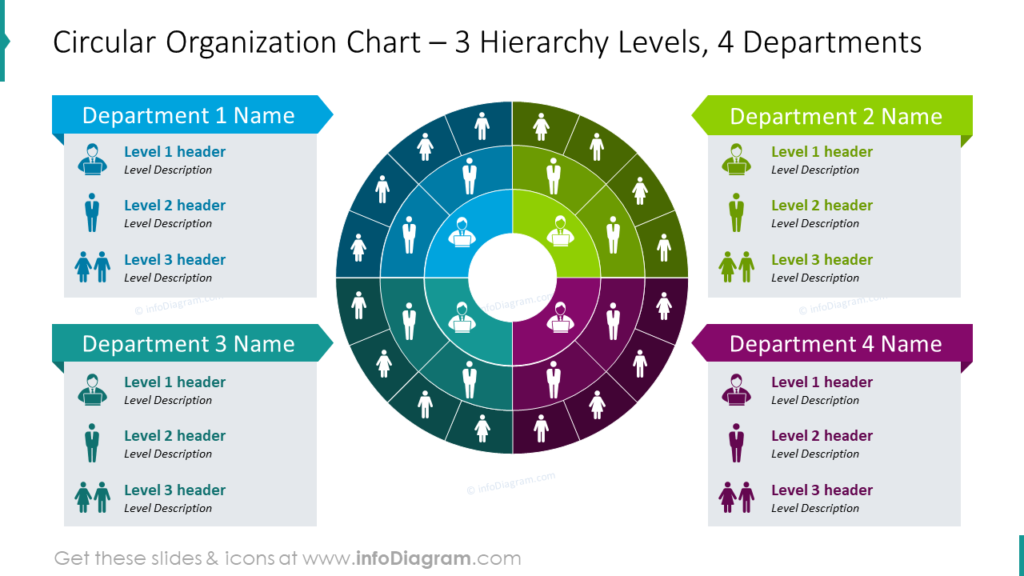
Tables and lists can get complicated when you are dealing with more than one or two categories. In this example an organization is broken down by department as well as employee level. Using this type of chart to explain and organization’s structure is much easier to understand, as well as much more compact, than many other methods. It is also easier for your audience to understand without a great deal of explanation or redundant text. The fewer words you can use on a slide, the better. Wordy slides tempt presenters to read directly from them, which does a disservice to both the speaker and the audience.
Use Engaging Radial Charts to Illustrate Survey Results in PowerPoint
SlideShare guide on How to Illustrate Survey Results Using Radial Charts
How can you get from the example Before to the After? It’s easy using PowerPoint and some design ideas:
- Prepare the fan graphics. You can build it with standard PowerPoint shapes or use a predesigned vector illustration from us.
- Illustrate the percentage values by adjusting the opacity of the radar elements.
- Illustrate categories with icons and add a touch of color to the design. Green will resemble a real radar.
- Add a dark background to make the radar chart more interesting. Remember to adjust the text color.
- Your radial fan chart slide is ready!
Although you could use a bulleted list to share your message when you look at these two slides, which is more interesting? Which one would be part of the talk you’d rather attend, or give? Radial charts are great for articulating data and categorical information in a professional, concise way. The right slide communicates a full idea at a glance, while the left requires several minutes of explanation. You’re busy and so is your audience. Don’t waste their time by giving anything but a cohesive, attractive presentation.
Resource: Radial Charts Fan Diagram Graphics
Whether you are looking for a creative way to share your business values or organization structure, radial charts are versatile, impactful graphics. Using sleek visuals you can customize in a few clicks is easier and more eye-catching than building complicated tables or lists. Click here to see the full set:
If you’d like more options to customize your presentations, check out this collection of professionally-designed infographics templates. These diagrams will help to make your next presentation even more attractive and unique.