10 New Presentation Trends
How will presentations look like this year? The past year has shown that there are things that most of us cannot predict. However, there is also something we can anticipate based on observations, and indicate that some tendencies may be becoming more popular.
I have prepared a list of presentation trends which as an art director I observe now on the market. The choice is made on the basis of last year’s projects of our agency for various business sectors, conversations with clients and with our team of graphic designers. Here are 10 directions that I believe will be important in 2021.
You might want to incorporate some ideas into your presentations right away, so read on 🙂
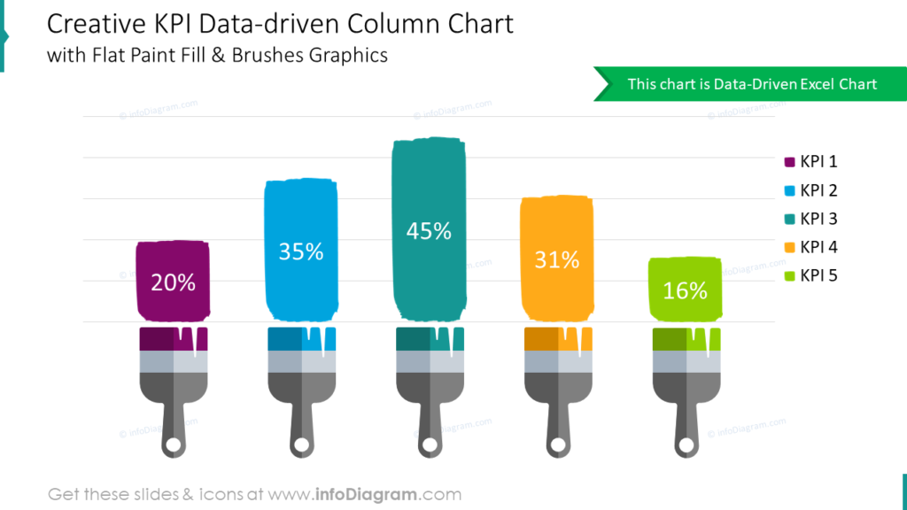
1. Creative data visualization
Data is everywhere. During the last year, many of us were following the statistics of COVID-19 cases. Depending on the needs, they can be illustrated in different ways.
Every day we are flooded with big amounts of data, which often need to be shown in the presentation. This year, even more emphasis will be placed on showing the data in an eye-catching, graphical way, so that it is quickly understood and remembered. Some common errors in data presentation are described in the article “5 errors in charts used in PowerPoint“. I also recommend a great book “Data story” by Nancy Duarte.
Below you can see several examples for a creative bar chart visualization on a slide.
2. Creative photo masks
While looking for a way out of the appearance of the standard slides, I see the increasing use of irregular shapes for photos or charts with data, and for this, you can use the masking technique.
Using masks allows you to give a creative custom shape to a photo. For instance, you can use a blob shape – that is connected with personal organic style.
Here is the example of such slide:
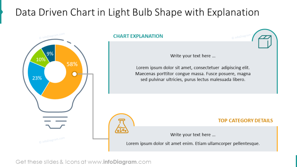
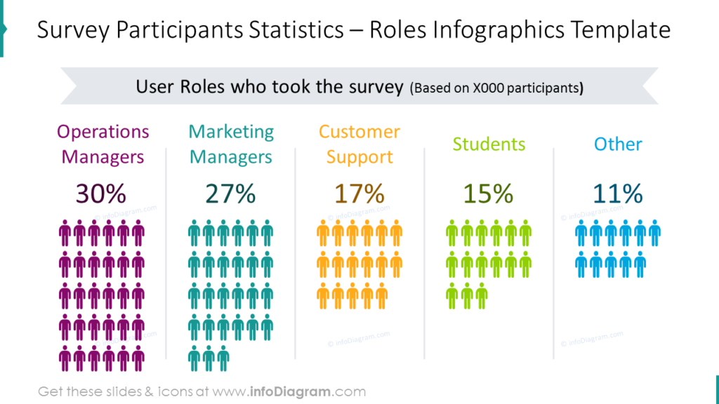
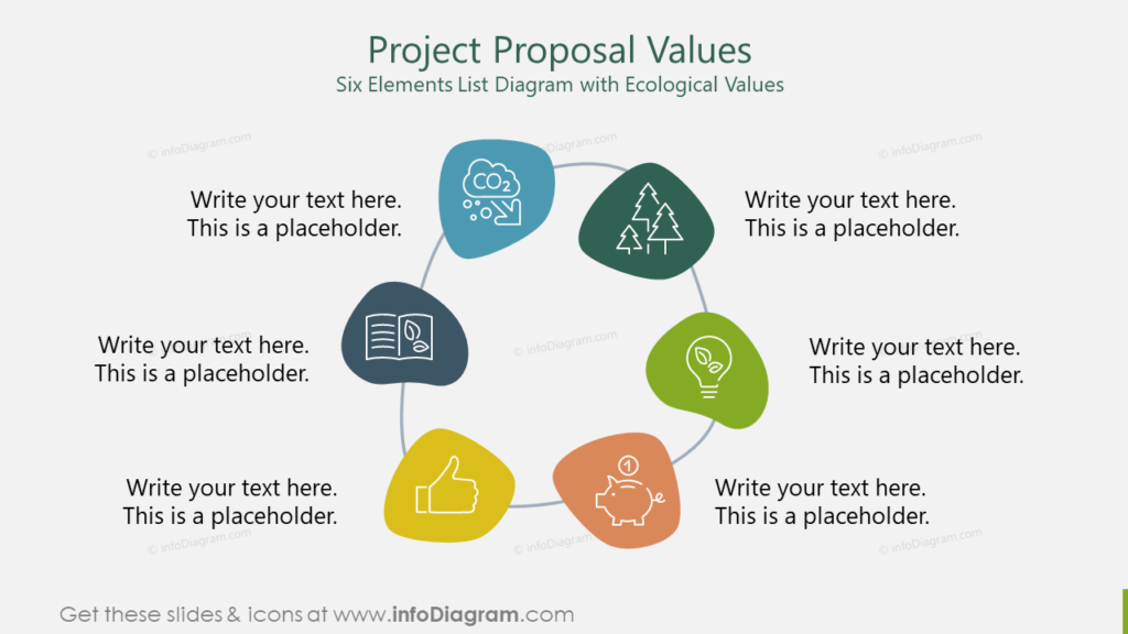
3. Infographic slides for data storytelling
The infographics is combination of graphics that explains certain story or present data in graphical way. It can have a form of highly customized data chart or enhanced flowchart with additional graphical elements. Infographic is not new but now they will become even more essential also in context of presentation slides. More and more people will present the key numbers along with their visualization.
You can make such slides relatively quickly in PowerPoint, using a few simple design tricks – composing infographics from standard PPT shapes:
On the slide below you see data visualization made from set of icons:
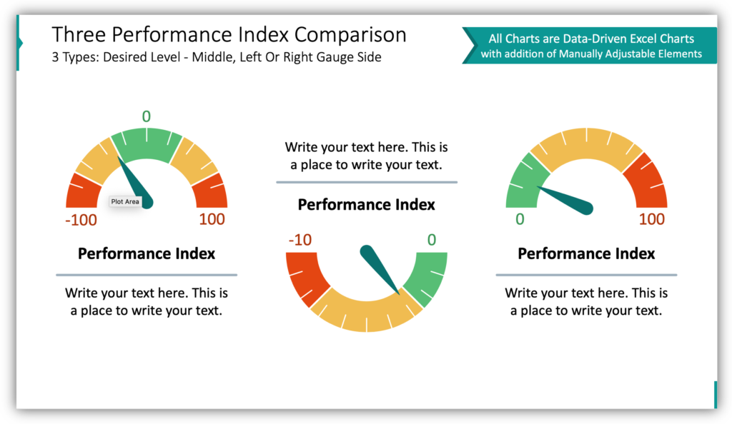
On this slide we show how you can illustrate a value of KPI with an interesting gauge chart. Such chart shows not only the value but also a range if the value is in the good, bad or medium area.
4. Minimalism in presentation
Minimalistic graphics are not a new trend, but they remain on top all the time.
A good example here is the graphics in the contour style (as we call them outline), which is distinguished by simplicity and elegance. It helps to focus on the content and highlight the most important information.
5. More photos and icons
Adding icons and images helps to build associations, which makes it easier to remember content. That’s why more and more of these elements will appear in presentations.
Replacing text with graphics will work especially on slides which are presented, while on slides that are intended for reading (in so called slideuments), icons will be a good addition.
6. Return of gradients
Gradients (tonal transitions between colors) will be used more often to fill icons or apply color to photos. Regular flat graphics will take on a deeper character.
To get a modern gradient effect in PowerPoint, it is better to set the color transitions manually, rather than use Quick styles offered by MS Office. The predefined Quick Styles contain gradients and 3D effects but they look pretty obsolete.
See an example of modern tonal transitions applied on a slide:

We also used gradient transition on our renewed webpage.
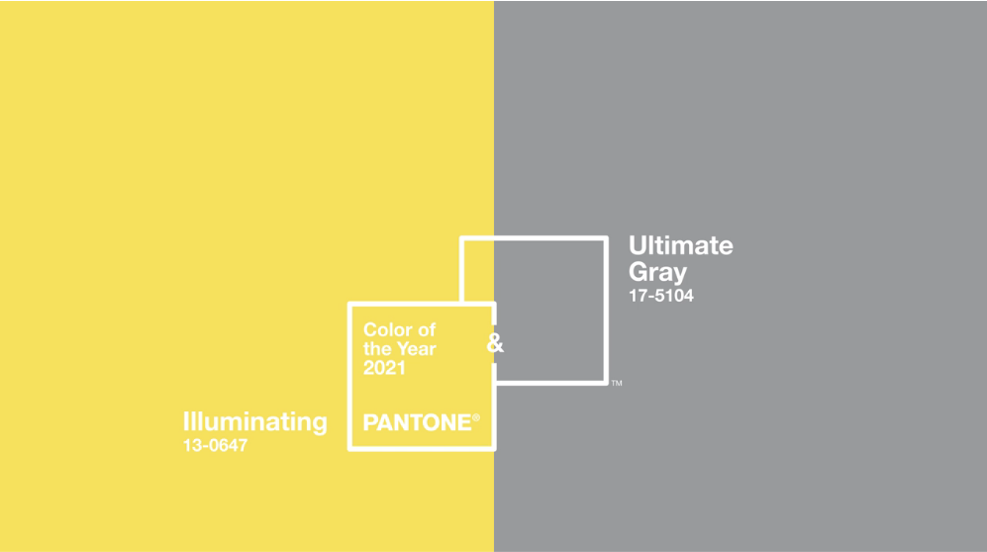
7. Pantone Color of the Year
Every year, PANTONE company selects a color that will characterize the year. This year it is a combination of yellow and gray, which even better emphasizes the expressive shade of the former. Yellow symbolizes optimism and energy, something that is needed to go through the year 2021.
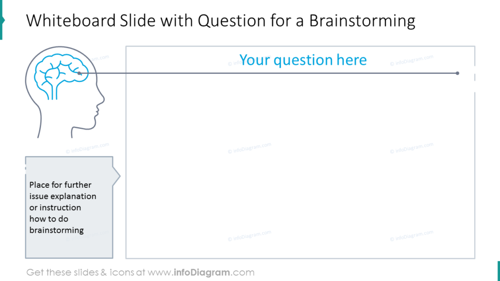
8. Involvement of presentation participants
Due to the rising amount of remote meetings, interactive slides will appear. They will give the possibility of greater participant involvement, e.g.they can make notes and add tags.
In order not to lose the attention of viewers, large differences in the contrast between slides will be applied. For example, the background color will be changed from slide to slide.
Below you can see an example of a slide that can be used to collect answers from participants in a meeting, for instance, in zoom. You can ask participants to write their answers to a white rectangle, just like you would do on a whiteboard or flipchart.
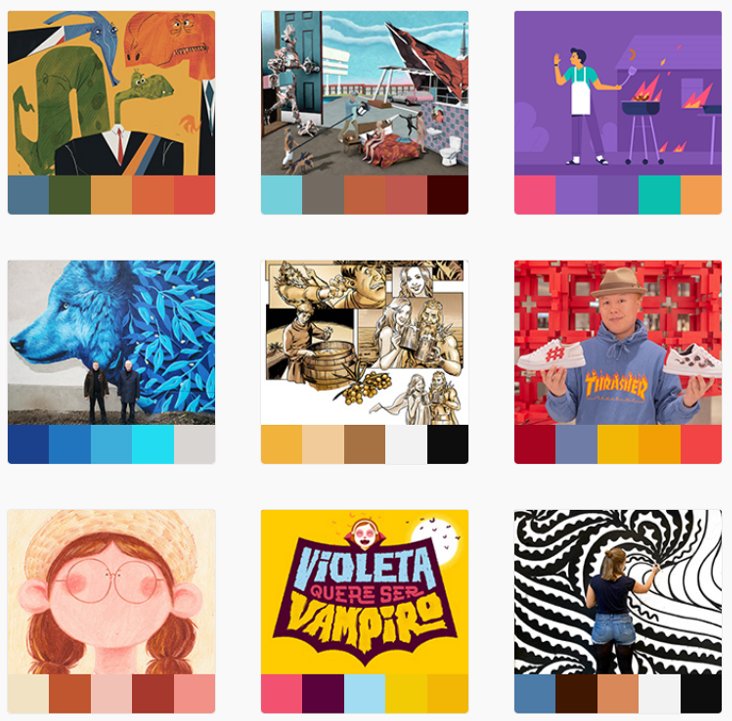
9. Less intensity of colors
More muted and less flashy color palette is definitely a rising trend. For example, pastel colors will be used in combination with dark colors to create a contrast. Here are the color trends according to color Adobe.
10. Organic shapes
Organic, soft, natural, asymmetrical shapes are becoming increasingly popular. They can appear as a background element or superimposed on a photo, as shown in the following slide. Here, for example, I have integrated a mask of organic shapes into a PowerPoint template. You can paste your own photo in such shapes.
This is my list of graphic directions that we should observe this year.
Whatever style you choose and whatever trend you like, remember to be consistent in your presentation. There is nothing less trendy than a mix of different styles, fonts and color palettes