How to Illustrate HR Data Using Dashboards in PowerPoint
Need to present human resources-related metrics? Use an organized way to display important aspects of the human resources performance indicators inside a concise data dashboard. This will help your audience quickly gain insights into the presented data. Read on to get inspiration and graphics ideas on illustrating HR concepts.
Transform your business presentations with our expert resources. Discover more on our business performance presentations webpage.
You can download all presented graphics examples as an editable HR Metrics Dashboard Data Charts PowerPoint deck. See details by clicking slide pictures.
What is an HR dashboard and why use it?
An HR metrics dashboard is a human resources management tool that visually tracks, analyses, and displays key performance indicators, metrics, and key data points to monitor the health of the HR department or a specific HR process or project.
It is a good idea to start a data presentation by clarifying the HR dashboard’s purpose and supporting it with an additional quote. To prepare such a slide, you can add a picture and design elements such as an icon and a quote box. They will make the slide more eye-catching.

Let’s see what HR metrics you can present and how to show them to be easy to understand.
Present employees profile split with HR dashboard
The employee profile dashboard can include headcount by:
- type of work (White Collar vs. Blue Collar)
- contract type (Full Time vs. Part Time)
- region
- department (e.g. General Management, Sales, Marketing, Finance & Administration, HR, Supply chain, IT)
- HQ overhead ratio
See below how you can organize such data set in a visually consistent layout:
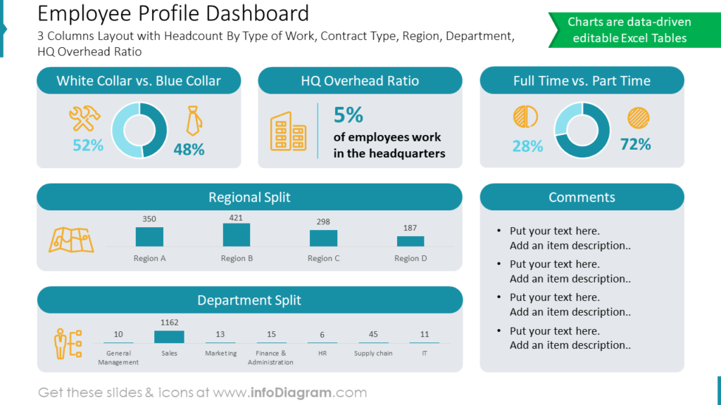
When putting various data categories on one slide, think about the best way to visualize each indicator. For example, we chose a donut chart for the type of work and contract, and bar charts for regional and department split. Icons also will help create a visual association.
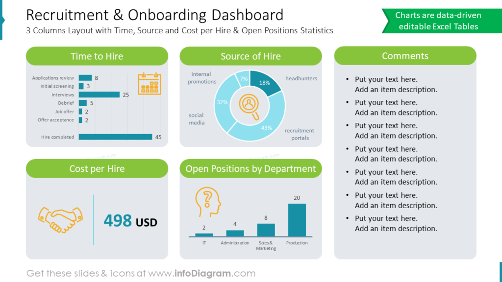
Illustrate recruitment and onboarding metrics
Recruitment and onboarding metrics usually represent:
- time and source to hire
- open positions by department
- cost per hire
We illustrated those HR metrics in a 3-column grid depending on data type: e.g. horizontal bar graph for comparing 6 indexes, and pie chart for the source of hire. You can also include a bold font showing KPI numbers to make them stand out, like the cost per hire on the slide below.
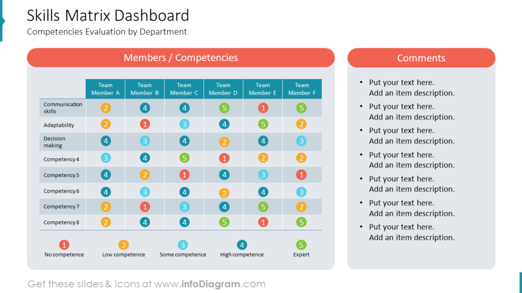
Design employees skills matrix
If you want to see a big picture of your employees’ skills, a matrix dashboard can be a good format to try. You can evaluate key competencies, like communication skills, adaptability, and decision-making by teams or departments.
See the skills profile slide below. Notice how we used color-coding for the level of a particular skill, starting from No competence to Expert level.
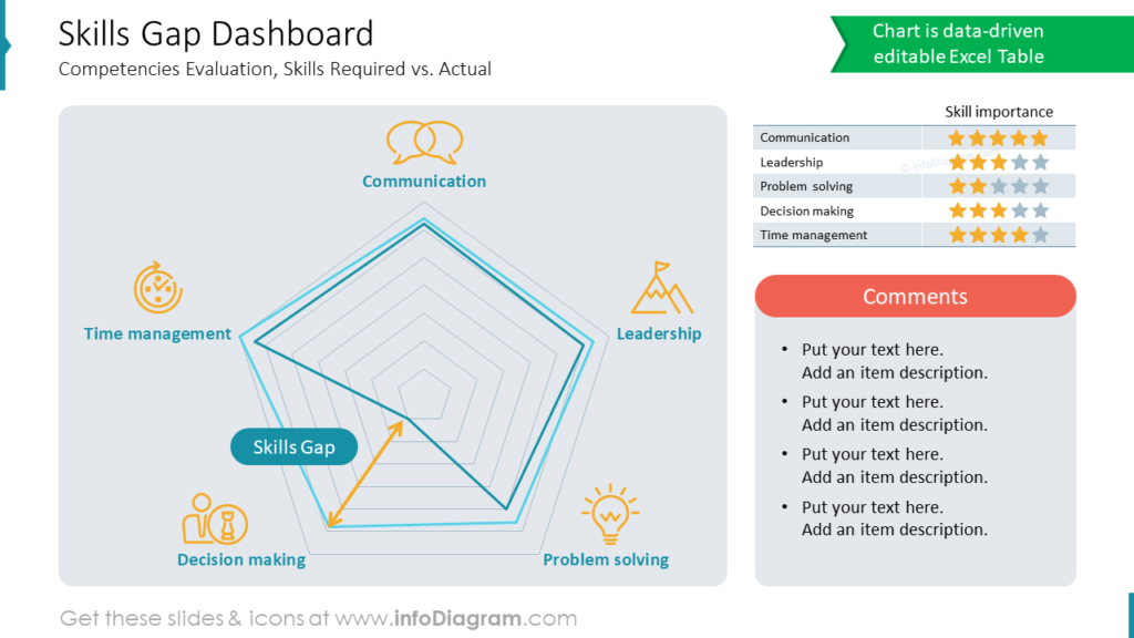
To illustrate the gap between required and actual skills, you can use a gap radar chart. With its help, you can show skills priorities, requirements, and deviations.
Visualize employees retention
To present employees’ retention dashboard with staff turnover ratios analysis you can create such a slide with a set of bar charts showing retention data over time.
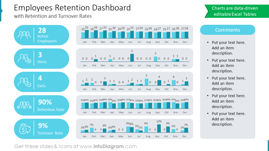
Notice the visual way we used to highlight key data (active employees, hires, exits, and retention and turnover rate) by icon and numbers in the colorful 1st column.
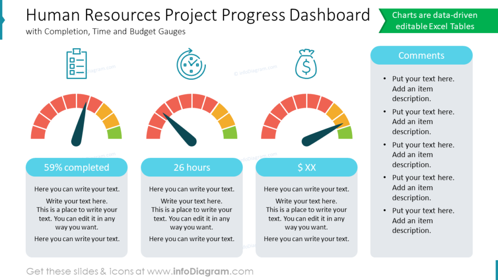
Illustrate HR project progress
“What gets measured, gets done”, as Peter Drucker said.
Need to evaluate a project’s progress? A gauge chart is great when you have to review and present goal completion or KPI achievement levels. In our example, we put three gauges showing the status of completion, time, and budget goals.
Present remuneration changes with HR dashboard
To show wage comparisons and YOY changes, you can use a remuneration dashboard with various metrics, e.g. an average gross annual salary and its increase, wage level benchmark, and wage change.
Organizing data elements in a regular grid will ensure the slide looks readable and professional.
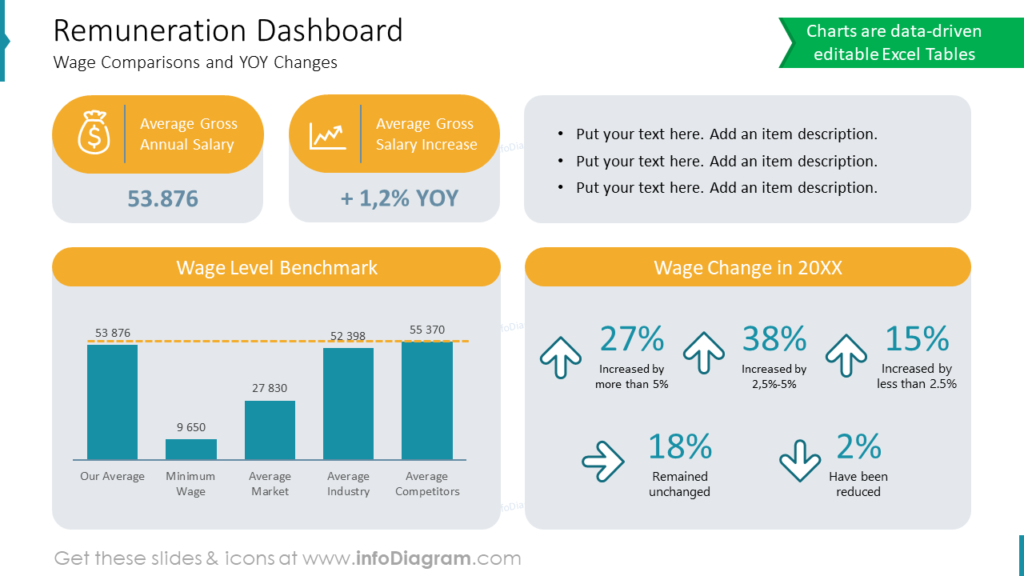
Notice in the last data box how you can show increasing or decreasing trends by a simple elegant arrow icon.
Explore our YouTube channel for more creative inspiration:
Resource: HR Metrics Dashboard Data PPT Charts
The slide graphics in this blog are a part of our HR dashboard graphics collection. It contains slide templates to create visual dashboard slides for presenting human resources metrics and charts (mostly data-driven Excel charts). Check the full collection here:
Want to customize your slides even more? Graphics from the professionally designed diagrams collection might help you take your next PowerPoint further.