Gauge Charts for KPI Presentations: Eye-Catching PowerPoint Templates
Create eye-catching gauge charts for KPI presentations in PowerPoint. See examples of speedometer diagrams, dashboard visuals, and performance meter templates.
When you want to visualize a goal achievement or express the status of a key progress indicator, consider using speedometer gauge charts as your data visualization format.
Let us share examples of such speedometer data charts used in Microsoft PowerPoint.
Speedometer Gauges can showcase your achievements
So-called gauge charts show one-dimensional data on a circular axis. They resemble the retro speedometers used in old cars. Those charts can also show several levels of risk of a target achievement. You can show for example, if your performance ended up below, at, or beyond the desired KPI target.
People are pretty familiar with speedometers, so when using gauge as your data visual, you won’t need to explain it further. Therefore they are good for executive summaries and top-management presentations.
All data visualization examples mentioned here have been designed by our team. You can get them as editable MS charts file here: Gauge Charts Graphics for PowerPoint.
We share here various examples of using such speedometer charts in business presentations.
Compare multiple performance indicators on one slide
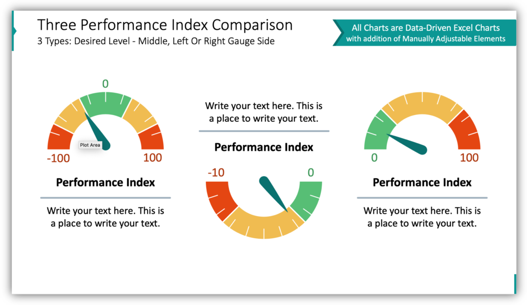
Need to compare the performance of multiple teams on the same performance indicator? Need to present several performance indicators for one team? Both of these scenarios are possible. Use multiple speedometer graphics on one slide. Customize the gauge graphics to represent the data, and then incorporate icons, titles, and descriptions to help your audience follow along.
Compare indicators with 4 possible performance levels with gauge charts
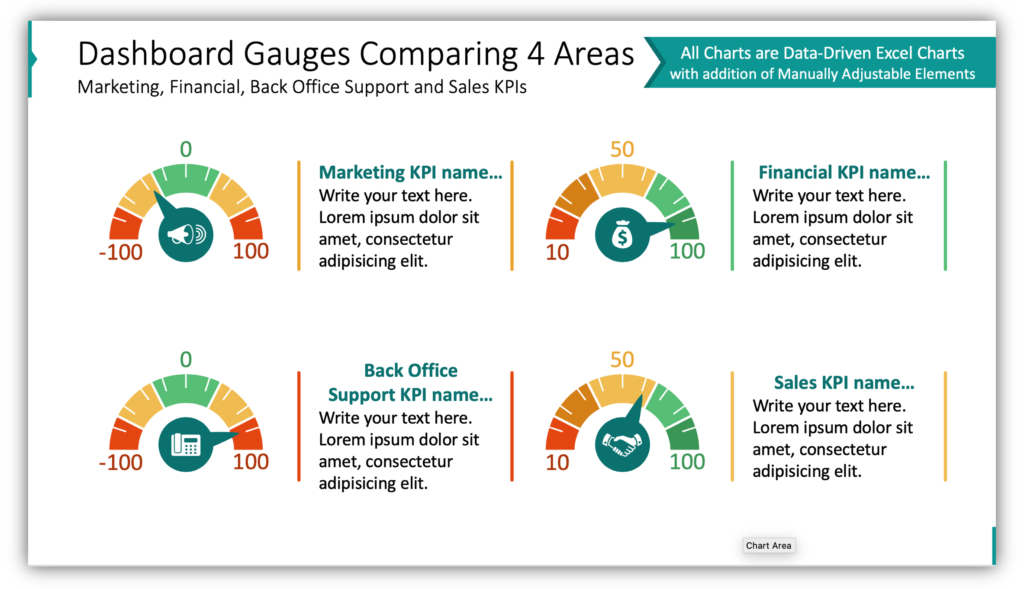
Sometimes performance is more than just a 3 tier gradient from bad to good. Sometimes to achieve a goal, things need to go just right. If you need to share those results, you might be tempted to incorporate boring charts or tables with data. See how much more interesting the dashboard of gauges above is? Keep your audience focused and attentive with modern visuals.
Present overall company performance by describing departments on a single KPI
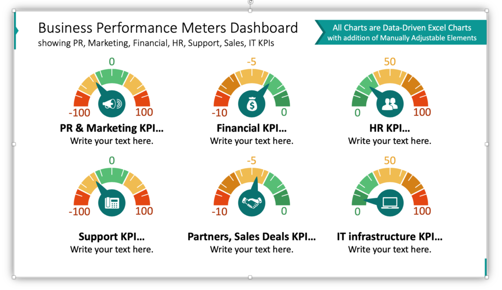
Overall, is your company achieving its goals? Are your staff performing at the level you expect? Regardless of how you answer those questions, you can paint a company-wide picture with a business performance meter dashboard. Are most of your divisions performing well? When you use a dashboard of thermometer graphics it will be obvious just how much work there is to do. Complex data analysis can be performed at a glance.
Use temperature meter indicators
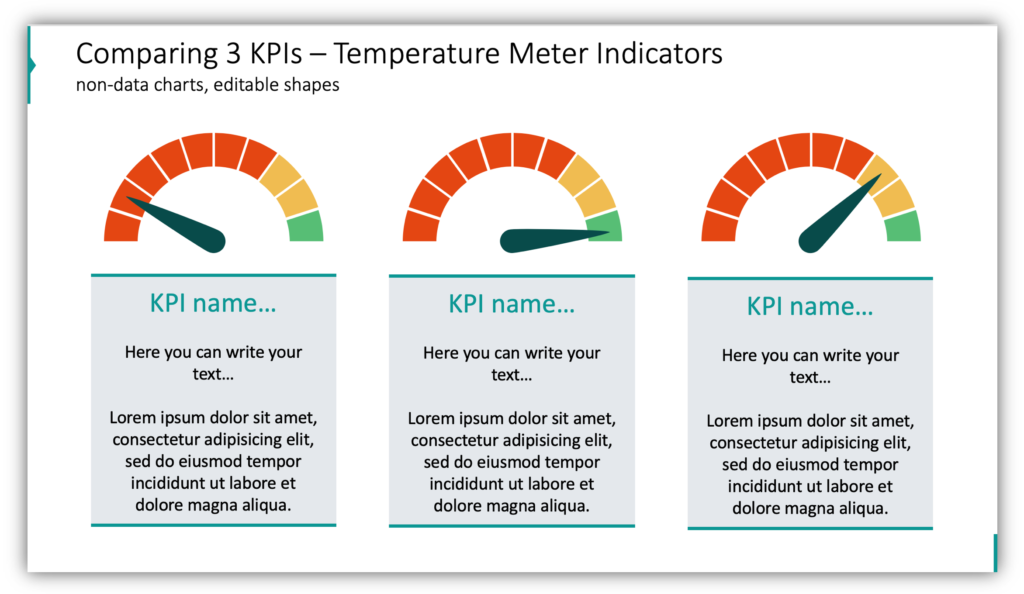
Does your key progress index have a large margin of error? Consider using a temperature gauge. Just as industrial machinery might have a small threshold for acceptable operating temperatures, your goals might have a limited range of acceptable performance. Add a label and description to each box to provide more context so that your verbal explanation more clear.
Present the status of completion with a speedometer
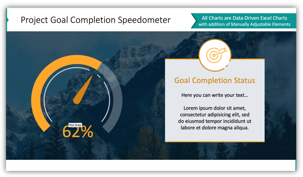
Goal completion isn’t always a sprint, and it doesn’t always need to be presented in pass/fail terms. In this example, you see how you can present your goals or key index performance as a percentage of completion. In the description box, you can provide details about the progress you’ve made, the steps it took to get there, and what your plans are to achieve the remainder of the goal.
Gauge charts are easy to use and easy to understand
Ready-made gauge graphics are simple to customize and use. Since audiences already are familiar with and know how to read speedometers and other gauges, you can save your explanations for your analysis of the findings.
Resource: Gauge Charts for KPI Dashboards
Impactful, beautiful gauge charts can be modified by editing the underlying Excel chart. For the few graphics in this slide deck which doesn’t populate from Excel data, you can customize them with the usual PowerPoint tools. Adding an icon or adding additional commentary next to the gauge will help you further explain your KPIs:
Communicating full ideas with graphics is easier when they’re simple and user-friendly. Put your ideas together simply, and add details by adding supplementary icons or a different style of graphics from our diagrams and charts collection.


