Slide Ideas for E-commerce Analysis and Strategy Presentation
Need to present your e-commerce market characteristics and your online store performance? With e-retail sales growing at a speedy rate you might need to present your e-commerce analysis, challenges, performance, or metrics. Using appealing visuals for describing topics connected with online business makes the information clear in the mind of the audience.
Transform your business presentations with our expert resources. Discover more on our business performance presentations webpage.
Below we present several ideas for visual slides covering e-commerce models, analysis methods, and concepts, including:
- e-commerce types by business model
- market characteristics dashboard
- reasons for shopping online
- customer journey process map
- purchase funnel
- payment and delivery methods
- monthly sales analysis
We hope our examples will help you save time in finding the most suitable icon or diagram and create attractive readable slides.
All slide examples below can be downloaded as an editable source. See the E-commerce Analysis & Management graphics collection for PowerPoint.
What is an E-commerce data-driven strategy?
E-commerce is a business model that lets firms and individuals buy and sell products or services over the Internet. Data powers most business operations and serves as a source of valuable insights into shoppers’ behavior.
By collecting, processing, and analyzing data generated by e-commerce businesses, it’s possible to predict future trends, adapt to customer expectations, boost online shopping experience, raise conversion, and improve sales and marketing performance.
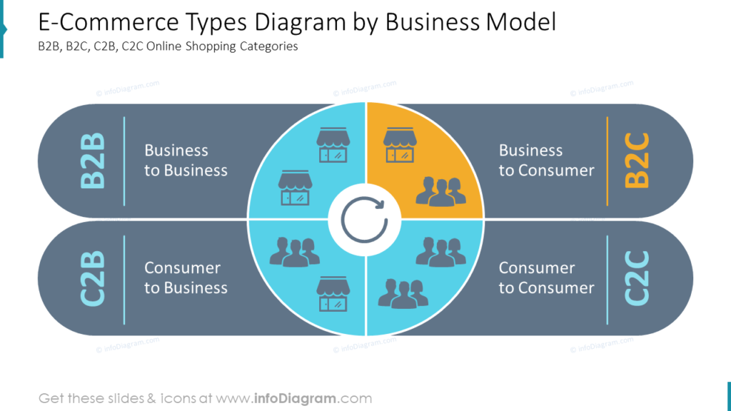
It is a good idea to start a presentation by clarifying the e-commerce definition and types. Below you can see an example of an e-commerce types diagram, including B2B, B2C, C2B, and C2C online shopping categories with a focus on the B2C type.
Illustrate market characteristics, demographics and competitors
Such a dashboard illustrating all essential demographic parameters of your e-commerce strategy on one slide will help to see the big picture and analyze the situation better. You can list the common indicators such as users split by:
- Sex
- Age
- Education
- Place of Living
- Income per Household
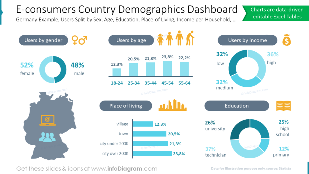
To make the data easy to read, we used various charts to represent each parameter: vertical and horizontal bar graphs for age and place of living, and donut charts for gender income, and education.
Describe main reasons for e-shopping in your e-commerce analysis presentation
We advise going beyond bullet-point lists and trying out creative ways of structuring the data. On the example slide, you can see the list that sums up reasons for shopping online: Convenience, Price, Convenience, Product Range, Customer Reviews, Shipping, and Time Saving.
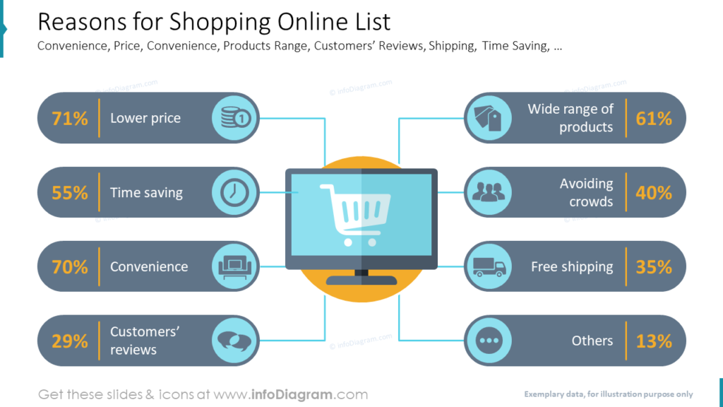
Each point is shown with an illustrative icon and percentage.
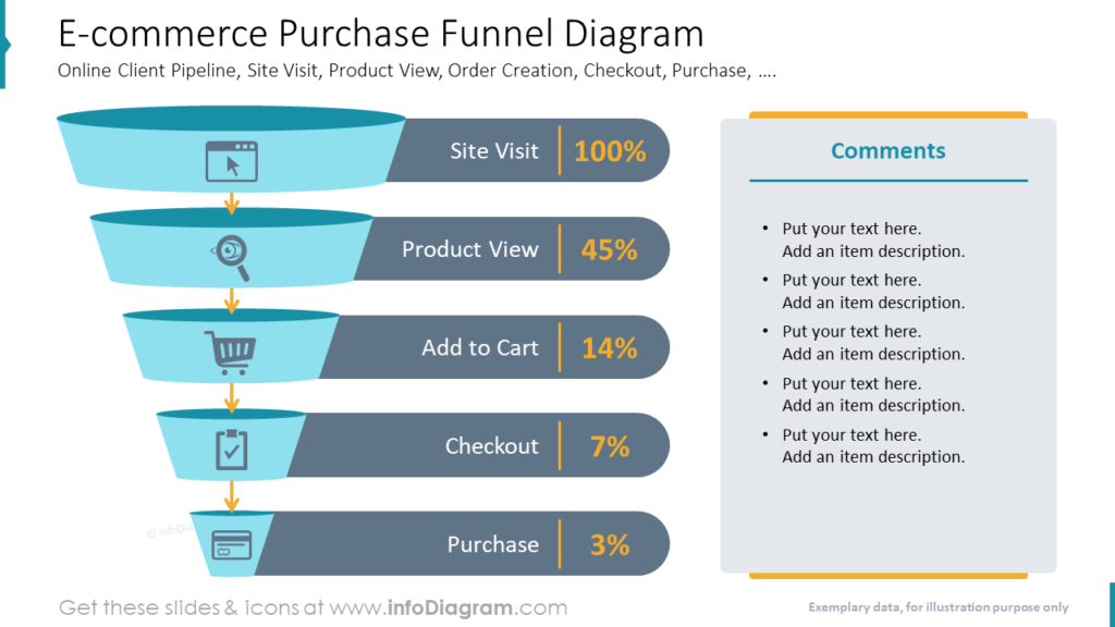
Outline customer journey process map
Present the customer journey using such roadmap graphics, divided into two main parts: purchase and post-purchase. You can include common steps such as:
- Site Visit
- Product View
- Add to Cart
- Checkout
- Purchase
- Order Tracking
- Delivery
- Return (optional)
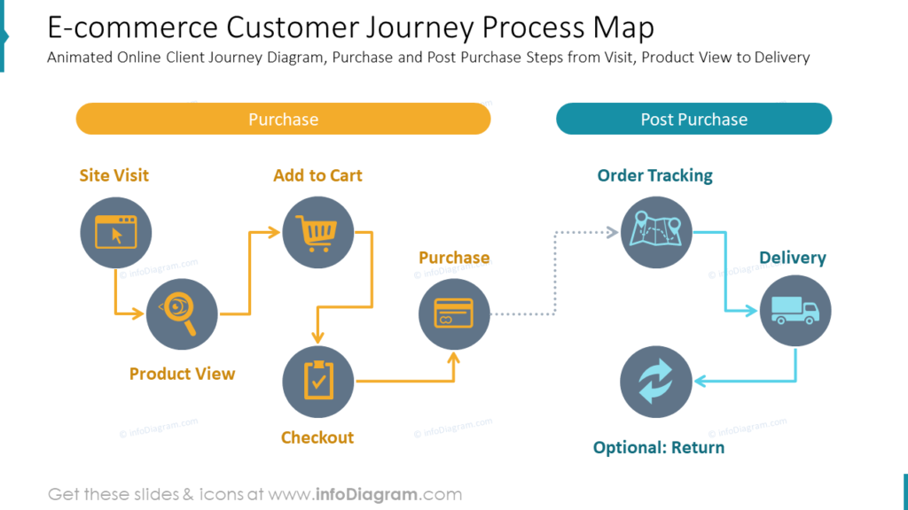
We used color-coding to make the stages more distinguishable and symbols to make the slide more attractive visually.
If you want to analyze the process deeper and to find solutions with your sales team on how to improve it, you can use such a funnel graphic demonstrating the percentage of users coming through each stage:
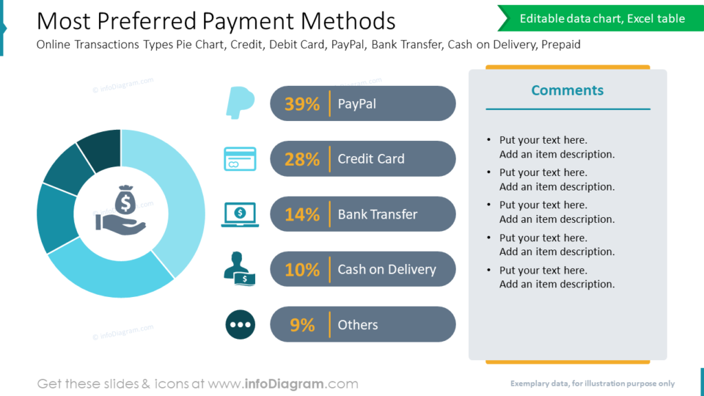
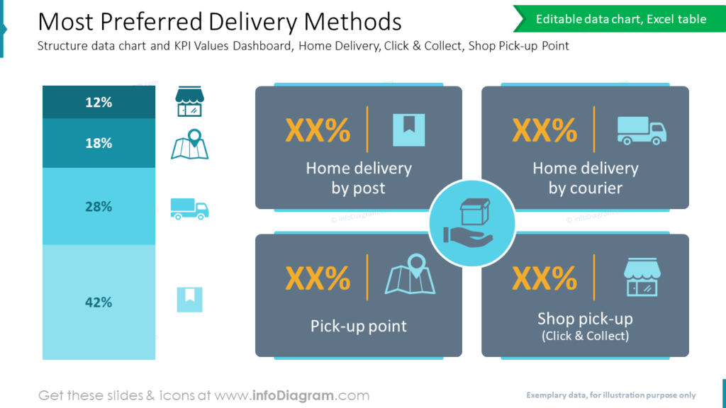
Visualize preferred payment and delivery methods
Illustrate the payment methods customers prefer most by using a donut chart with a description beside it.
On the example slide, you can see the summary of the following online transaction types: PayPal, Credit Card, Bank Transfer, Cash on Delivery, and Others.
To present preferred delivery methods, you can use the structure data chart and KPI values dashboard to make the numbers more visible. The common options include Home Delivery by post or courier, Click-and-collect, and Shop Pick-up Point.
Show the monthly sales e-commerce analysis
The trend line chart is one of the best visual methods for presenting and comparing tendencies. On the slide below you can see the comparison of Net Revenue Value vs. Orders Entry Value over time.
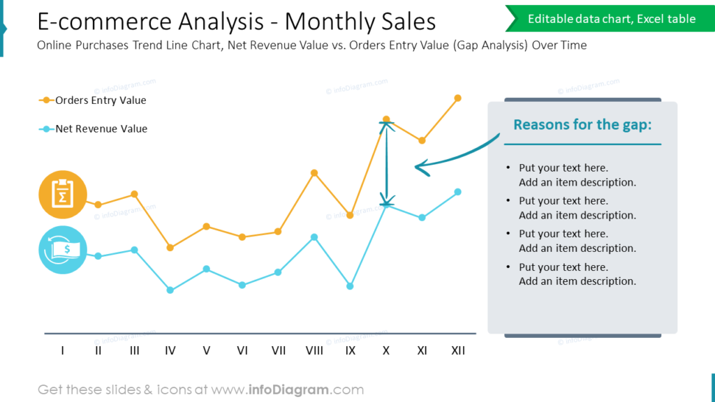
If you want to focus more on evaluating the current results and the necessary improvement efforts to close the gap and reach the desired performance, check this blog for inspiration and gap analysis illustration examples.
For more inspiration, subscribe to our YouTube channel:
Download our slide redesign guide here: How to Creatively Present E-Commerce Categories (a PDF document).
Resource: E-commerce Analysis & Management Presentation
The diagrams and graphics above are a part of our e-commerce slides collection. It contains templates to illustrate e-commerce concepts and models, including e-com market characteristics dashboard, competitors comparison template, customer journey process map, KPI analysis template, online store traffic’s sources data-driven chart, sales comparison slide templates, and more. Check the full deck here:
If you are looking for more general diagrams and charts, consider the ultimate collection of infographic templates.