Facelifting Webinar Presentation: 13 Examples for Better Attention
Preparing a webinar on slides for online presentation can be quite challenging. Presenting over a screen without seeing a direct feedback from your audience does not make it easy. Therefore many things matter, choosing a proper picture, making slides clear, crafting the right call to action message… Does it sound familiar? This blog gives you a few ideas on developing webinar template slides and organizing web conference flow.
Creating a reusable webinar template can ease up the content creation process. The graphics ideas we share here can be handy for people who decided to build a business through webinars as well as for the ones holding occasional online training.
Note: all presented slide layouts can be found in the Webinar Presentation of Problem-Solution template.
We use the PowerPoint slides here, the most common format used in e-learning and online conferences. Using Microsoft Office 2013 and newer additionally allows you to export the slides as video (see an example of such exported PPT to Youtube videos here). If you want to learn more about webinar content and its preparation, check this post by KissMetrics.
Let’s go over the common webinar structure, that you can reuse for your own presentation (click on the pictures below to see the source graphics).
The typical structure of a problem-solution webinar presentation contains those elements properly visualized (better forget using heavy text-only slides, if you want to keep the attention of your online audience):
- Intro slide with a catchy image along with a big readable webinar title
- The opening question in a corresponding layout that will focus on the question you want to ask
- Agenda slide with a place for main webinar parts
- Slide for webinar “housekeeping” information that will explain your presentation logistics (timing, how to comment etc.)
- An inspirational quote to set a mood
- Information about the speaker’s bio
- A place for a quick survey
- Key facts or numbers slide template to back up your speech with some real-world data
- A section about the challenges people can have
- Presenting the solutions to those challenges and how they work
- Summary slide when you’re about to finish
- Call-to-action slide – a frequently overlook the important part of the presentation
- Contact information, so people know where to reach the speaker
1. Starting with a Title Slide

Usually, it includes the webinar name, and the presenter’s name and title. Optionally you can put the date. However, don’t overload the first slide. Let participants gather, focus their attention, and then move to the next points.
2. Have You Ever Experienced a Similar Challenge?

As we designed this template for the problem-solution webinar, the opening question slide asking about the main challenge of listeners will suit well in the flow. Even if you’re holding another type of webinar, it would still be a good idea to address your audience.
3. You’ll Walk Out Knowing about the Following
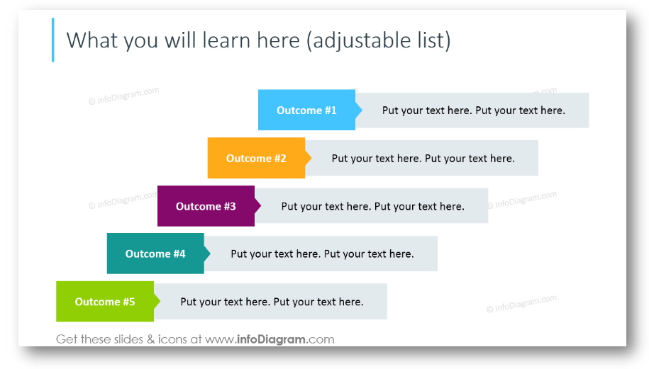
It’s a good practice to show listeners what they will get in the next hour. Of course, if they are attentive enough 🙂 Present outcomes in such a creative way, not just a bullet points list.
4. Explain Webinar Organizational Details
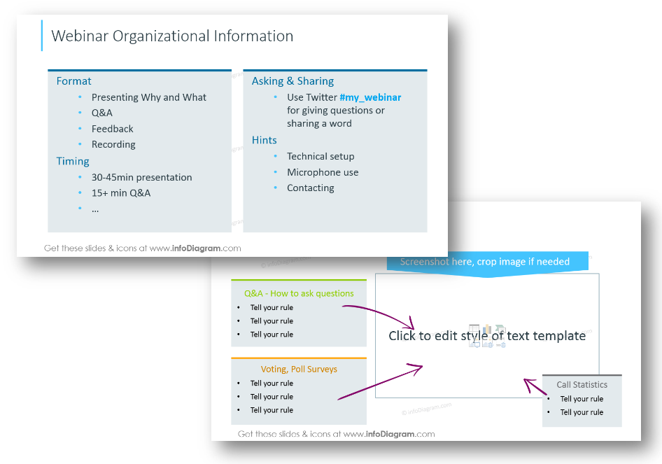
Spend some minutes explaining organizational stuff: webinar format, timing. Encourage people to ask, share and give them a few hints on how they can get the most out of the session. The next slide is for demonstrating the web-conferencing app setup. Give instructions on how people can ask questions, how to use a microphone, and vote in polls if the webinar will be recorded. Don’t forget about stating what’s the duration of the webinar so people can schedule their time. You can easily insert there your screenshot.
5. Introduce the Content with Visual Agenda
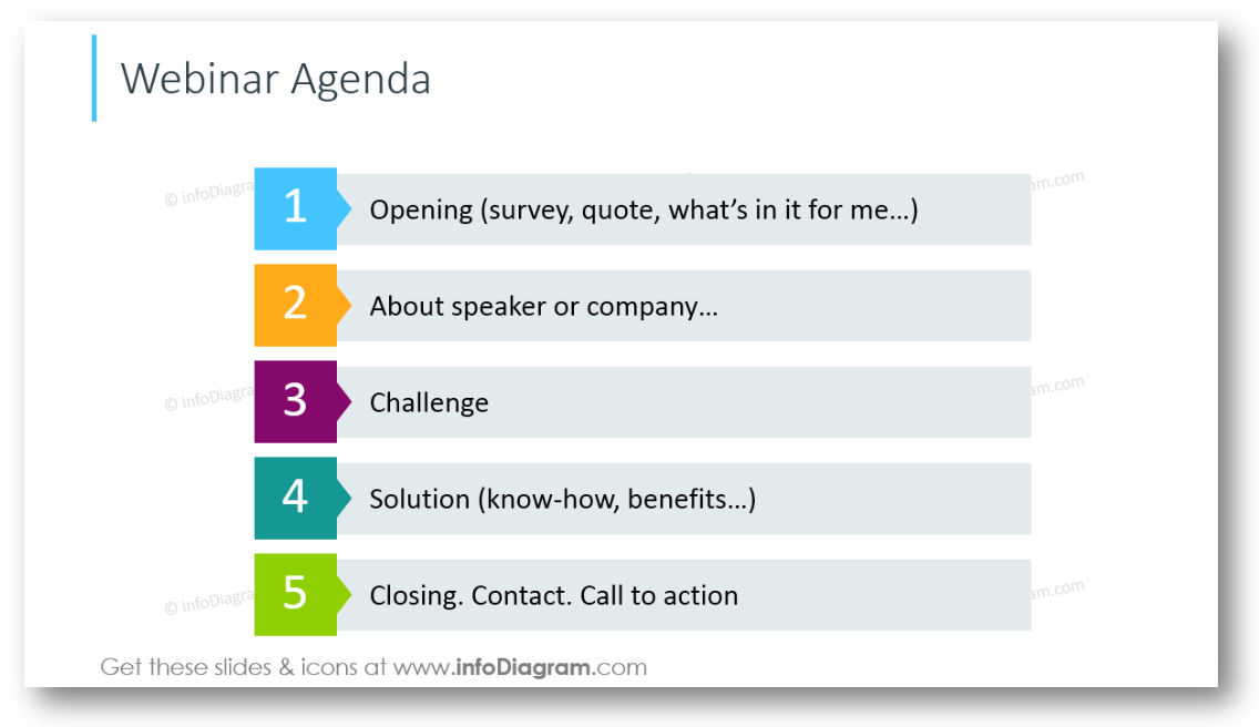
We recommend including 4-6 most important points here. It will help people to set clear expectations for the webinar and give a preview.
6. Motivate with an Inspirational Quote

Quotes are a great way to add an inspirational element to your presentation and in the case of the webinar – to set a mood of web-course. Appropriate quotation adds credibility to your topic. The text can be easily altered.
See our SlideShare to discover other ideas for designing a quote slide.
7. Presenting Speakers’ Bio
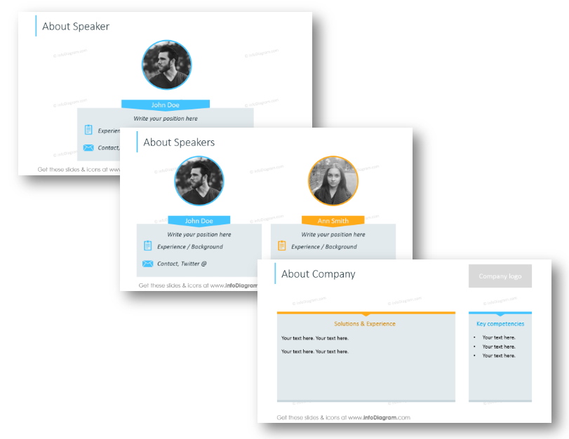
This slide is for putting the basic information about speakers. In case you’re having an interview webinar, it will be useful for the listeners. Optionally you can add information about a company, its logo, and what it does if this is a commercial webinar.
8. Include a Poll or a Survey
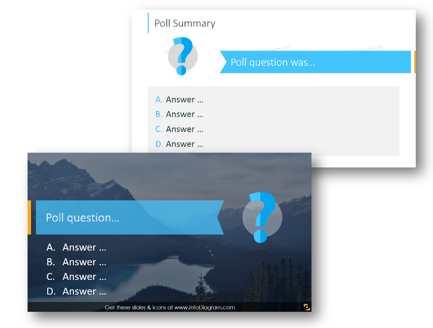
Let the participants vote, and encourage them to share their opinion. This template allows you to present the poll question and answer options, and the next slide layout can be applied to present results.
9. Talk Facts and Numbers
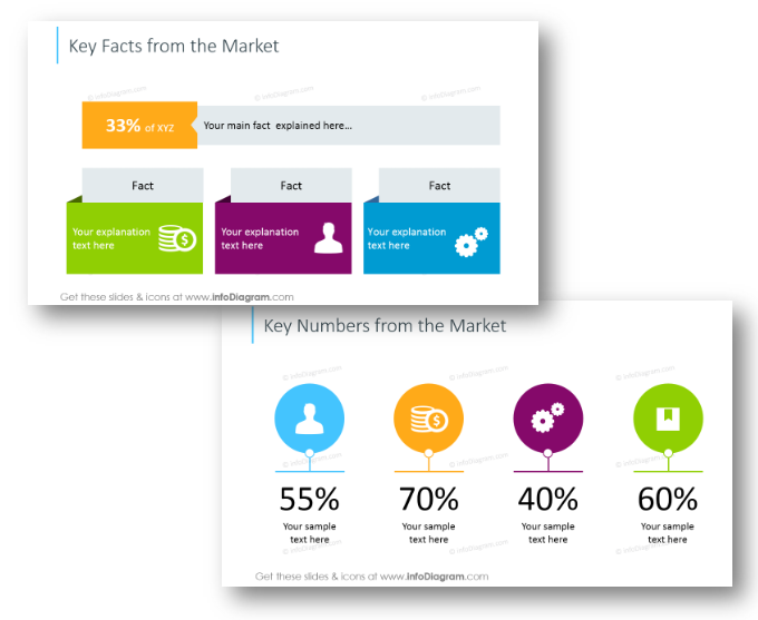
A good idea is to incorporate some interesting facts, and data from the market that support a point you want to make in the presentation.
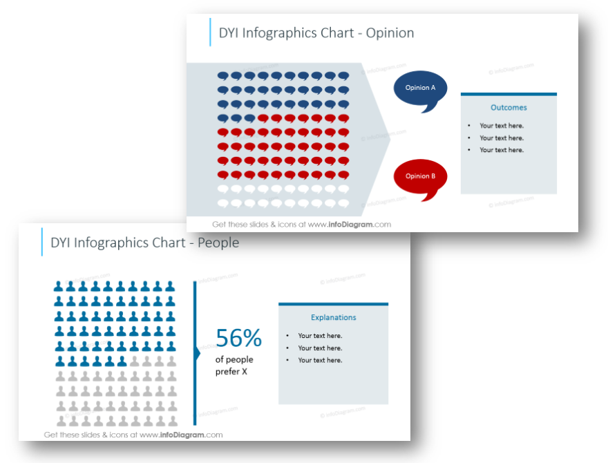
Represent the data by simple infographics using appropriate icon symbols and underline the key numbers, like in the picture above. You can easily adjust the numbers as you need.
10. Present a Challenge
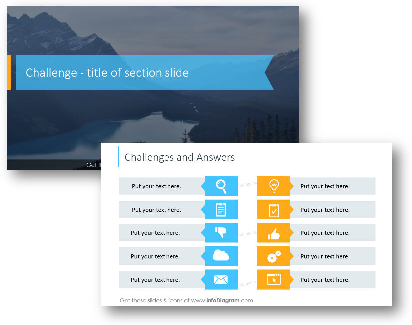
After you discussed all details and showed data from the market, it’s time to address the challenges or problems people have. Add some details – list possible problems and answers. Illustrating your ideas with icons will help people to get on point faster.
And then slowly build u a foundation for introducing your solution.
11. Introduce the Solution
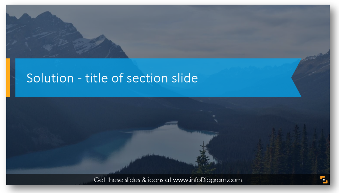
That’s why people came – to hear your brilliant ideas to solve their challenges. You can first state the solution using one phrase or sentence – and put it on a suitable background:
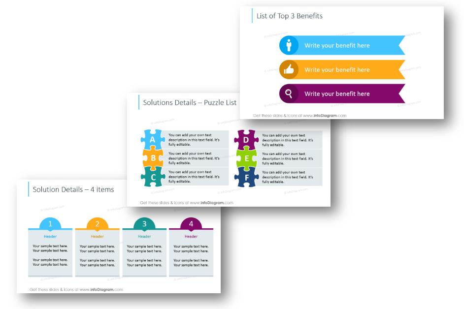
Start describing it with the list of the main benefits – see the example of circle diagrams or puzzle graphics:
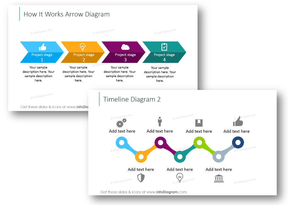
Continue with a timeline illustrating how your solution works, and what stages it has:
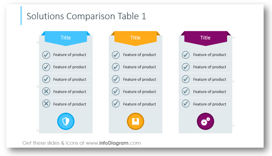
Optionally you can use a table for comparing various solutions:
12. Finish with a Strong Summary
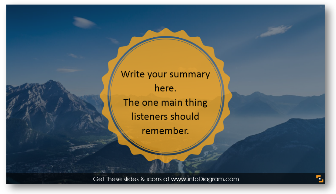
Make a conclusion – we recommend stating here one main thing you want listeners to remember.
13. Close with Call-to-Action
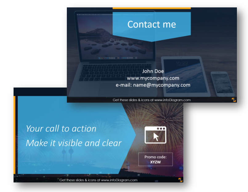
Time to ask people to take action: to contact you, to sign up for your service, to try your solution. Make clear actionable follow-up, that has a time constraint, so people are motivated to act now. We added several actionable button designs you can edit and use. Look for other examples of CTA buttons here.
Attention Keeping is a Key
Those are 13 ideas you can use to make your next webinar more engaging visually. Keeping the attention of the online audience is much harder than in face-to-face meetings. You must rely much more on presentation slides, as there is less direct interaction.
Therefore we proposed to you those dozen ideas on how you can facelift graphically your webinar content. From a catchy introduction, via an infographics-like agenda, and finishing with a strong call to action. When properly used, those elements will help you to extend the attention span of your listeners.
Graphics Resources: the Webinar Presentation template
To help you with preparing appealing professional-looking slides, we designed this editable slide set for the webinar presentation. If you want to avoid a boring default look and come up with something different, this slides set is for you 🙂
It’s prepared as a PowerPoint file, however, you can use also other presentation software capable of importing PPTX files such as Google Slides or Keynote.
If you enjoyed the graphics above and they can be useful for your next webinar, you can see the full deck and get it here:
If you need to create another sales, strategy, or training presentation, then check more slide graphics on our Business & Marketing diagrams page.


