Design Examples of Presenting Annual Budget Proposal in PowerPoint
Working on your annual budget proposal? Financial presentations and documents can be difficult to be absorbed, especially by non-financial audiences. If you want to communicate key financial information to stakeholders clearly and effectively, check our article for examples and inspiration on how to present corporate annual financial summaries and forecasts.
What is a company budget?
A budget is an estimation of the earnings and spending of an organization or its departments. Basically, it is a financial plan for a defined period, usually a year.
In case of a corporate budget, it can contain several subtopics:
- Revenue budget, with main revenue sources, sales distributions, and key growth drivers
- Expenditure budget with operational cost presentations, key cost drivers, OPEX, and capital expenditures
- Marketing budget allocation
- Sensitivity analysis and risk assessment
- Organization costs and structure
Why use graphics for budget proposal presentation?
It’s not enough to come up with a list of financial reports and annual budget goals. You have to explain clearly your data and map out how you’ll accomplish those financial goals or make your ideas come to life… within a reasonable budget.
When you need to make your case to managers or executives, a well-prepared budget proposal presentation is an essential tool used to communicate financial information to both internal and external stakeholders. A consistent way of showing financial highlights can help keep the numbers organized, making it easy to track revenue or plan for expenses.
Get inspired by examples of how you can illustrate the components of your budget proposal.
All visual examples presented below can be downloaded as an editable source. Explore the Annual Budget Financial Presentation for PowerPoint.
Presenting the current state of the business
To give a big picture of what you’ll be talking about, kick things off with an executive summary, strategic goals and targets overview, and corporate budget assumptions for the future period.
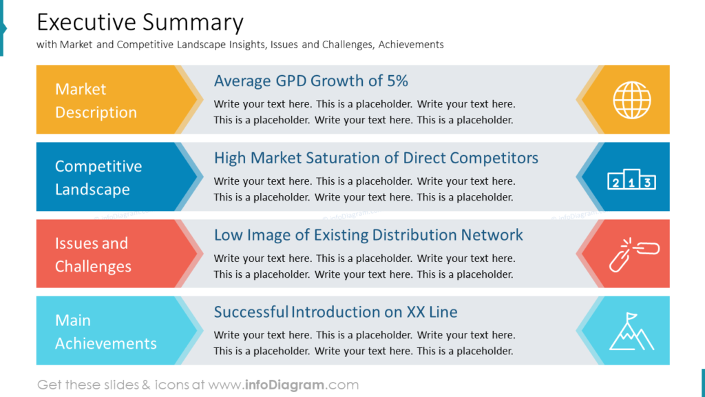
Such a general slide with an executive summary will help to see the broad view and give an entire perspective to your audience. You can list the common key indicators such as Market Description and Competitive Landscape Insights, Issues and Challenges, and Main Achievements.
You can use arrow shapes to present each item in your executive summary slide, as you can see below. Each point is illustrated by a related icon e.g. market description by globe symbol and achievement by peak icon.
To remind about strategic goals or sustainability targets effectively, you can replace bullet points with modern professional-looking diagrams. Here’s an example of goals summary with 6 highlighted ambitions for the next year:
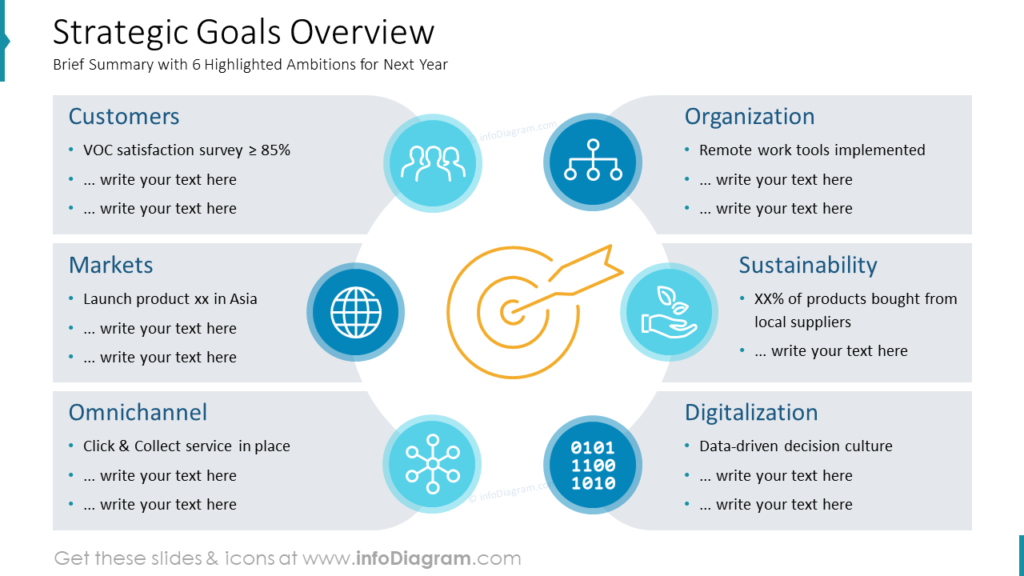
Notice how nicely you can present six goals if they are distributed around a circle. It gives a feeling of concise integrated direction.
One of the ways to show the interdependence of sustainability targets is the Euler diagram, which illustrates the connection of three elements: People, Planet, and Profit. Simple design elements, like outline icons, neutral background picture, and color coding will help make your presentation more appealing and consistent:
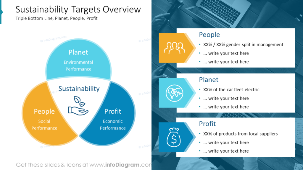
If you need to illustrate the triple bottom line model in more detail, check this blog for visualization examples.
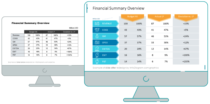
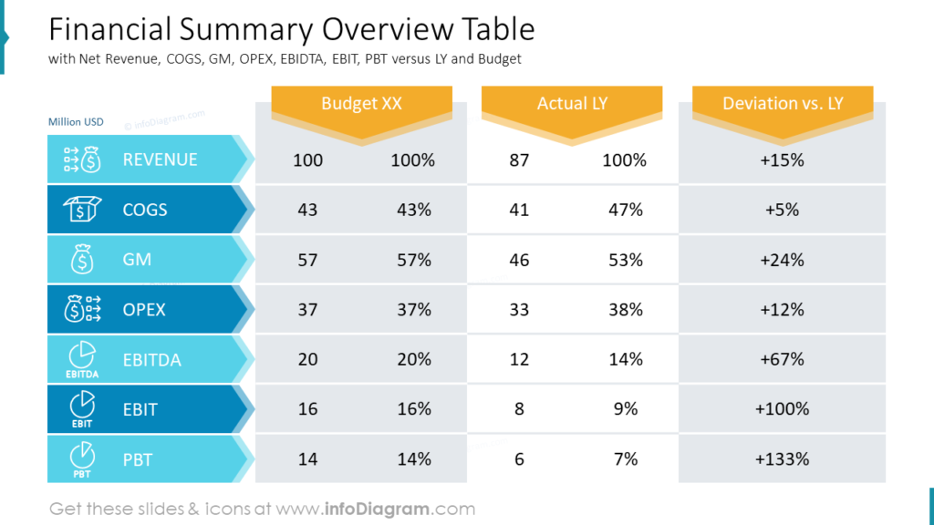
To give a quick insight into the financials, you can include the simple summary overview table. Not every table needs to scare your audience, so make sure you have enough white space between the numbers. You can list the common indexes such as Net Revenue, COGS, GM, OPEX, EBIDTA, EBIT, PBT versus LY and Budget:
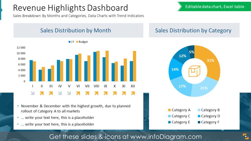
Illustrating revenue highlights in the corporate budget proposal
To keep the audience engaged, try incorporating more visual elements into complex financial slides. Here’s an example of a dashboard with revenue highlights, showcasing sales breakdown by months and categories, and a data chart illustrating trend indicators:
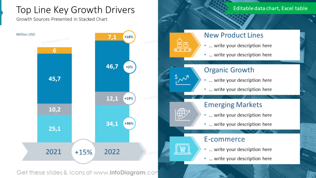
The next slide illustrates the top-line key growth drivers analysis over two years. As an example, we outlined the following drivers: New Product Lines, Organic Growth, Emerging Markets, and E-commerce. With the help of stacked charts and color-coding, the information becomes much easier to follow:
Pie charts are useful when you need to show percentages of a whole. On the slide below you can see the key revenue drivers comparison, with the description of top revenue sources and the rest of them:
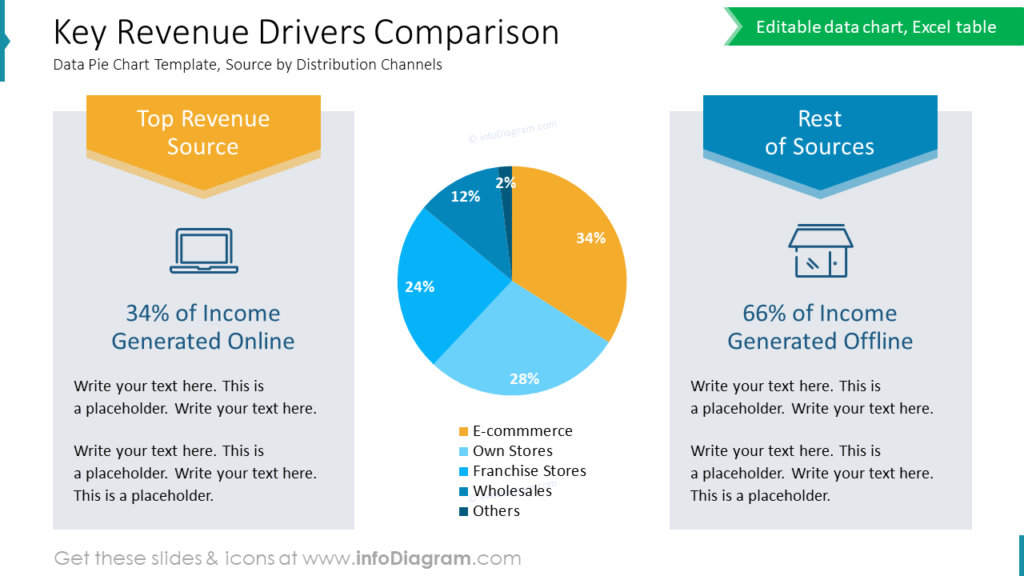
Design hint: Use rule of contrast to focus attention on the most important driver. Focus on one such thing per slide, not more. If you need to highlight more items, consider presenting each on separate slide.
Notice how we used color-coding to highlight the top revenue source by orange, versus the rest of the sources that have shades of blue color.
Visualize expenditure budget details clearly
If you want to include OPEX and CAPEX expenses overview and breakdown, here are several examples of how those concepts can be shown visually.
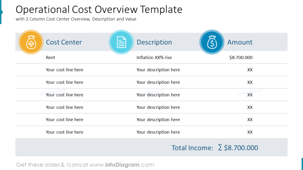
One way is to show an operational cost overview in a form of a modern-looking clean table, including Cost Center Overview, Description, and Value. In our example, we also highlighted total income to make it stand out:
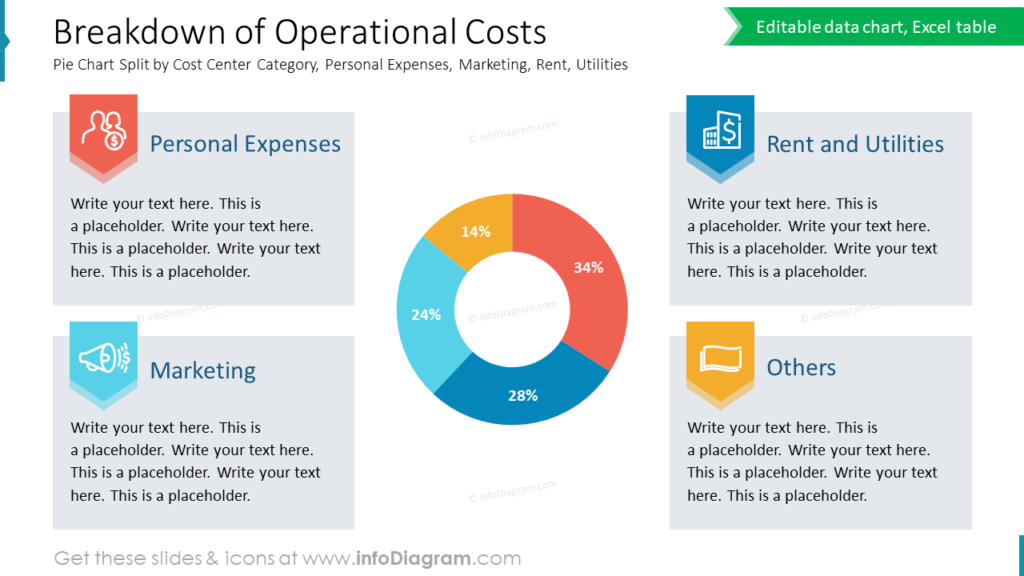
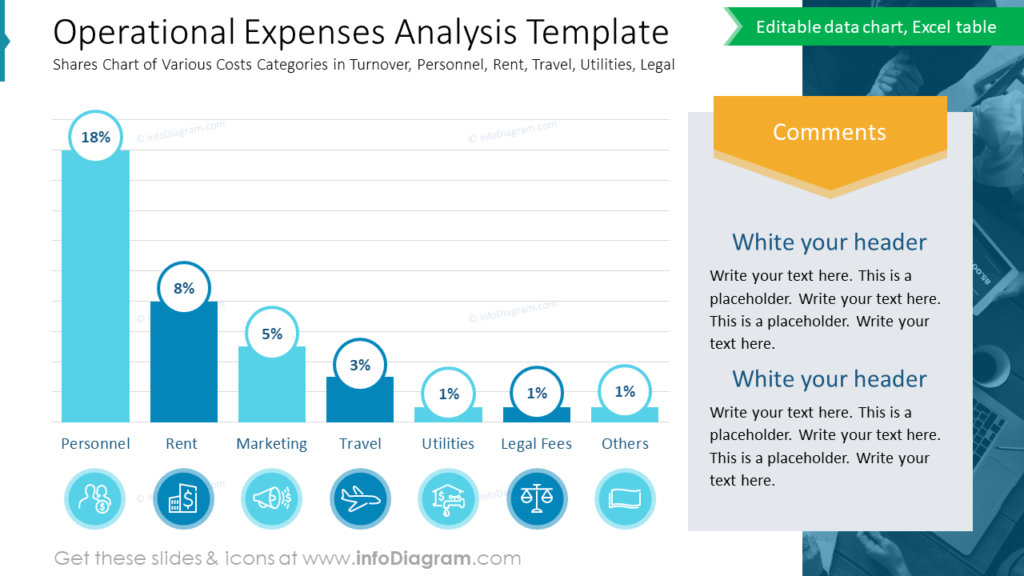
To show more details, break your operational costs down in a pie chart by cost center category or analyze them using a bar chart visualization.
If you have many categories you’d like to put on a slide, we advise using a bar chart. Pie charts are effective when you want to show up to 5 elements.
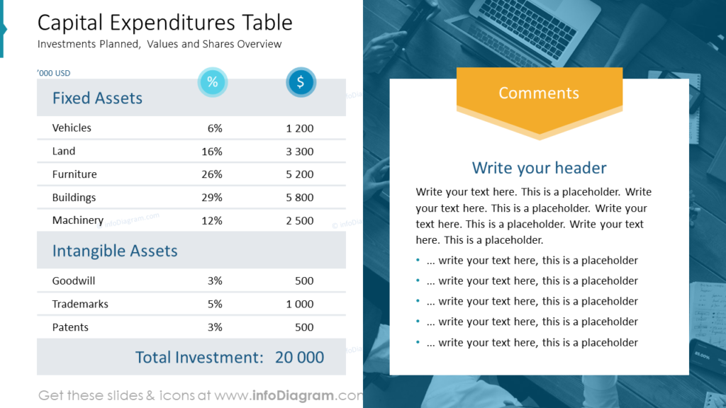
To illustrate your CAPEX investment split by tangible and intangible assets, you can use such a table with comments aside:
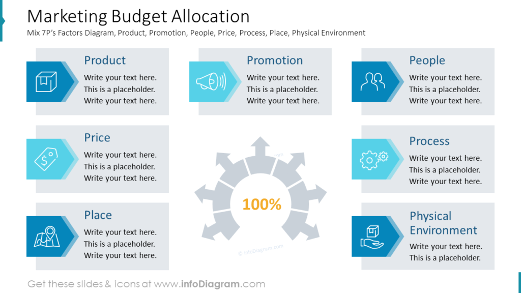
Include a marketing budget overview
If you use too many figures on one slide, it will be hard to keep the attention of the audience. Here are the slide examples you can use to communicate the marketing calendar, budget allocation, and planned expenses for promotion.
You can use the marketing mix approach to present marketing budget allocations. Here you can see an example presentation of Marketing Mix 7Ps on one slide Product, Promotion, People, Price, Process, Place, and Physical Environment factors:
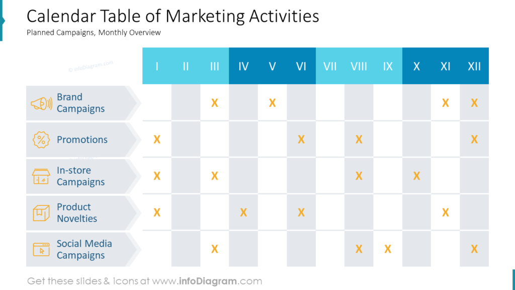
When you’ll be talking about planned marketing activities throughout the year, use a calendar table to make it easier for understanding. Also, you will be able to see a clear picture of how many resources you need to allocate each month to a specific activity:
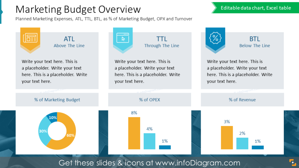
If you want to give more details on planned expenses, you can illustrate ATL, TTL, and BTL as a percentage of the marketing budget, OPEX, and turnover using pie and bar charts:
If you are looking for inspiration on marketing concepts and model illustrations, browse through our marketing presentations category on the blog.
Design tricks to make corporate budget presentation attractive
A budget presentation can look eye-catching if you follow some basic design advice such as:
- consistency of color palette
- using one graphical style – expressed by one major type of shape and icon style
- organizing slide content within certain layouts
- avoid stuffing too much information into one slide
- applying the rule of contrast, I mentioned above, highlighting one key point per slide.
Resource: Annual Budget Proposal Financial Presentation
The graphics in this blog are a part of our budget proposal graphics collection. This deck contains budget presentation examples, 38 data charts, dashboards, and diagrams to present financial summaries and forecasts for a corporate organization. See the whole slide deck here:
Using concise, innovative visuals will make your presentation structured and consistent. To make your presentations even more engaging, consider also using this collection of professionally designed diagram layouts.
Subscribe to the newsletter and follow our YouTube channel to get more design tips and slide inspiration.