Explaining Climate Change Business Opportunities with PPT Infographics
Is it important to you to spread knowledge about climate change and some practical actions that can be taken to combat this crisis? Supporting rich data with appealing visuals may be a way to catch your audience’s attention, and that is the first step to change.
Inspire yourself with a dose of example visual slides illustrating complex topics related to global warming that you might find useful. Some of them are:
- Listing the main consequences of climate change
- Presenting chemical compounds contributing to greenhouse gasses emissions
- Highlighting key data on world CO2 emissions per year
- Establishing a roadmap for environmental law change
- Illustrating company sustainability goals
Source of graphics presented here is available for download (link to visuals: Actions PPT Template Against Climate Change ).
Click on the slide pictures to see and get the editable illustration.
Why Show the Goal of Climate Action Visually?
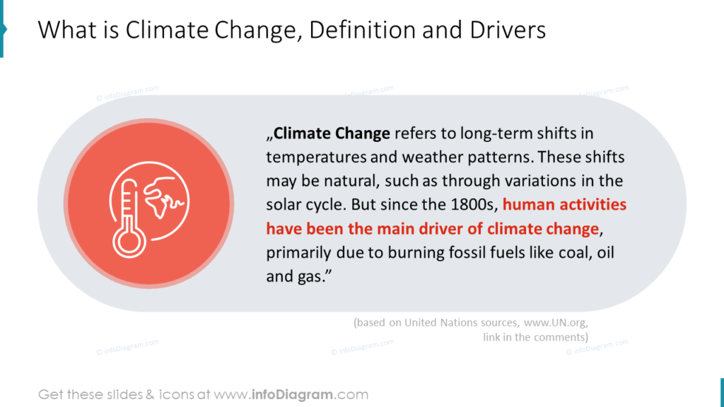
Climate Change refers to long-term shifts in temperatures and weather patterns. These shifts may be natural, such as through variations in the solar cycle. But since the 1800s, human activities have been the main driver of climate change, primarily due to burning fossil fuels like coal, oil, and gas.
Covering the climate crisis topics may be challenging as it impacts us in different ways depending on our role in society. You may need to illustrate risks and opportunities for institutions, businesses, or individuals to influence actual actions against the progressive warming of the climate. In all cases, using impactful visuals help in explaining the problem and presenting solutions.
Illustrating a Climate Change Definition and Drivers
It’s good to start a presentation by explaining the terms. Here is an example of how you can illustrate a quote from the climate change definition.
Definitions usually contain lengthy sentences that should be presented as a complete text. However, you can still make them more visually appealing by design moves:
- highlight the keywords, not more than 20% of the text. See how we made bold the term “Climate Change” and the part about human activities as the main driver
- add illustration, e.g. by icon or picture. Here we chose an outline icon showing Earth and a thermometer symbolizing global warming.
- keep the text paragraph readable by alignment to the left and line spacing – not too dense. Align text to the center only if you have shorter text.
- apply light background graphics that will not steal too much attention from the message. Here we used a light grey shape in the background. However, a simple plain white slide is sometimes better than one overloaded with decorations.
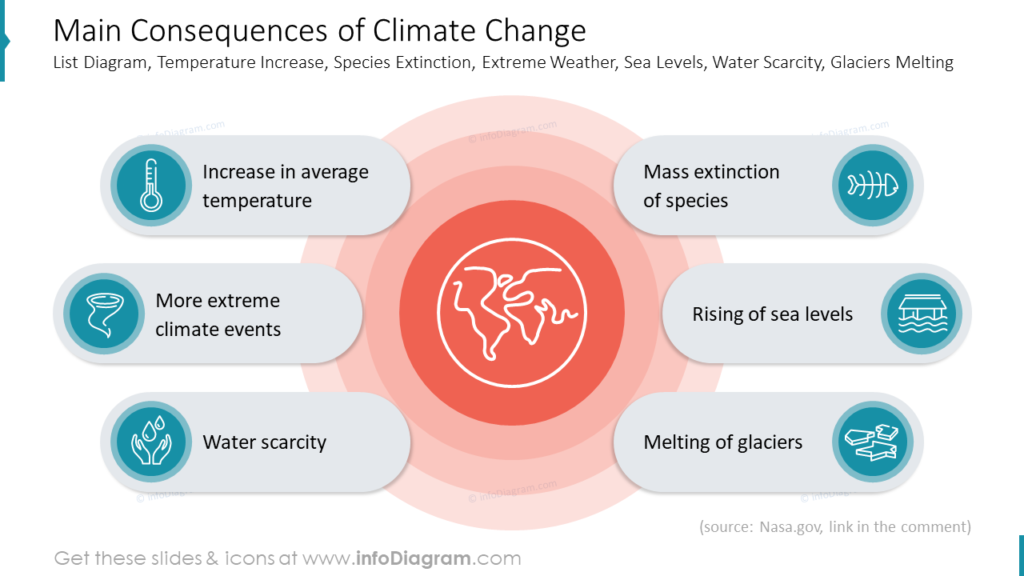
Listing the Main Consequences of Climate Change
Plain text lists are the most common way of giving examples but not the most effective ones. You can see an infographic that shows how adding icons, text containers, and color enriches the message and makes it easier to understand simultaneously. The viewer can get the idea even without reading the text.
You may consider picking an original layout if the list is not hierarchical. Create a focal point of the globe symbol in the center and surround it with your list of elements. Here is a list of climate change consequences:
- Increase in average temperature with thermometer icon
- More extreme climate events with tornado icon
- Water scarcity with hands catching water drops icon
- Mass extinction of species with fish skeleton icon
- Rising the sea levels with flooded house icon
- Melting of glaciers with ice floes icon
Picking red shades for the background illustration catches an eye in a second and gives a sense of urgency.
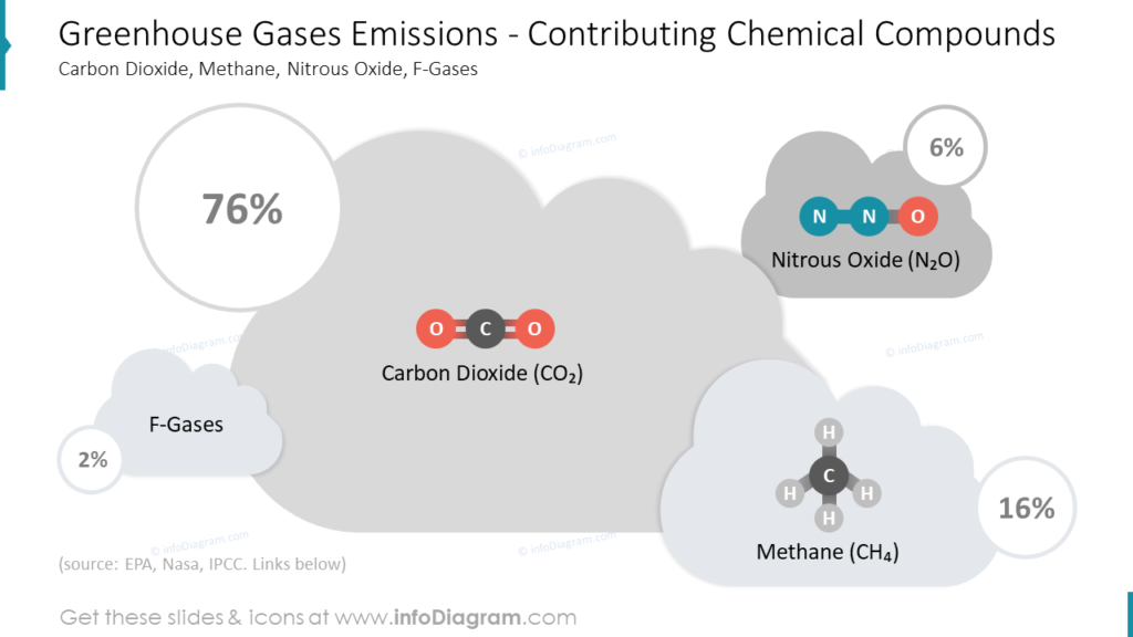
Presenting Chemical Compounds Contributing to Greenhouse Gasses Emissions
When you need to present a bit of background on what are greenhouse gases, you may illustrate the chemical compounds with simple infographics.
Input for this infographic was a table with raw data on the percentage share of greenhouse gases like carbon dioxide, methane, nitrous oxide, and f-gases in the generation of pollution.
To avoid using a generic table layout all text was placed in cloud-shaped containers giving an impression of gas fumes to set the tone of a message. Distinguishing them is more accessible thanks to different fill colors and added PowerPoint-made illustrations of chemical compounds. You can realize that size of the cloud container is related to the size of the percent number which makes comparison easier and in the end, the whole information is easier to remember.
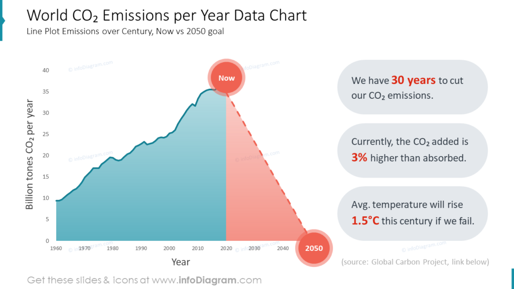
Highlighting Key Data on World CO2 Emissions per Year
Adding a data chart to your presentation is another good idea to support science-based evidence on how CO2 emissions are cumulating. Currently, the CO2 added to the atmosphere is 3% higher than the amount absorbed. It’s also an excellent way to show how much we need to decrease carbon emissions within three decades. Failing that will cause the average temperature to rise above 1,5°C, leading to catastrophic environmental changes.
Fitting much information into one slide may be challenging. Notice how we mixed presenting a line chart of data collected over the years with a prognosis and highlighting crucial information on the topic. Why does it work?
First of all, we combined two time-related information in one chart. To make them easier to distinguish, they are of different colors, with red as the priority element: time we have left to act against climate change. As the most important content of this slide, start and end dates were emphasized using red circles. This underline with color was used coherently in-text containers to make them easy to scan. Although no icons or illustrations were used in this infographic, the result is visually engaging and impactful.
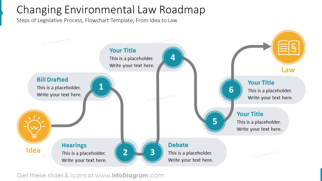
Establishing a Roadmap for Environmental Law Change
One of the actions against climate change is developing more environment-friendly laws. It’s a complicated legislative process, starting from an idea via drafting the bill, hearings, public debate, etc., and resulting in a new act.
Illustrating any process offers many opportunities to make your message more attractive. Look how adding a curving arrow line guides your eyes through the stages. Choosing a bright yellow color for indicating the beginning and end points makes them easy to notice. Adding icons of an idea light bulb symbolizing the source of action, and a law document representing the goal wraps all steps neatly.
Resignation from the list in favor of a free arrangement when the order of elements is essential doesn’t have to be a mistake. Adding visible numbering to each step of the process allowed us to keep its logic and make the infographic interesting at the same time.
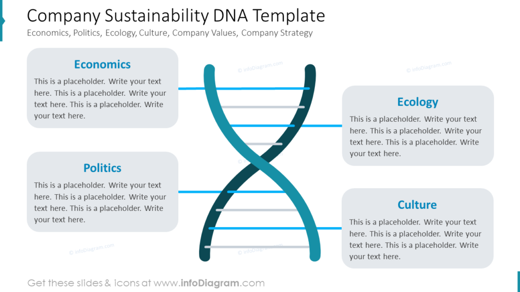
Illustrating Company Sustainability Goals
You can present four elements of company sustainability (Economics, Politics, Ecology, and Culture) as DNA graphics, as they should be part of essential company values.
Using a DNA helix to illustrate company core values added a unique symbolic layer of meaning to this infographic. Amazingly, such complex shapes can be made in PowerPoint. Once done, you can weave the content of your choice into its structure using distinctive colored lines connecting the helix with text containers. Placing illustration in the center and other elements like economics, ecology, politics, and culture on its sides optimizes the use of the horizontal slide layout.
Summarizing The Most Efficient Ways of Presenting Climate Crisis
If you are about to present a topic related to global warming, you are aware of how complex and often technical it can be, therefore hard to digest for your audience. Hopefully, our example slides convinced you how visuals may help to clarify the message. Replacing tables, lists, and flat charts with attractive infographics delivers the data in a pleasant and engaging way. What you need to do is:
- choose a bold layout of your slide that uses its entire space for better clearance
- place your text in containers to make it visible and easy to move around the slide
- add meaningful icons to your data to make it eye-catching and understandable
- choose the appropriate color palette highlighting climate change risks and opportunities
Resource: Actions Template Against Climate Change PowerPoint Presentation
The climate change action infographics presented in this blog are available for download in our infoDiagram collection of ready-to-use templates. You will find many slides covering this topic appropriate for institutional, business, and civil audiences in this presentation, as well as infographics, icons, quotes, and useful tools like the SMART template or creative action calendar.
Don’t hesitate to check the details and click the link to the Actions Template Against Climate Change (PPT Presentation) below:
See more examples of presenting climate and sustainability related ideas:
- ESG Metrics presentation examples
- Explaining Climate Change Actions Visually
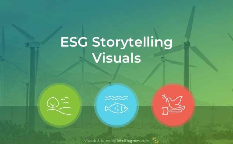
- Visual storytelling presenting ESG essentials
Or watch video tutorial on redesigning Climate OKR goals slide: