How to Create a Hierarchical Concept Chart in a PowerPoint
Harnessing the power of good data visualization is both an art and a science. Let’s explore the intricacies of visual structuring when presenting a concept data. This blog post will guide you through the transformation from a simple slide layout to a compelling visual hierarchy diagram. What are the secrets behind the impactful slide design? Read on to learn how to elevate your content presentation.
Understanding the Content First
To kick things off, I want to stress the importance of first analyzing the content you’re about to represent on your slide. This preliminary step guides you in selecting the most suitable form of visualization.
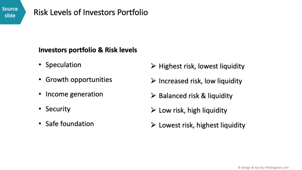
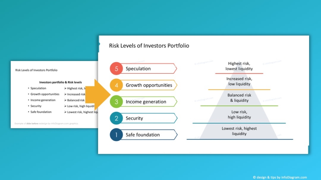
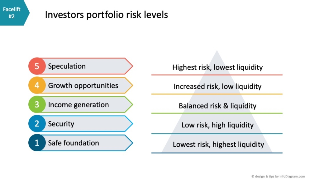
Let’s break down our sample slide. It features various investor portfolios and risk levels. We observe their five main items, each coupled with its respective risk level.
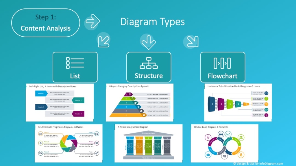
Bearing this in mind, it’s crucial to decide on the type of diagram that would best represent this information. Diagrams generally fall into three primary categories:
- Those that depict a list of items
- Those that highlight the structure
- Flowchart diagrams that present a process
Slide design step of visualizing the hierarchical chart example
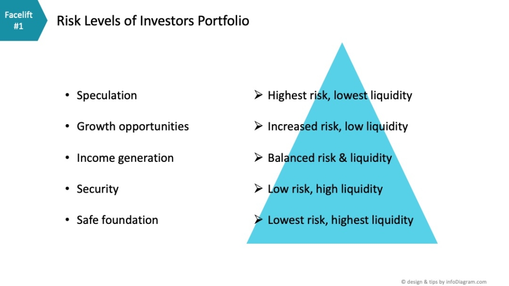
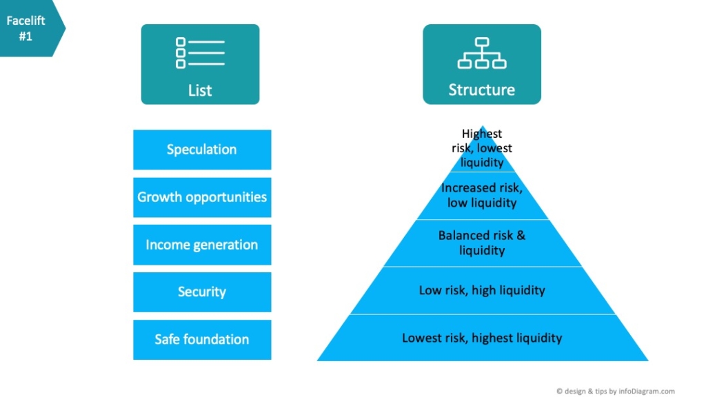
From the content at hand, it’s clear we’re not just dealing with a mere list. There’s an inherent hierarchy in the list, marked by varying levels of risk. This calls for the use of a structure visualization. One of the obvious ways to showcase this hierarchy can be using the pyramid metaphor. A simple triangle can depict the pyramid, with the base representing the lowest risk level and the apex denoting the highest. Alternatively, if we would want to focus on liquidity measure, that is increasing downwards, an inverted pyramid might do the trick.
Using PowerPoint SmartArt for quick diagram design: Pros, Cons & Tips
If you’re seeking a more graphical touch, consider delving into Smart Art diagrams. PowerPoint’s SmartArt feature lets you seamlessly transform texts into dynamic diagrams. These come in various basic shapes, enabling you to pick one that resonates with your content, such as a pyramid shape in our scenario. The beauty of Smart Art diagrams lies in their automatic adjustment to added content, which makes them a versatile tool for quick edits.
However, they’re not without their challenges. Their rigidness can be limiting when customization is needed. For instance, adjusting the number of lines or adding more text might skew the original design of the hierarchical chart example. Smart Art could give you that kind of kick-off with the thinking visually so it’s still better than just showing the points.
To counter this, I suggest using a drawing inspiration from SmartArt but crafting your own hierarchy diagram by hand. Let me walk you through how I approached this.
Get inspired on how to illustrate levels clearly using various hierarchy diagrams.
Designing your own hierarchy diagram with PowerPoint shapes
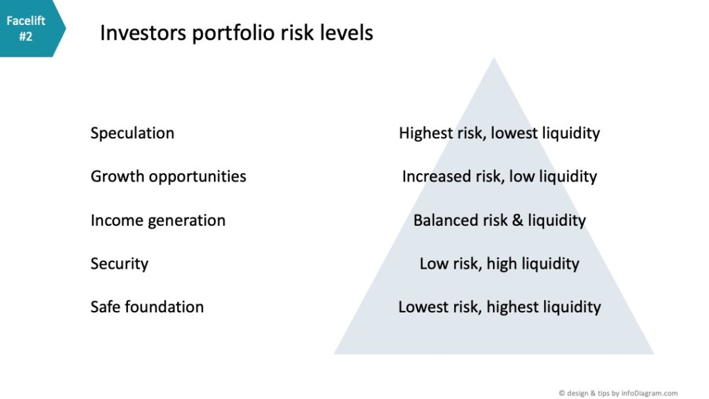
I began by eliminating bullet points, centering the text, and introducing the aforementioned triangle. Let’s position the triangle behind the text.
Opt for a subtle color, perhaps silver, to maintain visibility. This allows the text to sit outside the pyramid seamlessly, unlike the previous Smart Art diagram.
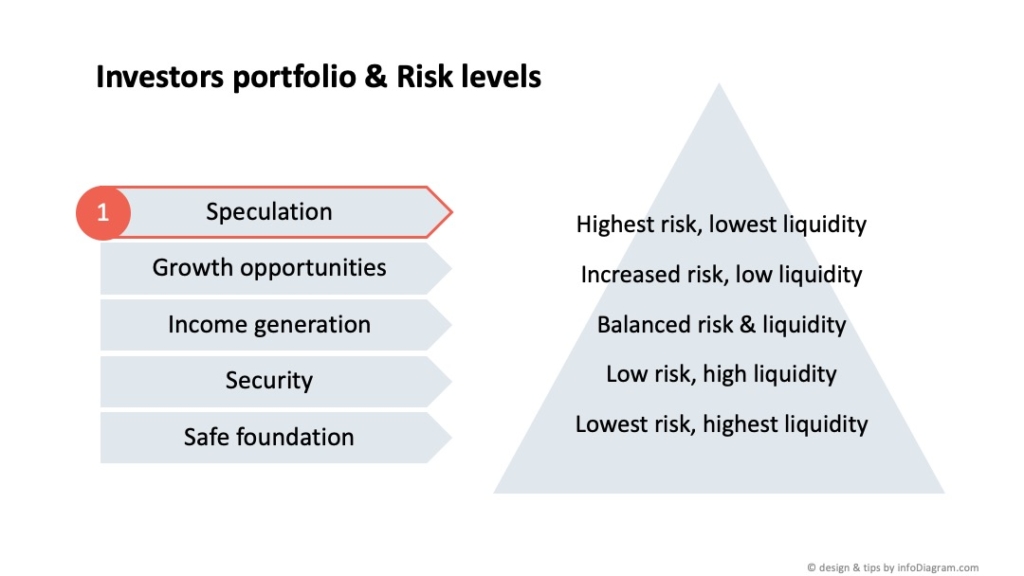
For these levels, we’ll explore a different visualization approach. As for representing the levels, I introduced a pentagram shape, ensuring the text size was proportionate.
Additional elements, like icons and numberings, further elevated the design. I created a circle ensuring its proportions remain consistent in terms of width and height. A handy design tip is to utilize a shade darker for the circle than the base color for consistency. For instance, when indicating speculation levels, I’d opt for colors like red or yellow, commonly associated with risk. The circle’s shade can be a slightly darker version of this chosen color.
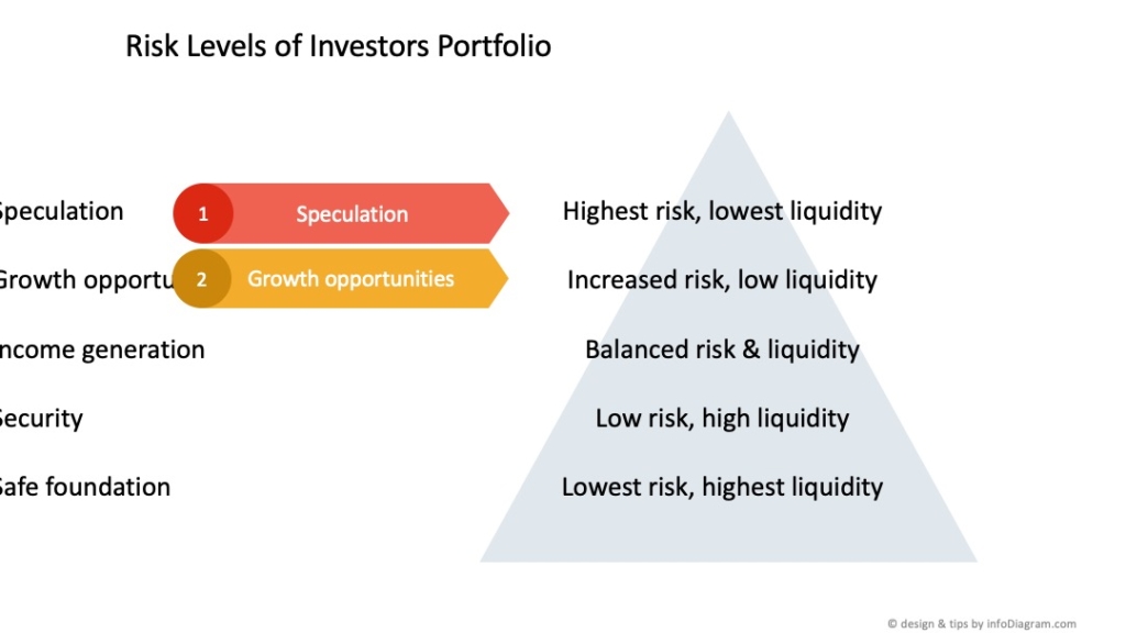
I can then replicate this, adjusting the text and color (perhaps a less intense yellow) for the subsequent level.
This method offers a clear idea of building a hierarchical chart example using PowerPoint’s basic shapes. While it might take a tad longer than employing Smart Art, the outcome is visually appealing and deviates from the generic Smart Art or plain text slides.
Round up of slide design process
I presented here a recommended way to approach slide design, following three simple steps:
- Understanding of slide content
- Visluazaliton of your slide information
- Beatification of final slide design
Starting with content analysis that will help you choose a proper visualization. In our case, we had a hierarchy of information that I represented by a pyramid diagram.
Later you can develop slide designs further using colors, and icons, as I did in the example above.
You can watch the full movie on our YouTube channel, don’t forget to subscribe:
Check another guide from this know-how series: transforming raw text to structure slide.
Enhancing Your PowerPoint Presentation Library
Want to amplify your PowerPoint game further? Head over to infodiagram.com. Our vast collection of editable diagrams and icons ensures you won’t be starting from scratch. Enhance your presentations with content-specific designs tailored to various business needs.
Remember to sign up for our email tutorials where we share valuable tips on revamping diagrams and upping their visual appeal. Plus, you’ll score some free graphics 🙂