7 Ways to Make PowerPoint Table Design More Attractive and Clear
Tired of boring PowerPoint tables? Discover 7 practical ways to make your PPT table design more attractive, clear, and professional - with before-and-after examples.
Are you tired of presentations full of cluttered tables? We know how frustrating it can be to decipher complicated data when it’s not engaging. In the world of business presentations, tables are a popular format for conveying information in an organized manner. However, creating PowerPoint tables that capture your audience’s attention, convey your message clearly, and leave a lasting impact can be challenging.
In this blog, we’re addressing this common pain point of people who frequently create and deliver presentations. We’ll share our tips and techniques to transform those mundane tables into visual graphics that enhance comprehension and make your presentations more engaging and memorable.
Let’s explore how to make your PowerPoint tables shine and create engaging data presentations that will leave your audience impressed.
All graphics presented here are available in our slide library. Click on the images to see and download the source illustrations. Also, you’ll find the full resource list at the end.
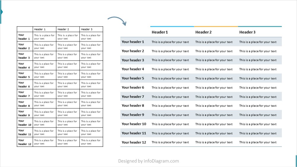
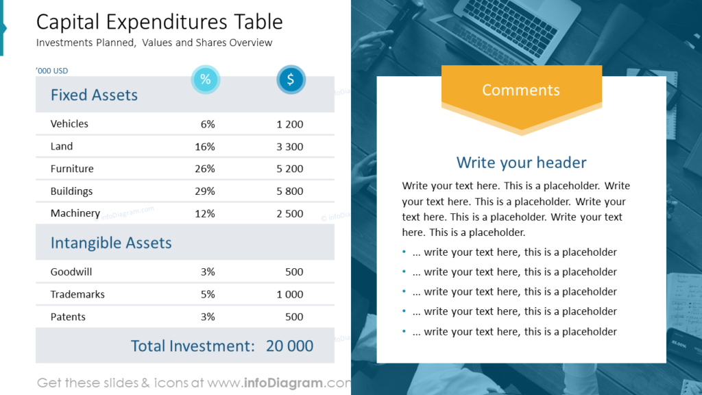
1. Simplify Your PowerPoint Tables
The initial step in optimizing PowerPoint tables involves simplifying its appearance. The choice of table grid line color is not limited to black; sometimes, lines may not be necessary at all. It’s important to evaluate whether all the content displayed in the table is essential. There might be table data that can be omitted without sacrificing critical information. Moreover, consider using icons or symbols to replace text values, as this can significantly enhance the speed at which viewers grasp the information.
For instance, instead of employing “YES” or “NO” for indicating features, opt for universally understood symbols like a checkmark or a cross. When communicating project statuses, consider using Harvey balls, which offer an efficient way to convey information.
Compare the design of the two tables below – one with a default black grid, another with no grid at all. Notice that thanks to light grey background of rows, grid is not needed.
See how you can simplify complex tables and slides using three simple steps.
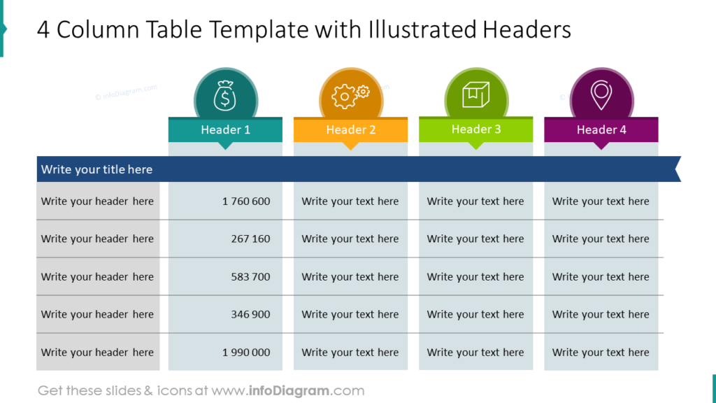
2. Add Unique Table Headings
Instead of merely applying bold formatting or altering the background color of table headers, consider incorporating distinct graphics to make them more attention-grabbing. This could involve using elements like downward-pointing arrows, unconventional frames, or subtle watercolor strokes as header background accents. Adding icons to the headers is also a highly effective practice, providing an instant visual cue to quickly identify the content presented in the table.
See the table examples below for your inspiration.
3. Eye-Catching First Column
You can employ a similar approach to enhance the first column of your table. Instead of the usual highlighting, consider using arrows for each row or a banner-like design.
To make a table design elegant and readable, ensure there is no padding within this column. Adding enough whitespace around a table and also inside its cells. Such visually distinctive elements can add a unique touch to your table and improve its overall appeal. See how we incorporated such design elements into tables on the slides below.
Here we used light outline elements:
In this table we used a light flat grey background on some elements, which makes the first column stand out:

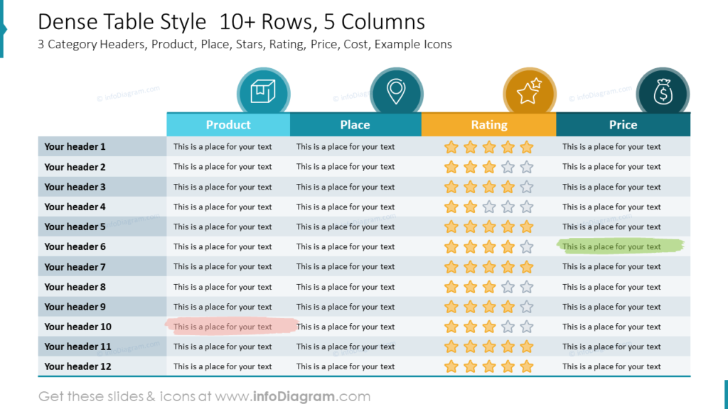
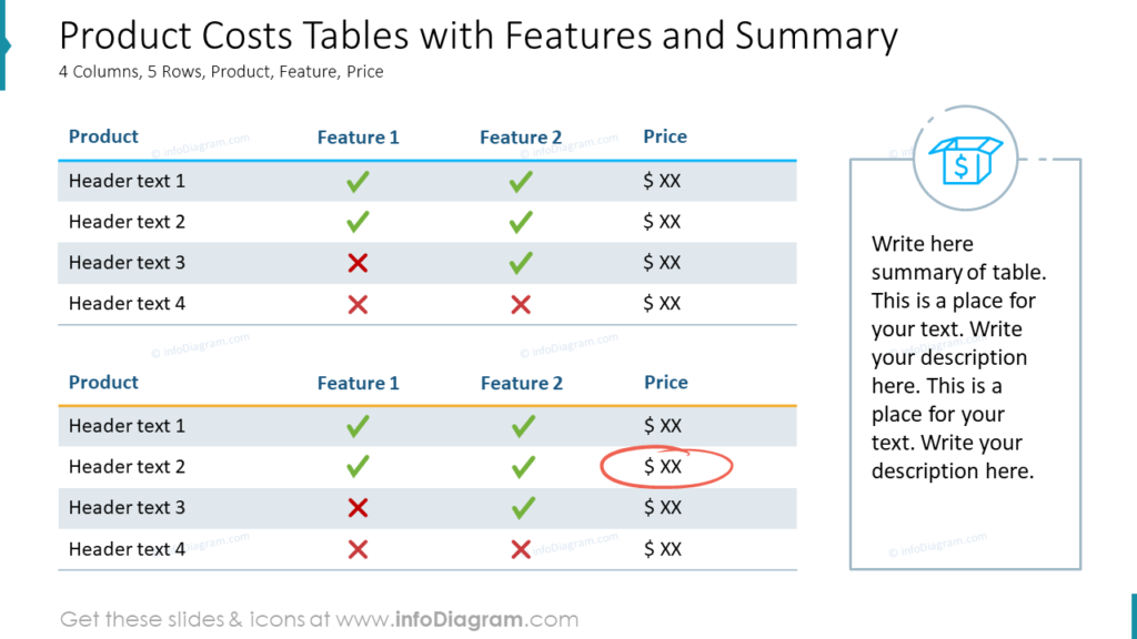
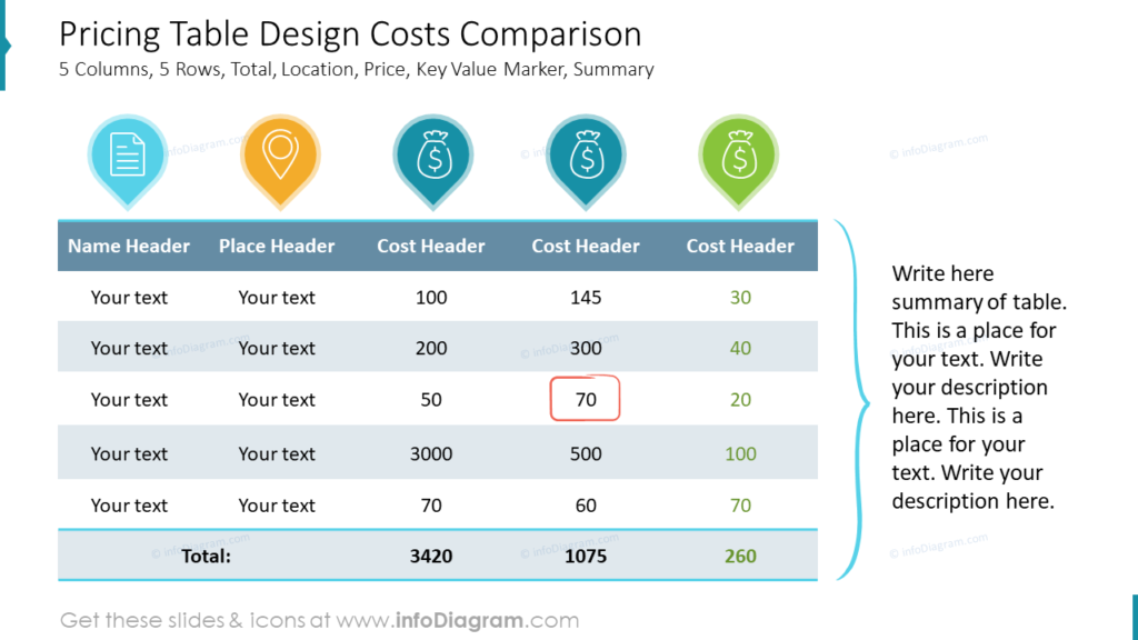
4. Symbols and Status Indicators
Adding symbols and status indicators to your table can significantly enhance comprehension and streamline the understanding of certain elements. For instance, in the following table example the locations category is not represented by a text by with simple symbols:
- an office building icon for B2B or company location
- warehouse distribution center pictogram for delivery point
- a housing estate icon for B2C or private premises
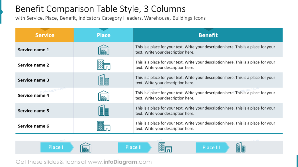
Moreover, consider using icons like checkmarks (✔️) and crosses (❌) instead of “YES” and “NO” labels to denote the presence or absence of specific features. To indicate project status, you can opt for “Harvey balls” or traffic lights, which provide a clear ranking system. These visual cues expedite the absorption of information and make your table more accessible and user-friendly.
Picking up a graphical symbol representing an abstract term can take some time. Therefore we created a visual dictionary of business terms PowerPoint icons, covering topics from finance and management.
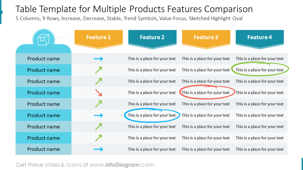
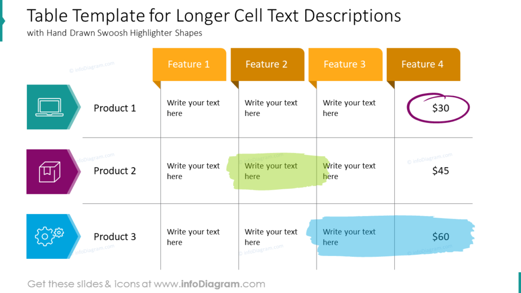
5. Highlight Key Information
Emphasizing the essential data in your table helps to ensure people can quickly identify what’s most important. While traditional methods such as changing text color, bolding text, or altering the background color are effective, you can also opt for a more engaging approach. Consider adding highlighter marks directly onto the table to draw attention to significant sections. This visually distinctive method can make important information stand out vividly, enhancing the overall impact of your table.
You can create such a highlighter using an oval shape with a thicker contour line and transparent filling, or you can use more creative hand-drawn shapes that we designed (it’s accessible in the table PowerPoint icon set linked under the picture below).
Another unique highlighter can be a swoosh shape like that over here:
6. Incorporate Table Summaries and Conclusions
In presentations where live comments and explanations may not be feasible, it’s important to provide clear summaries or conclusions. This step ensures that your audience can grasp the key takeaways without further explanation. Here are some ideas on where and how to place these summaries:
- Header or Footer Notes: You can add a brief summary or conclusion as a header or footer note directly above or below the table. This way, the essential insights are readily available to viewers.
- Sidebars or Callout Boxes: Incorporate a separate sidebar or callout box adjacent to the table to highlight the main findings or conclusions. This provides a dedicated space for key insights.
- Table Captions: Utilize the table caption to encapsulate the central message or conclusion of the table. This keeps the summary closely tied to the table itself.
- Summary Slide: If your presentation includes a summary slide, consider adding a concise overview of the table findings and any necessary context or insights. This ensures that the audience can quickly understand the significance of the data.
- Infographic Overlay: Transform your table into an infographic by overlaying key insights, conclusions, or summary points directly onto the table itself. This can make complex data more visually appealing and easier to digest.
Incorporating these strategies ensures that your audience can extract meaningful insights from the table, even when viewing a static PDF file, enhancing the overall effectiveness of your presentation.
Let’s explore a few examples of summary sidebars and callouts. Notice the consistency of the graphical style of the comment field and the table elements.
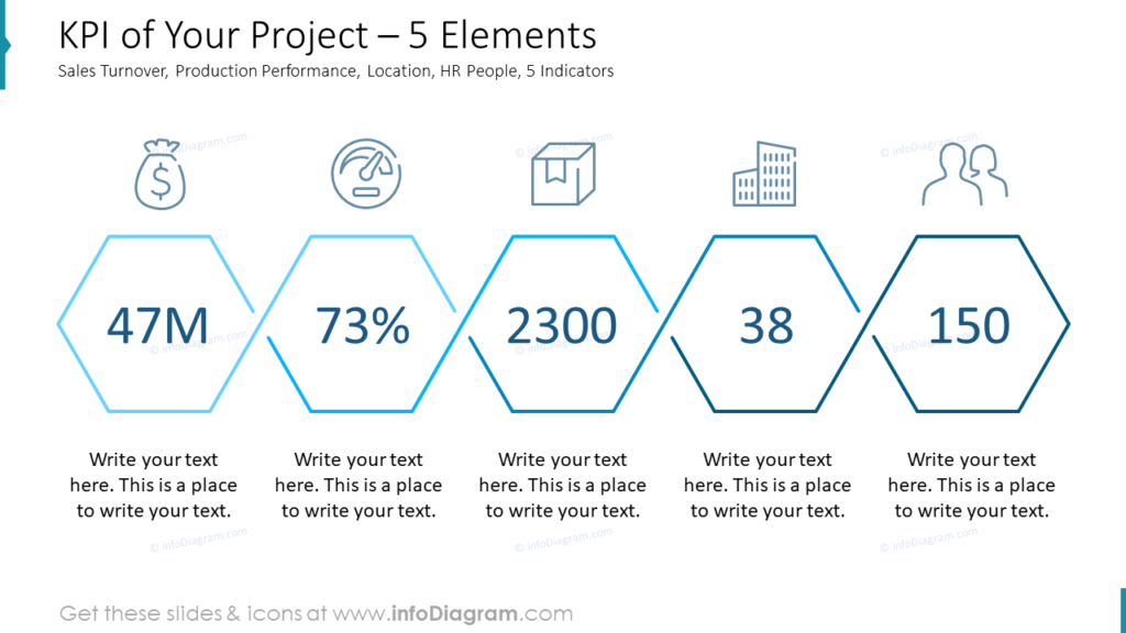
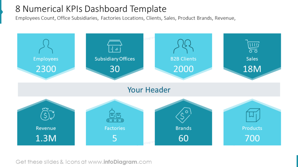
7. Presenting Key Performance Indicators (KPIs)
To provide the crowning touch to your presentation, consider extracting essential data from your table and presenting it separately. This can be done to the table if space permits, or on a separate slide, serving as a comprehensive summary.
Extracting and visualizing KPIs in graphical form offers several advantages:
- enhanced clarity: graphical representations of KPIs provide a clearer and more concise overview of crucial data points, making it easier for your audience to grasp key insights.
- visual impact: showing single key data instead of a full detailed chart will have a more significant visual impact, capturing your audience’s attention and facilitating better retention of information.
If you worry about losing details, you can always put them into appendix slides. It’s also fairly possible that after extracting and presenting the main indexes graphically, you may realize that the table itself becomes unnecessary, and the summarized conclusions suffice.
Here we designed a few ideas of how such a key data presentation slide can look like:
Explore another creative way of KPIs and illustrating performance levels with gauge charts.
Mastering PowerPoint Tables Design: Key Takeaways
In the world of business presentations, tables are essential tools for conveying data. Optimizing their design and overall look can make a significant difference in engagement and comprehension. In this blog, we’ve explored techniques such as simplifying table appearance, using attention-grabbing headers, enhancing the first column, employing symbols and status indicators, adding highlights, and presenting KPIs graphically. These tips not only make your PowerPoint tables visually appealing but also improve the efficiency of data communication.
Remember, the goal is to transform mundane tables into compelling visual assets that captivate your audience and leave a lasting impact. If you implement even a couple of the tricks from above, you can elevate the quality of your presentations, making them more engaging and memorable.
Resources List
If you’d like to get any of the tables above for your use, here’s the list of the source decks we used in this blog:
- Business PowerPoint Table Design & KPI Lists template
- Creative Tables Graphics
- Ultimate Diagrams Deck for Visual Presentations
- Creative Presentation Tables and KPI Outline Design
- Annual Budget Financial Presentation
Follow our YouTube channel, and subscribe to our newsletter for more design tips and slide inspiration.


