Perfecting Chart Design: Using PowerPoint Chart Styles and Data Bars Adjustments
As a professional slide designer, I understand the importance of creating visually appealing and informative charts in PowerPoint presentations. Let’s dive into how you can transform a basic data chart design into a more professional-looking one with a few simple steps using the Chart Styles feature.
PowerPoint Chart Styles – an unknown feature that saves a lot of time
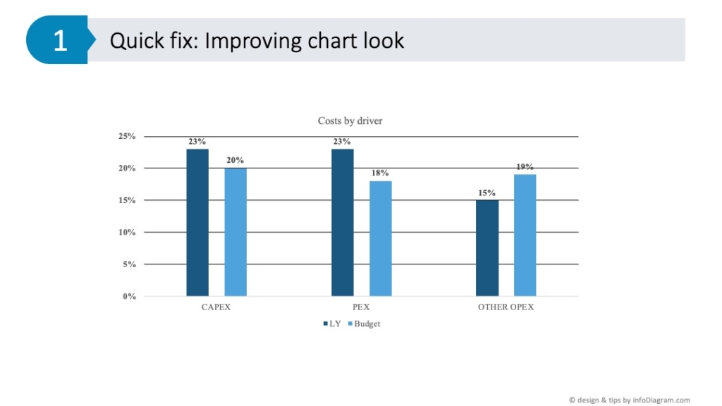
When you have a data chart you want to present, it can come in various forms – using weird color palettes or old-looking graphical styles with shines and bevels. Often I receive data charts where someone tried to apply all fancy styles, shadows, 3D effects, or obsolete-looking gradients.
The best way to deal with such charts is to reset them to one of the standard PowerPoint chart styles. If you use a recent MS Office version you can find there quite simple and plain-looking chart styles.
For data visualization and clarity, I suggest using the most simple design – plain flat fill, avoiding gradients and unnecessary decorations.
How to do it in PowerPoint? When you click on your chart, a new tab appears, offering various chart style options. These styles are PowerPoint’s suggestions on how your chart can be visually enhanced. However, there are a couple of pitfalls to avoid.
If you want to improve your charts further, check our YouTube guide. There Peter discusses effectively addressing the common mistakes in PowerPoint chart design.
Tips for using PPT Chart Styles
I’d strongly suggest avoiding heavy overwhelming backgrounds. In my experience, chart designs with heavy backgrounds, like a gray gradient or dark themes, tend to draw attention away from the content. Instead, opt for simpler styles.
Select a simple, clear style: I usually click on the simpler options to change the chart from a heavy look to something more clear and effective.
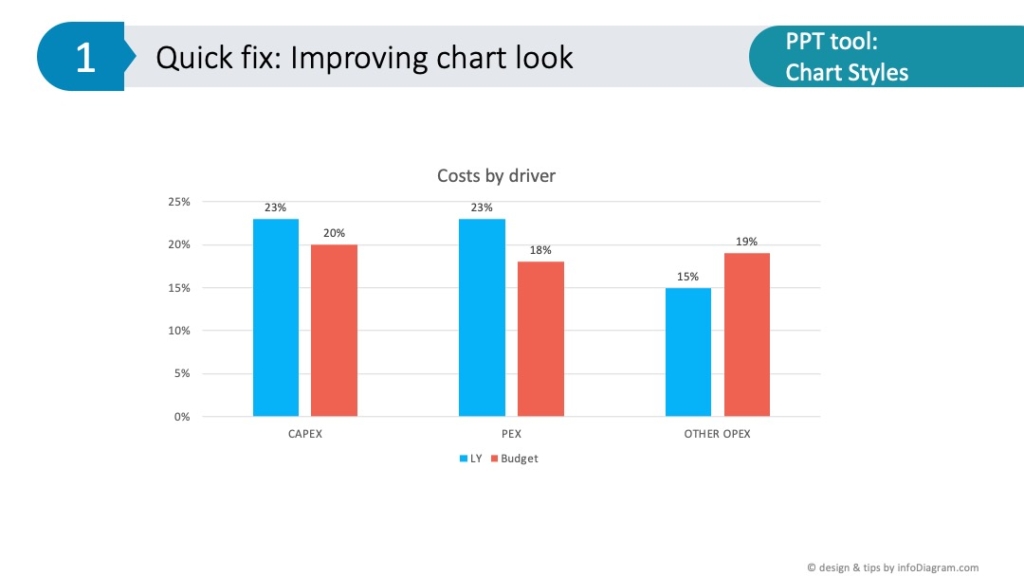
Customizing PowerPoint chart colors
Predefined Chart Styles use palette colors. You can switch them in the Colors tab, however, the proposed color order may not always fit you. In my projects I often manually adjust what palette color is used, to ensure the data chart is readable and using the main brand color.
Therefore my next step in adjusting PowerPoint charts is adjusting their colors. In chart design, color selection is more than just an aesthetic choice, it’s about efficient visual communication:
- Review default color schemes: to enhance your chart design, manually select colors that complement your content, rather than relying on PowerPoint’s default options only
- Consider color psychology in data chart design: for financial data, avoid red unless you’re indicating negative values, as red often signifies debt in financial contexts.
- Use color intensity and contrast to represent past vs. current data: Use a milder color like turquoise for representing past data (like last year’s figures) and a more prominent color like yellow or orange for current data or focus data (like this year’s budget).
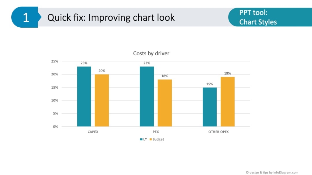
Wrapping up – final adjustments in chart design
A part of mastering optimal data chart design in PowerPoint involves adjusting quickly the chart look to fit your presentation context and make your charts look clear and eye-catchy:
- For fast PowerPoint chart redesign, use the powerful tool of Chart Styles. It will provide you with a simpler look at the chart within one click. With a few more adjustments you can create a customized data chart fitting your branding.
- In chart design, each element matters. Adjust colors for each bar to ensure they align with your presentation’s narrative. Choose colors that align with your presentation’s purpose and the message you want to convey.
By incorporating these chart design techniques, your PowerPoint slides will not only look more professional but also communicate your data more effectively. Remember, effective chart design is about making your data accessible and engaging for your audience.
If you want to dive deeper into chart design, explore our blog on choosing the most effective chart for your content.
Watch the full movie here:
Follow our YouTube channel if you want to see more of such guides. Subscribe to the newsletter to get more design tips and slide inspiration.
Author: Peter Zvirinsky, slide design trainer and the founder of infoDiagram
Reach out to Peter on LinkedIn or via his slide design & training website.