Crafting Visual Presentations: Transforming Dense PowerPoint Slides
Creating compelling visual slides in PowerPoint is more than just an exercise in aesthetics; it’s about enhancing understanding and retention for the audience. As a slide designer, I focus on transforming data-heavy dense PowerPoint presentations into visual graphics that tell a clear story. Read on to learn the techniques I use to declutter slides and make them more visually engaging.
Consider Splitting Slide Content
When I’m faced with an overcrowded slide like in our example, the first question I ask myself is about the necessity of each data point. Is it imperative to display all 12 table cells’ content at once? The slide below is an example of the table that I often see in business presentations, and in this article, I’ll show a few ways to improve it.
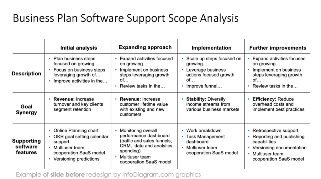
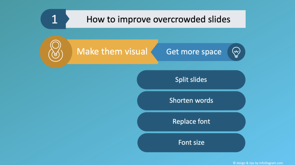
The easiest way to improve overcrowded slides is to distribute the content across multiple slides, allowing each to breathe and stand out, fostering a series of visual slides that guide the audience through the narrative one step at a time.
Here I took only the information from the first column and visualized it on a separate slide. This gives you space to add more graphics and make content more readable.
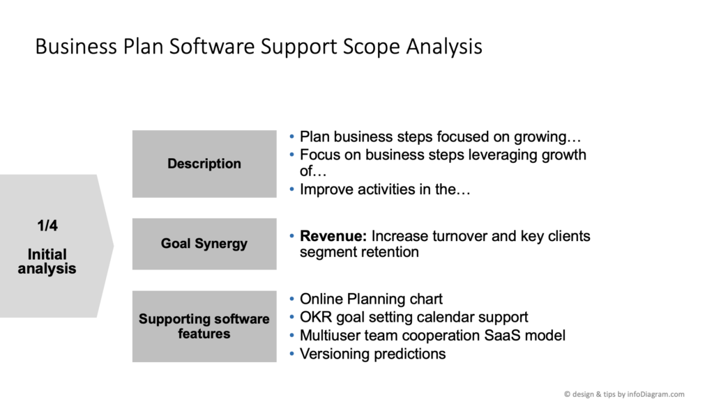
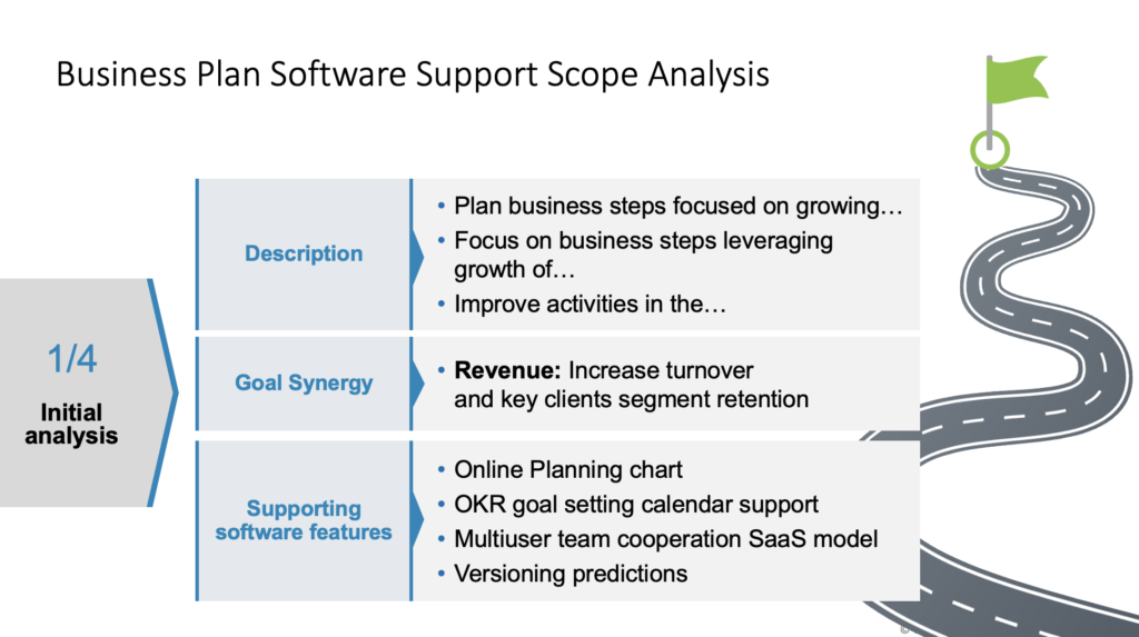
If you can break down the content this way, you will get the opportunity to play with the design. I can further enhance these slides with illustrations of the content. In this case, I added roadmap graphics and some design elements like lines and small triangles that support the reading flow of a slide.
Tricks for Dealing with Dense PowerPoint Slide
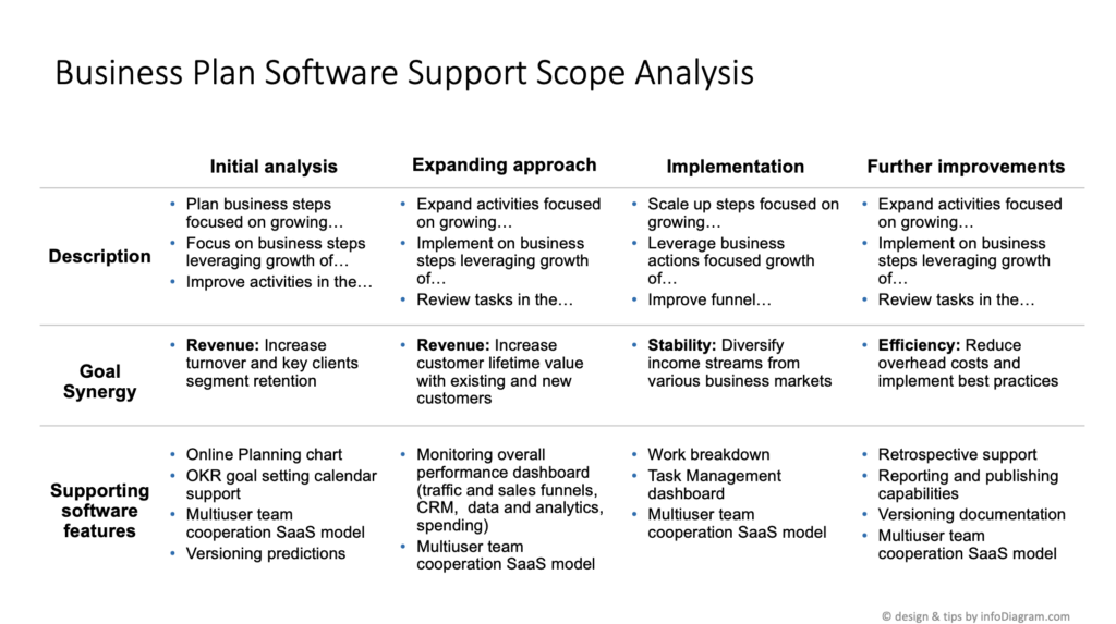
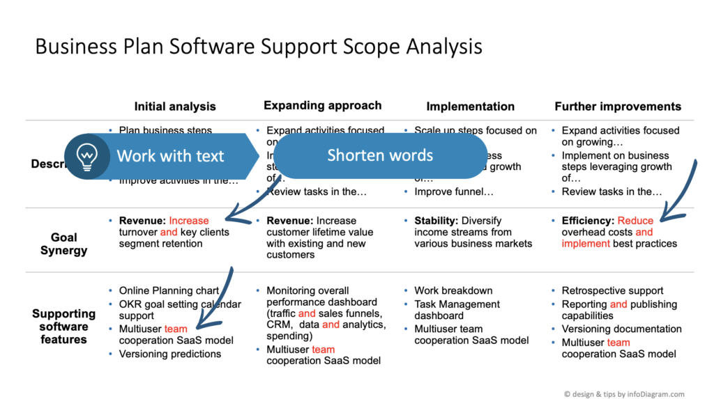
However, there are times when splitting the content isn’t an option, especially when designing for someone else. Or sometimes you may have a reason to show all the information together e.g. to demonstrate data synergy.
In this case, you can use the following techniques to make even slides with lots of information still relatively readable.
- remove non-essential elements, like a heavy grid, which I can lighten or eliminate, and ensure the table remains cohesive and comprehensible.
- make the text shorter – I often see several opportunities to shorten text by a few words. By replacing long words with symbols or abbreviations, you can easily create more space for visual elements. For instance, “and” can become “&,” and action words like “increase” or “reduce” can be symbolized with arrows.
- look for repetitive words. If you have a table, you don’t have to write in every cell all the words, if you put them in the header row, for example.
Using those ideas you can usually simplify content by 10-20%. It’s not a lot, but it can allow you to improve the readability of your dense slide.
Typography Tricks for Dense PowerPoint Presentations
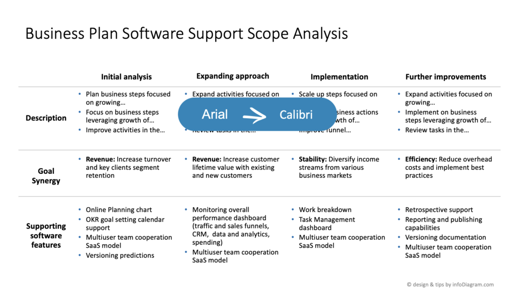
One more trick is to work with fonts if you can. Replace the font you use, especially if you use wide fonts such as Verdana or Tahoma.
Some fonts are more suitable for dense slides. A switch from Arial to Calibri, for example, offers a more compact and modern look that’s still legible on screens.
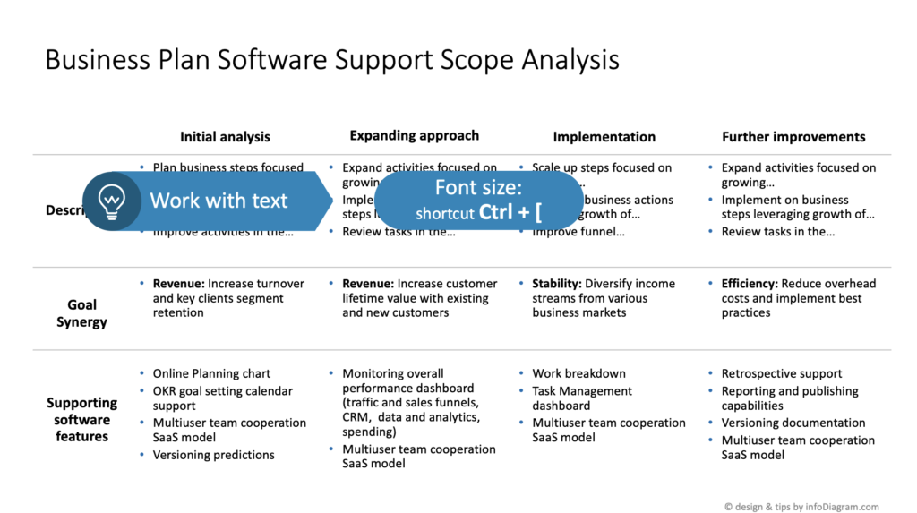
You can also consider changing the font size. Reducing it slightly can make a significant difference in space, especially when dealing with a text-heavy slide. But you have to be cautious – the text must remain legible for the audience, whether they are up close or seated at the back.
In Conclusion: Dealing with Dense PowerPoint Presentation Slides
Dealing with overcrowded slides is a common business reality, and I often need to tackle myself in my projects. I shared several ideas how you can make such dense content slides more readable.
To sum up:
- consider splitting content into more slides
- reduce content
- play with typography
In crafting visual slides, the balance between informative content and visual clarity is key. By breaking down the data, enhancing design elements, and optimizing the text, you can transform overloaded slides into clean, professional visual slides that effectively communicate their messages.
If you want to elevate your presentations even more, see how to ensure the slides are readable and clear for the audience, so your message can be heard.
Watch the movie with full instructions here:
Follow our YouTube channel if you want to see more of such guides, and subscribe to the newsletter to get more design tips and slide inspiration.
Author: Peter Zvirinsky, slide design trainer and the founder of infoDiagram
Reach out to Peter on LinkedIn or via his slide design & training website.