Beautify the Look of Bar Charts in PowerPoint in 5 Simple Steps
A professional presentation aims to deliver a clear message in every presentation slide. When your presentation contains data charts, it’s worth make effort to transform a simple chart into a compelling bar chart infographic.
As a slide designer, I often deal with chart visual transformations. Let me share practical ways how you can beautify bar charts in PowerPoint with a few creative touches. I will show you how you can take a presentation from standard to stand out.
Using Icons for Bar Chart Beautification
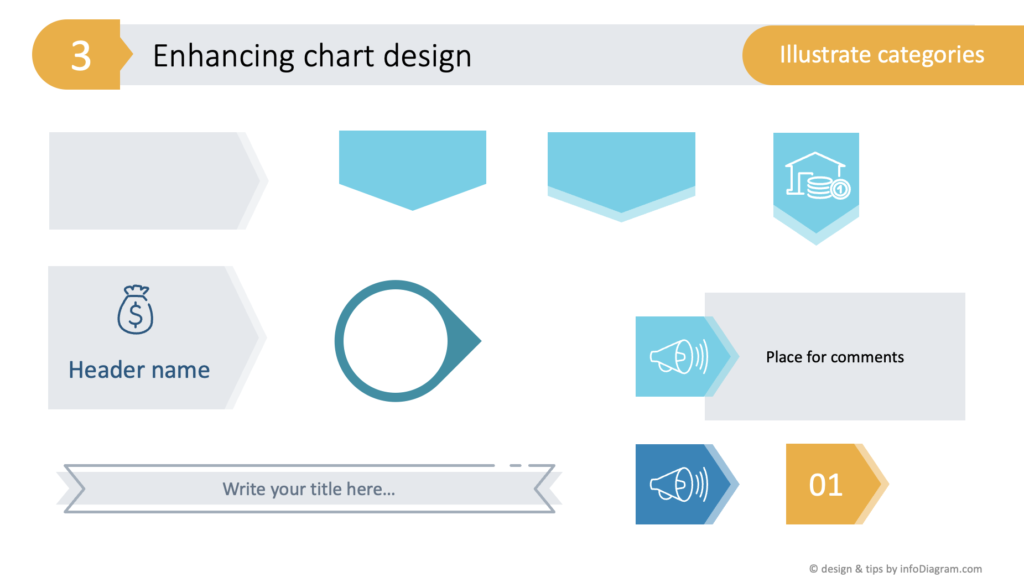
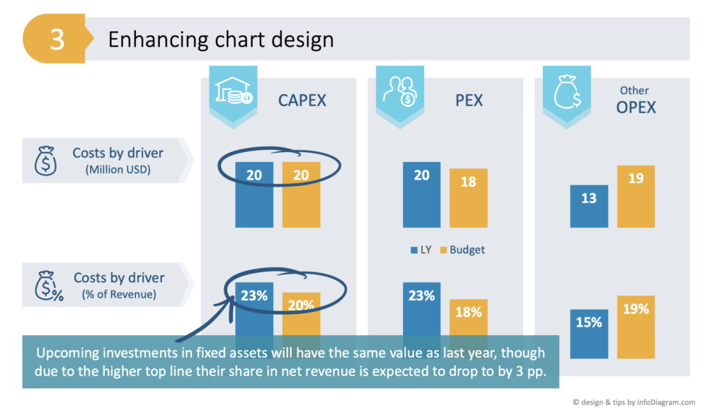
One quick strategy I employ to avoid the default chart look is to illustrate data categories with icons.
Selecting and adding the right icons representing a data category can make all the difference. The right imagery can elevate the entire slide.
For example, if I’m discussing financial reports, I can represent financial figures with icons for dollars, percentages, or shopping carts. These visual symbols can be copied directly onto the slide, enhancing the overall design. If you struggle with finding the right symbols, check our blog where we discuss criteria to consider when choosing icons.
I usually choose icons from our extensive PPT symbols collection at InfoDiagram are from one consistent style that ensures that each bar chart is not just informative but also professionally looking.
To further customize added icons, I modified the colors of the outline icons to fit the presentation theme. This isn’t just about making the chart colorful; it’s about using color strategically to guide the viewer’s eye, fit the content, and make the data infographic truly pop.
A nice design way to beautify bar charts with icons is to integrate them within a shape, like a circle, to create a more cohesive design element.
To make your presentation look professional, explore several design ways of how you can blend symbols with your content.
By placing icons within shapes, such as circles or teardrops, you can create a more integrated look. These shapes can either be crafted from scratch using PowerPoint’s built-in options or sourced from our template decks, which offer a variety of pre-designed graphics. This could be as simple as creating a uniform circle to house an icon, ensuring consistent height and width, and giving the infographic a neat and organized feel.
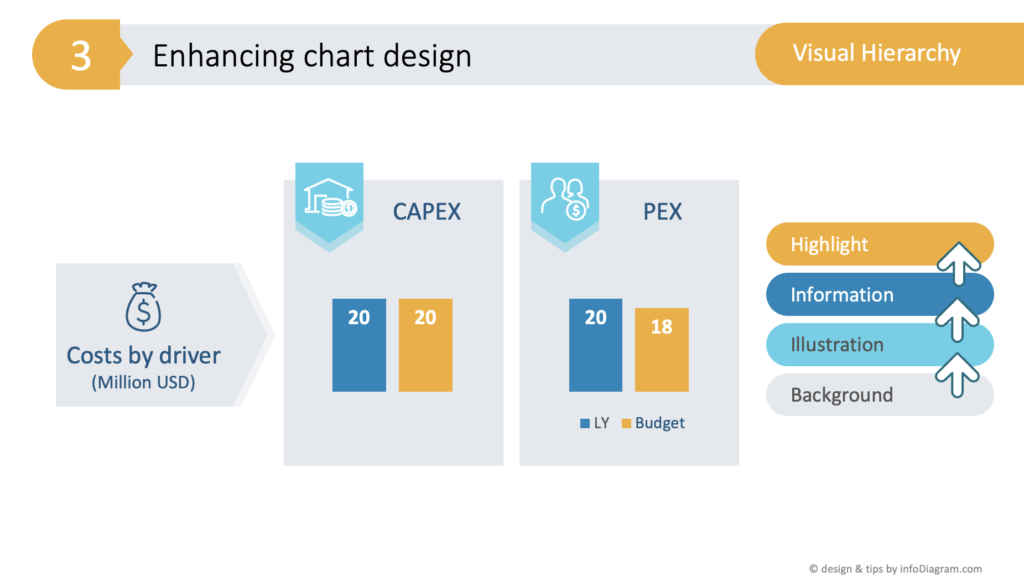
Beautify Bar Charts with Visual Hierarchy in Mind
A crucial aspect of creating easy to read data chart is the visual hierarchy. It’s not just about adding elements but also about knowing how to layer them.
For example, I use a light grey rectangle to group categories subtly, ensuring not to disrupt the chart’s readability. The visual hierarchy is further emphasized through color selection – highlighting the most critical parts. Here I used orange color for the budget bar, contrasting last year’s values, and using the lightest color for the background.
Highlighting Key Data Points with Graphic Markers
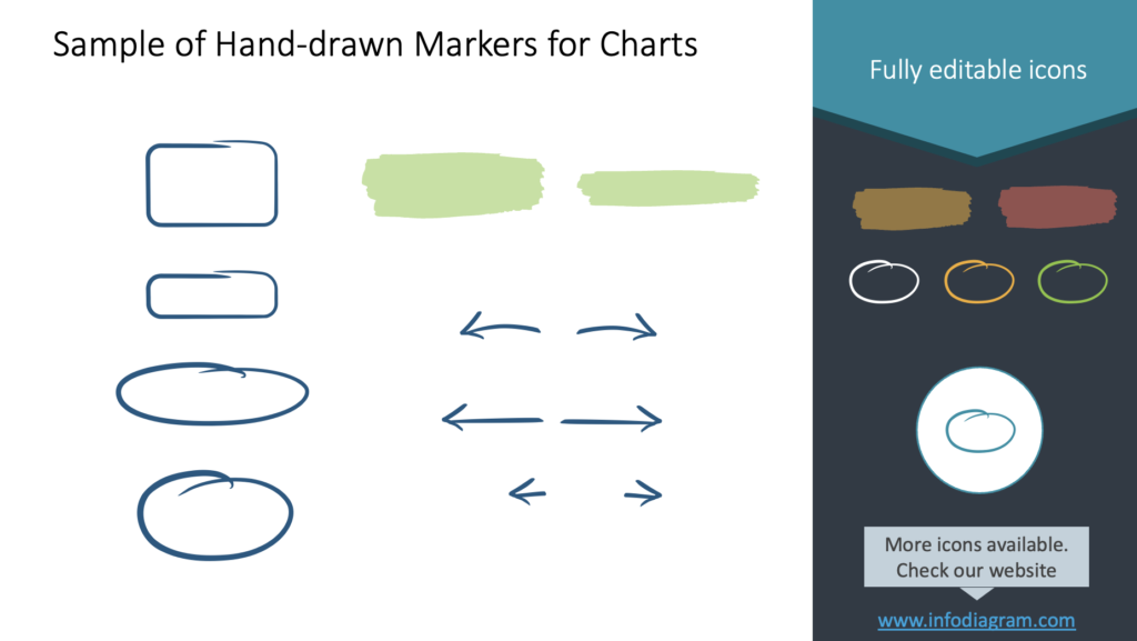
To draw attention to specific data points, the trick I often use is to add an arrow or an oval hand-drawn marker. If you don’t have such a shape by hand, using a standard PowerPoint shape a rectangle with rounded corners and a distinct outline does the trick.
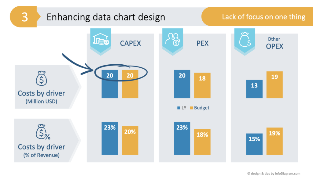
These graphic elements serve as simple yet effective markers, emphasizing the areas of focus for the audience.
Data Chart Bottom-line Message
Adding a proper explanation of data context to a chart infographic is essential for clear data communication. If the bar chart is to be shared in a written report or as a standalone slide, I include a sentence or two summarizing the key takeaways. The simple design way to do it is to write that bottom-line text inside an ordinary PowerPoint shape, e.g. a rectangle with a distinct color, ensuring that the message isn’t lost.
Other Ideas for Chart Beautification
To make a bar chart more unique, you can consider crafting custom legends or even integrating the bar chart with other graphical elements in its background for a distinctive and creative look.
I would be careful with using pictures, in order not to cover the essential data visualized in your data chart. You can use a photograph on a narrow side stripe but I would not use it under the whole data chart.
Incorporating the strategies mentioned in this article into a PowerPoint presentation ensures that a bar chart is not just a data representation but can be part of your storytelling. By illustrating categories with icons, using color to establish a visual hierarchy, emphasizing critical elements with graphic markers, and conveying the chart’s message clearly, you can create charts that are both informative and visually compelling.
You can watch the full movie here:
To learn how to effectively address the common mistakes in PowerPoint chart design, check this article.
Follow our YouTube channel if you want to see more of such guides, and subscribe to the newsletter to get more design tips and slide inspiration.
Author: Peter Zvirinsky, slide design trainer and the founder of infoDiagram
Reach out to Peter on LinkedIn or via his slide design & training website.