Creating Impactful Slides: PowerPoint Chart Improvement Tips
As a slide designer, I frequently work on enhancing charts to make them more impactful for business presentations. Today, I want to share several practical chart improvement tips on how to creatively customize your PowerPoint graphs for a more professional look.
Chart Improvement 1: Broadening Bars
The first step in upgrading a bar chart I usually do is adjusting the width of the bars. The default width proposed by PowerPoint or Excel often makes the bars appear too narrow. Since these bars are crucial for conveying information in PowerPoint presentations, I make them wider for better visual presentation of underlying data values.
To do this, I simply right-click on a bar, select ‘Format Series’, and then adjust the Gap Width. A good rule of thumb is to aim for a Gap Width of around 70-80%. This simple adjustment makes a significant difference in how your bar chart in PowerPoint is perceived.
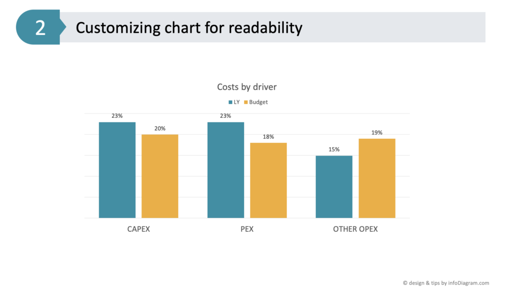
Chart Improvement 2: Enhancing Clarity with Data Labels
Another data chart area worth customizing, after adjusting the bar widths are the data labels. The default location of data values is not always optimal. They may be too small or not visible. In my example placing these data labels inside the bars can significantly improve readability. Thanks to wider bars, we now have a space to embed numbers inside. This positioning, close to the bar ends, conveniently shows the value.
To ensure they stand out, I increased the font size to 20 and adjusted the color to white for better contrast against the colored background. Depending on the font used, making these labels bold can further improve visibility. This makes your bar chart in PowerPoint not only more readable but also more visually engaging.
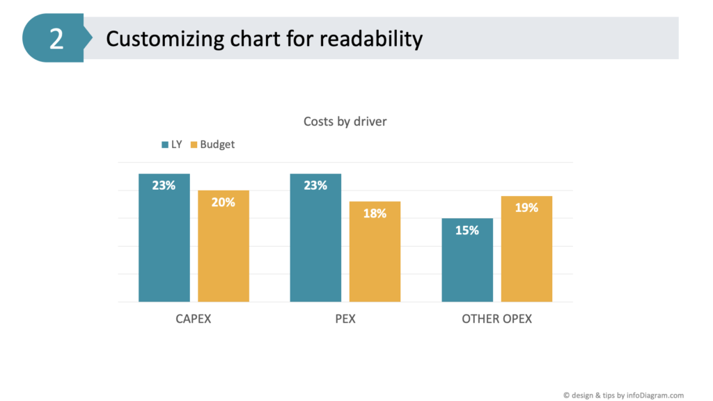
Chart Improvement 3: Simplifying Your Bar Chart, Removing Unnecessary Information
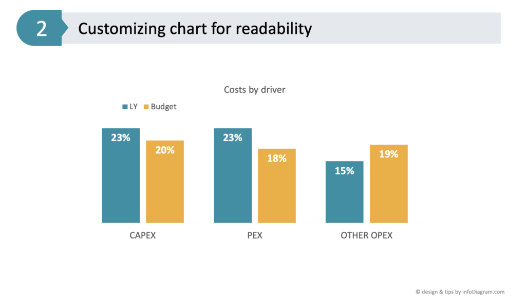
A key part of making a slide more readable is removing unnecessary elements. For instance, if the vertical axis (Y-axis) is providing practically the same information as data labels, then simply delete it. You will not lose information because it’s mentioned inside bars.
Alternatively, you can keep only the axis and remove the bar data labels. You don’t need to have the same data expressed twice.
This step, along with removing gridlines, contributes to a cleaner and more focused bar chart in PowerPoint, ensuring that the viewer’s attention is solely on the data being presented.
Chart Improvement 4: Tailoring the Graph Legend
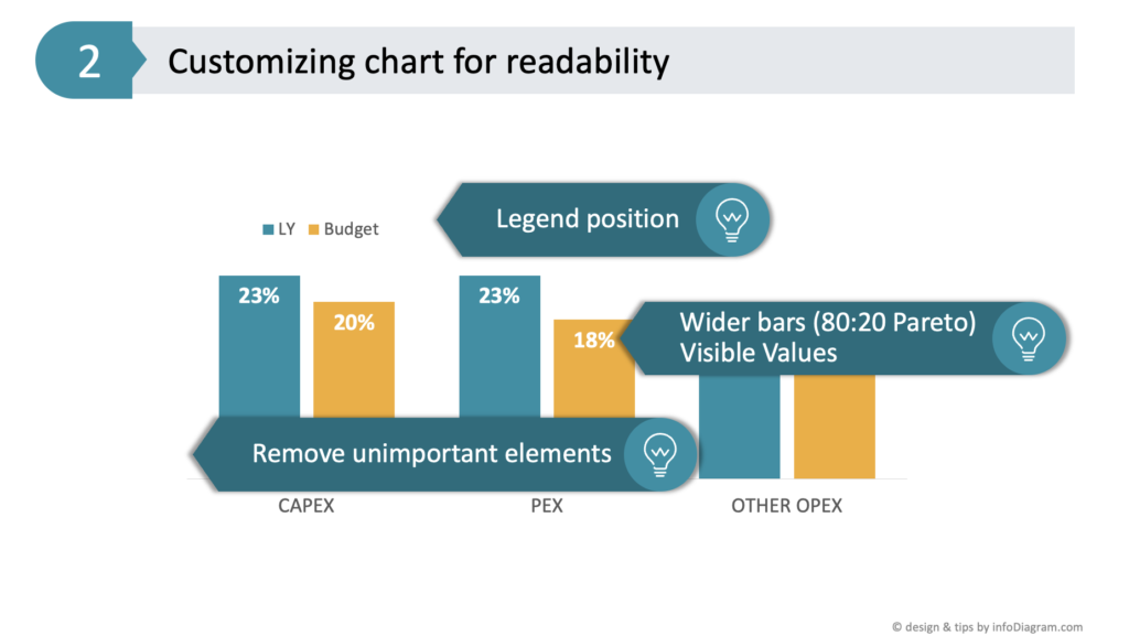
The final touch I usually do in optimizing a bar chart in PowerPoint is adjusting the legend’s position. The legend placement depends on your presentation context.
If your audience is already familiar with presented data categories, the legend can be placed in a less prominent position e.g. on the right side or under the data chart. However, for newcomers who seek first to learn what data categories you present, I recommend placing the legend where they see it first. For example at the top of the bar chart in PowerPoint or from the left side. This ensures an immediate understanding of what each bar represents, enhancing the overall effectiveness of your presentation.
Legend position can be adjusted either from chart options or manually by moving it.
Conclusion: Enhance Your PowerPoint Bar Charts for Audience Engagement
To sum up, customizing a bar chart in PowerPoint for better clarity involves several key steps:
- widen the bars (applying the 80-20 rule)
- enhance data value visibility
- eliminate unnecessary elements – axis data if they are already expressed other way
- choose the legend’s position based on your audience’s familiarity
By following these simple yet effective tips, you can transform a standard chart into a more engaging and informative visual tool for your business presentations.
Explore more practical tips on how to ensure the slide reading flow is natural and easy to follow.
Watch the movie with full instructions here:
Explore another article related to bar chart design, where I share how to effectively address the common mistakes in PowerPoint chart design.
Follow our YouTube channel if you want to see more of such guides, and subscribe to the newsletter to get more design tips and slide inspiration.
Author: Peter Zvirinsky, slide design trainer and the founder of infoDiagram
Reach out to Peter on LinkedIn or via his slide design & training website.